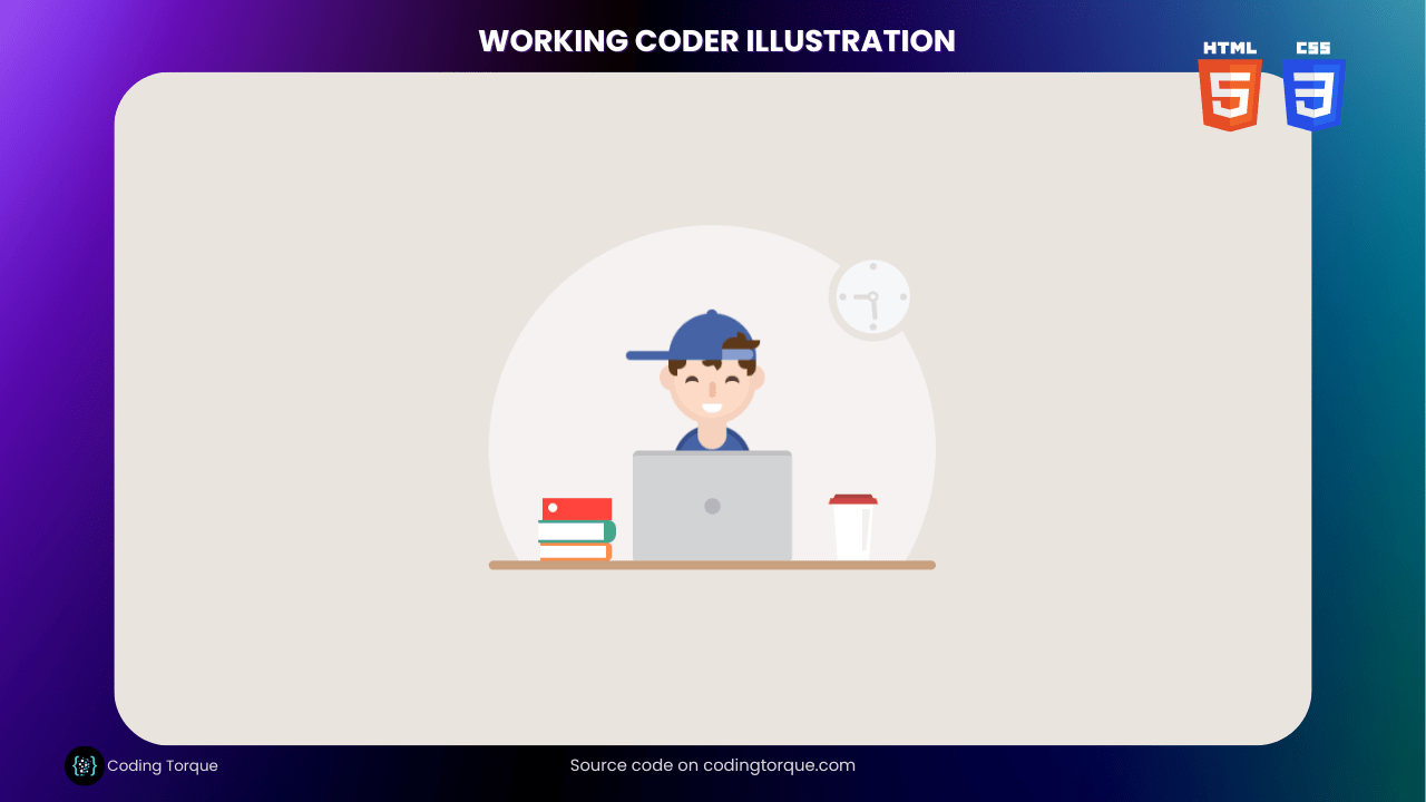
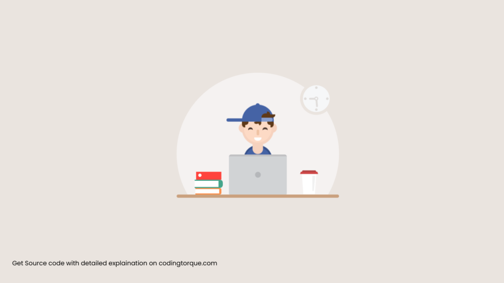
If you’re a web developer or aspiring to be one, showcasing your skills through an interactive illustration is a great way to impress potential clients or employers. In this tutorial, we’ll show you how to create an eye-catching “Working Coder Illustration” using only HTML and CSS. You’ll learn how to use HTML to create the structure of the illustration and style it with CSS to give it a unique and visually appealing appearance. We’ll also cover how to add interactive animations to make your coder illustration come to life. By the end of this tutorial, you’ll have a fully-functional and visually stunning “Working Coder Illustration” that you can use to showcase your web development skills and attract more clients or job opportunities. So, let’s get started on creating a beautiful and interactive “Working Coder Illustration” using HTML and CSS!
Before we start here are 50 projects to create using HTML CSS and JavaScript –
I would recommend you don’t just copy and paste the code, just look at the code and type by understanding it.
Demo
HTML Code
Starter Template
<!doctype html>
<html lang="en">

<head>
    <!-- Required meta tags -->
    <meta charset="utf-8">
    <meta name="viewport" content="width=device-width, initial-scale=1">

    <!-- CSS -->
    <link rel="stylesheet" href="style.css">

    <title>Working Coder Illustration using HTML and CSS - Coding Torque</title>
</head>

<body>
    <!-- Further code here -->
</body>

</html>
Paste the below code in your <body> tag.
<div class="stage">
    <div class="table"></div>
    <div class="pc"></div>
    <div class="cup"></div>
    <div class="cup-cover"></div>
    <div class="clock">
        <div class="marker-top"></div>
        <div class="marker-right"></div>
        <div class="marker-bottom"></div>
        <div class="marker-left"></div>
        <div class="pointer-min"></div>
        <div class="pointer-hour"></div>
        <div class="pointer"></div>
    </div>
    <div class="guy">
        <div class="hat">
            <div class="hat-hair"></div>
            <div class="hat-close"></div>
        </div>
        <div class="hair-left"></div>
        <div class="hair-middle"></div>
        <div class="hair-right"></div>
        <div class="ear-left"></div>
        <div class="ear-right"></div>
        <div class="face">
            <div class="eye"></div>
            <div class="eye"></div>
            <div class="nose"></div>
            <div class="mouth"></div>
        </div>
        <div class="neck"></div>
        <div class="body"></div>
    </div>
    <div class="book one"></div>
    <div class="book two"></div>
    <div class="book three"></div>
</div>
CSS Code
Create a file style.css and paste the code below.
* {
  box-sizing: border-box;
}

html,
body {
  margin: 0;
  padding: 0;
  height: 100%;
  overflow: hidden;
  background-color: #eae4df;
}

body {
  display: -webkit-box;
  display: -ms-flexbox;
  display: flex;
  -webkit-box-pack: center;
  -ms-flex-pack: center;
  justify-content: center;
  -webkit-box-align: center;
  -ms-flex-align: center;
  align-items: center;
}

.stage {
  width: 400px;
  height: 400px;
  border-radius: 50%;
  background-color: #f5f2f1;
  position: relative;
}

.stage:after {
  background-color: #eae4df;
  height: 100px;
  width: 100%;
  position: absolute;
  content: "";
  bottom: 0;
}

.table {
  position: absolute;
  bottom: 92px;
  width: 100%;
  height: 8px;
  background-color: #caa17f;
  z-index: 1;
  border-radius: 20px;
}

.pc {
  z-index: 2;
  position: absolute;
  bottom: 100px;
  width: 142px;
  height: 98px;
  background-color: #c0c0c2;
  border-radius: 5px;
  left: 50%;
  -webkit-transform: translateX(-50%);
  transform: translateX(-50%);
}

.pc:after {
  content: "";
  width: 14px;
  height: 14px;
  border-radius: 50%;
  background-color: #b5b7ba;
  position: absolute;
  top: 51%;
  left: 50%;
  -webkit-transform: translateX(-50%) translateY(-50%);
  transform: translateX(-50%) translateY(-50%);
}

.pc:before {
  content: "";
  position: absolute;
  top: 4px;
  left: 0;
  right: 0;
  height: calc(100% - 4px);
  background-color: #d1d3d5;
  border-radius: 2px;
}

.guy {
  width: 174px;
  height: 130px;
  position: absolute;
  left: 50%;
  -webkit-transform: translateX(-50%) translateY(0) translateZ(0);
  transform: translateX(-50%) translateY(0) translateZ(0);
  bottom: 198px;
  -webkit-animation: guyMove 3500ms cubic-bezier(0.4, 0, 1, 1) infinite
    alternate;
  animation: guyMove 3500ms cubic-bezier(0.4, 0, 1, 1) infinite alternate;
}

@-webkit-keyframes guyMove {
  0% {
    -webkit-transform: translateX(-50%) translateY(45px) translateZ(0);
  }
  15% {
    -webkit-transform: translateX(-50%) translateY(50px) translateZ(0);
  }
  30% {
    -webkit-transform: translateX(-50%) translateY(45px) translateZ(0);
  }
  45% {
    -webkit-transform: translateX(-50%) translateY(50px) translateZ(0);
  }
  60% {
    -webkit-transform: translateX(-50%) translateY(0px) translateZ(0);
  }
  100% {
    -webkit-transform: translateX(-50%) translateY(0px) translateZ(0);
  }
}

@keyframes guyMove {
  0% {
    transform: translateX(-50%) translateY(45px) translateZ(0);
  }
  15% {
    transform: translateX(-50%) translateY(50px) translateZ(0);
  }
  30% {
    transform: translateX(-50%) translateY(45px) translateZ(0);
  }
  45% {
    transform: translateX(-50%) translateY(50px) translateZ(0);
  }
  60% {
    transform: translateX(-50%) translateY(0px) translateZ(0);
  }
  100% {
    transform: translateX(-50%) translateY(0px) translateZ(0);
  }
}

.body {
  width: 70px;
  height: 40px;
  position: absolute;
  bottom: -14px;
  z-index: 1;
  left: 50%;
  -webkit-transform: translateX(-50%);
  transform: translateX(-50%);
  border-radius: 50px 50px 0 0;
  background-color: #36508a;
}

.body:after {
  content: "";
  position: absolute;
  width: 60px;
  height: 30px;
  -webkit-transform: translateX(-50%);
  transform: translateX(-50%);
  left: 50%;
  border-radius: 50px 50px 0 0;
  background-color: #4563a5;
  bottom: 5px;
}

.neck {
  width: 26px;
  height: 26px;
  background-color: #f6d2be;
  border-radius: 0 0 50px 50px;
  bottom: 4px;
  z-index: 4;
  position: absolute;
  left: 50%;
  -webkit-transform: translateX(-50%);
  transform: translateX(-50%);
}

.face {
  background-color: #f6d2be;
  width: 78px;
  border-radius: 0 0 50px 50px;
  height: 58px;
  position: absolute;
  bottom: 26px;
  left: 50%;
  -webkit-transform: translateX(-50%);
  transform: translateX(-50%);
}

.face:after {
  background-color: #fddac5;
  width: 68px;
  border-radius: 0 0 50px 50px;
  height: 52px;
  content: "";
  left: 50%;
  -webkit-transform: translateX(-50%);
  transform: translateX(-50%);
  position: absolute;
}

.eye {
  width: 12px;
  height: 12px;
  background-color: #533d34;
  position: absolute;
  left: 15px;
  top: 14px;
  z-index: 5;
  border-radius: 50px;
}

.eye:nth-child(2) {
  left: auto;
  right: 15px;
}

.eye:after {
  content: "";
  width: 16px;
  left: -2px;
  height: 14px;
  background-color: #fddac5;
  border-radius: 50%;
  position: absolute;
  -webkit-animation: eyeMove 3500ms cubic-bezier(0.4, 0, 1, 1) infinite
    alternate;
  animation: eyeMove 3500ms cubic-bezier(0.4, 0, 1, 1) infinite alternate;
}

@-webkit-keyframes eyeMove {
  0% {
    -webkit-transform: translateY(16px) translateZ(0);
  }
  15% {
    -webkit-transform: translateY(16px) translateZ(0);
  }
  30% {
    -webkit-transform: translateY(16px) translateZ(0);
  }
  45% {
    -webkit-transform: translateY(16px) translateZ(0);
  }
  60% {
    -webkit-transform: translateY(4px) translateZ(0);
  }
  100% {
    -webkit-transform: translateY(4px) translateZ(0);
  }
}

@keyframes eyeMove {
  0% {
    transform: translateY(16px) translateZ(0);
  }
  15% {
    transform: translateY(16px) translateZ(0);
  }
  30% {
    transform: translateY(16px) translateZ(0);
  }
  45% {
    transform: translateY(16px) translateZ(0);
  }
  60% {
    transform: translateY(4px) translateZ(0);
  }
  100% {
    transform: translateY(4px) translateZ(0);
  }
}

.nose {
  background-color: #efc2a3;
  position: absolute;
  top: 20px;
  left: 50%;
  -webkit-transform: translateX(-50%);
  transform: translateX(-50%);
  width: 6px;
  height: 14px;
  z-index: 5;
  border-radius: 20px;
}

.hat {
  background-color: #4563a5;
  height: 42px;
  width: 78px;
  top: 4px;
  left: 50%;
  -webkit-transform: translateX(-50%);
  transform: translateX(-50%);
  border-radius: 50px 50px 0 0;
  position: absolute;
  z-index: 5;
}

.hat:before {
  height: 6px;
  width: 10px;
  background-color: #4563a5;
  position: absolute;
  content: "";
  border-radius: 50px 50px 0 0;
  top: -3px;
  left: 50%;
  margin-left: -5px;
}

.hat:after {
  height: 8px;
  width: 42px;
  background-color: #4563a5;
  position: absolute;
  content: "";
  border-radius: 50px 0 0 50px;
  bottom: 0;
  left: -38px;
}

.hair-left {
  background-color: #5e3919;
  position: absolute;
  top: 46px;
  z-index: 5;
  left: 48px;
  width: 8px;
  border-radius: 0 0 0 50px;
  height: 14px;
}

.hair-left:before {
  content: "";
  position: absolute;
  top: 0;
  left: 8px;
  width: 8px;
  height: 8px;
  background-color: #5e3919;
  border-radius: 0 0 50px 0;
}

.hair-right {
  background-color: #5e3919;
  position: absolute;
  top: 46px;
  z-index: 5;
  right: 48px;
  width: 8px;
  border-radius: 0 0 50px 0;
  height: 14px;
}

.hair-right:before {
  content: "";
  position: absolute;
  top: 0;
  right: 8px;
  width: 8px;
  height: 8px;
  background-color: #5e3919;
  border-radius: 0 0 0 50px;
}

.hair-middle {
  background-color: #5e3919;
  top: 45px;
  left: 49%;
  z-index: 4;
  width: 14px;
  height: 6px;
  border-radius: 0 0 100px 100px;
  position: absolute;
  z-index: 4;
  -webkit-transform: translateX(-50%);
  transform: translateX(-50%) rotate(-15deg);
}

.hair-middle:after {
  content: "";
  position: absolute;
  top: -4px;
  right: -3px;
  width: 8px;
  height: 14px;
  border-radius: 0 50px 50px 0;
  background-color: #5e3919;
  transform: rotate(-15deg);
}

.hat-hair {
  width: 24px;
  height: 10px;
  background-color: #5e3919;
  border-radius: 50px 50px 0 0;
  position: absolute;
  bottom: 10px;
  right: 6px;
}

.hat-hair:before {
  content: "";
  position: absolute;
  width: 8px;
  height: 8px;
  top: -5px;
  right: 3px;
  background-color: #5e3919;
  border-radius: 0 50px 0 0;
}

.hat-hair:after {
  content: "";
  position: absolute;
  width: 14px;
  height: 8px;
  top: 2px;
  right: -10px;
  background-color: #5e3919;
  border-radius: 0 0 50px 0;
}

.hat-close {
  position: absolute;
  bottom: 0;
  right: 2px;
  width: 28px;
  height: 10px;
  border-radius: 0 100px 100px 0;
  background-color: #879ed0;
}

.mouth {
  width: 18px;
  height: 8px;
  border-radius: 0 0 50px 50px;
  background-color: #fff;
  position: absolute;
  bottom: 11px;
  left: 50%;
  -webkit-transform: translateX(-50%);
  transform: translateX(-50%);
  z-index: 12;
}

.ear-left {
  position: absolute;
  top: 50px;
  left: 40px;
  border-radius: 50px 0 0 50px;
  width: 16px;
  height: 24px;
  background-color: #f6d2be;
}

.ear-right {
  position: absolute;
  top: 50px;
  right: 40px;
  border-radius: 0 50px 50px 0;
  width: 16px;
  height: 24px;
  background-color: #f6d2be;
}

.clock {
  width: 80px;
  height: 80px;
  border-radius: 50%;
  background-color: #eae4df;
  position: absolute;
  right: 16px;
  top: 24px;
}

.clock:before {
  content: "";
  width: 66px;
  height: 66px;
  background-color: #f6f7f8;
  border-radius: 50%;
  position: absolute;
  top: 7px;
  left: 7px;
  z-index: 2;
}

.pointer-min {
  height: 22px;
  width: 4px;
  border-radius: 0 0 50px 50px;
  background-color: #e0dddb;
  position: absolute;
  left: 50%;
  top: calc(50% + 10px);
  -webkit-transform: translateX(-50%) translateY(-50%) rotate(-30deg);
  transform: translateX(-50%) translateY(-50%) rotate(-30deg);
  z-index: 20;
  transform-origin: top;
  -webkit-animation: min 30s linear infinite;
  animation: min 30s linear infinite;
}

@-webkit-keyframes min {
  0% {
    -webkit-transform: translateX(-50%) translateY(-50%) rotate(-30deg);
  }
  100% {
    -webkit-transform: translateX(-50%) translateY(-50%) rotate(330deg);
  }
}

@keyframes min {
  0% {
    transform: translateX(-50%) translateY(-50%) rotate(-30deg);
  }
  100% {
    transform: translateX(-50%) translateY(-50%) rotate(330deg);
  }
}

.pointer-hour {
  width: 14px;
  height: 4px;
  border-radius: 50px 0 0 50px;
  background-color: #e0dddb;
  position: absolute;
  top: 50%;
  -webkit-transform: translateY(-50%);
  transform: translateY(-50%);
  z-index: 20;
  left: 22px;
}

.pointer {
  position: absolute;
  top: 50%;
  left: 50%;
  -webkit-transform: translateX(-50%) translateY(-50%);
  transform: translateX(-50%) translateY(-50%);
  width: 10px;
  height: 10px;
  border: 3px solid #e0dddb;
  background-color: #f6f7f8;
  border-radius: 50%;
  z-index: 30;
}

.marker-top {
  width: 6px;
  height: 6px;
  background-color: #e0dddb;
  position: absolute;
  top: 10px;
  left: 50%;
  z-index: 20;
  border-radius: 50%;
  -webkit-transform: translateX(-50%);
  transform: translateX(-50%);
}

.marker-right {
  width: 6px;
  height: 6px;
  background-color: #e0dddb;
  position: absolute;
  right: 10px;
  top: 50%;
  z-index: 20;
  border-radius: 50%;
  -webkit-transform: translateY(-50%);
  transform: translateY(-50%);
}

.marker-bottom {
  width: 6px;
  height: 6px;
  background-color: #e0dddb;
  position: absolute;
  bottom: 10px;
  left: 50%;
  z-index: 20;
  border-radius: 50%;
  -webkit-transform: translateX(-50%);
  transform: translateX(-50%);
}

.marker-left {
  width: 6px;
  height: 6px;
  background-color: #e0dddb;
  position: absolute;
  left: 10px;
  top: 50%;
  z-index: 20;
  border-radius: 50%;
  -webkit-transform: translateY(-50%);
  transform: translateY(-50%);
}

.cup {
  width: 36px;
  height: 60px;
  position: absolute;
  bottom: 90px;
  z-index: 20;
  right: 56px;
  border-top: 50px solid #fff;
  border-left: 4px solid transparent;
  border-right: 4px solid transparent;
}

.cup:after {
  content: "";
  position: absolute;
  right: -1px;
  top: -46px;
  width: 4px;
  border-top: 38px solid rgba(220, 220, 220, 0.41);
  border-left: 0px solid transparent;
  border-right: 4px solid transparent;
}

.cup-cover {
  width: 44px;
  right: 52px;
  position: absolute;
  bottom: 150px;
  z-index: 21;
  border-bottom: 6px solid #ce4646;
  border-left: 2px solid transparent;
  border-right: 2px solid transparent;
}

.cup-cover:after {
  content: "";
  width: 32px;
  right: 2px;
  position: absolute;
  bottom: 0;
  z-index: 21;
  border-bottom: 4px solid #af4242;
  border-left: 2px solid transparent;
  border-right: 2px solid transparent;
}

.book.one {
  position: absolute;
  bottom: 100px;
  width: 64px;
  height: 16px;
  left: 46px;
  background-color: #fff;
  border-top: 3px solid #fb904d;
  border-right: 6px solid #fb904d;
  border-bottom: 3px solid #fb904d;
  border-radius: 0 4px 4px 0;
}

.book.two {
  position: absolute;
  bottom: 116px;
  width: 70px;
  height: 20px;
  left: 44px;
  background-color: #fff;
  border-top: 3px solid #45a58b;
  border-right: 11px solid #45a58b;
  border-bottom: 3px solid #45a58b;
  border-radius: 0 7px 8px 0;
}

.book.three {
  position: absolute;
  bottom: 136px;
  width: 62px;
  height: 20px;
  left: 48px;
  background-color: #ff443d;
}

.book.three:after {
  content: "";
  position: absolute;
  top: 5px;
  left: 5px;
  width: 8px;
  height: 8px;
  background-color: #fff;
  border-radius: 50%;
}
Final Output
Written by: Piyush Patil
Code Credits: @JoseRosario
If you found any mistakes or have any doubts please feel free to Contact Us
Hope you find this post helpful💖


