Welcome to our latest web development tutorial! Today, we’re embarking on a journey to create a mesmerizing card layout with an infinite scrolling effect using the trifecta of HTML, CSS, and JavaScript.


I would recommend you don’t just copy and paste the code, just look at the code and type by understanding it.
Demo
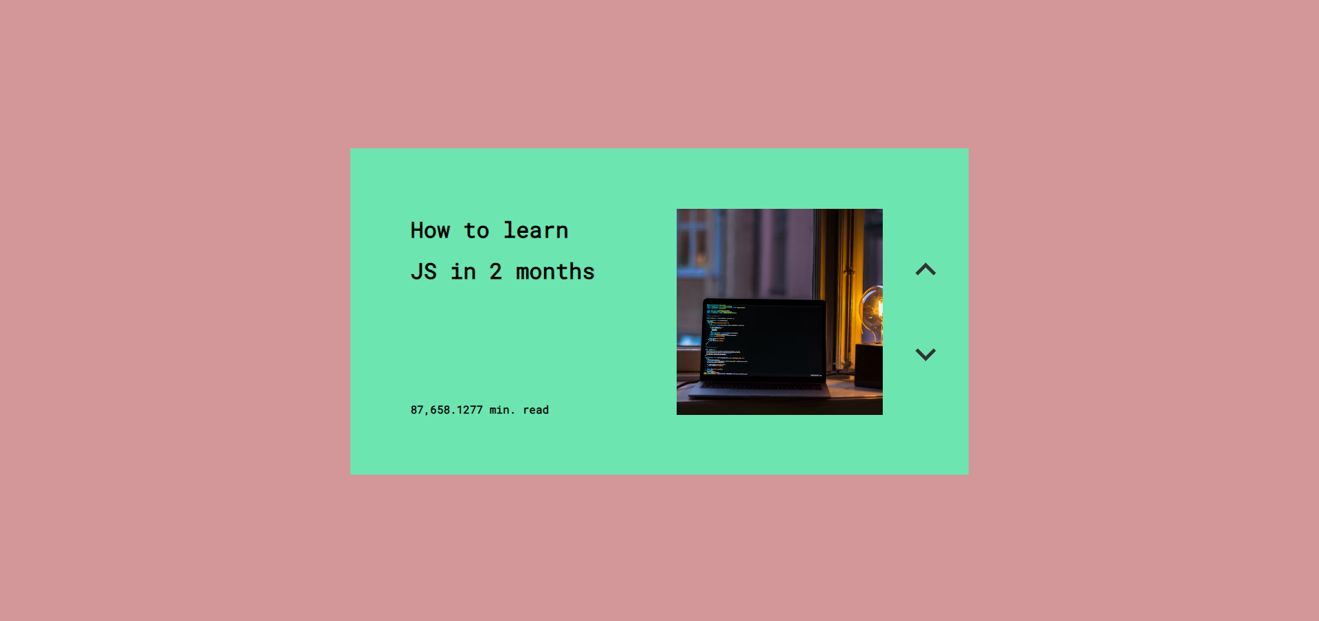
See the Pen CSS and JS Infinite Carousel [INTERACTION] by Radu Bratan (@RaduBratan) on CodePen.
HTML Code
Starter Template
<!doctype html>
<html lang="en">

<head>
    <!-- Required meta tags -->
    <meta charset="utf-8">
    <meta name="viewport" content="width=device-width, initial-scale=1">

    <!-- CSS -->
    <link rel="stylesheet" href="style.css">

    <title>Card with infinite scrolling effect using HTML CSS and JavaScript - Coding Torque</title>
</head>

<body>
    <!-- Further code here -->

    <script src="script.js"></script>
</body>

</html>
Paste the below code in your <body> tag.
<div id="carousel-wrapper">
  <div id="menu">
      <div id="current-option">
        <span id="current-option-text1" data-previous-text="" data-next-text=""></span>
        <span id="current-option-text2" data-previous-text="" data-next-text=""></span>
      </div>
      <button id="previous-option"></button>
      <button id="next-option"></button>
  </div>
  <div id="image"></div>
</div>
CSS Code
Create a file style.css and paste the code below.
@import url("https://fonts.googleapis.com/css?family=Poppins|Lato|Roboto+Mono&display=swap");

body {
  width: 100vw;
  height: 100vh;
  overflow: hidden;
  margin: 0;
  padding: 0;
  background: lighten(#CB8589, 5%);
  font-family: "Helvetica Neue", "Roboto Mono", "Poppins", sans-serif;
  display: flex;
  flex-direction: column;
  justify-content: center;
  align-items: center;
}

* {
  box-sizing: border-box;
  outline: none;
  user-select: none;
}

#carousel-wrapper {
  width: auto;
  height: auto;
  display: flex;
  flex-direction: row;
  align-items: center;
  justify-content: center;
  overflow: hidden;

  #menu {
    height: 380px;
    width: 720px;
    overflow: hidden;
    font-weight: 700;
    line-height: 1;
    display: flex;
    flex-direction: row;
    align-items: center;
    justify-content: center;
    vertical-align: middle;
    transition: all 0.6s ease-in-out;

    #current-option {
      position: relative;
      width: 100%;
      height: 100%;
      transform: translate(-25%, 0%);
      display: flex;
      flex-direction: column;
      align-items: center;
      justify-content: center;
      //background-color: blue;
      overflow: hidden;

      #current-option-text1 {
        font-size: 1.6rem;
        line-height: 3rem;
        width: 220px;
        height: 200px;
        display: flex;
        flex-direction: column;
        align-items: center;
        justify-content: flex-start;
        //background: red;

        &::before {
          content: attr(data-next-text);
          position: absolute;
          transform: translate(0%, 380px);
          width: 100%;
          height: 200px;
          display: flex;
          flex-direction: column;
          align-items: center;
          justify-content: flex-start;
          //background: red;
        }

        &::after {
          content: attr(data-previous-text);
          position: absolute;
          transform: translate(0%, -380px);
          width: 100%;
          height: 200px;
          display: flex;
          flex-direction: column;
          align-items: center;
          justify-content: flex-start;
          //background: red;
        }
      }

      #current-option-text2 {
        font-size: 0.8rem;
        width: 220px;
        height: 40px;
        display: flex;
        flex-direction: column;
        align-items: flex-start;
        justify-content: flex-end;
        //background: green;

        &::before {
          content: attr(data-next-text);
          position: absolute;
          transform: translate(0%, 380px);
          width: 100%;
          height: 40px;
          display: flex;
          flex-direction: column;
          align-items: flex-start;
          justify-content: flex-end;
          //background: green;
        }

        &::after {
          content: attr(data-previous-text);
          position: absolute;
          transform: translate(0%, -380px);
          width: 100%;
          height: 40px;
          display: flex;
          flex-direction: column;
          align-items: flex-start;
          justify-content: flex-end;
          //background: green;
        }
      }
    }

    #previous-option {
      width: 1.5rem;
      height: 1.5rem;
      border: none;
      display: block;
      cursor: pointer;
      background: url("data:image/svg+xml,%3Csvg version='1.1' xmlns='http://www.w3.org/2000/svg' xmlns:xlink='http://www.w3.org/1999/xlink' x='0px' y='0px' viewBox='0 0 256 256'%3E%3Cpolygon points='225.813,48.907 128,146.72 30.187,48.907 0,79.093 128,207.093 256,79.093' fill='%23333'%3E%3C/polygon%3E%3C/svg%3E");
      background-size: cover;
      position: absolute;
      transform: translate(310px, 50px);
    }

    #next-option {
      width: 1.5rem;
      height: 1.5rem;
      border: none;
      display: block;
      cursor: pointer;
      background: url("data:image/svg+xml,%3Csvg version='1.1' xmlns='http://www.w3.org/2000/svg' xmlns:xlink='http://www.w3.org/1999/xlink' x='0px' y='0px' viewBox='0 0 256 256'%3E%3Cpolygon points='225.813,48.907 128,146.72 30.187,48.907 0,79.093 128,207.093 256,79.093' fill='%23333'%3E%3C/polygon%3E%3C/svg%3E");
      background-size: cover;
      position: absolute;
      transform: translate(310px, -50px) rotate(180deg);
    }
  }

  #image {
    height: 240px;
    width: 240px;
    background-position: center;
    background-repeat: no-repeat;
    background-size: cover;
    z-index: 101;
    position: absolute;
    transform: translate(140px, 0);
  }

  &.anim-next {
    pointer-events: none;

    #current-option-text1 {
      animation: next-text 0.65s 0.085s;
    }

    #current-option-text2 {
      animation: next-text 0.65s 0.085s;
    }

    #previous-option {
      animation: next-top-arrow 0.65s 0.085s;
    }

    #next-option {
      animation: next-bottom-arrow 0.65s 0.085s;
    }

    #image {
      animation: next-image 0.65s 0.085s;
    }
  }

  &.anim-previous {
    pointer-events: none;

    #current-option-text1 {
      animation: previous-text 0.65s 0.085s;
    }

    #current-option-text2 {
      animation: previous-text 0.65s 0.085s;
    }

    #previous-option {
      animation: previous-top-arrow 0.65s 0.085s;
    }

    #next-option {
      animation: previous-bottom-arrow 0.65s 0.085s;
    }

    #image {
      animation: previous-image 0.65s 0.085s;
    }
  }
}

@keyframes previous-text {
  50%,
  55% {
    transform: translate(0%, 390px);
  }
  to {
    transform: translate(0%, 380px);
  }
}

@keyframes previous-top-arrow {
  50% {
    transform: translate(310px, 53px);
  }
}

@keyframes previous-bottom-arrow {
  50% {
    transform: translate(310px, -47px) rotate(180deg);
  }
}

@keyframes previous-image {
  0% {
    transform: translate(140px, 0) scale(1);
    opacity: 1;
  }
  70% {
    transform: translate(140px, 0) scale(1.1);
    opacity: 0;
  }
  100% {
    transform: translate(140px, 0) scale(1);
    opacity: 1;
  }
}

@keyframes next-text {
  50%,
  55% {
    transform: translate(0%, -390px);
  }
  to {
    transform: translate(0%, -380px);
  }
}

@keyframes next-top-arrow {
  50% {
    transform: translate(310px, 47px);
  }
}

@keyframes next-bottom-arrow {
  50% {
    transform: translate(310px, -53px) rotate(180deg);
  }
}

@keyframes next-image {
  0% {
    transform: translate(140px, 0) scale(1);
    opacity: 1;
  }
  70% {
    transform: translate(140px, 0) scale(1.1);
    opacity: 0;
  }
  100% {
    transform: translate(140px, 0) scale(1);
    opacity: 1;
  }
}
JavaScript Code
Create a file script.js and paste the code below.
const text1_options = [
  "Why art is so important",
  "Why you shouldn't buy the new iPhone",
  "Is life actually real?",
  "How to learn JS in 2 months"
];
const text2_options = [
  "69 min. read",
  "7 min. read",
  "8 min. read",
  "87,658.1277 min. read"
];
const color_options = ["#EBB9D2", "#FE9968", "#7FE0EB", "#6CE5B1"];
const image_options = [
  "https://images.unsplash.com/photo-1524721696987-b9527df9e512?ixlib=rb-1.2.1&ixid=eyJhcHBfaWQiOjEyMDd9&auto=format&fit=crop&w=1190&q=80",
  "https://images.unsplash.com/photo-1556656793-08538906a9f8?ixlib=rb-1.2.1&ixid=eyJhcHBfaWQiOjEyMDd9&auto=format&fit=crop&w=1050&q=80",
  "https://images.unsplash.com/photo-1506073828772-2f85239b6d2d?ixlib=rb-1.2.1&auto=format&fit=crop&w=1189&q=80",
  "https://images.unsplash.com/photo-1523800503107-5bc3ba2a6f81?ixlib=rb-1.2.1&ixid=eyJhcHBfaWQiOjEyMDd9&auto=format&fit=crop&w=500&q=80"
];
var i = 0;
const currentOptionText1 = document.getElementById("current-option-text1");
const currentOptionText2 = document.getElementById("current-option-text2");
const currentOptionImage = document.getElementById("image");
const carousel = document.getElementById("carousel-wrapper");
const mainMenu = document.getElementById("menu");
const optionPrevious = document.getElementById("previous-option");
const optionNext = document.getElementById("next-option");

currentOptionText1.innerText = text1_options[i];
currentOptionText2.innerText = text2_options[i];
currentOptionImage.style.backgroundImage = "url(" + image_options[i] + ")";
mainMenu.style.background = color_options[i];

optionNext.onclick = function () {
  i = i + 1;
  i = i % text1_options.length;
  currentOptionText1.dataset.nextText = text1_options[i];

  currentOptionText2.dataset.nextText = text2_options[i];

  mainMenu.style.background = color_options[i];
  carousel.classList.add("anim-next");

  setTimeout(() => {
    currentOptionImage.style.backgroundImage = "url(" + image_options[i] + ")";
  }, 455);

  setTimeout(() => {
    currentOptionText1.innerText = text1_options[i];
    currentOptionText2.innerText = text2_options[i];
    carousel.classList.remove("anim-next");
  }, 650);
};

optionPrevious.onclick = function () {
  if (i === 0) {
    i = text1_options.length;
  }
  i = i - 1;
  currentOptionText1.dataset.previousText = text1_options[i];

  currentOptionText2.dataset.previousText = text2_options[i];

  mainMenu.style.background = color_options[i];
  carousel.classList.add("anim-previous");

  setTimeout(() => {
    currentOptionImage.style.backgroundImage = "url(" + image_options[i] + ")";
  }, 455);

  setTimeout(() => {
    currentOptionText1.innerText = text1_options[i];
    currentOptionText2.innerText = text2_options[i];
    carousel.classList.remove("anim-previous");
  }, 650);
};
Final Output

Written by: Piyush Patil
Code Credits: https://codepen.io/RaduBratan/pen/dyGEzay
If you found any mistakes or have any doubts please feel free to Contact Us
Hope you find this post helpful💖


