Hello Guys! Welcome to Coding Torque. In this blog, we are going to make a Flexy mega menu using HTML, CSS and JavaScript. You must create this if you are a beginner and learning HTML and CSS.
Before we start, here are some JavaScript Games you might like to create:
1. Snake Game using JavaScript
2. 2D Bouncing Ball Game using JavaScript
3. Rock Paper Scissor Game using JavaScript
4. Tic Tac Toe Game using JavaScript
5. Whack a Mole Game using JavaScript
I would recommend you don’t just copy and paste the code, just look at the code and type by understanding it.
HTML Code
Starter Template
<!doctype html>
  <html lang="en">

  <head>
      <!-- Required meta tags -->
      <meta charset="utf-8">
      <meta name="viewport" content="width=device-width, initial-scale=1">
      <title>Flexy mega menu using HTML, CSS and JavaScript - @codingtorque</title>

      <link rel="stylesheet" href="style.css">
      <link href="https://fonts.googleapis.com/css?family=Varela+Round" rel="stylesheet">
  </head>

  <body>
          <!-- further code in next block -->

          <!-- JQuery CDN -->
          <script src="https://code.jquery.com/jquery-3.6.1.js"
          integrity="sha256-3zlB5s2uwoUzrXK3BT7AX3FyvojsraNFxCc2vC/7pNI=" crossorigin="anonymous"></script>

          <script src="script.js"></script>
  </body>

  </html>
Paste the below code in your <body> tag
<svg xmlns="http://www.w3.org/2000/svg" style="display:none;">
<defs>
<symbol viewBox="0 0 60 60" id="icon-facebook">
<path d="M25.8 46.3h6.7V30H37l.6-5.6h-5.1v-2.8c0-1.5.1-2.3 2.2-2.3h2.8v-5.6H33c-5.4 0-7.3 2.7-7.3 7.3v3.4h-3.4V30h3.4v16.3zM30 60C13.4 60 0 46.6 0 30S13.4 0 30 0s30 13.4 30 30-13.4 30-30 30z"/>
</symbol>
<symbol viewBox="0 0 60 60" id="icon-linkedin">
<path d="M46.8 44.1V32.4c0-6.3-3.3-9.2-7.8-9.2-3.6 0-5.2 2-6.1 3.4v-2.9h-6.8c.1 1.9 0 20.4 0 20.4h6.8V32.7c0-.6 0-1.2.2-1.7.5-1.2 1.6-2.5 3.5-2.5 2.5 0 3.4 1.9 3.4 4.6V44l6.8.1zM19 20.9c2.4 0 3.8-1.6 3.8-3.5 0-2-1.5-3.5-3.8-3.5s-3.8 1.5-3.8 3.5 1.4 3.5 3.8 3.5zM30 60C13.4 60 0 46.6 0 30S13.4 0 30 0s30 13.4 30 30-13.4 30-30 30zm-7.6-15.9V23.7h-6.8v20.4h6.8z"/>
</symbol>
<symbol viewBox="0 0 60 60" id="icon-twitter">
<path d="M34.2 18.3c-2.6 1-4.3 3.4-4.1 6.1l.1 1-1-.1c-3.8-.5-7.1-2.1-10-4.9L17.7 19l-.4 1c-.8 2.3-.3 4.7 1.3 6.3.8.9.6 1-.8.5-.5-.2-.9-.3-1-.2-.1.1.4 2.1.8 2.8.5 1.1 1.7 2.1 2.9 2.7l1 .5h-1.2c-1.2 0-1.2 0-1.1.5.4 1.4 2.1 2.8 3.9 3.5l1.3.4-1.1.7c-1.7 1-3.6 1.5-5.6 1.6-.9 0-1.7.1-1.7.2 0 .2 2.6 1.4 4 1.9 4.5 1.4 9.8.8 13.7-1.6 2.8-1.7 5.7-5 7-8.2.7-1.7 1.4-4.9 1.4-6.4 0-1 .1-1.1 1.2-2.3.7-.7 1.3-1.4 1.5-1.6.2-.4.2-.4-.9 0-1.8.6-2 .6-1.2-.4.6-.7 1.4-1.9 1.4-2.3 0-.1-.3 0-.7.2-.4.2-1.2.5-1.8.7l-1.1.4-1-.7c-.6-.4-1.4-.8-1.8-.9-.9-.4-2.6-.4-3.5 0zM30 60C13.4 60 0 46.6 0 30S13.4 0 30 0s30 13.4 30 30-13.4 30-30 30z"/>
</symbol>
</defs>
</svg>
<div class="hero">
<header id="masthead" role="banner">
<div class="container">
<button class="hamburger hamburger--boring" type="button">
<span class="hamburger-box">
<span class="hamburger-inner"></span>
</span>
<span class="hamburger-label">Menu</span>
</button>
<form id="masthead-search">
<input type="search" name="s" aria-labelledby="search-label" placeholder="Search…" class="draw">
<button type="submit">→</button>
</form>
<nav id="site-nav" role="navigation">
<div class="col">
<h4>Expertise</h4>
<ul>
<li><a href="#">Insurance Industry</a></li>
<li><a href="#">Retail Industry</a></li>
<li><a href="#">Logistics Industry</a></li>
<li><a href="#">Blog</a></li>
</ul>
</div>
<div class="col">
<h4>Results</h4>
<ul>
<li><a href="#">Case Studies</a></li>
<li><a href="#">Client Partners</a></li>
</ul>
</div>
<div class="col">
<h4>Company</h4>
<ul>
<li><a href="#">Our Story</a></li>
<li><a href="#">Our Team</a></li>
<li><a href="#">Our Culture</a></li>
<li><a href="#">News</a></li>
<li><a href="#">Join Us</a></li>
</ul>
</div>
<div class="col">
<h4>Approach</h4>
<ul>
<li><a href="#">Digital Transformation</a></li>
<li><a href="#">Digital Readiness Tool</a></li>
<li><a href="#">Solution Partners</a></li>
</ul>
</div>
<div class="col">
<ul class="social">
<li><a href=""><svg title="Facebook"><use xlink:href="#icon-facebook"></use></svg></a></li>
<li><a href=""><svg title="Twitter"><use xlink:href="#icon-twitter"></use></svg></a></li>
<li><a href=""><svg title="LinkedIn"><use xlink:href="#icon-linkedin"></use></svg></a></li>
</ul>
</div>
</nav>
</div>
</header>
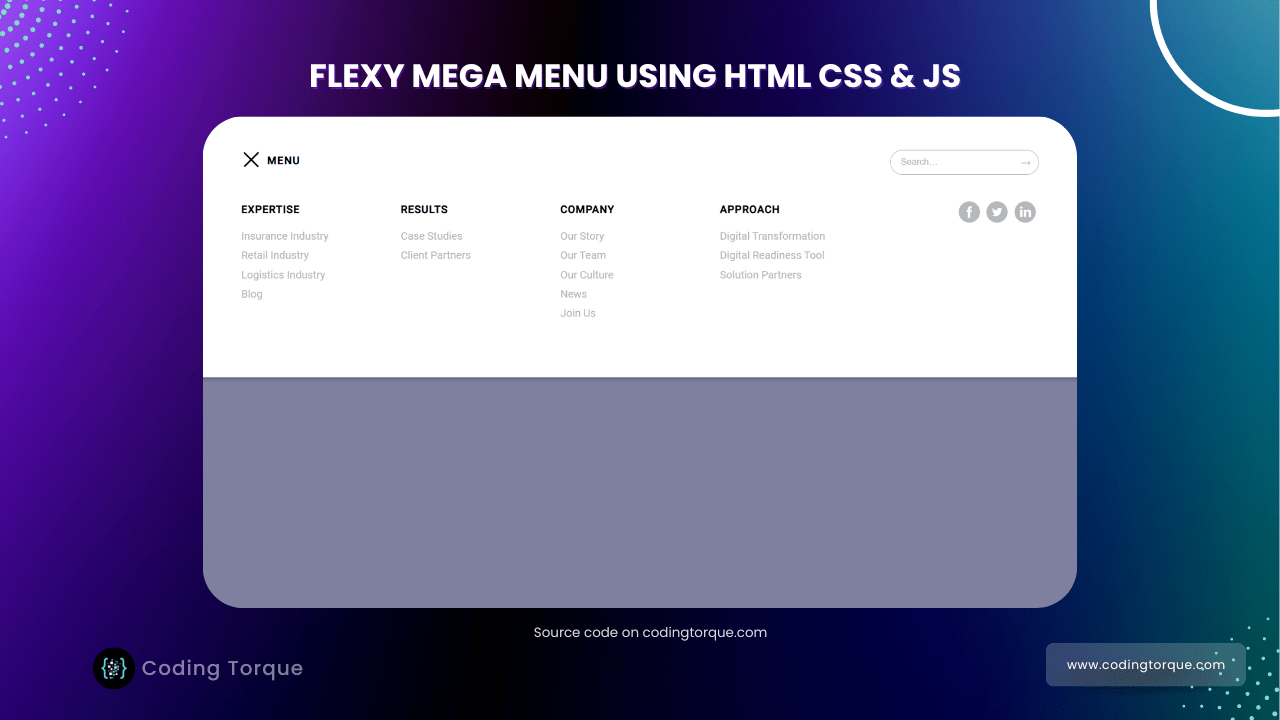
</div>Output Till Now
CSS Code
Create a file style.css and paste the code below.
/*
Inspiration for this menu: https://dribbble.com/shots/2962837-Header-Nav by Scout: https://dribbble.com/scout
*/

@import 'https://fonts.googleapis.com/css?family=Roboto:400,500';

html {
  box-sizing: border-box;
}

*, *:before, *:after {
  box-sizing: inherit;
}

html,
body {
  height: 100%;
}

html, body, div, object, iframe, h1, h2, h3, h4, h5, h6, p, blockquote, ol, ul, li, form, legend, label, table, header, footer, nav, section, figure {
  margin: 0;
  padding: 0;
}

header, footer, nav, section, article, hgroup, figure {
  display: block;
}

body {
  font-family: 'Roboto', sans-serif;
  font-size: 100%;
  line-height: 1.5;
}

.container {
  width: 90%;
  margin-left: auto;
  margin-right: auto;
  max-width: 1200px;
}

.container:after {
  content: "";
  display: table;
  clear: both;
}

.container {
  margin-left: auto;
  margin-right: auto;
  width: 90%;
  max-width: 1200px;
}

/*
Full screen background image
*/
.hero {
  background: url('https://hd.unsplash.com/photo-1454165804606-c3d57bc86b40');
  background-size: cover;
  width: 100%;
  height: 100%;
  position: relative;
}

/*
Blueish tint overlay
*/
.hero:after {
  content: '';
  background: rgba(0, 0, 64, 0.5);
  position: absolute;
  top: 0;
  width: 100%;
  height: 100%;
}

/*
Making sure everything in .hero sits above our :after elements
*/
.hero * {
  position: relative;
  z-index: 1;
}

#masthead {
  padding: 2.5em 0;
  position: relative;
}

#masthead.is-active {
  box-shadow: 0 4px 4px rgba(0, 0, 0, 0.15);
}

/*
Using this method because browsers can transition opacity very cheaply as opposed to using background: rgba
https://www.html5rocks.com/en/tutorials/speed/high-performance-animations/
*/
#masthead:after {
  content: '';
  position: absolute;
  top: 0;
  width: 100%;
  height: 100%;
  background-color: #fff;
  opacity: 0;
  transition: opacity 0.3s ease;
}

#masthead.is-active:after {
  opacity: 1;
}

/*!
 * Hamburgers
 * @description Tasty CSS-animated hamburgers
 * @author Jonathan Suh @jonsuh
 * @site https://jonsuh.com/hamburgers
 * @link https://github.com/jonsuh/hamburgers
 */
.hamburger {
  background-color: transparent;
  border: 0;
  color: inherit;
  cursor: pointer;
  display: inline-block;
  float: left;
  font: inherit;
  margin: 0.8125em 0 0;
  overflow: visible;
  outline: none;
  padding: 0;
  text-transform: none;
  transition: opacity 0.15s;
  -webkit-appearance: none;
}

.hamburger:hover {
  opacity: 0.7;
}

.hamburger-box {
  width: 30px;
  height: 24px;
  display: inline-block;
  position: relative;
}

.hamburger-inner {
  display: block;
  top: 50%;
  margin-top: -2px;
}

.hamburger-inner,
.hamburger-inner::before,
.hamburger-inner::after {
  width: 30px;
  height: 2px;
  background-color: #fff;
  border-radius: 4px;
  position: absolute;
  transition-property: -webkit-transform;
  transition-property: transform;
  transition-property: transform, -webkit-transform;
  transition-duration: 0.15s;
  transition-timing-function: ease;
}

#masthead.is-active .hamburger-inner,
#masthead.is-active .hamburger-inner::before,
#masthead.is-active .hamburger-inner::after {
    background-color: #000;
}

.hamburger-inner::before,
.hamburger-inner::after {
  content: "";
  display: block;
}

.hamburger-inner::before {
  top: -6px;
}

.hamburger-inner::after {
  bottom: -6px;
}

/*
 * Boring
 */
.hamburger--boring .hamburger-inner,
.hamburger--boring .hamburger-inner::before,
.hamburger--boring .hamburger-inner::after {
  transition-property: none;
}

.hamburger--boring.is-active .hamburger-inner {
  -webkit-transform: rotate(45deg);
  transform: rotate(45deg);
}

.hamburger--boring.is-active .hamburger-inner::before {
  top: 0;
  opacity: 0;
}

.hamburger--boring.is-active .hamburger-inner::after {
  bottom: 0;
  -webkit-transform: rotate(-90deg);
  transform: rotate(-90deg);
}

.hamburger-label {
  color: #fff;
  display: inline-block;
  font-weight: 700;
  letter-spacing: 0.08em;
  line-height: 1;
  margin-left: 0.3125em;
  text-transform: uppercase;
}

#masthead.is-active .hamburger-label {
  color: #000;
}

.hamburger-box,
.hamburger-label {
  display: inline-block;
  vertical-align: middle;
}

#site-nav {
  clear: both;
  display: flex;
  flex-direction: column;
  height: 0;
  overflow: hidden;
  padding-top: 2.5em;
}

#site-nav.is-active {
  height: auto;
  overflow: visible;
}

#site-nav .col {
  padding-bottom: 2.5em;
}

@media screen and (min-width: 550px) {
  #site-nav {
    flex-direction: row;
    flex-wrap: wrap;
  }

  #site-nav .col {
    flex: 0 0 50%;
  }
}

@media screen and (min-width: 768px) {
  #site-nav .col {
    flex: 0 0 33.333333333%;
  }
}

@media screen and (min-width: 960px) {
  #site-nav {
    flex-wrap: nowrap;
  }

  #site-nav .col {
    flex: 0 0 20%;
  }

  #site-nav .col:last-child {
    display: flex;
    justify-content: flex-end;
  }
}

#site-nav h4 {
  letter-spacing: 0.05em;
  text-transform: uppercase;
}

#site-nav ul {
  list-style-type: none;
  margin-top: 1em;
}

#site-nav li {
  margin-bottom: 0.3125em;
}

#site-nav li a {
  color: #b4b9ba;
  text-decoration: none;
  transition: color 0.3s ease;
}

#site-nav li a:hover,
#site-nav li a:focus {
  color: #686d6e;
}

#site-nav .social {
  margin: 0;
  overflow: hidden;
}

#site-nav .social li {
  float: left;
  margin: 0 0.3125em;
  width: 32px;
  height: 32px;
}

#site-nav .social li svg {
  display: block;
  fill: #b4b9ba;
  width: 100%;
  height: 100%;
  transition: fill 0.3s ease;
}

#site-nav .social li:hover svg {
  fill: #686d6e;
}

#masthead-search {
  float: right;
  margin-top: 0.625em;
  width: 100%;
  max-width: 14em;
  position: relative;
  -webkit-appearance: none;
}

#masthead-search input {
  background: transparent;
  border: none;
  border-color: #fff;
  border-style: solid;
  border-width: 1px;
  border-radius: 50px;
  outline: none;
  width: 100%;
  padding: 0.75em 1.125em;
  transition: border-color 0.3s ease;
  -webkit-appearance: none;
}

#masthead-search button {
  background: none;
  border: none;
  color: #fff;
  font-size: 1em;
  padding: 0;
  position: absolute;
  top: 50%;
  right: 0.75em;
  transform: translateY(-50%);
  -webkit-appearance: none;
}

#masthead.is-active #masthead-search button {
  color: #b4b9ba;
}

#masthead.is-active #masthead-search input {
  border-color: #b4b9ba;
}

#masthead-search ::-webkit-input-placeholder {
    color:    #fff;
}

#masthead-search :-moz-placeholder {
   color:    #fff;
   opacity:  1;
}

#masthead-search ::-moz-placeholder {
   color:    #fff;
   opacity:  1;
}

#masthead-search :-ms-input-placeholder {
   color:    #fff;
}

#masthead.is-active #masthead-search ::-webkit-input-placeholder {
    color:    #b4b9ba;
}

#masthead.is-active #masthead-search :-moz-placeholder {
   color:    #b4b9ba;
   opacity:  1;
}

#masthead.is-active #masthead-search ::-moz-placeholder {
   color:    #b4b9ba;
   opacity:  1;
}

#masthead.is-active #masthead-search :-ms-input-placeholder {
   color: #b4b9ba
}

#masthead .col {
  opacity: 0;
}

#masthead.is-active .col {
  transform: translateY(40px);
  transition: opacity 0.3s ease;
  animation: fade-in-stagger 0.8s ease forwards;
}

#masthead.is-active .col:nth-child(1) {
    -webkit-animation-delay: 0;
}

#masthead.is-active .col:nth-child(2) {
    -webkit-animation-delay: 0.1s;
}

#masthead.is-active .col:nth-child(3) {
    -webkit-animation-delay: 0.2s;
}

#masthead.is-active .col:nth-child(4) {
    -webkit-animation-delay: 0.3s;
}

#masthead.is-active .col:nth-child(5) {
    -webkit-animation-delay: 0.4s;
}

@keyframes fade-in-stagger {
  to {
    opacity: 1;
    transform: translateY(0);
  }
}
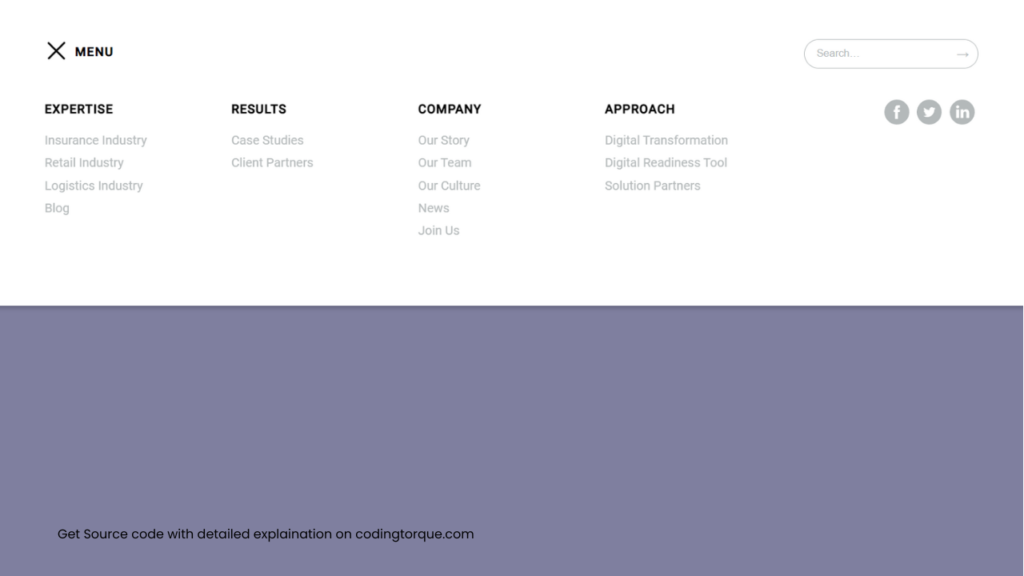
Output Till Now
JavaScript Code
Create a file
script.js and paste the code below.$(function() {
$('body').addClass('js');
var $hamburger = $('.hamburger'),
$nav = $('#site-nav'),
$masthead = $('#masthead');
$hamburger.click(function() {
$(this).toggleClass('is-active');
$nav.toggleClass('is-active');
$masthead.toggleClass('is-active');
return false;
})
});
Written by: Piyush Patil
Code Credits: @mtorosian
If you have any doubts or any project ideas feel free to Contact Us
Hope you find this post helpful💖


