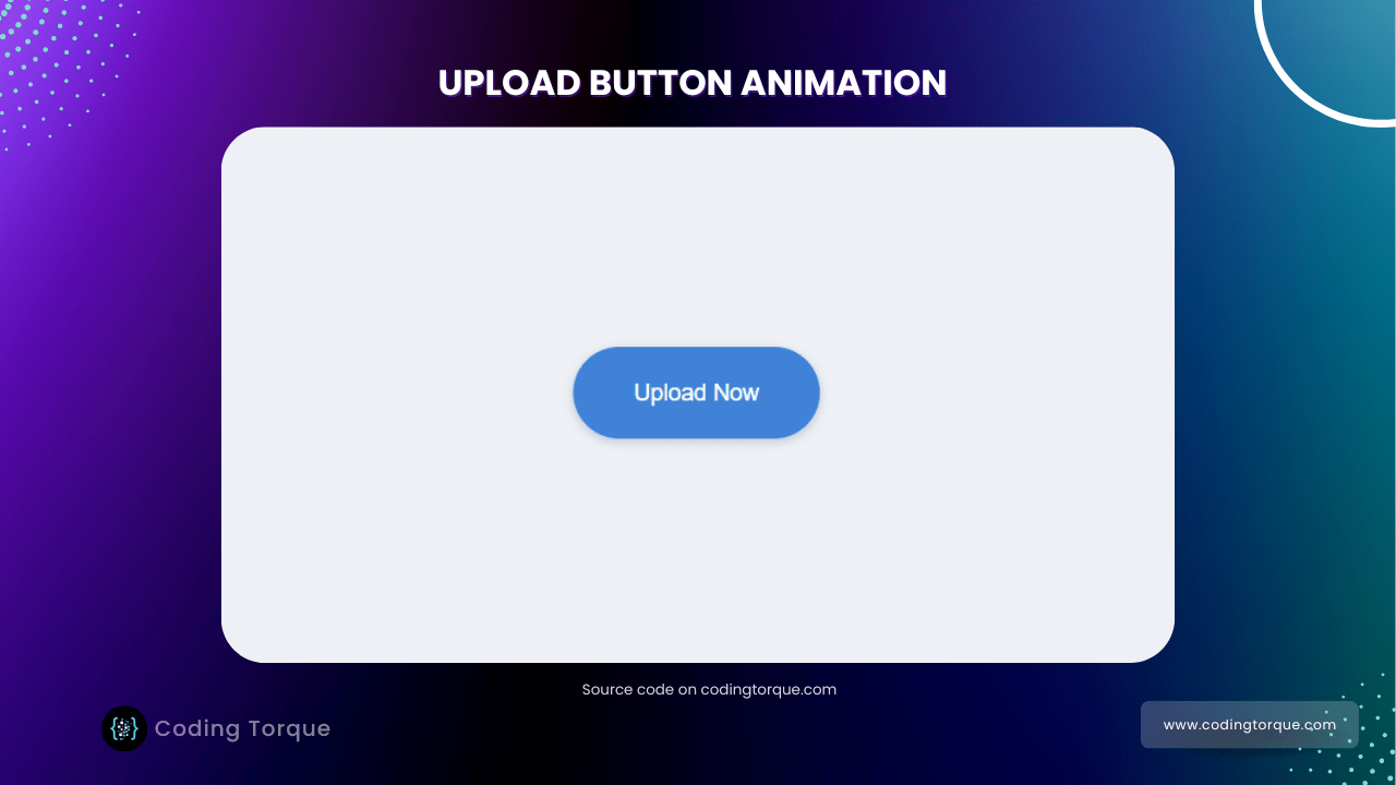
Hello Guys! Welcome to Coding Torque. In this blog, we are going to make an upload button animation using HTML, CSS, and JavaScript. You must create this if you are a beginner and learning HTML and CSS.
Before we start, here are some JavaScript Games you might like to create:
1. Snake Game using JavaScript
2. 2D Bouncing Ball Game using JavaScript
3. Rock Paper Scissor Game using JavaScript
4. Tic Tac Toe Game using JavaScript
5. Whack a Mole Game using JavaScript
I would recommend you don’t just copy and paste the code, just look at the code and type by understanding it.
HTML Code
Starter Template
<!doctype html>
  <html lang="en">

  <head>
      <!-- Required meta tags -->
      <meta charset="utf-8">
      <meta name="viewport" content="width=device-width, initial-scale=1">
      <title>Upload button animation - @codingtorque</title>

      <link rel="stylesheet" href="style.css">
      <link href="https://fonts.googleapis.com/css?family=Varela+Round" rel="stylesheet">

      <!-- Less CDN -->
      <script src="https://cdn.jsdelivr.net/npm/less"></script>
  </head>

  <body>
          <!-- further code in next block -->

          <!-- JQuery CDN -->
          <script src="https://code.jquery.com/jquery-3.6.1.js"
          integrity="sha256-3zlB5s2uwoUzrXK3BT7AX3FyvojsraNFxCc2vC/7pNI=" crossorigin="anonymous"></script>

          <script src="script.js"></script>
  </body>

  </html>
Paste the below code in your <body> tag
<div class="button">
    <a>
        <span>Upload Now</span>
        <svg class="load" version="1.1" x="0px" y="0px" width="30px" height="30px" viewBox="0 0 40 40"
            enable-background="new 0 0 40 40">
            <path opacity="0.3" fill="#fff"
                d="M20.201,5.169c-8.254,0-14.946,6.692-14.946,14.946c0,8.255,6.692,14.946,14.946,14.946
            s14.946-6.691,14.946-14.946C35.146,11.861,28.455,5.169,20.201,5.169z M20.201,31.749c-6.425,0-11.634-5.208-11.634-11.634
            c0-6.425,5.209-11.634,11.634-11.634c6.425,0,11.633,5.209,11.633,11.634C31.834,26.541,26.626,31.749,20.201,31.749z" />
            <path fill="#fff" d="M26.013,10.047l1.654-2.866c-2.198-1.272-4.743-2.012-7.466-2.012h0v3.312h0
            C22.32,8.481,24.301,9.057,26.013,10.047z">
                <animateTransform attributeType="xml" attributeName="transform" type="rotate" from="0 20 20"
                    to="360 20 20" dur="0.5s" repeatCount="indefinite" />
            </path>
        </svg>
        <svg class="check" xmlns="http://www.w3.org/2000/svg" width="30" height="30" viewBox="0 0 24 24">
            <path d="M9 16.17L4.83 12l-1.42 1.41L9 19 21 7l-1.41-1.41z" />
        </svg>
    </a>
    <div>
        <span></span>
    </div>
</div>
CSS Code
Create a file style.css and paste the code below.
@primary: #3f82d7;
@success: #28e470;
@light: #d3d7e0;
body {
background: #eef0f5;
font-family: Arial;
font-size: 14px;
}
.button {
svg {
display: none;
position: absolute;
left: 50%;
top: 50%;
margin: -15px 0 0 -15px;
fill: #fff;
}
div {
span {
position: absolute;
background: @success;
height: 4px;
left: 0;
top: 0;
width: 0;
display: block;
border-radius: 2px;
}
height: 4px;
margin: -2px 0 0 0;
position: absolute;
top: 50%;
left: 71px;
right: 25px;
background: @light;
display: none;
border-radius: 2px;
}
a {
span {
cursor: pointer;
display: block;
}
position: relative;
display: block;
background: @primary;
z-index: 2;
line-height: 56px;
height: 56px;
border-radius: 28px;
width: 100%;
text-align: center;
color: #fff;
box-shadow: 0 2px 6px rgba(170, 185, 200, 0.4);
}
border-radius: 28px;
position: absolute;
left: 50%;
top: 50%;
display: block;
background: #fff;
width: 150px;
box-shadow: 0 2px 6px rgba(170, 185, 200, 0.4);
-webkit-transform: translate(-50%, -50%);
transform: translate(-50%, -50%);
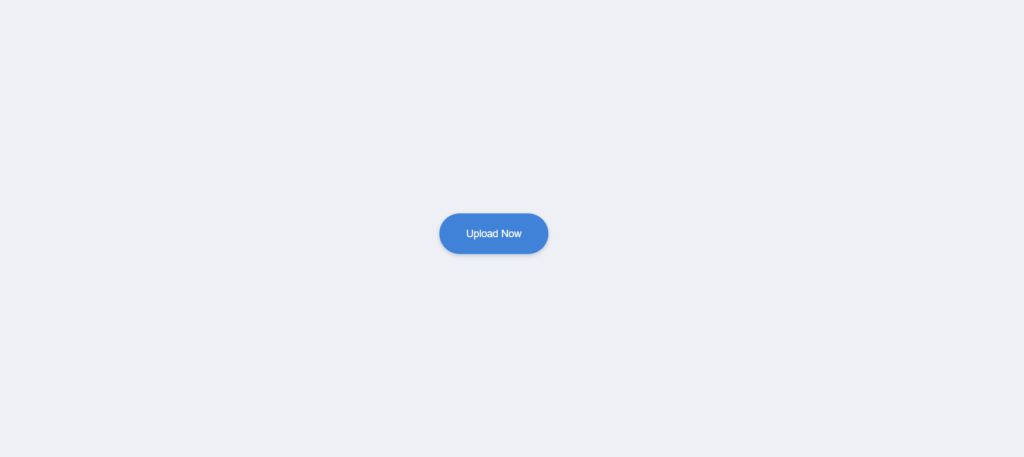
}Output Till Now
JavaScript Code
Create a file
script.js and paste the code below.$(document).ready(function () {
$(".button a span").click(function () {
var btn = $(this).parent().parent();
var loadSVG = btn.children("a").children(".load");
var loadBar = btn.children("div").children("span");
var checkSVG = btn.children("a").children(".check");
btn.children("a").children("span").fadeOut(200, function () {
btn.children("a").animate({
width: 56
}, 100, function () {
loadSVG.fadeIn(300);
btn.animate({
width: 320
}, 200, function () {
btn.children("div").fadeIn(200, function () {
loadBar.animate({
width: "100%"
}, 2000, function () {
loadSVG.fadeOut(200, function () {
checkSVG.fadeIn(200, function () {
setTimeout(function () {
btn.children("div").fadeOut(200, function () {
loadBar.width(0);
checkSVG.fadeOut(200, function () {
btn.children("a").animate({
width: 150
});
btn.animate({
width: 150
}, 300, function () {
btn.children("a").children("span").fadeIn(200);
});
});
});
}, 2000);
});
});
});
});
});
});
});
});
});Written by: Piyush Patil
Code Credits: @aaroniker
If you have any doubts or any project ideas feel free to Contact Us
Hope you find this post helpful💖


