Welcome to our latest blog post, where we’re about to embark on a spooky journey through the realms of web design! Today, we’re conjuring up a Ghost 404 Page using the mystical trio of HTML, CSS, and JavaScript.


I would recommend you don’t just copy and paste the code, just look at the code and type by understanding it.
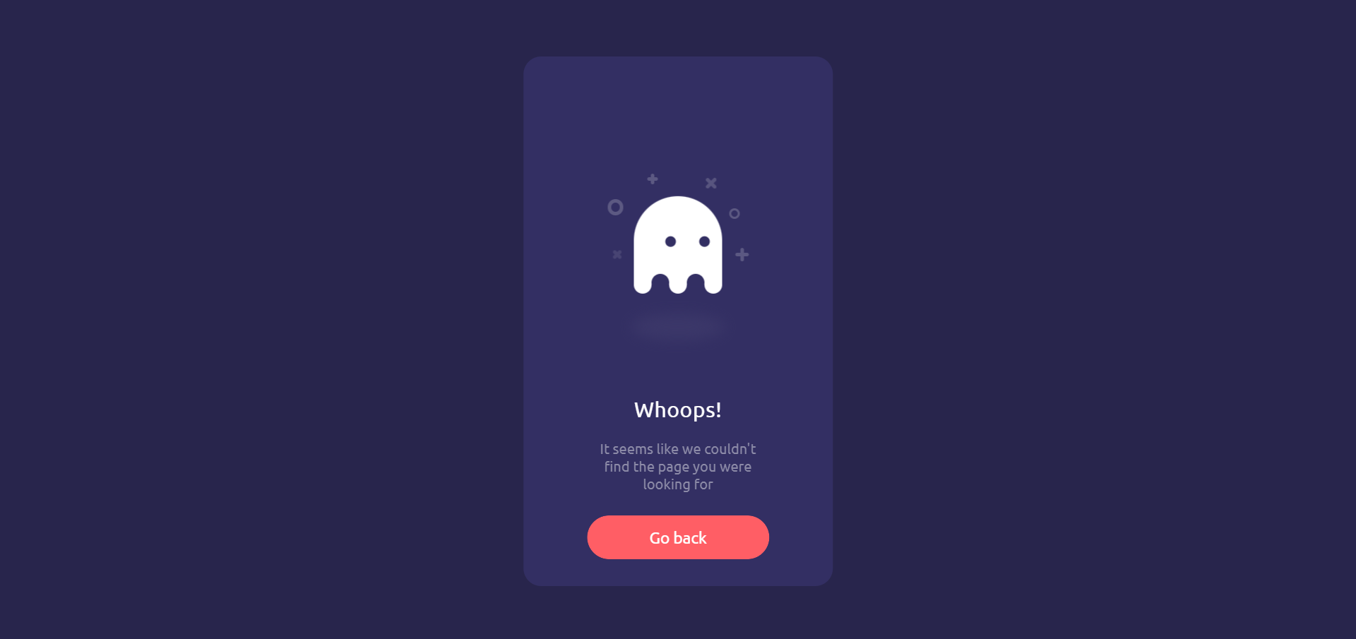
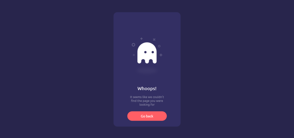
Demo
See the Pen Ghost Page | 404 by Diogo Gomes (@diogo_ml_gomes) on CodePen.
HTML Code
Starter Template
<!doctype html>
<html lang="en">

<head>
    <!-- Required meta tags -->
    <meta charset="utf-8">
    <meta name="viewport" content="width=device-width, initial-scale=1">

    <!-- CSS -->
    <link rel="stylesheet" href="style.css">

    <title>Ghost 404 Page using HTML CSS and JavaScript - Coding Torque</title>
</head>

<body>
    <!-- Further code here -->

    <script src="script.js"></script>
</body>

</html>
Paste the below code in your <body> tag.
<div class="box">
  <div class="box__ghost">
    <div class="symbol"></div>
    <div class="symbol"></div>
    <div class="symbol"></div>
    <div class="symbol"></div>
    <div class="symbol"></div>
    <div class="symbol"></div>

    <div class="box__ghost-container">
      <div class="box__ghost-eyes">
        <div class="box__eye-left"></div>
        <div class="box__eye-right"></div>
      </div>
      <div class="box__ghost-bottom">
        <div></div>
        <div></div>
        <div></div>
        <div></div>
        <div></div>
      </div>
    </div>
    <div class="box__ghost-shadow"></div>
  </div>

  <div class="box__description">
    <div class="box__description-container">
      <div class="box__description-title">Whoops!</div>
      <div class="box__description-text">It seems like we couldn't find the page you were looking for</div>
    </div>

    <a href="https://codepen.io/diogo_ml_gomes/" target="_blank" class="box__button">Go back</a>

  </div>

</div>
CSS Code
Create a file style.css and paste the code below.
@import url(https://fonts.googleapis.com/css?family=Ubuntu);
//variables
$purple: #28254C;
$l-purple: #332F63;
$t-purple: #8C8AA7;
$pink: #FF5E65;
$white: #fff;

html, body {
  background: $purple;
  font-family: 'Ubuntu';
}
* {
  box-sizing: border-box;
}

.box {
  width: 350px;
  height: 100%;
  max-height: 600px;
  min-height: 450px;
  background: $l-purple;
  border-radius: 20px;
  position: absolute;
  left: 50%;
  top: 50%;
  transform: translate(-50%, -50%);
  padding: 30px 50px;

  .box__ghost {
    padding: 15px 25px 25px;
    position: absolute;
    left: 50%;
    top: 30%;
    transform: translate(-50%, -30%);

    .symbol{
      &:nth-child(1) {
        opacity: .2;
        animation: shine 4s ease-in-out 3s infinite;

        &:before, &:after {
          content: '';
          width: 12px;
          height: 4px;
          background: $white;
          position: absolute;
          border-radius: 5px;
          bottom: 65px;
          left: 0;
        }
        &:before {
          transform: rotate(45deg);
        }
        &:after {
          transform: rotate(-45deg);
        }
      }
      &:nth-child(2) {
        position: absolute;
        left: -5px;
        top: 30px;
        height: 18px;
        width: 18px;
        border: 4px solid;
        border-radius: 50%;
        border-color: $white;
        opacity: .2;
        animation: shine 4s ease-in-out 1.3s infinite;
      }
      &:nth-child(3) {
        opacity: .2;
        animation: shine 3s ease-in-out .5s infinite;

        &:before, &:after {
          content: '';
          width: 12px;
          height: 4px;
          background: $white;
          position: absolute;
          border-radius: 5px;
          top: 5px;
          left: 40px;
        }
        &:before {
          transform: rotate(90deg);
        }
        &:after {
          transform: rotate(180deg);
        }
      }
      &:nth-child(4) {
        opacity: .2;
        animation: shine 6s ease-in-out 1.6s infinite;

        &:before, &:after {
          content: '';
          width: 15px;
          height: 4px;
          background: $white;
          position: absolute;
          border-radius: 5px;
          top: 10px;
          right: 30px;
        }
        &:before {
          transform: rotate(45deg);
        }
        &:after {
          transform: rotate(-45deg);
        }
      }
      &:nth-child(5) {
        position: absolute;
        right: 5px;
        top: 40px;
        height: 12px;
        width: 12px;
        border: 3px solid;
        border-radius: 50%;
        border-color: $white;
        opacity: .2;
        animation: shine 1.7s ease-in-out 7s infinite;
      }
      &:nth-child(6) {
        opacity: .2;
        animation: shine 2s ease-in-out 6s infinite;

        &:before, &:after {
          content: '';
          width: 15px;
          height: 4px;
          background: $white;
          position: absolute;
          border-radius: 5px;
          bottom: 65px;
          right: -5px;
        }
        &:before {
          transform: rotate(90deg);
        }
        &:after {
          transform: rotate(180deg);
        }
      }
    }

    .box__ghost-container {
      background: $white;
      width: 100px;
      height: 100px;
      border-radius: 100px 100px 0 0;
      position: relative;
      margin: 0 auto;
      animation: upndown 3s ease-in-out infinite;

      .box__ghost-eyes {
        position: absolute;
        left: 50%;
        top: 45%;
        //transform: translate(-50%, -45%);
        height: 12px;
        width: 70px;

        .box__eye-left {
          width: 12px;
          height: 12px;
          background: $l-purple;
          border-radius: 50%;
          margin: 0 10px;
          position: absolute;
          left: 0;
        }
        .box__eye-right {
          width: 12px;
          height: 12px;
          background: $l-purple;
          border-radius: 50%;
          margin: 0 10px;
          position: absolute;
          right: 0;
        }
      }

      .box__ghost-bottom {
        display:flex;
        position: absolute;
        top:100%;
        left:0;
        right:0;

        div {
          flex-grow:1;
          position: relative;
          top:-10px;
          height:20px;
          border-radius:100%;
          background-color: $white;

          &:nth-child(2n) {
            top: -12px;
            margin: 0 -0px;
            border-top: 15px solid $l-purple;
            background: transparent;
          }
        }
      }
    }

    .box__ghost-shadow {
      height: 20px;
      box-shadow: 0 50px 15px 5px #3B3769;
      border-radius: 50%;
      margin: 0 auto;
      animation: smallnbig 3s ease-in-out infinite;
    }
  }

  .box__description {
    position: absolute;
    bottom: 30px;
    left: 50%;
    transform: translateX(-50%);

    .box__description-container {
      color: $white;
      text-align: center;
      width: 200px;
      font-size: 16px;
      margin: 0 auto;

      .box__description-title {
        font-size: 24px;
        letter-spacing: .5px;
      }

      .box__description-text {
        color: $t-purple;
        line-height: 20px;
        margin-top: 20px;
      }
    }

    .box__button {
      display: block;
      position: relative;
      background: $pink;
      border: 1px solid transparent;
      border-radius: 50px;
      height: 50px;
      text-align: center;
      text-decoration: none;
      color: $white;
      line-height: 50px;
      font-size: 18px;
      padding: 0 70px;
      white-space: nowrap;
      margin-top: 25px;
      transition: background .5s ease;
      overflow: hidden;
      -webkit-mask-image: -webkit-radial-gradient(white, black);

      &:before {
        content: '';
        position: absolute;
        width: 20px;
        height: 100px;
        background: $white;
        bottom: -25px;
        left: 0;
        border: 2px solid $white;
        transform: translateX(-50px) rotate(45deg);
        transition: transform .5s ease;
      }

      &:hover {
        background: transparent;
        border-color: $white;

        &:before {
          transform: translateX(250px) rotate(45deg);
        }
      }
    }
  }
}

//keyframes
@keyframes upndown {
  0% {transform: translateY(5px);}
  50% {transform: translateY(15px);}
  100% {transform: translateY(5px);}
}
@keyframes smallnbig {
  0% {width: 90px;}
  50% {width: 100px;}
  100% {width: 90px;}
}
@keyframes shine {
  0% {opacity: .2;}
  25% {opacity: .1;}
  50% {opacity: .2;}
  100% {opacity: .2;}
}
JavaScript Code
Create a file script.js and paste the code below.
var pageX = $(document).width();
var pageY = $(document).height();
var mouseY=0;
var mouseX=0;

$(document).mousemove(function( event ) {
  //verticalAxis
  mouseY = event.pageY;
  yAxis = (pageY/2-mouseY)/pageY*300;
  //horizontalAxis
  mouseX = event.pageX / -pageX;
  xAxis = -mouseX * 100 - 100;

  $('.box__ghost-eyes').css({ 'transform': 'translate('+ xAxis +'%,-'+ yAxis +'%)' });

  //console.log('X: ' + xAxis);

});
Final Output
Written by: Piyush Patil
Code Credits: https://codepen.io/diogo_ml_gomes/pen/PyWdLb
If you found any mistakes or have any doubts please feel free to Contact Us
Hope you find this post helpful💖


