
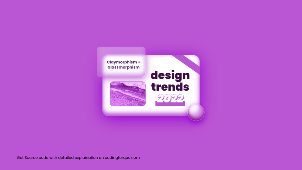
Hello Guys! Welcome to Coding Torque. In this blog, we are going to make a Claymorphism+Glassmorphism design card using HTML and CSS. You should create this if you are a beginner and learning HTML and CSS.
Before we start, here are some JavaScript Games you might like to create:
1. Snake Game using JavaScript
2. 2D Bouncing Ball Game using JavaScript
3. Rock Paper Scissor Game using JavaScript
4. Tic Tac Toe Game using JavaScript
5. Whack a Mole Game using JavaScript
I would recommend you don’t just copy and paste the code, just look at the code and type by understanding it.
HTML Code
Starter Template
<!doctype html>
  <html lang="en">

  <head>
      <!-- Required meta tags -->
      <meta charset="utf-8">
      <meta name="viewport" content="width=device-width, initial-scale=1">
      <title>Claymorphism+Glassmorphism design card using HTML and CSS - @codingtorque</title>

      <link rel="stylesheet" href="style.css">
      <link href="https://fonts.googleapis.com/css?family=Varela+Round" rel="stylesheet">
  </head>

  <body>
          <!-- further code in next block -->

  </body>

  </html>
Paste the below code in your <body> tag
<div>
  <p><span></span>design<br>trends<br><i>2022</i></p>
  <div>
  </div>
</div>
CSS Code
Create a file style.css and paste the code below.
*,
*::before,
*::after {
  box-sizing: border-box;
}

body,
html {
  font-family: "Poppins", sans-serif;
  -webkit-text-size-adjust: 100%;
  -webkit-tap-highlight-color: transparent;
  -webkit-font-smoothing: antialiased;
  text-rendering: optimizeLegibility;
  font-size: 12pt;
  font-weight: 400;
  color: black;
}

body {
  display: flex;
  flex-direction: column;
  align-items: center;
  justify-content: center;
  height: 100vh;
  overflow: hidden;
  background: MediumOrchid;
  margin: 0;
  padding: 0;
}

div {
  position: relative;
  display: flex;
  flex-direction: row;
  align-items: flex-end;
  justify-content: center;
  min-width: 400px;
  min-height: 250px;
  max-width: 400px;
  max-height: 250px;
  background: linear-gradient(
    35deg,
    white 0%,
    white 84.7%,
    MediumOrchid 85%,
    MediumOrchid 91%,
    white 91.3%
  );
  box-shadow: 0 10px 60px 0 DarkViolet, inset 0px -10px 17px 2px MediumOrchid;
  border-radius: 25px;
  z-index: -1;
}

div::before {
  position: absolute;
  backdrop-filter: blur(5px);
  bottom: -20px;
  right: -20px;
  width: 70px;
  height: 70px;
  content: "";
  border-radius: 200px;
  background: #ffffff66;
  box-shadow: 0 10px 25px 0 DarkViolet, inset 0px -8px 15px 0px Purple;
  border: 0.1px solid transparent;
}

div > p {
  position: relative;
  right: 5px;
  font-size: 34pt;
  font-weight: 900;
  margin: 0;
  padding: 20px 35px 10px 25px;
  line-height: 36pt;
  text-align: center;
  color: #3d0d49;
  align-self: center;
  order: 2;
}

div > p > span {
  position: absolute;
  bottom: 4px;
  left: 45px;
  width: 55%;
  height: 20px;
  background: MediumOrchid;
  content: "";
  z-index: -1;
}

div > p > i {
  color: white;
  text-shadow: 1px 1px 0px MediumOrchid, 2px 2px 0px MediumOrchid,
    3px 3px 0px MediumOrchid, -1px -1px 0px MediumOrchid;
}

div::after {
  backdrop-filter: blur(5px);
  position: absolute;
  display: flex;
  flex-direction: column;
  align-items: flex-end;
  justify-content: flex-end;
  padding-left: 20px;
  padding-bottom: 28px;
  top: -35px;
  left: -23px;
  width: 50%;
  height: 50%;
  background: #ffffff55;
  content: "Claymorphism + Glassmorphism";
  text-align: center;
  color: #3e0d4a;
  line-height: 16pt;
  font-weight: 700;
  border-radius: 15px;
  box-shadow: 0 5px 30px 0 MediumOrchid, inset 0px -10px 20px 0px #ba55d3bb;
  border: 0.1px solid transparent;
}

div > div {
  all: unset;
  position: relative;
  width: 150px;
  height: 100px;
  display: flex;
  flex-direction: column;
  align-items: center;
  justify-content: center;
  margin: 35px 0px 40px 30px;
  border-radius: 15px;
  background: url("https://picsum.photos/id/640/1280/800");
  background-size: cover;
  background-position: center;
  border: 0.1px solid MediumOrchid;
  z-index: -1;
}

div > div::before {
  all: unset;
  position: absolute;
  top: 0;
  left: 0;
  width: 100%;
  height: 100%;
  content: "";
  background: MediumOrchid;
  mix-blend-mode: color;
  border-radius: 15px;
}

div > div::after {
  all: unset;
}
Output Till Now
Written by: Piyush Patil
Code Credits: @TheMOZZARELLA
If you have any doubts or any project ideas feel free to Contact Us
Hope you find this post helpful💖


