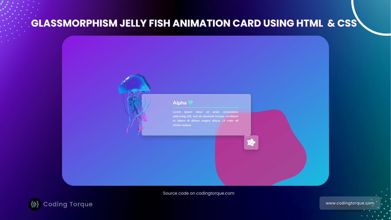
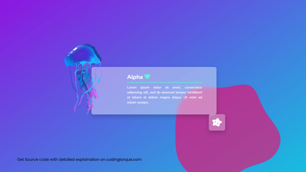
Hello Guys! Welcome to Coding Torque. In this blog, we are going to make a Glassmorphic jelly fish animation card using HTML, CSS and Bootstrap. You must create this if you are a beginner and learning HTML and CSS.
Before we start, here are some JavaScript Games you might like to create:
1. Snake Game using JavaScript
2. 2D Bouncing Ball Game using JavaScript
3. Rock Paper Scissor Game using JavaScript
4. Tic Tac Toe Game using JavaScript
5. Whack a Mole Game using JavaScript
I would recommend you don’t just copy and paste the code, just look at the code and type by understanding it.
HTML Code
Starter Template
<!doctype html>
  <html lang="en">

  <head>
      <!-- Required meta tags -->
      <meta charset="utf-8">
      <meta name="viewport" content="width=device-width, initial-scale=1">
      <title>Glassmorphic jelly fish animation card using HTML, CSS and Bootstrap - @codingtorque</title>

      <link rel="stylesheet" href="style.css">
      <link href="https://fonts.googleapis.com/css?family=Varela+Round" rel="stylesheet">
  </head>

  <body>
          <!-- further code in next block -->

  </body>

  </html>
Paste the below code in your <body> tag
<section>
    <div class="container">
        <div class="row justify-content-center">


            <div class="col-8 col-md-6">
                <div class="jelly-card">
                    <div class="card py-3 ">

                        <div class="row">
                            <div class="col-10 col-md-4 col-lg-3 jelly-bloc text-center text-md-start">
                                <img src="https://nsm09.casimages.com/img/2021/07/28//21072811131525998217508884.png"
                                    class="card-img-top card-pic slowfloat2s" alt="meduse">
                            </div>
                            <div class="col-12 col-md-8 col-lg-8">
                                <div class="card-body">
                                    <h5 class="card-title">
                                        Alpha
                                    </h5>
                                    <div class="line"></div>
                                    <p class="card-text">
                                        Lorem ipsum dolor sit amet, consectetur adipiscing elit, sed do eiusmod tempor
                                        incididunt ut labore et dolore magna aliqua. Ut enim ad minim veniam.
                                    </p>
                                    <i class="fas fa-disease slowfloat3s"></i>
                                </div>
                            </div>
                        </div>
                    </div>
                </div>
            </div>


        </div>
    </div>
</section>
Output Till Now
CSS Code
Create a file style.css and paste the code below.
@import url('https://fonts.googleapis.com/css2?family=Nunito:ital,wght@0,200;0,300;0,400;0,600;0,700;0,800;0,900;1,200;1,300;1,400;1,600;1,700;1,800;1,900&display=swap');

:root
{
  --family:'Nunito', sans-serif;
}
*
{
   -webkit-transition: all .3s ease-out;
   -moz-transition:  all .3s ease-out;
   -ms-transition: all .3s ease-out;
   -o-transition:  all .3s ease-out;
   transition: all .3s ease-out;
}

body
{
  font-size:17px;
  color: #666;
  text-align:justify;
  font-family: var(--family);
  background: rgb(0,159,231);
  background: linear-gradient(326deg, rgba(147,13,224,1) 0%, rgba(0,159,231,1) 15%, rgba(0,222,223,1) 50%, rgba(156,0,224,1) 100%);
  background-repeat:no-repeat;
  background-size: 100% 600%;
  min-height: 100%;
}

section
{
  padding-top:25vw;
}

section::before
{
 content: url("data:image/svg+xml,%3Csvg viewBox='0 0 200 200' xmlns='http://www.w3.org/2000/svg'%3E%3Cpath fill='%23FF0066' d='M41.9,-72.2C51.7,-67,55.1,-50.4,63,-36.5C70.9,-22.5,83.3,-11.3,85.9,1.5C88.5,14.3,81.4,28.6,69.8,36.2C58.2,43.7,42.2,44.6,29.9,52.7C17.5,60.9,8.8,76.3,-2,79.7C-12.7,83.2,-25.5,74.7,-36.9,66C-48.3,57.3,-58.3,48.4,-63.4,37.4C-68.4,26.3,-68.5,13.2,-68.5,0C-68.6,-13.2,-68.6,-26.4,-64.4,-39.1C-60.3,-51.7,-52.1,-63.8,-40.7,-68C-29.2,-72.2,-14.6,-68.5,0.7,-69.7C16.1,-71,32.2,-77.3,41.9,-72.2Z' transform='translate(100 100)' /%3E%3C/svg%3E ");
  opacity:0.6;
  position:absolute;
  left: 60%;
  width: 40vw;
}

.card
{
  background: rgba(255,255,255,0.4);
   border-radius: 10px;
   border: 1px solid rgba(255,255,255,0.4);
    position:relative;
  color:white;
  z-index:1;
    backdrop-filter: blur(10px);
  -webkit-backdrop-filter: blur(10px);
  box-shadow: 0 10px 25px rgba(0,0,0,0.2);
}

.card-pic
{
  width:12rem;
background-blend-mode: hard-light;
  margin:-20vw auto;
}

@media(min-width:991px)
{
  section
  {
    padding-top:15vw;
  }
  section::before
  {
     left: 50%;
      width: 30vw;
  }
  .card-pic
  {
   position:absolute;
    left:-6vw;
    top:-5vw;
    margin:0;
  }
}

h5
{
  font-size:1.8rem;
  font-weight:bold;
}

h5::after
{
 font-family: "Font Awesome 5 Free"; font-weight: 900; content: "\f004";
  color:#5CF5CB;
}

.line
{
  width:100%;
  height:4px;
  background-color:#5CF5CB;
  opacity:0.7;
  margin-bottom:10px;
}

i
{
  position:absolute;
  right:-2vw;
  bottom:-4vw;
  z-index:2;
  color:white;
    font-size:3rem;
  background: rgba(255,255,255,0.3);
  border: 1px solid rgba(255,255,255,0.2);
    padding: 1rem;
    border-radius: 10px;
    transition: all .6s ease-in-out;
   backdrop-filter: blur(15px);
  -webkit-backdrop-filter: blur(5px);
  box-shadow: 0 10px 25px rgba(0,0,0,0.2);
}

@-webkit-keyframes SlowFloat {
    0% { transform: translateY(0); }
    100% { transform: translateY(-10px); }
}
.slowfloat2s {
    -webkit-animation: SlowFloat 2s infinite  alternate;
    animation: SlowFloat 2s infinite  alternate;
}

.slowfloat3s {
    -webkit-animation: SlowFloat 3s infinite  alternate;
    animation: SlowFloat 3s infinite  alternate;
}
Output Till Now
Written by: Piyush Patil
Code Credits: @psyloute
If you have any doubts or any project ideas feel free to Contact Us
Hope you find this post helpful💖


