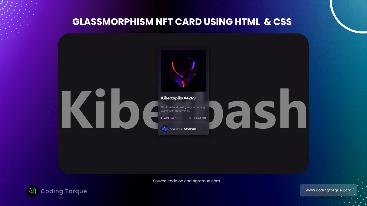
Hello Guys! Welcome to Coding Torque. In this blog, we are going to make a Glassmorphic NFT card using HTML and CSS. You must create this if you are a beginner and learning HTML and CSS.
Before we start, here are some JavaScript Games you might like to create:
1. Snake Game using JavaScript
2. 2D Bouncing Ball Game using JavaScript
3. Rock Paper Scissor Game using JavaScript
4. Tic Tac Toe Game using JavaScript
5. Whack a Mole Game using JavaScript
I would recommend you don’t just copy and paste the code, just look at the code and type by understanding it.
HTML Code
Starter Template
<!doctype html>
  <html lang="en">

  <head>
      <!-- Required meta tags -->
      <meta charset="utf-8">
      <meta name="viewport" content="width=device-width, initial-scale=1">
      <title>Glassmorphic NFT card using HTML and CSS - @codingtorque</title>

      <link rel="stylesheet" href="style.css">
      <link href="https://fonts.googleapis.com/css?family=Varela+Round" rel="stylesheet">
  </head>

  <body>
          <!-- further code in next block -->

  </body>

  </html>
Paste the below code in your <body> tag
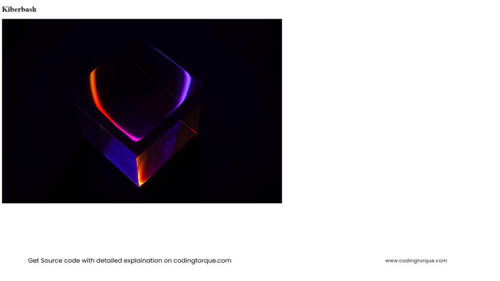
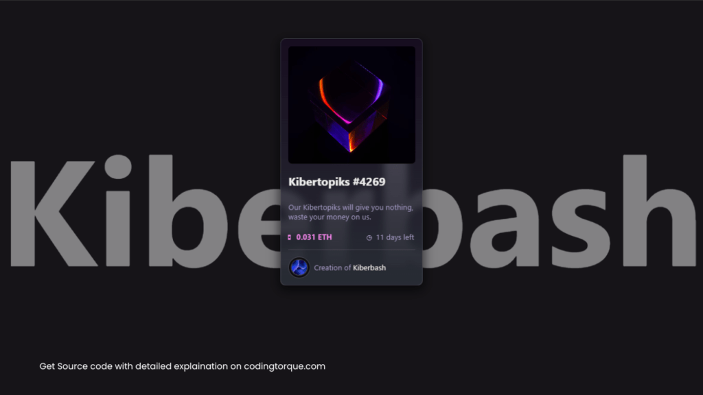
<div class="bg">
    <h1>Kiberbash</h1>
</div>
<div class="nft">
    <div class='main'>
      <img class='tokenImage' src="https://images.unsplash.com/photo-1621075160523-b936ad96132a?ixlib=rb-1.2.1&ixid=MnwxMjA3fDB8MHxwaG90by1wYWdlfHx8fGVufDB8fHx8&auto=format&fit=crop&w=1170&q=80" alt="NFT" />
      <h2>Kibertopiks #4269</h2>
      <p class='description'>Our Kibertopiks will give you nothing, waste your money on us.</p>
      <div class='tokenInfo'>
        <div class="price">
          <ins>◘</ins>
          <p>0.031 ETH</p>
        </div>
        <div class="duration">
          <ins>◷</ins>
          <p>11 days left</p>
        </div>
      </div>
      <hr />
      <div class='creator'>
        <div class='wrapper'>
          <img src="https://images.unsplash.com/photo-1620121692029-d088224ddc74?ixlib=rb-1.2.1&ixid=MnwxMjA3fDB8MHxwaG90by1wYWdlfHx8fGVufDB8fHx8&auto=format&fit=crop&w=1932&q=80" alt="Creator" />
        </div>
        <p><ins>Creation of</ins> Kiberbash</p>
      </div>
    </div>
</div>
Output Till Now
CSS Code
Create a file style.css and paste the code below.
body {
  margin: 0;
  font-family: -apple-system, BlinkMacSystemFont, "Segoe UI", "Roboto", "Oxygen",
    "Ubuntu", "Cantarell", "Fira Sans", "Droid Sans", "Helvetica Neue",
    sans-serif;
  -webkit-font-smoothing: antialiased;
  -moz-osx-font-smoothing: grayscale;
  background-color: rgb(22, 20, 24);
  color: #eee;
  user-select: none;
}

code {
  font-family: source-code-pro, Menlo, Monaco, Consolas, "Courier New",
    monospace;
}

.nft{
  user-select:none;
  max-width: 300px;
  margin: 5rem auto;
  border: 1px solid #ffffff22;
  background-color: #282c34;
  background: linear-gradient(0deg, rgba(40,44,52,1) 0%, rgba(17,0,32,.5) 100%);
  box-shadow: 0 7px 20px 5px #00000088;
  border-radius: .7rem;
  backdrop-filter: blur(7px);
  -webkit-backdrop-filter: blur(7px);
  overflow: hidden;
  transition: .5s all;
  hr{
    width: 100%;
    border: none;
    border-bottom: 1px solid #88888855;
    margin-top: 0;
  }
  ins{
    text-decoration: none;
  }
  .main{
    display: flex;
    flex-direction: column;
    width: 90%;
    padding: 1rem;
    .tokenImage{
      border-radius: .5rem;
      max-width: 100%;
      height: 250px;
      object-fit: cover;
    }
    .description{
      margin: .5rem 0;
      color: #a89ec9;
    }
    .tokenInfo{
      display: flex;
      justify-content: space-between;
      align-items: center;
      .price{
        display: flex;
        align-items: center;
        color: #ee83e5;
        font-weight: 700;
        ins{
          margin-left: -.3rem;
          margin-right: .5rem;
        }
      }
      .duration{
        display: flex;
        align-items: center;
        color: #a89ec9;
        margin-right: .2rem;
        ins{
          margin: .5rem;
          margin-bottom: .4rem;
        }
      }
    }
    .creator{
      display: flex;
      align-items: center;
      margin-top: .2rem;
      margin-bottom: -.3rem;
      ins{
        color: #a89ec9;
        text-decoration: none;
      }
      .wrapper{
        display: flex;
        align-items: center;
        border: 1px solid #ffffff22;
        padding: .3rem;
        margin: 0;
        margin-right: .5rem;
        border-radius: 100%;
        box-shadow: inset 0 0 0 4px #000000aa;
        img{
          border-radius: 100%;
          border: 1px solid #ffffff22;
          width: 2rem;
          height: 2rem;
          object-fit: cover;
          margin: 0;
        }
      }
    }
  }
  ::before{
    position: fixed;
    content: "";
    box-shadow: 0 0 100px 40px #ffffff08;
    top: -10%;
    left: -100%;
    transform: rotate(-45deg);
    height: 60rem;
    transition: .7s all;
  }
  &:hover{
    border: 1px solid #ffffff44;
    box-shadow: 0 7px 50px 10px #000000aa;
    transform: scale(1.015);
    filter: brightness(1.3);
    ::before{
      filter: brightness(.5);
      top: -100%;
      left: 200%;
    }
  }
}

.bg{
  position: fixed;
  top: 50%;
  left: 50%;
  transform: translate(-50%, -50%);
  h1{
    font-size: 20rem;
    filter: opacity(0.5);
  }
}
Output Till Now
Written by: Piyush Patil
If you have any doubts or any project ideas feel free to Contact Us
Hope you find this post helpful💖


