Hello Coders! Welcome to Coding Torque. In this blog, we are going to create amazing border animations using HTML and CSS. You should create these projects if you are a beginner or intermediate-level web developer.
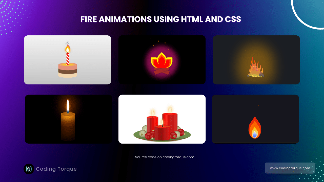
1. Candle on cake with fire animation

Code Credits: @ludomydla
HTML Code
<div class="wrapper">
  <div class="cake">
    <div class="lyr lyr-1"></div>
    <div class="lyr lyr-2"></div>
    <div class="lyr lyr-3"></div>
  </div>
  <div class="candle"></div>
  <div class="flame">
  <div class="smoke smk-1"></div>
  <div class="smoke smk-2"></div>
  <div class="smoke smk-3"></div>
  <div class="smoke smk-4"></div>
  <div class="smoke smk-5"></div>
<div class=”flm-part flipped red”></div>
<div class=”flm-part orng”></div>
<div class=”flm-part flipped ylw”></div>
<div class=”flm-part wht”></div>
</div>
CSS Code
body {
  background-image: linear-gradient(#fff,#bbb);
  height: 100vh;
  display: flex;
  justify-content: center;
  align-items: center;
}
.wrapper {
position: relative;
width: 15rem;
height: 30rem;
transform: scale(.5); /* initial dimensions too big imho, quick dirty hack*/
}
.cake {
position: absolute;
bottom: 0;
}
.cake .lyr {
width: 15rem;
height: 6rem;
background-color: currentColor;
position: absolute;
border-radius: 7.5rem / 1.5rem;
}
.cake .lyr-1 { color: #F1D4AF; bottom: 0;}
.cake .lyr-2 { color: #774F38; bottom: 3rem;}
.cake .lyr-3 { color: #E08E79; bottom: 6rem;
background-image: radial-gradient(ellipse 7.5rem 1.5rem at 7.5rem 1.5rem, gold, gold 5%, #E99788 100%, transparent);}
.candle {
position: absolute;
bottom: 10rem;
left: 6.5rem;
width: 2rem;
height: 10rem;
background-color: red;
border-radius: 1rem / .5rem;
background-image: repeating-linear-gradient(45deg, white, white 10%, transparent 10%, transparent 20%);
}
.candle::before {
content: “”;
position: absolute;
width: .5rem;
height: 2rem;
border-radius: .25rem / .15rem;
background-color: black;
top: -1.5rem;
left: .75rem;
}
.candle::after {
content: “”;
width: 2rem;
height: 1rem;
background-color: red;
display: block;
border-radius: 50%;
}
.flame {
position: absolute;
left: 6.5rem;
}
.wht {
color: white; animation: burn-wht 1.8s;
box-shadow: 0 0 1rem white;}
.ylw {
color: gold; top: 1.8rem; animation: burn-ylw 1.6s;
box-shadow: 0 0 1rem gold; opacity: .9}
.orng {
color: orange; top: 3.6rem; animation: burn-orng 0.4s;
box-shadow: 0 0 1rem orange; opacity: .8}
.red {
color: crimson; top: 5.4rem; animation: burn-red 1s;
opacity: .7;}
.smoke {
color: black; top: 8.8rem;
box-shadow: 0 0 2rem black;
background-color: currentColor;
position: relative;
border-color: currentColor;
width: .25rem;
height: .25rem;
top: 7rem;
animation-name: burn-smoke;
animation-timing-function: ease-out;
animation-iteration-count: infinite;
}
.smk-1 {animation-duration: .5s; animation-name: burn-smoke-rev; left: .5rem;}
.smk-2 {animation-duration: .6s; left: -.5rem;}
.smk-3 {animation-duration: .7s; animation-name: burn-smoke-rev; left: 1rem;}
.smk-4 {animation-duration: .8s; left: 1.5rem;}
.smk-5 {animation-duration: .9s; left: 2rem;}
.flm-part {
background-color: currentColor;
border-radius: 50%;
position: relative;
transform: rotate(60deg) skewX(0deg) scale(1);
border-color: currentColor;
width: 2rem;
height: 2rem;
animation-timing-function: linear;
animation-iteration-count: infinite;
}
.flm-part.flipped {
transform: rotate(120deg) skewX(0deg) scale(1);
}
.flm-part::before {
content: “”;
position: absolute;
border-radius: 0 0 0 100%;
border-bottom-style: solid;
border-bottom-color: inherit;
height: .5rem;
width: 2rem;
left: -1rem;
top: -.5rem;
border-bottom-width: 2rem;
}
.flm-part.flipped::before {
border-radius: 100% 0 0 0;
border-bottom: 0 solid transparent;
border-top-style: solid;
border-top-color: inherit;
border-top-width: 2rem;
height: .5rem;
width: 2rem;
left: -1rem;
top: 0;
}
@keyframes burn-wht {
0% { transform: rotate(60deg) skewX(0deg) scale(1)}
20% { transform: rotate(50deg) skewX(-3deg) scale(1.1)}
40% { transform: rotate(60deg) skewX(0deg) scale(1)}
60% { transform: rotate(70deg) skewX(3deg) scale(1.1)}
100% {transform: rotate(60deg) skew(0deg) scale(1)}
}
@keyframes burn-ylw {
0% { transform: rotate(120deg) skewX(0deg) scale(1.4)}
20% { transform: rotate(110deg) skewX(10deg) scale(1.5)}
40% { transform: rotate(120deg) skewX(0deg) scale(1.4)}
60% { transform: rotate(130deg) skewX(-10deg) scale(1.5)}
100% {transform: rotate(120deg) skew(0deg) scale(1.4)}
}
@keyframes burn-orng {
0% { transform: rotate(65deg) skewX(0deg) scale(1.6)}
20% { transform: rotate(60deg) skewX(-15deg) scale(1.7)}
40% { transform: rotate(65deg) skewX(0deg) scale(1.6)}
60% { transform: rotate(70deg) skewX(2deg) scale(1.7)}
100% {transform: rotate(65deg) skew(0deg) scale(1.6)}
}
@keyframes burn-red {
0% { transform: rotate(120deg) skewX(0deg) scale(1.8)}
20% { transform: rotate(118deg) skewX(5deg) scale(2)}
40% { transform: rotate(120deg) skewX(0deg) scale(1.8)}
60% { transform: rotate(122deg) skewX(-5deg) scale(2)}
100% {transform: rotate(120deg) skew(0deg) scale(1.8)}
}
@keyframes burn-smoke {
0% { transform: rotate(0deg) scale(1); opacity: 1; }
100% {transform: rotate(360deg) scale(4); opacity: 0; top: 0;}
}
@keyframes burn-smoke-rev {
0% { transform: rotate(0deg) scale(1); opacity: 1; }
100% {transform: rotate(-360deg) scale(5); opacity: 0; top: 0;}
}
2. Spark Float from a blazing fire

Code Credits: @RebelJess
HTML Code
<div class="fire">
	<div class="logs">
		<div class="log l1"></div>
		<div class="log l2"></div>
	</div>
	<div class="flames">
		<div class="flame f1"></div>
		<div class="flame f2"></div>
		<div class="flame f3"></div>
	</div>
	<div class="sparks">
		<div class="spark s1"></div>
		<div class="spark s2"></div>
		<div class="spark s3"></div>
		<div class="spark s4"></div>
		<div class="spark s5"></div>
		<div class="spark s6"></div>
		<div class="spark s7"></div>
		<div class="spark s8"></div>
	</div>
</div>
CSS Code
body {
	display: grid;
	grid-template: 1fr 1fr 1fr / 1fr 1fr 1fr;
background: black;
width: 100vw;
height: 100vh;
margin: 0;
padding: 0;
}
.fire {
position: relative;
grid-column: 2 / 3;
grid-row: 2 / 3;
align-self: end;
justify-self: center;
width: 300px;
height: 300px;
background: #880e4f;
border-radius: 50%;
box-shadow: 0 0 50px 50px #880e4f;
animation: background 5s ease infinite;
}
.flame {
position: absolute;
bottom: 70px;
width: 100px;
height: 100px;
background-color: red;
border-radius: 0 70%;
box-shadow: -10px -10px 0 10px orange, -20px -20px 0 20px yellow;
animation: flicker 5s ease infinite;
}
.f1 {
left: 50px;
}
.f3 {
transform: rotateZ(45deg);
left: 100px;
bottom: 100px;
}
.f2 {
transform: rotateZ(90deg);
left: 150px;
}
.log {
position: absolute;
bottom: 15px;
left: 50px;
width: 200px;
height: 50px;
background-color: brown;
border-radius: 10px;
}
.l1 {
transform: rotateZ(20deg);
box-shadow: 0 0 10px #3e2723;
}
.l2 {
transform: rotateZ(-20deg);
box-shadow: 0 0 10px #3e2723;
}
.l3 {
transform: rotate3d(1, 1, 1, 40deg);
}
.l4 {
transform: rotate3d(1, 1, 1, -40deg);
}
.spark {
width: 5px;
height: 5px;
background-color: orangered;
border-radius: 50%;
box-shadow: 0 0 5px 3px orange;
position: absolute;
top: 150px;
left: 150px;
opacity: 0;
}
.s1 {
animation: fadein 5s ease infinite, floatup 5s ease infinite,
left 5s ease infinite;
}
.s2 {
animation: fadein 5s 0.5s ease infinite, floatup 5s 0.5s ease infinite,
right 5s 0.5s ease infinite;
}
.s3 {
animation: fadein 5s 1s ease infinite, floatup 5s 1s ease infinite,
farleft 5s 1s ease infinite;
}
.s4 {
animation: fadein 5s 1.5s ease infinite, floatup 5s 1.5s ease infinite,
farright 5s 1.5s ease infinite;
}
.s5 {
animation: fadein 5s 2s linear infinite, floatup 5s 2s linear infinite;
}
.s6 {
animation: fadein 5s 2.5s ease infinite, floatup 5s 2.5s ease infinite,
left 5s 2.5s ease infinite;
}
.s7 {
animation: fadein 5s 3s ease infinite, floatup 5s 3s ease infinite,
right 5s 3s ease infinite;
}
.s8 {
animation: fadein 5s 3.5s ease infinite, floatup 5s 3.5s ease infinite,
farleft 5s 3.5s ease infinite;
}
@keyframes flicker {
0%,
100% {
background-color: red;
box-shadow: -10px -10px 0 10px orange, -15px -15px 0 15px yellow;
}
25%,
75% {
background-color: red;
box-shadow: -10px -10px 0 10px orangered, -20px -20px 0 20px yellow;
}
50% {
background-color: red;
box-shadow: -10px -10px 0 10px orange, -15px -15px 0 15px yellow;
}
}
@keyframes fadein {
0%,
100% {
opacity: 0;
}
75% {
opacity: 100%;
}
}
@keyframes floatup {
0% {
top: 150px;
}
100% {
top: -50%;
}
}
@keyframes left {
0% {
left: 150px;
}
100% {
left: 100px;
}
}
@keyframes right {
0% {
left: 150px;
}
100% {
left: 200px;
}
}
@keyframes farleft {
0% {
left: 150px;
}
100% {
left: 0px;
}
}
@keyframes farright {
0% {
left: 150px;
}
100% {
left: 300px;
}
}
@keyframes background {
0%,
50%,
100% {
box-shadow: 0 0 50px 50px #880e4f;
}
25%,
75% {
box-shadow: 0 0 60px 60px #880e4f;
}
}
3. Burning Match Animation

Code Credits: @alvaromontoro
HTML Code
<input type="checkbox" id="animation" />
<label style="color:#fff" for="animation">Show animation</label>
<div class=”match” role=”img” aria-label=”A drawing of a match burning”></div>
CSS Code
body {
  background: #251c27;
  color: #251c27;
  font-family: Arial, sans-serif;
}
@keyframes burn {
0%, 100% { border-radius: 5% 87% 45% 85%; width: 30vmin; }
10% { border-radius: 5% 85% 49% 82%; }
20% { border-radius: 0% 85% 45% 87%; width: 31vmin; }
30%, 90% { border-radius: 5% 85% 49% 82%; }
40% { border-radius: 0% 85% 45% 87%; width: 32vmin; }
50% { border-radius: 2% 87% 42% 90%; }
60% { border-radius: 5% 97% 45% 88%; }
70% { border-radius: 2% 87% 42% 90%; width: 31vmin}
80% { border-radius: 5% 97% 45% 88%; }
}
/* see comment below */
#animation:checked ~ .match {
animation: burn 4s infinite;
width: 50vmin;
}
.match {
/*
The animation is disabled because it can be CPU-consuming.
Uncomment the next CSS line to re-enable it.
*/
/* animation: burn 4s infinite; */
width: 30vmin;
aspect-ratio: 1;
background:
radial-gradient(100% 100% at 90% 90%, #251c27, #251c2733 20%, #251c2700 50%),
radial-gradient(farthest-side at 110% 120%, #251c27, #631, #cb6c3b88, #0000),
radial-gradient(at 100% 100%, #fc08, #cb6c3b, #eebd7600 60%),
linear-gradient(135deg, #fff0 20%, #ff0)
;
background-color: #ffe;
border-radius: 2% 87% 45% 85%;
box-shadow:
inset 2vmin 2vmin 2vmin -1.5vmin #f808,
inset -1vmin -1vmin 5vmin -3vmin #00f7,
inset 0vmin -1vmin 5vmin -3vmin #00f8,
inset -1vmin -1vmin 2vmin -2vmin #251c27,
inset -1vmin -1vmin 3vmin -1vmin #251c27,
inset -1vmin -1vmin 2vmin #fc08,
-0.5vmin -0.5vmin 1vmin #ff08,
-1vmin -1vmin 2vmin #ce8c47,
-2vmin -2vmin 10vmin 1vmin #251c27,
-6vmin -6vmin 35vmin 3vmin #fa06;
filter: blur(0.1vmin);
transform: rotate(45deg);
/* demo */
position: absolute;
top: 50%;
left: 50%;
transform: translate(-50%, -15vmin) rotate(45deg);
}
.match::after {
content: “”;
display: block;
width: 6vmin;
height: 5vmin;
background:
linear-gradient(45deg, #f002, #fff0),
linear-gradient(to right, #d68356, #e5653e 3%, #d0363b 20%, #251c27);
top: 24vmin;
left: 24vmin;
border-radius: 100% / 120% 80% 80% 120%;
position: absolute;
transform: translate(-50%, -50%) rotate(45deg);
box-shadow: 0 0 5vmin 3vmin #251c27aa, inset -1vmin 0 1.5vmin #251c27;
}
.match::before {
content: “”;
display: block;
width: 20vmin;
height: 3vmin;
background: linear-gradient(to right, #d605, #321, #251c27);
top: 32vmin;
left: 32vmin;
position: absolute;
transform: translate(-50%, -50%) rotate(45deg);
box-shadow: 0 0 5vmin 3vmin #251c27aa, inset -1vmin 0 1.5vmin #251c27aa
}
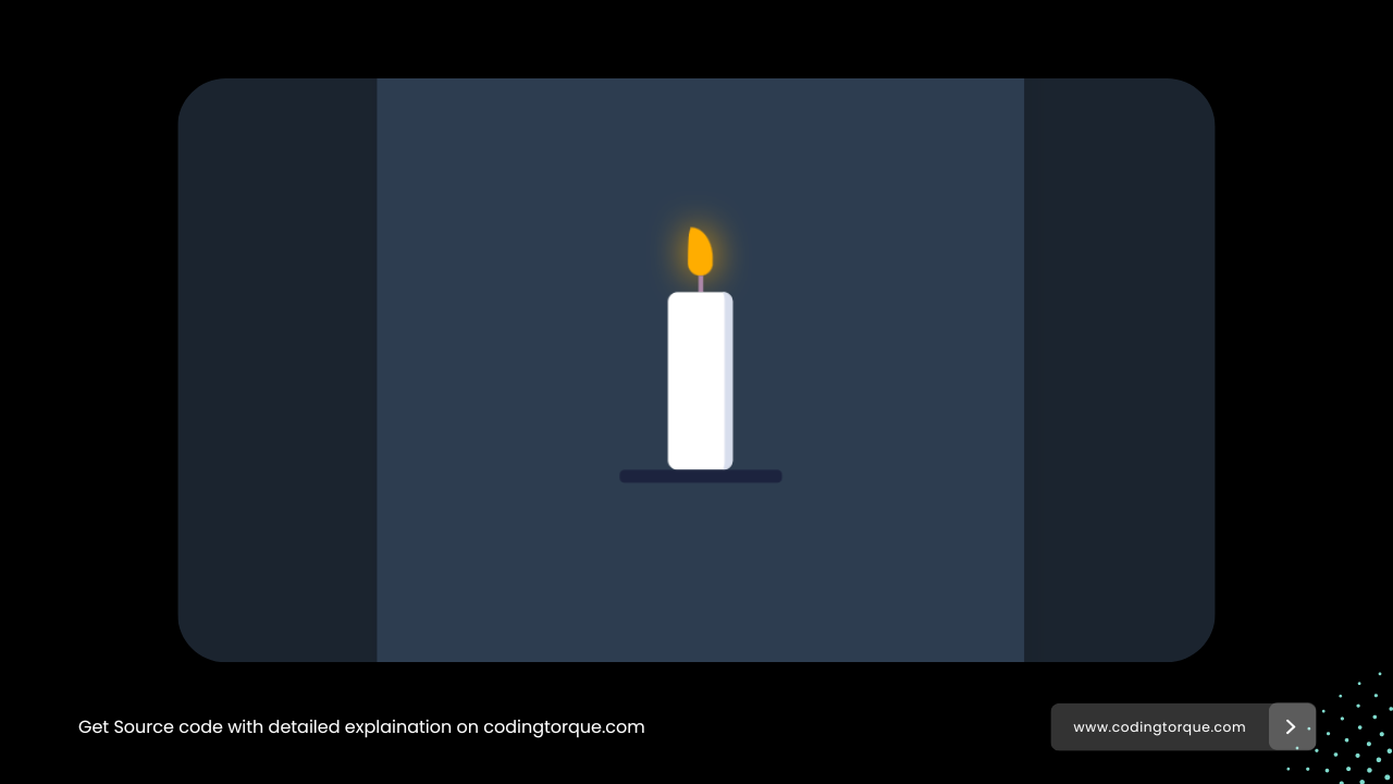
4. Candle Animation
Code Credits: @menashebouhadana
HTML Code
<div class="wrapper">
	<div class="center">
		<div class="candle">
			<div class="candle-flame"></div>
			<div class="candle-wick"></div>
			<div class="candle-wax"></div>
			<div class="candle-stand"></div>
		</div>
	</div>
</div>
CSS(SCSS) Code
*,
*::before,
*::afeter {
	box-sizing: border-box;
}
// global colors
$background: #2d3d50;
$flame: #ffad00;
$flame-shadow: #ffad00;
$wax: #ffffff;
$wax-shadow: #d8deed;
$wick: #ad87a9;
$stand: #1c233e;
html,
body {
height: 100%;
}
body {
display: flex;
justify-content: center;
align-items: center;
background: darken($background, 10%);
}
.wrapper {
position: absolute;
top: 50%;
left: 50%;
width: 400px;
height: 400px;
margin-top: -200px;
margin-left: -200px;
border-radius: 4px;
box-shadow: 4px 8px 16px 0 #00000010;
overflow: hidden;
background: $background;
}
// to center the candle i used another div with transform on it
.center {
position: absolute;
top: 50%;
left: 50%;
transform: translate(-50%, -50%);
}
// candle nesting
.candle {
display: flex;
flex-direction: column;
align-items: center;
&-flame {
width: 15px;
height: 30px;
background: $flame;
border-radius: 8px 8px 8px 8px / 20px 20px 8px 8px;
box-shadow: 0px 0px 20px 0px $flame-shadow;
animation: flame-twirl 15s ease infinite, glow 2s ease infinite;
}
&-wick {
height: 10px;
width: 3px;
background: $wick;
}
&-wax {
width: 40px;
height: 110px;
background: $wax;
border-radius: 6px;
box-shadow: inset -15px 0px 0px -10px $wax-shadow;
}
&-stand {
width: 100px;
height: 8px;
background: $stand;
border-radius: 3px;
}
}
// animations
@keyframes flame-twirl {
0%,
22%,
49%,
62%,
81%,
100% {
border-radius: 2px 14px 8px 8px / 20px 20px 8px 8px;
}
14%,
32%,
56%,
70%,
89% {
border-radius: 14px 2px 8px 8px / 20px 20px 8px 8px;
}
}
@keyframes glow {
0%,
30%,
60%,
80%,
100% {
box-shadow: 0 0 20px 0 #ffad00;
}
20%,
50%,
70% {
box-shadow: 0 0 22px 0 #ffad00;
}
}
5. Candle Light Flame Animation

Code Credits: @kh-mamun
HTML Code
<div class="holder">
  <div class="candle">
    <div class="blinking-glow"></div>
    <div class="thread"></div>
    <div class="glow"></div>
    <div class="flame"></div>
  </div>
</div>
CSS Code
@import url('https://fonts.googleapis.com/css?family=Ubuntu:400,400i,700,700i');*, *:before, *:after {
margin: 0;
padding: 0;
word-break: break-all;
box-sizing: border-box;
scroll-behavior: smooth;
}
html {
font-size: 10px;
}
body {
font-family: ‘Ubuntu’, sans-serif;
color: #6e6e6e;
font-size: 1.6rem;
background: black;
}
header, footer {
display: block;
}
a, a:link, a:visited {
text-decoration: none;
}
img {
border: 0;
}
ul {
list-style: none;
}
.center {
width: 1170px;
margin: 20px auto 0;
}
.holder {
margin: 12rem auto 0;
width: 150px;
height: 400px;
position: relative;
}
.holder *, .holder *:before, .holder *:after {
position: absolute;
content: “”;
}
.candle {
bottom: 0;
width: 150px;
height: 300px;
border-radius: 150px / 40px;
box-shadow: inset 20px -30px 50px 0 rgba(0, 0, 0, 0.4), inset -20px 0 50px 0 rgba(0, 0, 0, 0.4);
background: #190f02;
background: -moz-linear-gradient(#e48825, #e78e0e, #833c03, #4c1a03 50%, #1c0900);
background: -webkit-linear-gradient(#e48825, #e78e0e, #833c03, #4c1a03 50%, #1c0900);
background: -o-linear-gradient(#e48825, #e78e0e, #833c03, #4c1a03 50%, #1c0900);
background: -ms-linear-gradient(#e48825, #e78e0e, #833c03, #4c1a03 50%, #1c0900);
background: linear-gradient(#e48825, #e78e0e, #833c03, #4c1a03 50%, #1c0900);
}
.candle:before {
width: 100%;
height: 40px;
border-radius: 50%;
border: 2px solid #d47401;
background: #b86409;
background: -moz-radial-gradient(#eaa121, #8e4901 45%, #b86409 80%);
background: -webkit-radial-gradient(#eaa121, #8e4901 45%, #b86409 80%);
background: -o-radial-gradient(#eaa121, #8e4901 45%, #b86409 80%);
background: -ms-radial-gradient(#eaa121, #8e4901 45%, #b86409 80%);
background: radial-gradient(#ffef80, #b86409 60%);
background: radial-gradient(#eaa121, #8e4901 45%, #b86409 80%);
}
.candle:after {
width: 34px;
height: 10px;
left: 50%;
transform: translateX(-50%);
border-radius: 50%;
top: 14px;
box-shadow: 0 0 20px 0 rgba(0, 0, 0, 0.5);
background: -moz-radial-gradient(rgba(0, 0, 0, 0.6), transparent 45%);
background: -webkit-radial-gradient(rgba(0, 0, 0, 0.6), transparent 45%);
background: -o-radial-gradient(rgba(0, 0, 0, 0.6), transparent 45%);
background: -ms-radial-gradient(rgba(0, 0, 0, 0.6), transparent 45%);
background: radial-gradient(rgba(0, 0, 0, 0.6), transparent 45%);
}
.thread {
width: 6px;
height: 36px;
top: -17px;
left: 50%;
z-index: 1;
border-radius: 40% 40% 0 0;
transform: translateX(-50%);
background: #121212;
background: -moz-linear-gradient(#d6994a, #4b232c, #121212, black, #e8bb31 90%);
background: -webkit-linear-gradient(#d6994a, #4b232c, #121212, black, #e8bb31 90%);
background: -o-linear-gradient(#d6994a, #4b232c, #121212, black, #e8bb31 90%);
background: -ms-linear-gradient(#d6994a, #4b232c, #121212, black, #e8bb31 90%);
background: linear-gradient(#d6994a, #4b232c, #121212, black, #e8bb31 90%);
}
.flame {
width: 24px;
height: 120px;
left: 50%;
transform-origin: 50% 100%;
transform: translateX(-50%);
bottom: 100%;
border-radius: 50% 50% 20% 20%;
background: rgba(255, 255, 255, 1);
background: -moz-linear-gradient(white 80%, transparent);
background: -webkit-linear-gradient(white 80%, transparent);
background: -o-linear-gradient(white 80%, transparent);
background: -ms-linear-gradient(white 80%, transparent);
background: linear-gradient(white 80%, transparent);
animation: moveFlame 6s linear infinite, enlargeFlame 5s linear infinite;
}
.flame:before {
width: 100%;
height: 100%;
border-radius: 50% 50% 20% 20%;
box-shadow: 0 0 15px 0 rgba(247, 93, 0, .4), 0 -6px 4px 0 rgba(247, 128, 0, .7);
}
@keyframes moveFlame {
0%, 100% {
transform: translateX(-50%) rotate(-2deg);
}
50% {
transform: translateX(-50%) rotate(2deg);
}
}
@keyframes enlargeFlame {
0%, 100% {
height: 120px;
}
50% {
height: 140px;
}
}
.glow {
width: 26px;
height: 60px;
border-radius: 50% 50% 35% 35%;
left: 50%;
top: -48px;
transform: translateX(-50%);
background: rgba(0, 133, 255, .7);
box-shadow: 0 -40px 30px 0 #dc8a0c, 0 40px 50px 0 #dc8a0c, inset 3px 0 2px 0 rgba(0, 133, 255, .6), inset -3px 0 2px 0 rgba(0, 133, 255, .6);
}
.glow:before {
width: 70%;
height: 60%;
left: 50%;
transform: translateX(-50%);
bottom: 0;
border-radius: 50%;
background: rgba(0, 0, 0, 0.35);
}
.blinking-glow {
width: 100px;
height: 180px;
left: 50%;
top: -55%;
transform: translateX(-50%);
border-radius: 50%;
background: #ff6000;
-webkit-filter: blur(50px);
-moz-filter: blur(60px);
-o-filter: blur(60px);
-ms-filter: blur(60px);
filter: blur(60px);
animation: blinkIt .1s infinite;
}
@keyframes blinkIt {
50% { opacity: .8;}
}
6. Camfire Flame Animation

Code Credits: @kylewetton
HTML Code
<div class="fireplace">
  <div class="blur">
  <div class="fireplace__flame_big"></div>
    </div>
  <section class="fireplace__log"></section>
  <section class="fireplace__log"></section>
  <section class="fireplace__log"></section>
  <section class="fireplace__log"></section>
  <section class="fireplace__log"></section>
  <section class="fireplace__log"></section>
  <section class="fireplace__log"></section>
   <main class="fireplace__spark"></main>
  <main class="fireplace__spark"></main>
  <main class="fireplace__spark"></main>
  <main class="fireplace__spark"></main>
  <div class="blur fix">
  <div class="fireplace__flame"></div>
    </div>
  <div class="fireplace__light"></div>
</div>
CSS(SCSS) Code
// Options
$black: #1b1e23;
$white: #f4eed7;
$feature : #4b9aaa;
$log: linear-gradient(#e66465, #5d5e55);
$fire: linear-gradient(0deg, rgba(236,221,66,1) 10%, rgba(237,174,52,1) 15%, rgba(237,100,52,1) 50%, rgba(250,71,8,1) 59%);
// Pen specific
html,
body {
height: 100%;
}
body {
background: $black;
display: flex;
justify-content: center;
align-items: center;
font-family: sans-serif;
}
.fireplace {
width: 320px;
height: 320px;
position: relative;
display: flex;
justify-content: center;
align-items: flex-end;
&__flame, &__flame_big {
height: 250px;
width: 180px;
background: $fire;
position: relative;
margin-bottom: -15px;
z-index: 3;
opacity: 0.7;
}
&__flame {
width: 350px;
margin-left: 10px;
animation: burn 1.5s linear forwards infinite;
}
&__flame_big {
margin-bottom: -5px;
z-index: -1;
opacity: 1;
animation: burn_alt 2.5s linear forwards infinite;
}
&__log {
background: $log;
height: 100px;
width: 20px;
position: absolute;
bottom: 0;
border-radius: 10px;
transform-origin: bottom center;
box-shadow: 0px 0px 3px rgba(0,0,0,0.5);
}
&__log:after {
content: “”;
display: block;
background: #ff915b;
width: 100%;
height: 20px;
border-radius: 20px;
transform-origin: top center;
transform: scale(1, 0.5);
}
section:nth-of-type(1) {
left: 70px;
transform: rotateZ(45deg);
}
section:nth-of-type(2) {
left: 100px;
transform: rotateZ(25deg);
}
section:nth-of-type(3) {
left: 140px;
transform: rotateZ(5deg);
}
section:nth-of-type(4) {
left: 140px;
transform: rotateZ(-5deg);
}
section:nth-of-type(5) {
left: 170px;
transform: rotateZ(-15deg);
}
section:nth-of-type(6) {
left: 200px;
transform: rotateZ(-35deg);
}
section:nth-of-type(7) {
left: 230px;
transform: rotateZ(-45deg);
}
&__spark {
position: absolute;
height: 4px;
width: 4px;
border-radius: 1px;
top: 0; left: 0;
filter: blur(1px);
background: yellow;
z-index: 10;
opacity: 0;
}
main:nth-of-type(1) {
animation: spark_1 1s forwards infinite;
}
main:nth-of-type(2) {
animation: spark_2 1s 0.75s forwards infinite;
}
main:nth-of-type(3) {
animation: spark_3 1s 0.25s forwards infinite;
}
main:nth-of-type(4) {
animation: spark_4 1s 0.5s forwards infinite;
}
&__light {
height: 100%;
width: 100%;
border-radius: 50% 50% 30% 30%;
transform: scale(1.1,1.2);
filter: blur(50px);
background: orange;
position: absolute;
top: 40px; left: 0;
z-index: -1;
opacity: 0.4;
}
.blur {
filter: blur(1px);
&.fix {
position: absolute;
}
}
}
@keyframes burn {
0% {
clip-path: polygon(48% 97%, 42% 97%, 37% 93%, 31% 92%, 28% 88%, 26% 81%, 29% 84%, 34% 84%, 33% 79%, 30% 74%, 31% 67%, 34% 57%, 34% 65%, 39% 71%, 43% 65%, 43% 55%, 40% 45%, 48% 59%, 49% 69%, 51% 76%, 55% 71%, 54% 65%, 54% 58%, 58% 64%, 61% 72%, 57% 92%, 61% 97%, 64% 98%, 66% 95%, 64% 93%, 57% 96%, 54% 93%, 48% 97%);
}
25% {
clip-path: polygon(49% 97%, 41% 97%, 35% 92%, 33% 86%, 34% 80%, 30% 74%, 34% 77%, 38% 81%, 38% 78%, 36% 72%, 35% 67%, 37% 61%, 37% 54%, 39% 61%, 39% 67%, 43% 63%, 43% 58%, 45% 44%, 44% 58%, 48% 66%, 51% 67%, 51% 59%, 54% 67%, 56% 72%, 57% 79%, 59% 77%, 60% 71%, 61% 77%, 61% 83%, 60% 89%, 61% 94%, 57% 97%, 52% 98%);
}
50% {
clip-path: polygon(46% 97%, 39% 96%, 35% 89%, 36% 84%, 34% 77%, 30% 73%, 30% 65%, 30% 70%, 35% 75%, 38% 68%, 37% 61%, 40% 53%, 41% 42%, 42% 56%, 44% 65%, 50% 67%, 51% 57%, 53% 68%, 52% 74%, 51% 81%, 55% 78%, 57% 72%, 58% 79%, 57% 85%, 55% 88%, 60% 87%, 63% 82%, 63% 89%, 59% 94%, 55% 98%, 51% 92%, 50% 99%, 45% 96%);
}
75% {
clip-path: polygon(45% 97%, 38% 97%, 33% 93%, 31% 87%, 31% 81%, 29% 76%, 25% 69%, 29% 61%, 30% 69%, 35% 71%, 35% 62%, 34% 54%, 38% 45%, 38% 54%, 43% 62%, 47% 57%, 48% 49%, 44% 38%, 50% 46%, 53% 60%, 54% 71%, 53% 79%, 59% 76%, 60% 66%, 64% 73%, 63% 79%, 59% 85%, 64% 90%, 68% 84%, 68% 92%, 60% 97%, 53% 98%, 48% 99%);
}
100% {
clip-path: polygon(48% 97%, 42% 97%, 37% 93%, 31% 92%, 28% 88%, 26% 81%, 29% 84%, 34% 84%, 33% 79%, 30% 74%, 31% 67%, 34% 57%, 34% 65%, 39% 71%, 43% 65%, 43% 55%, 40% 45%, 48% 59%, 49% 69%, 51% 76%, 55% 71%, 54% 65%, 54% 58%, 58% 64%, 61% 72%, 57% 92%, 61% 97%, 64% 98%, 66% 95%, 64% 93%, 57% 96%, 54% 93%, 48% 97%);
}
}
@keyframes burn_alt {
0%, 100% {
clip-path: polygon(48% 97%, 43% 97%, 38% 97%, 34% 94%, 33% 91%, 32% 87%, 29% 83%, 26% 80%, 21% 75%, 20% 71%, 20% 66%, 20% 59%, 20% 65%, 24% 68%, 28% 67%, 28% 62%, 25% 60%, 21% 52%, 21% 43%, 24% 32%, 23% 39%, 24% 46%, 28% 48%, 33% 44%, 33% 39%, 31% 32%, 28% 23%, 30% 14%, 31% 22%, 35% 28%, 39% 28%, 41% 25%, 40% 21%, 39% 13%, 41% 6%, 42% 15%, 45% 23%, 49% 25%, 52% 22%, 51% 13%, 54% 21%, 56% 29%, 53% 35%, 50% 41%, 53% 46%, 58% 46%, 60% 39%, 60% 34%, 64% 39%, 65% 45%, 63% 51%, 61% 56%, 64% 61%, 68% 59%, 71% 55%, 73% 48%, 73% 40%, 76% 48%, 77% 56%, 76% 62%, 74% 66%, 69% 71%, 71% 74%, 75% 74%, 79% 71%, 81% 65%, 82% 72%, 81% 77%, 77% 82%, 73% 86%, 73% 89%, 78% 89%, 82% 85%, 81% 91%, 78% 95%, 72% 97%, 65% 98%, 59% 98%, 53% 99%, 47% 97%);
}
10% {
clip-path: polygon(44% 100%, 39% 100%, 35% 99%, 32% 99%, 32% 99%, 27% 97%, 24% 95%, 21% 92%, 19% 89%, 18% 86%, 16% 83%, 16% 79%, 17% 73%, 18% 68%, 17% 64%, 16% 64%, 12% 60%, 13% 52%, 16% 45%, 18% 40%, 17% 47%, 17% 53%, 21% 57%, 26% 59%, 29% 56%, 30% 48%, 28% 45%, 25% 38%, 25% 33%, 27% 23%, 29% 15%, 28% 23%, 29% 31%, 32% 38%, 36% 49%, 39% 52%, 40% 59%, 41% 64%, 47% 66%, 52% 64%, 50% 56%, 47% 48%, 47% 42%, 51% 34%, 53% 29%, 51% 40%, 53% 46%, 55% 52%, 59% 54%, 62% 53%, 64% 49%, 63% 43%, 67% 46%, 68% 54%, 67% 60%, 64% 65%, 63% 71%, 66% 75%, 71% 77%, 75% 75%, 76% 68%, 78% 72%, 79% 76%, 77% 80%, 73% 82%, 72% 86%, 77% 88%, 82% 87%, 84% 81%, 84% 88%, 83% 92%, 77% 96%, 73% 99%, 68% 99%, 62% 98%, 57% 100%, 53% 100%, 53% 95%, 50% 94%, 44% 93%);
}
20% {
clip-path: polygon(44% 99%, 41% 99%, 35% 98%, 29% 97%, 24% 93%, 21% 86%, 20% 80%, 16% 74%, 16% 64%, 16% 71%, 21% 75%, 25% 72%, 25% 65%, 22% 59%, 19% 53%, 19% 44%, 21% 52%, 25% 59%, 29% 57%, 29% 51%, 26% 44%, 26% 38%, 30% 32%, 31% 26%, 30% 18%, 34% 25%, 33% 35%, 33% 44%, 34% 50%, 39% 53%, 44% 52%, 45% 49%, 44% 44%, 42% 38%, 44% 33%, 48% 26%, 45% 35%, 47% 41%, 50% 44%, 51% 52%, 49% 60%, 48% 65%, 53% 69%, 58% 65%, 57% 59%, 58% 51%, 62% 41%, 66% 40%, 64% 47%, 61% 58%, 63% 66%, 66% 68%, 70% 67%, 72% 62%, 73% 57%, 71% 48%, 75% 53%, 79% 57%, 79% 64%, 76% 70%, 72% 75%, 70% 78%, 74% 80%, 78% 79%, 82% 76%, 84% 71%, 85% 66%, 84% 62%, 88% 67%, 89% 72%, 89% 79%, 87% 83%, 84% 89%, 81% 93%, 76% 97%, 69% 98%, 60% 99%, 54% 99%, 48% 100%, 45% 97%);
}
30% {
clip-path: polygon(38% 100%, 34% 99%, 28% 96%, 25% 93%, 23% 89%, 19% 85%, 18% 79%, 21% 74%, 24% 68%, 24% 62%, 22% 55%, 20% 50%, 24% 53%, 28% 61%, 31% 68%, 36% 68%, 38% 69%, 43% 67%, 41% 59%, 35% 54%, 33% 46%, 35% 39%, 41% 32%, 41% 26%, 38% 17%, 42% 21%, 46% 29%, 46% 39%, 43% 45%, 43% 51%, 47% 55%, 52% 56%, 55% 54%, 55% 49%, 54% 42%, 52% 34%, 59% 43%, 61% 51%, 60% 58%, 58% 63%, 65% 68%, 69% 67%, 72% 63%, 72% 57%, 71% 51%, 76% 39%, 73% 50%, 77% 56%, 81% 55%, 82% 49%, 84% 59%, 79% 69%, 72% 74%, 69% 76%, 71% 81%, 77% 81%, 81% 77%, 84% 70%, 87% 75%, 86% 81%, 84% 84%, 81% 87%, 81% 91%, 79% 94%, 77% 96%, 74% 97%, 71% 95%, 68% 96%, 67% 99%, 63% 100%, 60% 100%, 55% 100%, 53% 100%, 50% 100%, 48% 100%, 46% 100%, 44% 100%, 44% 100%, 42% 100%, 41% 100%);
}
40% {
clip-path: polygon(45% 99%, 40% 98%, 34% 98%, 31% 96%, 28% 93%, 26% 89%, 27% 84%, 26% 81%, 23% 77%, 20% 73%, 18% 70%, 19% 65%, 19% 60%, 20% 53%, 20% 43%, 24% 41%, 28% 32%, 28% 40%, 28% 48%, 29% 53%, 33% 52%, 35% 49%, 36% 42%, 36% 35%, 36% 27%, 39% 19%, 42% 12%, 40% 23%, 39% 29%, 41% 37%, 43% 41%, 44% 47%, 45% 52%, 47% 55%, 50% 57%, 52% 54%, 53% 48%, 52% 42%, 51% 33%, 50% 26%, 54% 36%, 55% 39%, 57% 46%, 57% 52%, 55% 58%, 55% 61%, 58% 65%, 62% 64%, 64% 60%, 65% 54%, 64% 49%, 65% 43%, 68% 38%, 67% 44%, 69% 51%, 72% 53%, 72% 59%, 70% 65%, 68% 69%, 68% 74%, 71% 75%, 74% 73%, 76% 69%, 78% 63%, 82% 58%, 81% 63%, 81% 69%, 81% 75%, 76% 80%, 75% 85%, 79% 87%, 82% 84%, 83% 91%, 79% 94%, 75% 96%, 71% 97%, 64% 98%, 58% 99%, 53% 98%, 46% 100% );
}
50% {
clip-path: polygon(40% 99%, 35% 99%, 31% 98%, 25% 95%, 23% 92%, 21% 88%, 20% 83%, 21% 80%, 22% 76%, 21% 70%, 20% 68%, 18% 64%, 21% 68%, 23% 71%, 25% 75%, 26% 79%, 31% 84%, 31% 79%, 28% 69%, 23% 60%, 17% 53%, 19% 41%, 25% 31%, 24% 24%, 24% 19%, 26% 24%, 28% 30%, 26% 37%, 25% 44%, 28% 49%, 33% 50%, 39% 48%, 40% 43%, 39% 35%, 37% 29%, 42% 34%, 43% 40%, 44% 47%, 43% 53%, 45% 59%, 51% 60%, 53% 56%, 51% 49%, 51% 44%, 53% 36%, 55% 32%, 54% 22%, 57% 29%, 57% 44%, 56% 50%, 58% 56%, 62% 59%, 66% 59%, 68% 53%, 66% 45%, 65% 38%, 70% 44%, 71% 50%, 72% 55%, 71% 62%, 68% 66%, 65% 70%, 67% 74%, 72% 74%, 76% 71%, 78% 65%, 80% 68%, 81% 73%, 78% 81%, 76% 89%, 77% 93%, 75% 97%, 70% 98%, 67% 98%, 62% 98%, 58% 98%, 53% 99%, 50% 99%, 47% 99%, 45% 99%);
}
60% {
clip-path: polygon(45% 99%, 41% 99%, 35% 98%, 30% 98%, 25% 94%, 22% 89%, 21% 84%, 23% 77%, 23% 70%, 19% 63%, 23% 66%, 27% 71%, 28% 76%, 32% 78%, 35% 72%, 32% 67%, 28% 64%, 24% 58%, 24% 49%, 27% 42%, 30% 34%, 31% 24%, 29% 13%, 33% 18%, 38% 25%, 38% 36%, 37% 44%, 41% 48%, 45% 48%, 48% 45%, 48% 39%, 46% 33%, 48% 27%, 52% 20%, 50% 29%, 51% 38%, 53% 44%, 54% 52%, 56% 57%, 61% 57%, 64% 55%, 65% 48%, 63% 39%, 63% 32%, 66% 37%, 69% 44%, 70% 52%, 68% 59%, 66% 64%, 67% 69%, 73% 72%, 76% 71%, 77% 66%, 76% 58%, 76% 51%, 80% 57%, 82% 62%, 82% 68%, 80% 73%, 77% 78%, 74% 82%, 75% 87%, 78% 87%, 81% 84%, 84% 79%, 86% 74%, 88% 78%, 87% 83%, 84% 89%, 82% 92%, 78% 97%, 74% 97%, 69% 97%, 66% 98%, 61% 98%, 57% 97%, 53% 99%, 49% 96%, 47% 99%, 48% 99%);
}
70% {
clip-path: polygon(41% 99%, 34% 99%, 27% 98%, 23% 96%, 18% 94%, 17% 90%, 16% 85%, 16% 81%, 14% 75%, 12% 68%, 11% 62%, 14% 67%, 19% 72%, 21% 69%, 19% 62%, 18% 57%, 17% 54%, 18% 49%, 22% 43%, 24% 36%, 25% 30%, 24% 23%, 27% 24%, 29% 33%, 28% 39%, 29% 48%, 31% 53%, 36% 53%, 39% 47%, 37% 41%, 40% 43%, 42% 49%, 41% 55%, 42% 57%, 45% 59%, 50% 60%, 53% 55%, 54% 49%, 53% 44%, 50% 39%, 56% 42%, 58% 47%, 58% 56%, 58% 59%, 66% 61%, 67% 58%, 67% 51%, 72% 46%, 70% 55%, 72% 59%, 72% 64%, 68% 69%, 66% 74%, 64% 80%, 68% 82%, 72% 78%, 74% 73%, 76% 77%, 76% 80%, 74% 83%, 73% 87%, 76% 89%, 78% 88%, 79% 85%, 80% 82%, 83% 86%, 83% 90%, 82% 92%, 79% 94%, 76% 96%, 73% 99%, 70% 98%, 66% 98%, 62% 99%, 58% 100%, 54% 100%, 51% 100%, 49% 100%, 46% 100%, 44% 100%);
}
80% {
clip-path: polygon(47% 99%, 42% 99%, 37% 98%, 32% 96%, 28% 92%, 26% 89%, 26% 83%, 26% 80%, 26% 72%, 23% 67%, 16% 63%, 14% 52%, 16% 46%, 16% 53%, 20% 60%, 26% 58%, 27% 51%, 25% 46%, 20% 41%, 19% 36%, 19% 30%, 21% 26%, 24% 20%, 23% 13%, 22% 7%, 26% 11%, 28% 17%, 28% 24%, 26% 30%, 30% 34%, 34% 34%, 39% 32%, 40% 27%, 38% 21%, 43% 28%, 43% 36%, 41% 41%, 46% 44%, 51% 41%, 53% 35%, 53% 26%, 57% 26%, 59% 33%, 60% 39%, 57% 46%, 55% 53%, 58% 57%, 64% 56%, 66% 52%, 69% 41%, 70% 48%, 69% 56%, 66% 63%, 64% 67%, 65% 71%, 70% 71%, 74% 68%, 76% 62%, 77% 54%, 79% 60%, 81% 66%, 80% 71%, 76% 75%, 72% 78%, 71% 82%, 75% 84%, 80% 83%, 84% 78%, 86% 83%, 83% 89%, 78% 92%, 74% 92%, 73% 96%, 69% 97%, 65% 96%, 62% 98%, 57% 99%, 54% 97%, 51% 99%, 46% 99%);
}
90% {
clip-path: polygon(43% 99%, 39% 99%, 33% 99%, 29% 98%, 25% 97%, 20% 94%, 18% 91%, 17% 87%, 16% 82%, 17% 78%, 17% 73%, 18% 65%, 22% 61%, 23% 56%, 23% 51%, 21% 46%, 25% 51%, 26% 59%, 26% 64%, 28% 65%, 31% 65%, 33% 63%, 33% 59%, 31% 54%, 29% 49%, 28% 43%, 30% 37%, 31% 30%, 31% 24%, 33% 28%, 34% 33%, 33% 39%, 35% 46%, 37% 50%, 39% 55%, 44% 54%, 43% 49%, 43% 44%, 44% 39%, 44% 33%, 46% 38%, 48% 42%, 48% 47%, 52% 49%, 52% 51%, 51% 57%, 52% 60%, 57% 59%, 58% 56%, 59% 50%, 57% 42%, 56% 38%, 61% 44%, 62% 47%, 64% 53%, 64% 57%, 62% 61%, 61% 66%, 63% 69%, 68% 69%, 70% 67%, 71% 64%, 71% 58%, 71% 53%, 73% 49%, 73% 55%, 75% 58%, 76% 63%, 74% 68%, 73% 73%, 76% 78%, 77% 81%, 77% 85%, 77% 90%, 74% 94%, 71% 97%, 68% 99%, 61% 99%, 53% 100%, 48% 100%);
}
}
@keyframes spark_1 {
0% {
opacity: 1;
left: 100px;
top: 210px;
}
100% {
top: 60px;
left: 110px;
opacity: 0;
}
}
@keyframes spark_2 {
0% {
opacity: 1;
left: 180px;
top: 210px;
}
100% {
top: 20px;
left: 150px;
opacity: 0;
}
}
@keyframes spark_3 {
0% {
opacity: 1;
left: 220px;
top: 210px;
}
100% {
top: 30px;
left: 170px;
opacity: 0;
}
}
@keyframes spark_4 {
0% {
opacity: 1;
left: 120px;
top: 210px;
}
100% {
top: 30px;
left: 40px;
opacity: 0;
}
}
7. Animated Christmas Candle

Code Credits: @ryanindustries8
HTML Code
<div class="displayBox">
	<div class="candleBox">
<!-- CANDLES -->
		<div class="lgCandle">
			<div class="light">
				<div class="wick"></div>
				<div class="flameBox med">
					<div class="flame"></div>
					<div class="glow"></div>
				</div>
			</div>
		</div>
		<div class="mdCandle">
			<div class="light">
				<div class="wick"></div>
				<div class="flameBox slow">
					<div class="flame"></div>
					<div class="glow"></div>
				</div>
			</div>
		</div>
		<div class="smCandle">
			<div class="light">
				<div class="wick"></div>
				<div class="flameBox fast">
					<div class="flame"></div>
					<div class="glow"></div>
				</div>
			</div>
		</div>
<!-- ORNAMENTS -->
		<div class="ornament orna1">
			<div class="silverOrnament">
				<div class="spot"></div>
			</div>
			<div class="shadow"></div>
		</div>
		<div class="ornament orna2">
			<div class="capFull"></div>
			<div class="silverOrnament">
				<div class="spot"></div>
			</div>
			<div class="shadow"></div>
		</div>
		<div class="ornament orna3">
			<div class="cap"></div>
			<div class="redOrnament">
				<div class="spot"></div>
			</div>
			<div class="shadow"></div>
		</div>
		<div class="ornament orna4">
			<div class="cap"></div>
			<div class="redOrnament">
				<div class="spot"></div>
			</div>
			<div class="shadow"></div>
		</div>
		<div class="ornament orna5">
			<div class="silverOrnament">
				<div class="spot"></div>
			</div>
			<div class="shadow"></div>
		</div>
		<div class="ornament orna6">
			<div class="cap"></div>
			<div class="redOrnament">
				<div class="spot"></div>
			</div>
			<div class="shadow"></div>
		</div>
		<div class="ornament orna7">
			<div class="silverOrnament">
				<div class="spot"></div>
			</div>
			<div class="shadow"></div>
		</div>
		<div class="ornament orna8">
			<div class="capFull"></div>
			<div class="redOrnament">
				<div class="spot"></div>
			</div>
			<div class="shadow"></div>
		</div>
	</div>
	<div id="plate"></div>
</div>
CSS Code
body {
	position: absolute;
	bottom: 60px;
	width: 100%;
	height: 100vh;
	display: flex;
	justify-content: center;
	align-content: center;
	margin: 0;
	background: transparent;
}
.displayBox {
min-width: 700px;
height: 100%;
position: relative;
display: flex;
justify-content: center;
}
.candleBox {
position: relative;
display: flex;
justify-content: center;
width: 375px;
bottom: 25px;
z-index: 1;
}
/*** CANDLES ***/
.lgCandle,
.mdCandle,
.smCandle {
position: absolute;
display: flex;
justify-content: center;
}
.lgCandle,
.mdCandle {
bottom: 50px;
}
.lgCandle:before,
.mdCandle:before,
.smCandle:before {
content: ”;
position: absolute;
width: 100%;
border-radius: 100%;
background: rgb(249,26,18);
}
.lgCandle:after,
.mdCandle:after,
.smCandle:after {
content: ”;
position: absolute;
width: 100%;
height: 30px;
border-radius: 100%;
bottom: -14px;
}
.lgCandle,
.lgCandle:after {
background: linear-gradient(90deg,
rgb(164,38,15),
rgb(245,1,1),
rgb(246,49,41),
rgb(215,7,7),
rgb(197,37,37),
rgb(199,17,16),
rgb(214,50,48),
rgb(209,26,18));
}
.lgCandle {
height: 260px;
width: 185px;
right: 0;
box-shadow: 0px 2px 6px rgba(159,94,52,1) inset,
0px 2px 6px rgba(159,94,52,0.55);
z-index: 3;
}
.lgCandle:before {
height: 22px;
top: -12px;
border-bottom: 1px solid rgb(207,14,15);
}
.lgCandle:after {
box-shadow: 0px 3px 3px rgba(46,2,3,0.3);
}
.mdCandle,
.mdCandle:after {
background: linear-gradient(90deg,
rgb(176,52,40),
rgb(203,63,64),
rgb(187,62,66),
rgb(167,13,13),
rgb(182,28,30),
rgb(220,6,4),
rgb(220,6,4),
rgb(247,50,42),
rgb(255,7,8),
rgb(242,13,10),
rgb(232,53,33));
}
.mdCandle {
height: 220px;
width: 140px;
left: 0;
box-shadow: 0px 2px 6px rgba(159,94,52,1) inset,
0px 2px 6px rgba(159,94,52,0.55);
z-index: 3;
}
.mdCandle:before {
height: 26px;
top: -13px;
background: linear-gradient(rgb(255,40,32),
rgb(255,35,29));
border-bottom: 1px solid rgb(205,16,14);
}
.mdCandle:after {
box-shadow: 0px 3px 3px rgba(46,2,3,0.3);
}
.smCandle,
.smCandle:after {
background: linear-gradient(90deg,
rgb(166,37,32),
rgb(178,35,31),
rgb(161,29,25),
rgb(152,12,12),
rgb(144,22,21),
rgb(166,0,0),
rgb(180,32,30),
rgb(193,13,12),
rgb(206,32,33),
rgb(213,14,7));
}
.smCandle {
height: 155px;
width: 185px;
bottom: 0;
box-shadow: 0px 0px 20px rgb(160,16,15);
z-index: 6;
}
.smCandle:before {
height: 30px;
top: -15px;
background: linear-gradient(rgb(255,16,15),
rgb(219,68,39),
rgb(251,13,11));
border-bottom: 1px solid rgb(173,4,1);
box-shadow: 0px 0px 8px rgba(160,16,15,0.6);
}
.smCandle:after {
box-shadow: 0px 3px 3px rgba(46,2,3,0.3);
}
/*** FLAME ***/
.flameBox {
height: 100px;
width: 50px;
position: absolute;
top: -103px;
left: 0;
right: 0;
margin: 0 auto;
animation-name: flame;
animation-timing-function: linear;
animation-iteration-count: infinite;
animation-direction: alternate;
}
.slow {
animation-duration: 2s;
animation-delay: 5s;
}
.med {
animation-duration: 2s;
animation-delay: 2.5s;
}
.fast {
animation-duration: 2s;
animation-delay: .1s;
}
.flame {
width: 0;
height: 0;
position: relative;
border-left: 8px solid transparent;
border-right: 8px solid transparent;
border-bottom: 40px solid rgb(255,255,209);
margin: 0 auto;
transform: rotate(-6deg);
opacity: .9;
z-index: 2;
}
.flame:before {
content: ”;
position: absolute;
width: 20px;
height: 53px;
background: rgb(255,255,209);
top: 30px;
right: -10px;
border-top-left-radius: 70%;
border-top-right-radius: 70%;
border-bottom-left-radius: 70%;
border-bottom-right-radius: 70%;
}
.flame:after {
content: ”;
position: absolute;
width: 21px;
height: 50px;
background: rgb(255,255,209);
top: 40px;
right: -9px;
border-top-left-radius: 70%;
border-top-right-radius: 70%;
border-bottom-left-radius: 40%;
border-bottom-right-radius: 40%;
transform: rotate(8deg);
}
.glow {
width: 30%;
height: 50%;
background: linear-gradient(90deg,
rgb(253,236,104),
rgba(255,254,255,0.5),
rgb(253,236,104));
position: absolute;
left: 20px;
bottom: 25px;
border-radius: 100%;
transform: rotate(-2deg);
z-index: 1;
box-shadow: 0px 0px 35px 12px rgb(255,192,81);
animation-name: glow;
animation-duration: 3s;
animation-timing-function: linear;
animation-delay: .1s;
animation-iteration-count: infinite;
animation-direction: alternate;
}
.wick {
width: 6px;
height: 30px;
border-left: 6px solid rgb(0,3,0);
position: relative;
top: -26px;
left: 6px;
border-top-right-radius: 50%;
border-top-left-radius: 50%;
z-index: 3;
}
/*** ORNAMENTS ***/
.ornament {
position: absolute;
bottom: 0;
}
.redOrnament,
.silverOrnament {
width: 90px;
height: 90px;
position: relative;
border-radius: 100%;
z-index: 2;
}
.redOrnament {
background: radial-gradient(rgb(159,1,2),
rgb(181,3,1),
rgb(151,44,28));
}
.silverOrnament {
background: radial-gradient(rgb(207,210,155),
rgb(128,138,101));
}
.silverOrnament:before,
.silverOrnament:after,
.redOrnament:before,
.redOrnament:after,
.spot,
.spot:before {
content: ”;
position: absolute;
background: radial-gradient(rgba(255,255,255,0.27),
rgba(255,255,255,0.27));
border-radius: 100%;
box-shadow: 0 0 10px 8px rgba(255,255,255,0.27);
}
.silverOrnament:before,
.redOrnament:before {
width: 2px;
height: 25px;
bottom: 25px;
left: 15px;
}
.silverOrnament:after,
.redOrnament:after {
width: 2px;
height: 10px;
bottom: 28px;
left: 40px;
}
.spot {
width: 2px;
height: 15px;
bottom: 30px;
right: 11px;
}
.spot:before {
width: 30px;
height: 7px;
top: -26px;
right: 17px;
}
.cap {
width: 25px;
height: 20px;
z-index: 1;
}
.cap:before {
content: ”;
width: 100%;
height: 3px;
border-radius: 100%;
top: -2px;
border-bottom: 1px solid rgba(199,184,115,.5);
}
.cap,
.cap:before {
position: absolute;
background: linear-gradient(90deg,
rgb(202,200,113),
rgb(234,197,108),
rgb(254,244,183),
rgb(180,169,89),
rgb(165,150,91),
rgb(103,108,54));
}
.cap:after {
content: ”;
position: absolute;
width: 50%;
height: 50%;
border-radius: 100%;
border: 1px solid gold;
top: -10px;
z-index: -1;
margin: auto;
left: 0;
right: 0;
}
.capFull,
.capFull:before {
position: absolute;
border-radius: 100%;
}
.capFull {
width: 24px;
height: 24px;
background: radial-gradient(rgb(241,236,155),
rgb(187,163,115));
border-top: 1px solid rgba(134,89,47,0.3);
border-right: 1px solid rgba(134,89,47,0.3);
z-index: 9;
}
.capFull:before {
content: ”;
background: rgb(140,137,70);
width: 22px;
height: 22px;
top: 3px;
right: 1px;
border-top: 1px solid rgb(147,132,63);
border-right: 1px solid rgb(102,88,41);
border-left: 1px solid rgb(185,185,125);
}
.capFull:after {
content: ”;
background: linear-gradient(90deg,rgb(119,125,65),
rgb(232,195,106),
rgb(119,125,65));
position: absolute;
width: 75%;
height: 2px;
margin: auto;
left: 0;
right: 0;
bottom: 0;
top: 7px;
border: 1px solid rgb(119,125,65);
border-top: 1px solid transparent !important;
}
/** ORNAMENT PLACEMENT **/
.orna1 .silverOrnament,
.orna2 .silverOrnament,
.orna5 .silverOrnament,
.orna7 .silverOrnament {
box-shadow: -5px 2px 8px rgba(127,54,47,0.7) inset;
}
.orna3 .redOrnament,
.orna4 .redOrnament,
.orna6 .redOrnament,
.orna8 .redOrnament {
box-shadow: -3px 4px 6px rgba(150,19,11,0.7) inset,
-3px -9px 6px rgba(150,19,11,0.7) inset;
}
.orna5,
.orna6,
.orna7,
.orna8 {
transform: rotateY(180deg);
}
/* LEFT SIDE OF PLATE */
.orna1 {
left: -60px;
z-index: 2;
bottom: 80px;
}
.orna2 {
left: -95px;
bottom: 25px;
z-index: 4;
}
.orna2 .capFull,
.orna8 .capFull {
bottom: 22px;
left: 22px;
}
.orna3 {
left: 25px;
z-index: 5;
bottom: 15px;
}
.orna3 .cap {
top: -8px;
right: 22px;
transform: rotate(15deg);
}
.orna4 {
left: -25px;
z-index: 7;
bottom: -5px;
}
.orna4 .cap {
bottom: 8px;
right: -7px;
transform: rotate(120deg);
}
/* RIGHT SIDE OF PLATE */
.orna5 {
right: -45px;
z-index: 7;
bottom: 70px;
z-index: 2;
}
.orna6 {
right: -85px;
z-index: 7;
bottom: 40px;
}
.orna6 .cap {
bottom: 20px;
left: -10px;
transform: rotate(-110deg);
}
.orna7 {
right: -35px;
z-index: 7;
bottom: 13px;
}
.orna8 {
right: 5px;
z-index: 8;
bottom: 0px;
}
/** ORNAMENT SHADOW **/
.shadow {
position: absolute;
height: 30px;
width: 80px;
border-radius: 100%;
background: rgba(41,51,24,0.12);
bottom: -8px;
left: -12px;
box-shadow: 0px 0px 33px rgba(41,51,24,0.15);
}
/*** PLATE ***/
#plate,
#plate:before,
#plate:after {
width: 100%;
height: 150px;
position: absolute;
bottom: 0;
border-radius: 100%;
}
#plate {
background: linear-gradient(rgb(102,134,71),
rgb(110,145,77),
rgb(113,148,80),
rgb(91,107,58));
border-top: 4px solid rgb(114,146,83);
border-right: 1px solid rgb(77,99,37);
border-bottom: 5px solid rgb(164,94,60);
border-left: 1px solid rgb(98,132,71);
}
#plate:before {
content: ”;
background: transparent;
border-bottom: 2px solid rgb(73,70,27);
border-left: 1px solid rgba(244,255,246,0.25);
border-right: 1px solid rgb(86,110,48);
}
#plate:after {
content: ”;
background: rgb(116,151,83);
border-bottom: 1px solid rgb(125,115,64);
z-index: -1;
bottom: -10px;
width: 65%;
height: 50%;
margin: 0 auto;
left: 0;
right: 0;
box-shadow: 1px 1px 8px rgb(125,115,64);
}
/*** ANIMATIONS ***/
@keyframes flame {
0% {
transform: rotate(-2deg);
}
50% {
transform: rotate(5deg);
}
100% {
transform: rotate(0deg);
}
}
@keyframes glow {
0% {
filter: brightness(1.05);
}
50% {
filter: brightness(1);
}
100% {
filter: brightness(0.9);
}
}


