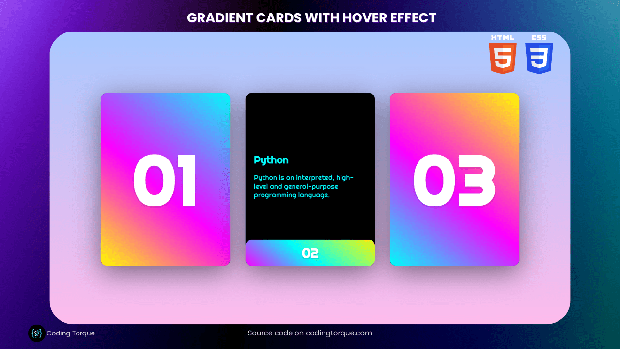
Gradient cards are a popular design trend that can add depth and dimension to your website. And when paired with a subtle hover effect, they can create an engaging user experience that will keep your visitors scrolling.
In this blog post, we’ll show you how to create gradient cards with hover effect using just HTML and CSS. . So, whether you’re a beginner or a seasoned web designer, you’ll be able to follow along and create stunning gradient cards in no time. Let’s get started!
Before we start here are some more articles you might like to read –
- Deploying a MERN App with Multiple Domain Names on VPS
- 3D CSS Logo with Pure CSS
- 3D Santa using HTML and CSS Only
- Crafting a 3D Police Squad Car with Pure CSS
- Crafting a 3D Printer with HTML and Pure CSS
I would recommend you don’t just copy and paste the code, just look at the code and type by understanding it.
HTML Code
Starter Template
<!doctype html>
<html lang="en">

<head>
    <!-- Required meta tags -->
    <meta charset="utf-8">
    <meta name="viewport" content="width=device-width, initial-scale=1">

    <!-- Font Awesome CDN  -->
    <link rel="stylesheet" href="https://cdnjs.cloudflare.com/ajax/libs/font-awesome/5.14.0/css/all.min.css"
        integrity="sha512-1PKOgIY59xJ8Co8+NE6FZ+LOAZKjy+KY8iq0G4B3CyeY6wYHN3yt9PW0XpSriVlkMXe40PTKnXrLnZ9+fkDaog=="
        crossorigin="anonymous" />

    <!-- CSS -->
    <link rel="stylesheet" href="style.css">

    <title>Gradient Cards with hover effect using HTML & CSS - Coding Torque</title>
</head>

<body>
    <!-- Further code here -->

    <script src="script.js"></script>
</body>

</html>
Paste the below code in your <body> tag.
<div class="container">
<div class="card">
<div class="face face1">
<div class="content">
<span class="stars"></span>
<h2 class="java">Java</h2>
<p class="java">Java is a class-based, object-oriented programming language that is designed to have as few implementation dependencies as possible.</p>
</div>
</div>
<div class="face face2">
<h2>01</h2>
</div>
</div>
<div class="card">
<div class="face face1">
<div class="content">
<span class="stars"></span>
<h2 class="python">Python</h2>
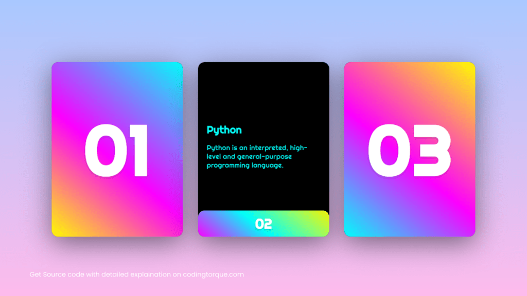
<p class="python">Python is an interpreted, high-level and general-purpose programming language.</p>
</div>
</div>
<div class="face face2">
<h2>02</h2>
</div>
</div>
<div class="card">
<div class="face face1">
<div class="content">
<span class="stars"></span>
<h2 class="cSharp">C#</h2>
<p class="cSharp">C# is a general-purpose, multi-paradigm programming language encompassing static typing, strong typing, lexically scoped and component-oriented programming disciplines.</p>
</div>
</div>
<div class="face face2">
<h2>03</h2>
</div>
</div>
</div>CSS (SCSS) Code
Create a file style.css and paste the code below.
@import url("https://fonts.googleapis.com/css2?family=Righteous&display=swap");

body {
  margin: 0;
  padding: 0;
  display: flex;
  justify-content: center;
  align-items: center;
  font-family: "Righteous", cursive;
  min-height: 100vh;
  background-color: #a9c9ff;
  background-image: linear-gradient(180deg, #a9c9ff 0%, #ffbbec 100%);

  .container {
    max-width: 100vw;
    display: grid;
    grid-template-columns: repeat(auto-fit, minmax(300px, 1fr));
    grid-gap: 35px;
    margin: 0 auto;
    padding: 40px 0;

    .card {
      position: relative;
      width: 300px;
      height: 400px;
      margin: 0 auto;
      background: #000;
      border-radius: 15px;
      box-shadow: 0 15px 60px rgba(0, 0, 0, 0.5);

      .face {
        position: absolute;
        bottom: 0;
        left: 0;
        width: 100%;
        height: 100%;
        display: flex;
        justify-content: center;
        align-items: center;

        &.face1 {
          box-sizing: border-box;
          padding: 20px;

          h2 {
            margin: 0;
            padding: 0;
          }

          .java {
            background-color: #fffc00;
            -webkit-background-clip: text;
            -webkit-text-fill-color: transparent;
          }

          .python {
            background-color: #00fffc;
            -webkit-background-clip: text;
            -webkit-text-fill-color: transparent;
          }

          .cSharp {
            background-color: #fc00ff;
            -webkit-background-clip: text;
            -webkit-text-fill-color: transparent;
          }
        }

        &.face2 {
          transition: 0.5s;

          h2 {
            margin: 0;
            padding: 0;
            font-size: 10em;
            color: #fff;
            transition: 0.5s;
            text-shadow: 0 2px 5px rgba(0, 0, 0, 0.2);
            z-index: 10;
          }
        }
      }
    }

    .card:hover .face.face2 {
      height: 60px;

      h2 {
        font-size: 2em;
      }
    }

    .card:nth-child(1) .face.face2 {
      background-image: linear-gradient(
        40deg,
        #fffc00 0%,
        #fc00ff 45%,
        #00fffc 100%
      );
      border-radius: 15px;
    }

    .card:nth-child(2) .face.face2 {
      background-image: linear-gradient(
        40deg,
        #fc00ff 0%,
        #00fffc 45%,
        #fffc00 100%
      );
      border-radius: 15px;
    }

    .card:nth-child(3) .face.face2 {
      background-image: linear-gradient(
        40deg,
        #00fffc 0%,
        #fc00ff 45%,
        #fffc00 100%
      );
      border-radius: 15px;
    }
  }
}
Output Till Now
Written by: Piyush Patil
Code Credits: @DivineBlow
If you found any mistakes or have any doubts please feel free to Contact Us
Hope you find this post helpful💖


