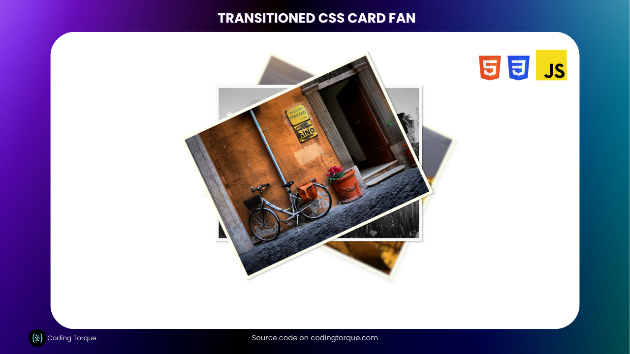
Greetings, fellow coders! Are you ready to add some visual flair to your website using HTML and CSS? In this blog post, we’ll be walking through the process of creating a stunning Transitioned CSS Cards Fan using only these two languages. With this technique, you can transform a simple set of cards into an eye-catching and interactive design element that will captivate your website visitors. Whether you’re a beginner or an experienced developer, this project is an excellent way to improve your CSS skills and impress your audience with a polished web design. So, let’s roll up our sleeves and get started!
Before we start here are some more projects you might like to create –
- Gallery hover effect using HTML and CSS
- Text with hover effect using pure css
- Team Profile with hover effect using HTML and CSS
- Cards with hover effect using HTML and CSS
- Ying & Yang Cats with hover effect using HTML and CSS
I would recommend you don’t just copy and paste the code, just look at the code and type by understanding it.
HTML Code
Starter Template
<!doctype html>
<html lang="en">

<head>
    <!-- Required meta tags -->
    <meta charset="utf-8">
    <meta name="viewport" content="width=device-width, initial-scale=1">

    <!-- CSS -->
    <link rel="stylesheet" href="style.css">

    <title>Transitioned CSS Card Fan using HTML & CSS - Coding Torque</title>
</head>

<body>
   <!-- Further code here -->
</body>

</html>
Paste the below code in your <body> tag.
<div class="cardfan">
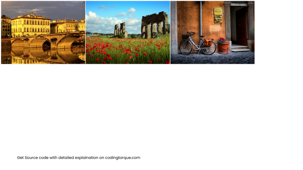
<img src="//s3-us-west-2.amazonaws.com/s.cdpn.io/4273/florence.jpg" alt="Photograph of Florence, Italy"
id="roma">
<img src="//s3-us-west-2.amazonaws.com/s.cdpn.io/4273/roma.jpg" alt="Photograph of an ancient aqueduct, Italy"
id="aqueduct">
<img src="//s3-us-west-2.amazonaws.com/s.cdpn.io/4273/bike.jpg" alt="Photograph of a bike on a Roman Street"
id="bike">
</div>
<svg version="1.1" xmlns="http://www.w3.org/2000/svg">
<filter id="blur">
<feGaussianBlur stdDeviation="3" />
</filter>
</svg>
<svg version="1.1" xmlns="http://www.w3.org/2000/svg">
<filter id="greyscale">
<feColorMatrix type="matrix" values="0.3333 0.3333 0.3333 0 0
0.3333 0.3333 0.3333 0 0
0.3333 0.3333 0.3333 0 0
0 0 0 1 0" />
</filter>
</svg>
<svg version="1.1" xmlns="http://www.w3.org/2000/svg">
<filter id="sepia">
<feColorMatrix values="0.14 0.45 0.05 0 0
0.12 0.39 0.04 0 0
0.08 0.28 0.03 0 0
0 0 0 1 0" />
</filter>
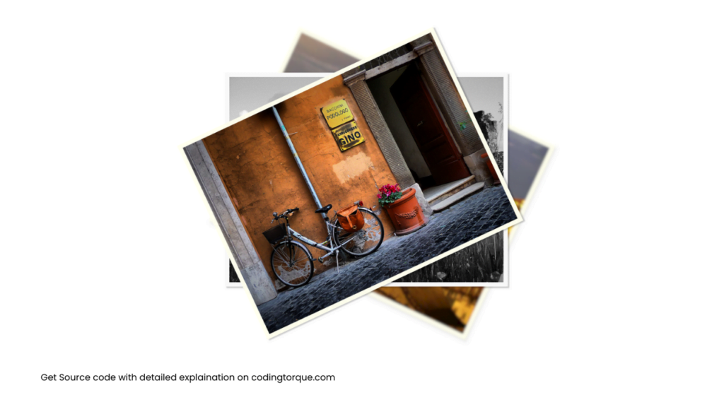
</svg>Output Till Now
CSS Code
Create a file style.css and paste the code below.
body {
  padding-top: 10rem;
}
div.cardfan {
  width: 33%;
  margin: 2rem auto;
  position: relative;
}
div.cardfan img {
  position: absolute;
  width: 100%;
  height: auto;
  border: 12px solid #ffe;
  box-shadow: 4px 4px 3px rgba(0, 0, 0, 0.2);
  transform-origin: center 400px;
  transition: all 1s linear;
}
div.cardfan img:first-child {
  transform: rotate(5deg);
}
div.cardfan img:last-child {
  transform: rotate(-5deg);
}
div.cardfan:hover img:first-child {
  transform: rotate(25deg);
}
div.cardfan:hover img:last-child {
  transform: rotate(-25deg);
}

img#aqueduct {
  -webkit-filter: grayscale(100%);
  filter: grayscale(100%);
  filter: url(#greyscale);
  filter: gray;
}
img#aqueduct:hover {
  -webkit-filter: grayscale(0);
  filter: grayscale(0);
  filter: none;
}
img#bike {
  -webkit-filter: sepia(100%);
  filter: sepia(100%);
  filter: url(#sepia);
  background-color: #5e2612;
  filter: alpha(opacity = 50);
}
img#bike:hover {
  -webkit-filter: sepia(0);
  filter: sepia(0);
  filter: alpha(opacity = 100);
  filter: none;
}
img#roma {
  -webkit-filter: blur(3px);
  filter: blur(3px);
  filter: url(#blur);
}
img#roma:hover {
  -webkit-filter: blur(0px);
  filter: blur(0px);
  filter: none;
}
Output Till Now
Written by: Piyush Patil
Code Credits: @dudleystorey
If you found any mistakes or have any doubts please feel free to Contact Us
Hope you find this post helpful💖f


