
Welcome, fellow coders! Are you ready to take your HTML and CSS skills to the next level and create a stunning, responsive credit card design that sparkles and shines? In this tutorial, we’ll walk you through the steps to create a Glittery Credit Card that will make any website or project stand out. Whether you’re a seasoned developer or just starting out, this project is a fun and exciting way to practice your front-end web development skills. So grab your favorite code editor and let’s get started on this dazzling design!
Before we start here are some more articles you might like to read-
- Gallery hover effect using HTML and CSS
- Text with hover effect using pure css
- Team Profile with hover effect using HTML and CSS
- Cards with hover effect using HTML and CSS
- Ying & Yang Cats with hover effect using HTML and CSS
I would recommend you don’t just copy and paste the code, just look at the code and type by understanding it.
HTML Code
Starter Template
<!doctype html>
<html lang="en">

<head>
    <!-- Required meta tags -->
    <meta charset="utf-8">
    <meta name="viewport" content="width=device-width, initial-scale=1">

    <!-- Font Awesome CDN  -->
    <link rel="stylesheet" href="https://cdnjs.cloudflare.com/ajax/libs/font-awesome/5.14.0/css/all.min.css"
        integrity="sha512-1PKOgIY59xJ8Co8+NE6FZ+LOAZKjy+KY8iq0G4B3CyeY6wYHN3yt9PW0XpSriVlkMXe40PTKnXrLnZ9+fkDaog=="
        crossorigin="anonymous" />

    <!-- CSS -->
    <link rel="stylesheet" href="style.css">

    <title>Responsive Glittery Credit Card using HTML and CSS - Coding Torque</title>
</head>

<body>
    <!-- Further code here -->

    <script src="script.js"></script>
</body>

</html>
Paste the below code in your <body> tag.
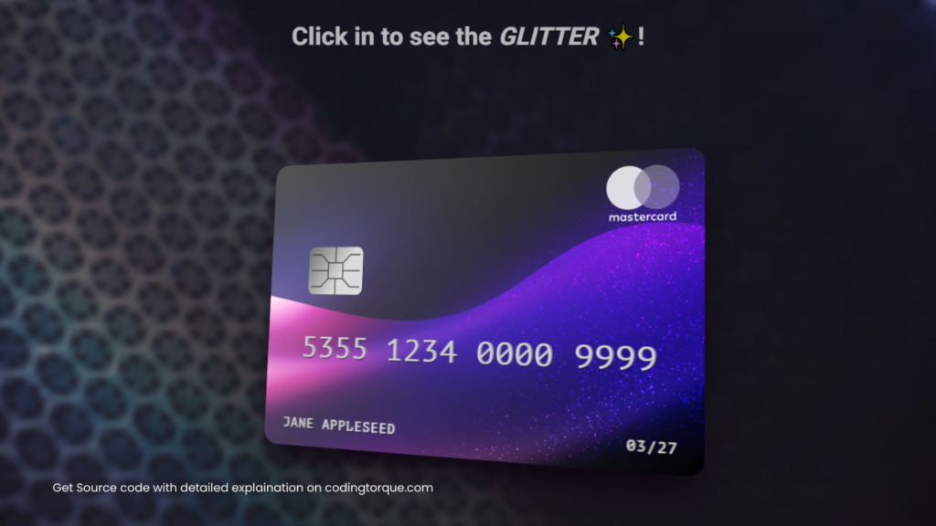
<main id=app>

  <h1>Click in to see the <em>GLITTER</em> ✨!</h1>

  <aside class="card-front">
    <label class="number" for="cardNumber">
      5355 1234 0000 9999
    </label>
    <label class="name" for="cardHolder">
      Jane Appleseed
    </label>
    <label class="expiry" for="expiryMonth" >
      03/27
    </label>
    <img class="cardLogo" data-v-5d206127="" data-v-8fcb32d4="" style="opacity: 1;" src="https://simey-credit-card.netlify.app/img/logos/master.svg">


    <div class="chip">
      <svg role="img" viewBox="0 0 100 100" aria-label="Chip">
        <use href="#chip-lines" />
      </svg>
    </div>
    <svg class="contactless" role="img" viewBox="0 0 24 24" aria-label="Contactless">
      <use href="#contactless">
    </svg>

  </aside>

</main>


<svg id="chip">
  <g id="chip-lines">
    <polyline points="0,50 35,50"></polyline>
    <polyline points="0,20 20,20 35,35"></polyline>
    <polyline points="50,0 50,35"></polyline>
    <polyline points="65,35 80,20 100,20"></polyline>
    <polyline points="100,50 65,50"></polyline>
    <polyline points="35,35 65,35 65,65 35,65 35,35"></polyline>
    <polyline points="0,80 20,80 35,65"></polyline>
    <polyline points="50,100 50,65"></polyline>
    <polyline points="65,65 80,80 100,80"></polyline>
  </g>
</svg>


<svg id="contactless">
   <path stroke="none" d="M0 0h24v24H0z" fill="none"></path>
   <path d="M9.172 15.172a4 4 0 0 1 5.656 0"></path>
   <path d="M6.343 12.343a8 8 0 0 1 11.314 0"></path>
   <path d="M3.515 9.515c4.686 -4.687 12.284 -4.687 17 0"></path>
</svg>
Output Till Now
CSS Code
Create a file style.css and paste the code below.
:root {

  --glitter: url("https://assets.codepen.io/13471/silver-glitter-background.png");
  --duration: 6.66s;

}

.card-front:before {

  content: "";
  inset: 0;
  position: absolute;
  transform: translate3d(0, 0, 0.01px);

  background-image: var(--glitter), var(--glitter),
    linear-gradient(120deg, black 25%, white, black 75%);
  background-size: 100% 100%, 80% 80%, 200% 200%;
  background-blend-mode: multiply, multiply, overlay;
  background-position: 50% 50%, 50% 50%, 50% 50%;

  mix-blend-mode: color-dodge;
  filter: brightness(2) contrast(0.8);

  animation: bg var(--duration) ease infinite;

}

.card-front {

  display: grid;
  position: relative;
  transform: translate3d(0, 0, 0.01px);
  width: 90vw;
  max-width: 580px;
  aspect-ratio: 3/2;

  border-radius: 3.5% 3.5% 3.5% 3.5% / 5% 5% 5% 5%;

  background-image: url(https://simey-credit-card.netlify.app/img/bgs/default.jpg);
  background-size: cover;

  box-shadow: 0 30px 40px -25px rgba(15, 5, 20, 1), 0 20px 50px -15px rgba(15, 5, 20, 1);
  overflow: hidden;
  animation: tilt var(--duration) ease infinite;
  image-rendering: optimizequality;

}

.card-front:after {

  content: "";
  background: none, none, linear-gradient(125deg, rgba(255,255,255,0) 0%, rgba(255,255,255,.4) 0.1%, rgba(255,255,255,0) 60%);
  background-size: 200% 200%;
  mix-blend-mode: hard-light;
  animation: bg var(--duration) ease infinite;

}

.card-front * {

  font-family: PT Mono, monospace;

}

.cardLogo,
.expiry,
.name,
.number,
.chip,
.icon {

  color: #ccc;
  position: absolute;
  margin: 0;
  padding: 0;
  letter-spacing: 0.075em;
  text-transform: uppercase;
  font-size: clamp(0.75rem, 2.8vw + 0.2rem, 1.1rem);
  inset: 5%;
  text-shadow: -1px -1px 0px rgba(255,255,255,0.5),1px -1px 0px rgba(255,255,255,0.5),1px 1px 0px rgba(0,0,0,0.5),1px -1px 0px rgba(0,0,0,0.5);
  z-index: 5;

}

.name, .number, .expiry {
  background-image: linear-gradient(to bottom, #ededed 20%, #bababa 70%), none,
    linear-gradient(120deg, transparent 10%, white 40%, white 60%, transparent 90%);
  background-size: cover, cover, 200%;
  background-position: 50% 50%;
  background-blend-mode: overlay;
  -webkit-text-fill-color: transparent;
  -webkit-background-clip: text;
  animation: bg var(--duration) ease infinite;

}

.number {
  font-family: PT Mono, monospace;
  text-align: center;
  font-size: clamp(1rem, 8vw - 0.5rem, 2.5rem);
  letter-spacing: 0.025em;
  top: 60%;
  bottom: auto;
}
.expiry,
.name {

  top: auto;

}

.name {
  right: auto;
  max-width: 180px;
  line-height: 1.2;
  text-align: left;
}

.expiry {

  left: auto;

}

.cardLogo {

  bottom: auto;
  left: auto;
  width: 15%;
  filter: invert(1) saturate(0) brightness(1) contrast(1.2);
  mix-blend-mode: screen;

}

.chip {

  display: grid;
  place-items: center;
  width: 14%;
  aspect-ratio: 5/4;
  left: 10%;
  top: 30%;
  border-radius: 10% 10% 10% 10% / 15% 15% 15% 15%;

  background-image: none, none,
    linear-gradient(120deg, #777 10%, #ddd 40%, #ddd 60%, #777 90%);
  background-size: 200% 200%;
  background-position: 50% 50%;

  overflow: hidden;
  animation: bg var(--duration) ease infinite;

}

.chip svg {

  display: block;
  width: 90%;
  fill: none;
  stroke: #444;
  stroke-width: 2;

}

.contactless {

  position: absolute;
  left: 23%;
  top: 30%;
  width: 12%;
  rotate: 90deg;

  stroke-width: 1.25;
  stroke: currentColor;
  fill: none;
  stroke-linecap: round;
  stroke-linejoin: round;
  opacity: 0.5;

}

.icon {

  width: 25%;
  bottom: auto;
  right: auto;
  top: 0;
  left: 15px;
  filter: invert(1) hue-rotate(180deg) saturate(5) contrast(2);

}

@keyframes tilt {

  0%, 100% { transform: translate3d(0, 0, 0.01px) rotateY(-20deg) rotateX(5deg); }
  50% { transform: translate3d(0, 0, 0.01px) rotateY(20deg) rotateX(5deg); }

}

@keyframes bg {

  0%, 100% { background-position: 50% 50%, calc(50% + 1px) calc(50% + 1px), 0% 50%; }
  50% { background-position: 50% 50%, calc(50% - 1px) calc(50% - 1px), 100% 50%; }

}


main {

  display: grid;
  grid-template-rows: minmax(20px,100px) 1fr;
  place-items: center;
  min-height: 100%;
  perspective: 1000px;

}

body {

  color: white;
  background: #333844;
  font-family: "Heebo", sans-serif;
  background: url(https://images.pexels.com/photos/3612932/pexels-photo-3612932.jpeg?auto=compress&cs=tinysrgb&w=1260&h=750&dpr=1);
  background-size: cover;
  background-position: center;
  background-repeat: no-repeat;
  backdrop-filter: blur(5px);

}

body,
html {

  height: 100%;
  padding: 0;
  margin: 0;

}

#chip,
#contactless {

  display: none;

}

h1 {
  margin: 1em;
  color: white;
  opacity: 0.7;
  text-shadow: 0 1px 1px black;
}
Output Till Now
Written by: Piyush Patil
Code Credits: @simeydotme
If you found any mistakes or have any doubts please feel free to Contact Us
Hope you find this post helpful💖


