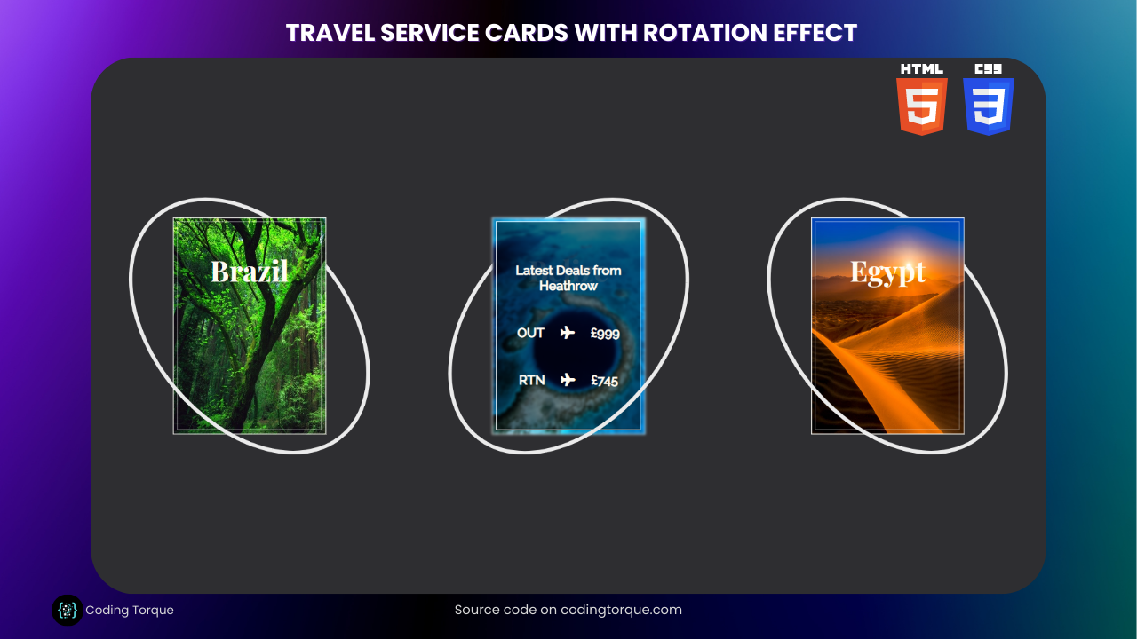
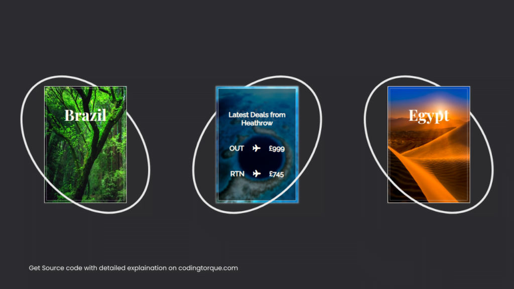
Welcome, fellow coders! Are you ready to take your front-end development skills to the next level? In this tutorial, we’ll show you how to create visually stunning Travel Service Cards using HTML and CSS. But that’s not all – we’ll also add a rotation effect that will take your design to new heights. By the end of this tutorial, you’ll have a powerful tool in your web development arsenal and the know-how to apply this effect to your own projects. So, let’s dive in and get started!
Before we start here are some more articles you might like to read-
- Gallery hover effect using HTML and CSS
- Text with hover effect using pure css
- Team Profile with hover effect using HTML and CSS
- Cards with hover effect using HTML and CSS
- Ying & Yang Cats with hover effect using HTML and CSS
I would recommend you don’t just copy and paste the code, just look at the code and type by understanding it.
HTML Code
Starter Template
<!doctype html>
<html lang="en">

<head>
    <!-- Required meta tags -->
    <meta charset="utf-8">
    <meta name="viewport" content="width=device-width, initial-scale=1">

    <!-- Font Awesome CDN  -->
    <link rel="stylesheet" href="https://cdnjs.cloudflare.com/ajax/libs/font-awesome/5.14.0/css/all.min.css"
        integrity="sha512-1PKOgIY59xJ8Co8+NE6FZ+LOAZKjy+KY8iq0G4B3CyeY6wYHN3yt9PW0XpSriVlkMXe40PTKnXrLnZ9+fkDaog=="
        crossorigin="anonymous" />

    <!-- CSS -->
    <link rel="stylesheet" href="style.css">

    <title>Travel Service Cards with Rotation Effect using HTML & CSS - Coding Torque</title>
</head>

<body>
    <!-- Further code here -->

    <script src="script.js"></script>
</body>

</html>
Paste the below code in your <body> tag.
<div class="container">
  <div class="panel">
    <div class="ring">
      <div class="card card1"></div>
      <div class="border">
        <p class="title">Brazil</p>
        <div class="slide">
          <h6 class="para">Latest Deals from Heathrow</h6>
          <div class="line">
            <h6 class="para">OUT</h6> <i class="fa fa-plane" aria-hidden="true"></i>
            <h6 class="para">£849</h6>
          </div>
          <div class="line">
            <h6 class="para">RTN</h6> <i class="fa fa-plane" aria-hidden="true"></i>
            <h6 class="para">£659</h6>
          </div>
        </div>
      </div>
    </div>
  </div>
  <div class="panel">
    <div class="ring">
      <div class="card card2"></div>
      <div class="border">
        <p class="title">Belize</p>
        <div class="slide">
          <h6 class="para">Latest Deals from Heathrow</h6>
          <div class="line">
            <h6 class="para">OUT</h6> <i class="fa fa-plane" aria-hidden="true"></i>
            <h6 class="para">£999</h6>
          </div>
          <div class="line">
            <h6 class="para">RTN</h6> <i class="fa fa-plane" aria-hidden="true"></i>
            <h6 class="para">£745</h6>
          </div>
        </div>
      </div>
    </div>
  </div>
  <div class="panel">
    <div class="ring">
      <div class="card card3"></div>
      <div class="border">
        <p class="title">Egypt</p>
        <div class="slide">
          <h6 class="para">Latest Deals from Heathrow</h6>
          <div class="line">
            <h6 class="para">OUT</h6> <i class="fa fa-plane" aria-hidden="true"></i>
            <h6 class="para">£399</h6>

          </div>
          <div class="line">
            <h6 class="para">RTN</h6> <i class="fa fa-plane" aria-hidden="true"></i>
            <h6 class="para">£257</h6>
          </div>
        </div>
      </div>
    </div>
  </div>
</div>
CSS Code
Create a file style.css and paste the code below.
body {
  margin: 0;
  background-color: #2e2e31;
  display: flex;
  align-items: center;
  height: 100vh;
  width: 100vw;
}

.container {
  height: 100vh;
  width: 100vw;
  max-height: 600px;
  max-width: 1200px;
  min-height: 600px;
  min-width: 1100px;
  display: flex;
  justify-content: space-around;
  align-items: center;
  margin: 0 auto;
}

.panel {
  height: 270px;
  width: 190px;
  position: relative;

  &:hover {
    .card {
      filter: blur(1.5px);
    }
    .card1 {
      background-size: 215% 135%;
    }
    .card2 {
      background-size: 115% 115%;
    }
    .card3 {
      background-size: 155% 115%;
    }
    .title {
      color: rgba(255, 255, 255, 0.2);
    }
    .border {
      border: 1px solid rgba(255, 255, 255, 1);
    }
    .slide {
      bottom: 0px;
    }
    .ring:before,
    .ring:after {
      transform: translateX(-50%) translateY(-50%) rotate(310deg);
    }
  }
}
.ring,
.card,
.border,
.slide,
.line {
  display: flex;
  justify-content: center;
  align-items: center;
}

.ring {
  color: #fffbf1;
  position: absolute;
  top: 50%;
  left: 50%;
  transform: translateX(-50%) translateY(-50%);
  font-size: 170px;
}

.card {
  background: #f0ead6;
  position: relative;
  transition: all 1s;
  height: 270px;
  width: 190px;
  border: 1px solid rgba(255, 255, 255, 1);
}

.card1 {
  background-image: url("https://assets.codepen.io/489403/brazil.jpg");
  background-repeat: no-repeat;
  background-size: 200% 120%;
}

.card2 {
  background-image: url("https://assets.codepen.io/489403/belize.jpg");
  background-repeat: no-repeat;
  background-size: 100% 100%;
}

.card3 {
  background-image: url("https://assets.codepen.io/489403/egypt.jpg");
  background-repeat: no-repeat;
  background-size: 140% 100%;
}

.ring:before,
.ring:after {
  content: "";
  padding: 0.7em 0.4em;
  position: absolute;
  left: 50%;
  width: 115%;
  top: 50%;
  display: block;
  border: 5px solid #50c9c3;
  border-radius: 50%;
  transition: transform 1s;
  transform: translateX(-50%) translateY(-50%) rotate(50deg);
}

.ring:before {
  border-color: rgb(235, 235, 235) rgb(235, 235, 235) rgba(0, 0, 0, 0)
    rgba(0, 0, 0, 0);
  z-index: -1;
}

.ring:after {
  border-color: rgba(0, 0, 0, 0) rgba(0, 0, 0, 0) rgb(235, 235, 235)
    rgb(235, 235, 235);
}

p {
  text-align: center;
  position: absolute;
  font-family: "Playfair Display";
}

.title {
  font-size: 36px;
  font-weight: 700;
  transition: all 1s;
  top: 0;
}

.para {
  bottom: 0;
  font-size: 16px;
  font-family: "Raleway";
  padding: 20px;
  margin: 0;
  text-align: center;
}

.border {
  position: absolute;
  border: 1px solid rgba(255, 255, 255, 0.5);
  height: 260px;
  width: 180px;
  transition: border 1s;
  overflow: hidden;
}

.slide {
  height: 260px;
  width: 180px;
  position: absolute;
  border: 1px solid black;
  bottom: -270px;
  background: rgba(0, 0, 0, 0.5);
  transition: bottom 1s;
  flex-direction: column;
}

.fa-plane {
  font-size: 16px;
}
Output Till Now
Written by: Piyush Patil
Code Credits: @petegarvin1
If you found any mistakes or have any doubts please feel free to Contact Us
Hope you find this post helpful💖


