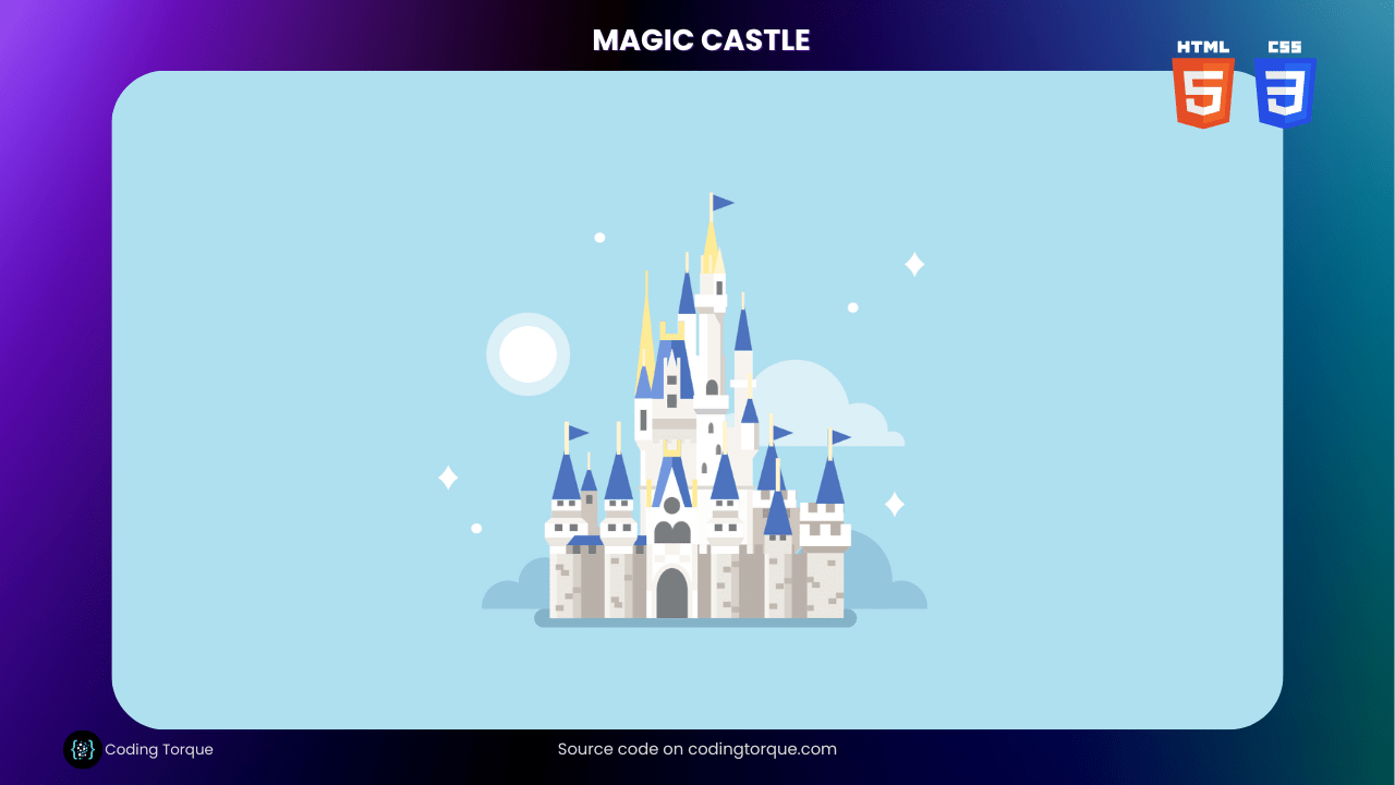
Looking for a fun and creative way to showcase your web development skills? Why not create a “Magic Castle” using only HTML and CSS? In this tutorial, we’ll show you step-by-step how to create a visually stunning and interactive magic castle using these two languages. You’ll learn how to use HTML to create the structure of the castle and style it with CSS to give it a magical and captivating appearance. Plus, you’ll gain valuable experience in using CSS to create dynamic and interactive animations. By the end of this tutorial, you’ll have a functional and visually appealing “Magic Castle” that you can use to showcase your skills and engage your website visitors. So, let’s get started on creating a beautiful and unique “Magic Castle” using HTML and CSS!
Before we start here are 50 projects to create using HTML CSS and JavaScript –
I would recommend you don’t just copy and paste the code, just look at the code and type by understanding it.
Demo

HTML Code
Starter Template
<!doctype html>
<html lang="en">

<head>
    <!-- Required meta tags -->
    <meta charset="utf-8">
    <meta name="viewport" content="width=device-width, initial-scale=1">

    <!-- CSS -->
    <link rel="stylesheet" href="style.css">

    <title>Magic Castle using HTML and CSS - Coding Torque</title>
</head>

<body>
    <!-- Further code here -->
</body>

</html>
Paste the below code in your <body> tag.
<div class="cartoon hb">
    <div class="sky r"></div>
    <div class="cloud cloud-1 ha"></div>
    <div class="cloud cloud-2 ha"></div>
    <div class="shadow"></div>
    <div class="minar-top minar-top-2"></div>
    <div class="minar-top"></div>
    <div class="minar ha"></div>
    <div class="tower tower-5 tower-6 tower-7"></div>

    <div class="house ha"></div>

    <div class="main-roof-behind"></div>
    <div class="main-roof ha"></div>
    <div class="main-top"></div>

    <div class="flag flag-4"></div>
    <div class="main-tower-roof"></div>
    <div class="main-tower"></div>
    <div class="main ha"></div>
    <div class="tower tower-3 tower-3a"></div>
    <div class="wall ha"></div>
    <div class="tower tower-1"></div>
    <div class="tower tower-2"></div>
    <div class="tower tower-3 tower-3b"></div>
    <div class="tower tower-4"></div>
    <div class="tower tower-5 tower-6"></div>
    <div class="tower tower-5"></div>
    <div class="brick"></div>

    <div class="room-1"></div>
    <div class="room-2"></div>
    <div class="room-3 ha"></div>
    <div class="window"></div>
    <div class="window-curved"></div>
    <div class="roof roof-1"></div>
    <div class="roof roof-2"></div>
    <div class="flag flag-1"></div>
    <div class="flag flag-2"></div>
    <div class="flag flag-3"></div>
    <div class="flag-pole-top"></div>
    <div class="flag-pole"></div>
    <div class="house-roof"></div>
    <div class="front-gate ha">
        <div class="gate"></div>
        <div class="balcony ha"></div>
        <div class="triangle ha"></div>
        <div class="front-poles"></div>
    </div>

</div>
CSS Code
Create a file style.css and paste the code below.
.cartoon {
  position: absolute;
  top: 50%;
  left: 50%;
  transform: translate(-50%, -50%);
  width: 90vmin;
  height: 90vmin;
}

.cartoon div {
  position: absolute;
  box-sizing: border-box;
}

.b {
  border: 1vmin solid black;
}

.r {
  border-radius: 100%;
}

.hb::before,
.ha::after {
  content: "";
  display: block;
  position: absolute;
}

/****/
/* https://dribbble.com/shots/2226079-Disney-World-Cinderella-Castle */
html,
body {
  --background: #afe0f0;
  background: var(--background);
}

.cartoon {
  --white: #fff;
  --light: #dcf0f7;
  --blue: #7497de;
  --bluedark: #4d73be;
  width: 90vmin;
  height: 90vmin;
}

.sky {
  color: var(--background);
  width: 9.5%;
  height: 9.5%;
  background: #fff;
  top: 37.25%;
  left: 17%;
  box-shadow: 0 0 0 2vmin #dcf0f7, 10.75vmin -17.5vmin 0 -3.5vmin #fff,
    48.75vmin -7vmin 0 -3.5vmin #fff, -7.75vmin 26.125vmin 0 -3.5vmin #fff,
    -8vmin 15vmin, -8vmin 22vmin, -16vmin 15vmin, -16vmin 22vmin,
    -12vmin 18.5vmin #fff, 59vmin 19vmin, 59vmin 26vmin, 51vmin 19vmin,
    51vmin 26vmin, 55vmin 22.5vmin #fff, 62vmin -17vmin, 62vmin -10vmin,
    54vmin -17vmin, 54vmin -10vmin, 58vmin -13.5vmin #fff;
}

.shadow {
  width: 53.75%;
  height: 3%;
  background: #85b3c7;
  border-radius: 10vmin;
  top: 84.5%;
  left: 22.75%;
}

.cloud {
  width: 80%;
  height: 20%;
  overflow: hidden;
}

.cloud-1 {
  top: 64.5%;
  left: 10%;
}

.cloud-1::after {
  color: #94c6dd;
  border-radius: 50%;
  width: 11%;
  height: 44%;
  background: #94c6dd;
  bottom: -20%;
  left: 5%;
  box-shadow: 5.5vmin -3.5vmin, 5.5vmin 0, 59vmin 0, 50vmin -4vmin 0 3.75vmin;
}

.cloud-2 {
  top: 37.33%;
  left: 50%;
}

.cloud-2::after {
  color: #dcf0f7;
  border-radius: 50%;
  width: 12%;
  height: 48%;
  background: #dcf0f7;
  bottom: -20%;
  left: 2%;
  box-shadow: 9vmin -4.25vmin 0 3.75vmin, 18.5vmin -1.5vmin,
    23.5vmin 0.25vmin 0 -2.5vmin;
}

.wall {
  background: #f008;
  height: 12.25%;
  width: 44%;
  top: 73.75%;
  left: 28.125%;
  background: linear-gradient(to bottom, transparent 12.5%, #bab2aa 0),
    linear-gradient(to right, transparent 50%, #bab2aa 0),
    linear-gradient(to right, #7a7d7f 50%, transparent 0);
  background-size: 6% 100%, 6% 100%, 100% 100%;
  background-position: -3.75vmin 0;
}

.wall::after {
  height: 14%;
  width: 40%;
  background: var(--bluedark);
  top: -13%;
  left: 0;
  clip-path: polygon(0% 100%, 8% 0%, 100% 0%, 100% 100%);
}

.tower {
  height: 19.75%;
  width: 6.25%;
  top: 66.25%;
  clip-path: polygon(
    12% 0%,
    88% 0%,
    88% 9%,
    84% 9%,
    84% 15%,
    100% 20%,
    100% 32%,
    87% 39%,
    87% 100%,
    12% 100%,
    12% 39%,
    0% 32%,
    0% 20%,
    16% 15%,
    16% 9%,
    12% 9%,
    12% 0
  );
  background: linear-gradient(
      to bottom,
      #ffffff 9%,
      #d7d1cb 0 15%,
      #f7f4f0 0 20%,
      #ffffff 0 32%,
      #ebe7e1 0 39%,
      #ffffff 0 45.75%,
      transparent 0
    ),
    linear-gradient(to right, #f7f4f0 27%, #ebe7e1 0 65%, #d7d1cb 0);
}

.tower-1 {
  left: 33.75%;
}

.tower-2 {
  left: 51.5%;
}

.tower-3 {
  width: 7.25%;
  left: 24.5%;
}

.tower-3a {
  clip-path: polygon(
    16% 0%,
    84% 0%,
    84% 9%,
    84% 15%,
    100% 20%,
    100% 32%,
    87% 39%,
    87% 100%,
    12% 100%,
    12% 39%,
    0% 32%,
    0% 20%,
    16% 15%,
    16% 9%,
    16% 0
  );
}

.tower-3b {
  clip-path: polygon(16% 45.75%, 84% 45.75%, 84% 100%, 16% 100%);
}

.tower-4 {
  opacity: 10.5;
  width: 6.66%;
  left: 60.125%;
  clip-path: polygon(16% 29.5%, 84% 30.5%, 84% 100%, 16% 100%);
  background: linear-gradient(to bottom, #ebe7e1 0 45.75%, transparent 0),
    linear-gradient(to right, #f7f4f0 27%, #ebe7e1 0 65%, #d7d1cb 0);
}

.tower-5 {
  left: 67%;
  width: 8.66%;
  clip-path: polygon(
    0% 20.5%,
    100% 20.5%,
    100% 39%,
    85% 45%,
    85% 100%,
    15% 100%,
    15% 45%,
    0% 39%
  );
  background: linear-gradient(
      transparent 30%,
      #ffffff 0 39%,
      #bab2aa 0 45%,
      #ebe7e1 0
    ),
    linear-gradient(to right, white 50%, #bab2aa 0);
  background-size: 100% 100%, 40% 100%;
}

.tower-6 {
  clip-path: polygon(0% 3%, 100% 3%, 100% 40%, 0% 40%);
  background-image: linear-gradient(transparent 13%, #ffffff 0 21%, #bab2aa 0),
    linear-gradient(to right, white 50%, #bab2aa 0);
  transform: scale(0.85);
  left: 66.4%;
  top: 64.8%;
}

.tower-7 {
  top: 62.66%;
  left: 58.5%;
}

.brick {
  color: #c1b9af;
  background: #c1b9af;
  top: 78%;
  left: 27.25%;
  width: 1.35%;
  height: 0.9%;
  box-shadow: -0.8vmin -0.85vmin, -0.8vmin 5.25vmin, 0.6vmin 3.5vmin,
    1.75vmin 2.6vmin, 7.5vmin -1.8vmin, 7.5vmin 4vmin, 8vmin 4.8vmin,
    9.5vmin 0.7vmin, 23.4vmin 1.9vmin, 24.33vmin -0.5vmin, 25.6vmin -1.3vmin,
    24.33vmin 4.75vmin, 25.6vmin 5.5vmin, 31.25vmin -1.75vmin, 31.25vmin 5vmin,
    32.25vmin 2vmin, 33.5vmin 1.2vmin, 36.75vmin 1vmin, 37.66vmin 1.8vmin,
    40vmin -1.5vmin, 40.125vmin 4.25vmin, 41.25vmin 3.4vmin, 36.75vmin 5.25vmin;
}

.window {
  color: #7a7d7f;
  background: #7a7d7f;
  width: 1.25%;
  height: 1.25%;
  top: 70.25%;
  left: 26.2%;
  box-shadow: 2.25vmin 0, 8vmin 0, 10.25vmin 0, 24vmin 0, 26.125vmin 0,
    4.6vmin -4vmin 0 -0.125vmin, 4.6vmin -4.5vmin 0 -0.125vmin,
    12.75vmin -15vmin 0 -0.125vmin, 12.75vmin -15.75vmin 0 -0.125vmin,
    12.75vmin -16.5vmin 0 -0.125vmin, 12.75vmin -17.25vmin 0 -0.125vmin,
    17vmin -22.125vmin 0 0.125vmin, 17vmin -19.33vmin 0 0.125vmin,
    17vmin -18.66vmin 0 0.125vmin,
    /* small right tower windows */ 32.125vmin 1.5vmin 0 -0.125vmin,
    33.66vmin 1.5vmin 0 -0.125vmin,
    /* tower windows */ 0.25vmin -3.66vmin 0 -0.125vmin,
    2vmin -3.66vmin 0 -0.125vmin, 8.125vmin -3.66vmin 0 -0.125vmin,
    9.875vmin -3.66vmin 0 -0.125vmin, 24.125vmin -3.66vmin 0 -0.125vmin,
    25.75vmin -3.66vmin 0 -0.125vmin;
}

.roof {
  color: #4d73be;
  width: 4.75%;
  height: 5%;
  border: 2vmin solid transparent;
  border-top: 8vmin solid transparent;
  border-bottom: 7.5vmin solid #4d73be;
}

.roof-1 {
  top: 49.125%;
  left: 34.5%;
  filter: drop-shadow(-7.8vmin 0) drop-shadow(23.8vmin 0);
  clip-path: polygon(-400% 0%, 500% 0%, 500% 100%, -400% 100%);
}

.roof-2 {
  top: 49.75%;
  left: 69.75%;
  filter: drop-shadow(-7.8vmin 4.75vmin) drop-shadow(-8.75vmin -2vmin);
  clip-path: polygon(-220% 0%, 100% 0%, 100% 200%, -220% 200%);
}

.flag-pole {
  width: 0.8%;
  height: 5.5%;
  background: #fff5cf;
  color: #fff5cf;
  top: 53.25%;
  left: 27.8%;
  box-shadow: 7.8vmin 0, 23.75vmin 0, 39.55vmin 0.9vmin, 31.7vmin 5.5vmin,
    30.7vmin -1.25vmin, 3.33vmin 4.5vmin 0 -0.125vmin;
}

.flag-pole-top {
  width: 0.5%;
  height: 3%;
  background: #fff5cf;
  color: #fff5cf;
  top: 41%;
  left: 40.8%;
  box-shadow: 6.5vmin -14vmin, 6.5vmin -14.5vmin, 14.9vmin -8.5vmin,
    8.75vmin -14vmin, 10vmin -14vmin;
}

.house-roof {
  left: 30.5%;
  top: 61.25%;
  width: 2.8%;
  height: 3.5%;
  background: #4d73be;
  clip-path: polygon(0% 100%, 40% 0%, 60% 0%, 100% 100%);
}

.house {
  background: #cec6be;
  width: 40%;
  height: 15%;
  left: 30.5%;
  top: 64.75%;
  clip-path: polygon(
    0% 0%,
    7% 0%,
    7% 40%,
    15% 40%,
    50% 100%,
    50% 19%,
    91.5% 19%,
    91.5% 64%,
    90% 68%,
    80% 100%,
    0% 100%
  );
}

.house::after {
  width: 11.5%;
  height: 10%;
  background: #a89f95;
  top: 20%;
  left: 76%;
}

.minar-top {
  width: 3%;
  height: 8%;
  background: #4d73be;
  top: 33.5%;
  left: 56.125%;
  clip-path: polygon(0% 100%, 45% 0%, 55% 0%, 100% 100%);
}

.minar-top-2 {
  top: 27.5%;
  left: 46.75%;
}

.minar {
  background: #ffffff;
  width: 3%;
  height: 25%;
  left: 46.75%;
  top: 35.25%;
  box-shadow: 1vmin 8vmin 0 1.75vmin #ffffff, 8.5vmin 5.5vmin #f7f4f0,
    6.5vmin 17vmin #f7f4f0;
}

.minar::after {
  width: 145%;
  height: 1.125vmin;
  left: 290%;
  top: 44%;
  background: #fff;
}

.main-roof-behind {
  top: 28%;
  left: 39.5%;
  background: #ffeb97;
  width: 4%;
  height: 21%;
  clip-path: polygon(0% 100%, 45% 20%, 45% 0%, 55% 0%, 55% 20%, 100% 100%);
}

.main-tower-roof {
  width: 3.75%;
  height: 14%;
  background: #f006;
  top: 15%;
  left: 50.4%;
  clip-path: polygon(0% 100%, 42% 35%, 42% 0%, 58% 0%, 58% 35%, 100% 100%);
  background: linear-gradient(#fff5cf 35%, #ffeb97 0);
}

.main-roof {
  width: 11.5%;
  height: 13%;
  background: #f007;
  left: 39.5%;
  top: 36.5%;
  clip-path: polygon(
    0% 100%,
    13.5% 48%,
    24% 90%,
    37% 24%,
    37% 0%,
    45% 0%,
    45% 16%,
    64% 16%,
    64% 0%,
    72% 0%,
    72% 24%,
    88% 100%
  );
  background: linear-gradient(#ffea97 24%, transparent 0),
    linear-gradient(to right, #7497dd 54%, #4d72bd 0);
}

.main-top {
  width: 10.5%;
  height: 26%;
  left: 40.5%;
  top: 41%;
  background: transparent;
  clip-path: polygon(
    50% 0%,
    58% 13%,
    58% 6%,
    63% 6%,
    63% 32.5%,
    100% 32.5%,
    100% 100%,
    0% 100%,
    0% 32.5%,
    37% 32.5%,
    37% 6%,
    42% 6%,
    42% 13%
  );
  background-image: linear-gradient(
      #f7f4f0 45%,
      #d7d1cb 0 52%,
      #ebe7e1 0 58%,
      transparent 0 61%,
      #f7f4f0 0
    ),
    linear-gradient(to right, #ebe7e1 50%, #f7f4f0 0);
  background-size: 100% 100%, 20% 100%;
  box-shadow: inset 0.75vmin 0 #fff;
}

.main {
  width: 18.75%;
  height: 20%;
  background: #fdfdfc;
  background: linear-gradient(to right, #f7f4f0 5%, #fdfdfc 0 95%, #f7f4f0 0);
  top: 64.5%;
  left: 40.5%;
}

.main::after {
  width: 104%;
  height: 0.5vmin;
  left: -2%;
  top: -0.5vmin;
  background: #dedbd5;
}

.main-tower {
  background: #f005;
  width: 6%;
  height: 50%;
  top: 28.5%;
  left: 49.25%;
  clip-path: polygon(
    80% 0%,
    20% 0%,
    20% 7%,
    5% 7%,
    5% 11%,
    17% 13.5%,
    17% 27.5%,
    10% 27.5%,
    10% 40.5%,
    0% 40.5%,
    0% 45%,
    10% 47%,
    10% 100%,
    90% 100%,
    90% 47%,
    100% 45%,
    100% 40.5%,
    90% 40.5%,
    90% 27.5%,
    83% 27.5%,
    83% 13.5%,
    95% 11%,
    95% 7%,
    80% 7%
  );
  background: linear-gradient(
      #f7f4f0 7%,
      #ffffff 0 11%,
      #d7d1cb 0 13.5%,
      transparent 0 40.5%,
      #ffffff 0 45%,
      #cccccc 0 47%,
      #ffffff 0
    ),
    linear-gradient(
      to right,
      transparent 7%,
      #fff 0 40%,
      #f7f4f0 0 75%,
      #d7d1cb 0
    );
}

.front-gate {
  width: 8.5%;
  height: 18.5%;
  top: 67.5%;
  left: 41.5%;
  background-image: linear-gradient(#fff 33%, transparent 0 75%, #fff 0),
    linear-gradient(to right, #f7f4f0 11%, #fff 0 89%, #f7f4f0 0);
}

.front-gate::after {
  width: 2.5vmin;
  height: 2.5vmin;
  background: #7a7d7f;
  border-radius: 50%;
  transform: translate(-50%, -60%);
  top: 0;
  left: 50%;
}

.gate {
  width: 80%;
  height: 50%;
  bottom: 0;
  left: 10%;
  background: #7a7d7f;
  border-radius: 140% 140% 0 0;
  border: 0.75vmin solid #f7f4f0;
  border-bottom: 0;
}

.balcony {
  width: 36%;
  height: 20%;
  background: #7a7d7f;
  color: #7a7d7f;
  border-radius: 100% 100% 0 0;
  top: 12.5%;
  left: 15%;
  box-shadow: 2.66vmin 0, 1.33vmin 2vmin 0 -0.25vmin #f7f4f0,
    7.25vmin -21.75vmin 0 -0.5vmin;
}

.balcony::after {
  width: 60%;
  height: 30%;
  bottom: -85%;
  background: #f7f4f0;
  box-shadow: 3.75vmin 0 #f7f4f0;
}

.triangle {
  width: 100%;
  height: 61%;
  baackground: #f007;
  top: -61%;
  clip-path: polygon(
    10% 100%,
    33% 25%,
    33% 0%,
    40% 0%,
    40% 15%,
    60% 15%,
    60% 0%,
    67% 0%,
    67% 25%,
    90% 100%
  );
  background: linear-gradient(#ffeb98 25%, transparent 0),
    linear-gradient(to right, #7497de 50%, #4d73be 0);
}

.triangle::after {
  width: 100%;
  height: 100%;
  background: #fff;
  clip-path: polygon(25% 100%, 50% 40%, 75% 100%);
}

.front-poles {
  width: 10%;
  height: 25%;
  background: #ffeb98;
  top: -25%;
  box-shadow: 6.85vmin 0 #ffeb98;
}

.flag {
  width: 4%;
  height: 3%;
  background: #4d73be;
  clip-path: polygon(0% 0%, 100% 50%, 0% 100%);
}

.flag-1 {
  top: 53.6%;
  left: 28%;
}

.flag-2 {
  left: 62%;
  top: 53.6%;
}

.flag-3 {
  left: 71.75%;
  top: 54.33%;
}

.flag-4 {
  top: 15.25%;
  left: 52.25%;
}

.room-1 {
  width: 3%;
  height: 9%;
  background: #f007;
  top: 49%;
  left: 39.5%;
  clip-path: polygon(0% 4%, 100% 4%, 100% 100%, 30% 100%, 0% 80%);
  background: linear-gradient(white 80%, #f6f4ef 0);
}

.room-2 {
  width: 3%;
  height: 15%;
  top: 45%;
  left: 57.25%;
  background: #f007;
  clip-path: polygon(
    0% 56%,
    39% 29%,
    39% 0%,
    62% 0%,
    60% 29%,
    100% 56%,
    100% 86%,
    50% 100%,
    0% 86%
  );
  background: linear-gradient(
      #fff5cf 29%,
      #4d73be 0 56%,
      transparent 0 86%,
      #f6f4ef 0
    ),
    linear-gradient(to right, #fff 72%, #d7d1ca 0);
}

.window-curved {
  width: 0.75%;
  height: 1.75%;
  background: #8a8b8d;
  color: #8a8b8d;
  border-radius: 100% 100% 0 0;
  top: 60%;
  left: 50.75%;
  box-shadow: 2.125vmin -2.75vmin, 1vmin -6vmin;
}

.room-3 {
  width: 2%;
  height: 13%;
  background: #f007;
  top: 24%;
  left: 52.7%;
  clip-path: polygon(0% 35%, 50% 0%, 100% 35%, 100% 85%, 50% 100%, 0% 85%);
  background: linear-gradient(#fff5cf 35%, #fff 0 85%, #d7d1cb 0);
}

.room-3::after {
  width: 50%;
  height: 17%;
  top: 45%;
  left: 25%;
  background: #7a7d7f;
}
Final Output
Written by: Piyush Patil
Code Credits: @alvaromontoro
If you found any mistakes or have any doubts please feel free to Contact Us
Hope you find this post helpful💖


