Greetings, fellow coders and design enthusiasts, as we embark on a thrilling journey into the world of web development at Coding Torque! Prepare to be enthralled as we breathe life into the realm of user interactions with a captivating mission: crafting an awe-inspiring Mail Notification Animation using the dynamic duo of HTML and CSS. Say goodbye to mundane email alerts and hello to a mesmerizing animation that will undoubtedly elevate the user experience to new heights. Whether you’re a seasoned coder seeking to expand your arsenal of skills or a curious beginner eager to dabble in the art of animation, this tutorial is your gateway to infusing your web projects with the magic of interactivity. So, brace yourselves for a whirlwind adventure of creativity and innovation, as we unlock the secrets to crafting an animation that’ll leave your users in awe. Welcome to the captivating world of Mail Notification Animation – where coding prowess meets digital enchantment!
Before we start here are 50 projects to create using HTML CSS and JavaScript –
I would recommend you don’t just copy and paste the code, just look at the code and type by understanding it.
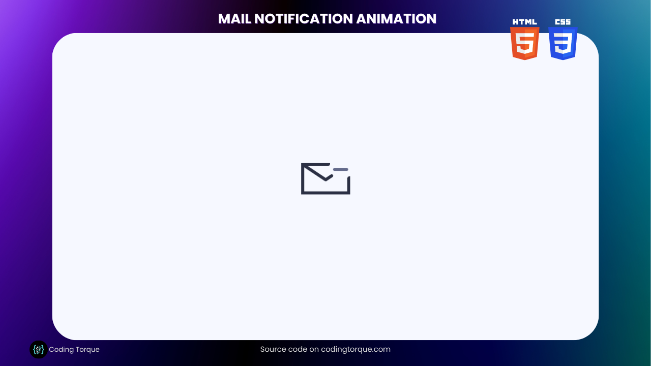
Demo
HTML Code
Starter Template
<!doctype html>
<html lang="en">

<head>
    <!-- Required meta tags -->
    <meta charset="utf-8">
    <meta name="viewport" content="width=device-width, initial-scale=1">

    <!-- CSS -->
    <link rel="stylesheet" href="style.css">

    <title>Mail Notification Animation using HTML and CSS - Coding Torque</title>
</head>

<body>
    <!-- Further code here -->
</body>

</html>
Paste the below code in your <body> tag.
<label class="email-notification">
    <input type="checkbox" />
    <svg viewBox="0 0 64 41">
        <path d="M3 2.5L32 21.5L61 2.5" />
    </svg>
    <div class="bell"></div>
</label>

<!-- dribbble - twitter -->
<a class="dribbble" href="https://dribbble.com/ai" target="_blank"><img src="https://cdn.dribbble.com/assets/dribbble-ball-mark-2bd45f09c2fb58dbbfb44766d5d1d07c5a12972d602ef8b32204d28fa3dda554.svg" alt=""></a>
<a class="twitter" target="_blank" href="https://twitter.com/aaroniker_me"><svg xmlns="http://www.w3.org/2000/svg" width="72" height="72" viewBox="0 0 72 72"><path d="M67.812 16.141a26.246 26.246 0 0 1-7.519 2.06 13.134 13.134 0 0 0 5.756-7.244 26.127 26.127 0 0 1-8.313 3.176A13.075 13.075 0 0 0 48.182 10c-7.229 0-13.092 5.861-13.092 13.093 0 1.026.118 2.021.338 2.981-10.885-.548-20.528-5.757-26.987-13.679a13.048 13.048 0 0 0-1.771 6.581c0 4.542 2.312 8.551 5.824 10.898a13.048 13.048 0 0 1-5.93-1.638c-.002.055-.002.11-.002.162 0 6.345 4.513 11.638 10.504 12.84a13.177 13.177 0 0 1-3.449.457c-.846 0-1.667-.078-2.465-.231 1.667 5.2 6.499 8.986 12.23 9.09a26.276 26.276 0 0 1-16.26 5.606A26.21 26.21 0 0 1 4 55.976a37.036 37.036 0 0 0 20.067 5.882c24.083 0 37.251-19.949 37.251-37.249 0-.566-.014-1.134-.039-1.694a26.597 26.597 0 0 0 6.533-6.774z"></path></svg></a>
CSS Code
Create a file style.css and paste the code below.
.email-notification {
    --border: #2b3044;
    --bell-default: #646b8c;
    --bell-active: #275efe;
    box-shadow: inset 4px -4px 0 0 var(--border);
    position: relative;
    display: table;
    cursor: pointer;
    transition: transform 0.15s;
    transform: scale(var(--scale, 1)) translateZ(0);
}
.email-notification:active {
    --scale: 0.96;
}
.email-notification:before, .email-notification:after {
    content: '';
    position: absolute;
    background: var(--border);
    display: block;
}
.email-notification:before {
    border-radius: 0 0 3px 0;
    left: 0;
    top: 0;
    height: 4px;
    width: 38px;
}
.email-notification:after {
    border-radius: 3px 0 0 0;
    right: 0;
    bottom: 0;
    width: 4px;
    height: 24px;
}
.email-notification input {
    display: none;
}
.email-notification input:checked + svg {
    --svg-animation: tick;
}
.email-notification input:checked + svg + .bell {
    --bell-animation: bell;
    --bell-bottom-animation: bell-bottom;
    --bell-bottom-duration: 0s;
    --bell-bottom-delay: 1.3s;
    --bell-bottom-s: 0.9;
    --bell-top-y: 0px;
    --bell-top-delay: 0.1s;
    --bell-color: var(--bell-active);
}
.email-notification svg {
    display: block;
    width: 64px;
    height: 41px;
    fill: none;
    stroke-linecap: round;
    stroke-linejoin: round;
    stroke-width: 4px;
    stroke-dasharray: 60px;
    stroke-dashoffset: 136px;
    stroke: var(--border);
    animation: var(--svg-animation, none) 0.3s linear;
}
.email-notification .bell {
    position: absolute;
    right: 2px;
    top: 6px;
    height: 4px;
    width: 20px;
    border-radius: 2px;
    background: var(--bell-color, var(--bell-default));
    animation: var(--bell-animation, none) 1.2s linear 0.1s;
    transition: background 0.25s;
}
.email-notification .bell:before, .email-notification .bell:after {
    content: '';
    display: block;
    position: absolute;
}
.email-notification .bell:before {
    left: 2px;
    bottom: 0;
    width: 16px;
    height: 19px;
    border-radius: 8px 8px 0 0;
    box-shadow: inset 0 0 0 4px var(--bell-color, var(--bell-default));
    clip-path: polygon(0 0, 16px 0, 16px calc(19px - var(--bell-top-y, 19px)), 0 calc(19px - var(--bell-top-y, 19px)));
    transform: translateY(var(--bell-top-y, 19px));
    transition: transform 0.1s linear var(--bell-top-delay, 0s), clip-path 0.1s linear var(--bell-top-delay, 0s), box-shadow 0.25s;
}
.email-notification .bell:after {
    bottom: -7px;
    left: 7px;
    width: 6px;
    height: 6px;
    border-radius: 50%;
    background: var(--bell-color, var(--bell-default));
    transform: scale(var(--bell-bottom-s, 0));
    transition: transform var(--bell-bottom-duration, 0.2s) ease var(--bell-bottom-delay, 0s), background 0.25s;
    animation: var(--bell-bottom-animation, none) 1.2s linear 0.2s;
}
@keyframes tick {
    25% {
        stroke-dashoffset: 144px;
   }
    50% {
        stroke-dashoffset: 120px;
   }
    100% {
        stroke-dashoffset: 136px;
   }
}
@keyframes bell {
    8%, 92% {
        transform: translate(6px, -8px) rotate(45deg);
   }
}
@keyframes bell-bottom {
    8%, 100% {
        transform: scale(0.9);
   }
    14%, 26%, 38%, 50%, 62%, 74%, 86% {
        transform: translateX(2px) scale(0.9);
   }
    20%, 32%, 44%, 56%, 68%, 80% {
        transform: translateX(-2px) scale(0.9);
   }
}
html {
    box-sizing: border-box;
    -webkit-font-smoothing: antialiased;
}
* {
    box-sizing: inherit;
}
*:before, *:after {
    box-sizing: inherit;
}
body {
    min-height: 100vh;
    display: flex;
    font-family: 'Inter', Arial;
    justify-content: center;
    align-items: center;
    flex-direction: column;
    background: #f6f8ff;
}
body .dribbble {
    position: fixed;
    display: block;
    right: 20px;
    bottom: 20px;
}
body .dribbble img {
    display: block;
    height: 28px;
}
body .twitter {
    position: fixed;
    display: block;
    right: 64px;
    bottom: 14px;
}
body .twitter svg {
    width: 32px;
    height: 32px;
    fill: #1da1f2;
}
Final Output

Written by: Piyush Patil
Code Credits: @aaroniker
If you found any mistakes or have any doubts please feel free to Contact Us
Hope you find this post helpful💖


