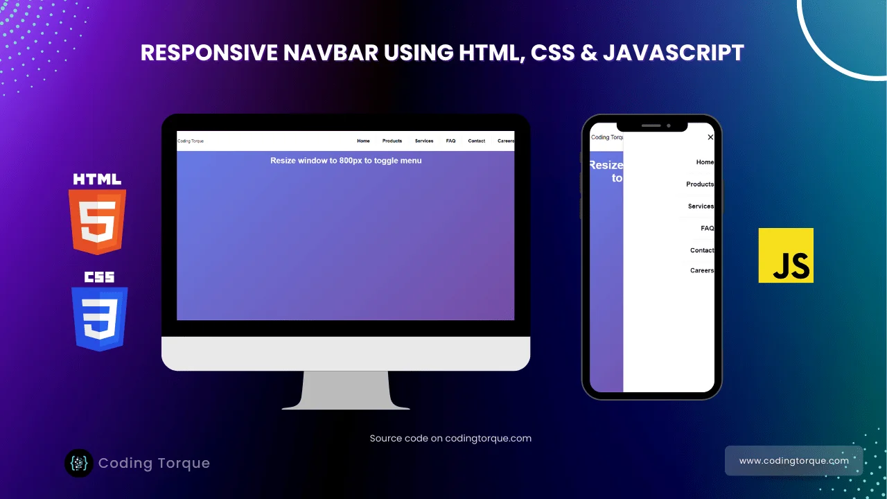
Hello Guys! Welcome to Coding Torque. In this blog, we are going to create a Responsive Navbar using HTML and CSS. You should create this project if you are a beginner and learning JavaScript.
Before we start, here are some JavaScript Games you might like to create:
1. Snake Game using JavaScript
2. 2D Bouncing Ball Game using JavaScript
3. Rock Paper Scissor Game using JavaScript
4. Tic Tac Toe Game using JavaScript
5. Whack a Mole Game using JavaScript
I would recommend you don’t just copy and paste the code, just look at the code and type by understanding it.
HTML Code
Starter Template
<!doctype html>
<html lang="en">

<head>
    <!-- Required meta tags -->
    <meta charset="utf-8">
    <meta name="viewport" content="width=device-width, initial-scale=1">


    <!-- CSS -->
    <link rel="stylesheet" href="style.css">

    <title>Responsive Navbar using HTML and CSS only with Source Code - @code.scientist x @codingtorque
    </title>
</head>

<body>
    <!-- Further Code Here -->
</body>

</html>
Paste the below code in your <body> tag
<header>
<div class="nav-wrapper">
<div class="logo-container">
Coding Torque
</div>
<nav>
<input class="hidden" type="checkbox" id="menuToggle">
<label class="menu-btn" for="menuToggle">
<div class="menu"></div>
<div class="menu"></div>
<div class="menu"></div>
</label>
<div class="nav-container">
<ul class="nav-tabs">
<li class="nav-tab">Home</li>
<li class="nav-tab">Products</li>
<li class="nav-tab">Services</li>
<li class="nav-tab">FAQ</li>
<li class="nav-tab">Contact</li>
<li class="nav-tab">Careers</li>
</ul>
</div>
</nav>
</div>
</header>
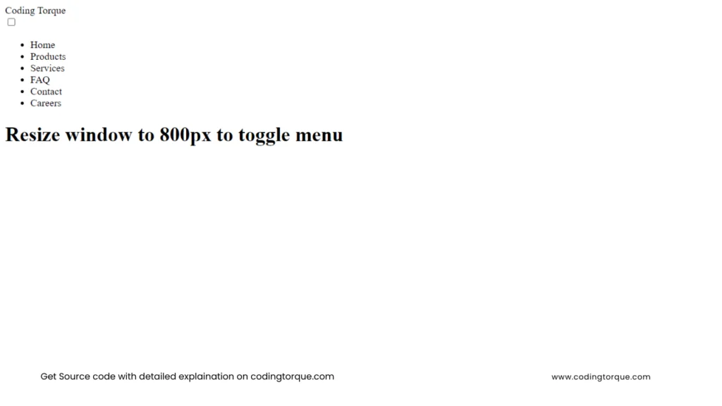
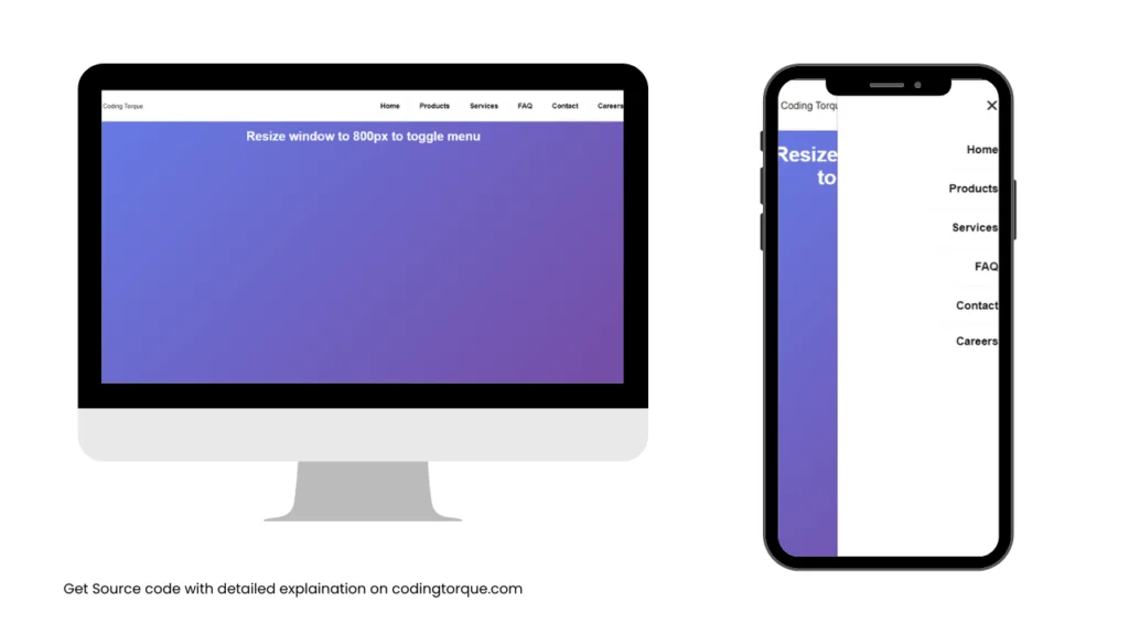
<div class="center">
<h1>Resize window to 800px to toggle menu</h1>
</div>Output Till Now
CSS Code
Create a file style.css and paste the code below.
html,
body {
  margin: 0;
  height: 100vh;
  width: 100vw;
  overflow: hidden;
}

body {
  font-family: "Roboto", sans-serif;
  background-image: linear-gradient(135deg, #667eea 0%, #764ba2 100%);
}

h1 {
  margin: 20px 0;
  color: #fff;
}

.center {
  text-align: center;
}

.nav-wrapper {
  display: flex;
  position: relative;
  flex-direction: row;
  flex-wrap: nowrap;
  align-items: center;
  justify-content: space-between;
  margin: auto;
  width: 90%;
  height: 80px;
  border-radius: 0 0 15px 15px;
  padding: 0 25px;
  z-index: 2;
  background: #fff;
  box-shadow: 0 1px 2px rgba(0, 0, 0, 0.2);
}

.logo-container {
  display: flex;
  justify-content: center;
  align-items: center;
}

.logo {
  height: 60px;
}

.nav-tabs {
  display: flex;
  font-weight: 600;
  font-size: 18px;
  list-style: none;
}

.nav-tab:not(:last-child) {
  padding: 10px 25px;
  margin: 0;
  border-right: 1px solid #eee;
}

.nav-tab:last-child {
  padding: 10px 0 0 25px;
}

.nav-tab,
.menu-btn {
  cursor: pointer;
}

.hidden {
  display: none;
}

@media screen and (max-width: 800px) {
  .nav-container {
    position: fixed;
    display: none;
    overflow-y: auto;
    z-index: -1;
    top: 0;
    right: 0;
    width: 280px;
    height: 100%;
    background: #fff;
    box-shadow: -1px 0 2px rgba(0, 0, 0, 0.2);
  }

  .nav-tabs {
    flex-direction: column;
    align-items: flex-end;
    margin-top: 80px;
    width: 100%;
  }

  .nav-tab:not(:last-child) {
    padding: 20px 25px;
    margin: 0;
    border-right: unset;
    border-bottom: 1px solid #f5f5f5;
  }

  .nav-tab:last-child {
    padding: 15px 25px;
  }

  .menu-btn {
    position: relative;
    display: block;
    margin: 0;
    width: 20px;
    height: 15px;
    cursor: pointer;
    z-index: 2;
    padding: 10px;
    border-radius: 10px;
  }

  .menu-btn .menu {
    display: block;
    width: 100%;
    height: 2px;
    border-radius: 2px;
    background: #111;
  }

  .menu-btn .menu:nth-child(2) {
    margin-top: 4px;
    opacity: 1;
  }

  .menu-btn .menu:nth-child(3) {
    margin-top: 4px;
  }

  #menuToggle:checked + .menu-btn .menu {
    transition: transform 0.2s ease;
  }

  #menuToggle:checked + .menu-btn .menu:nth-child(1) {
    transform: translate3d(0, 6px, 0) rotate(45deg);
  }

  #menuToggle:checked + .menu-btn .menu:nth-child(2) {
    transform: rotate(-45deg) translate3d(-5.71429px, -6px, 0);
    opacity: 0;
  }

  #menuToggle:checked + .menu-btn .menu:nth-child(3) {
    transform: translate3d(0, -6px, 0) rotate(-45deg);
  }

  #menuToggle:checked ~ .nav-container {
    z-index: 1;
    display: flex;
    animation: menu-slide-left 0.3s ease;
  }
  @keyframes menu-slide-left {
    0% {
      transform: translateX(200px);
    }
    to {
      transform: translateX(0);
    }
  }
}
Output Till Now
Written by: Piyush Patil
Code Credits: @rexdesigndk
If you have any doubts or any project ideas feel free to Contact Us
Hope you find this post helpful💖