Welcome to Coding Torque, your ultimate destination for web development wonders! Today, we embark on a journey that will add a touch of elegance and sophistication to your web projects as we unveil the art of crafting mesmerizing Rounded Edges Sliding Panels using the dynamic duo of HTML and CSS. Imagine sleek, modern panels that gracefully slide into view, offering a seamless and captivating user experience. Whether you’re a coding enthusiast eager to elevate your skills or a design aficionado craving to infuse your websites with a touch of innovation, this tutorial is your ticket to unlock the secrets behind creating polished and user-friendly sliding panels that effortlessly blend form and function. Prepare to witness your designs transcend into a realm of brilliance, captivating your visitors and leaving a lasting impression. So, get ready to embrace the power of HTML and CSS, as we slide into the realm of Rounded Edges Sliding Panels, where creativity knows no bounds!
Before we start here are 50 projects to create using HTML CSS and JavaScript –
I would recommend you don’t just copy and paste the code, just look at the code and type by understanding it.
Demo
HTML Code
Starter Template
<!doctype html>
<html lang="en">

<head>
    <!-- Required meta tags -->
    <meta charset="utf-8">
    <meta name="viewport" content="width=device-width, initial-scale=1">

    <!-- CSS -->
    <link rel="stylesheet" href="style.css">

    <title>Rounded Edges Sliding Panels using HTML and CSS - Coding Torque</title>
</head>

<body>
    <!-- Further code here -->
</body>

</html>
Paste the below code in your <body> tag.
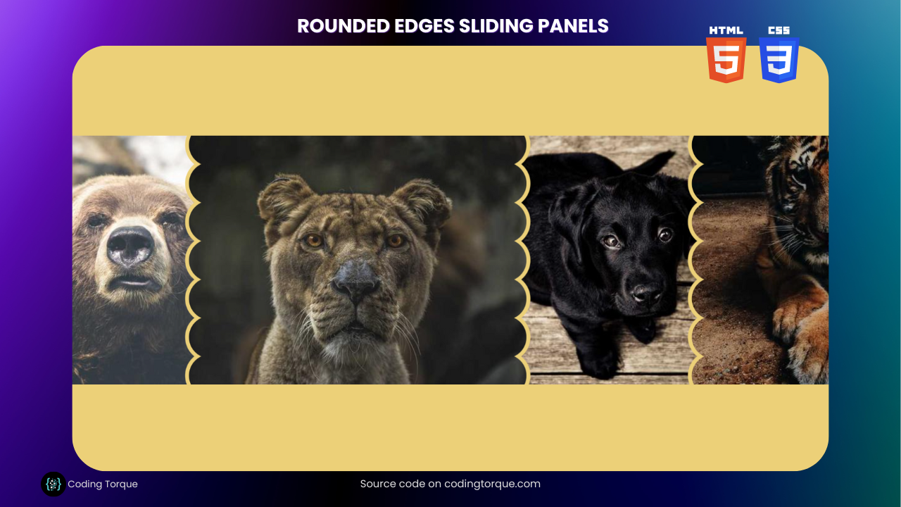
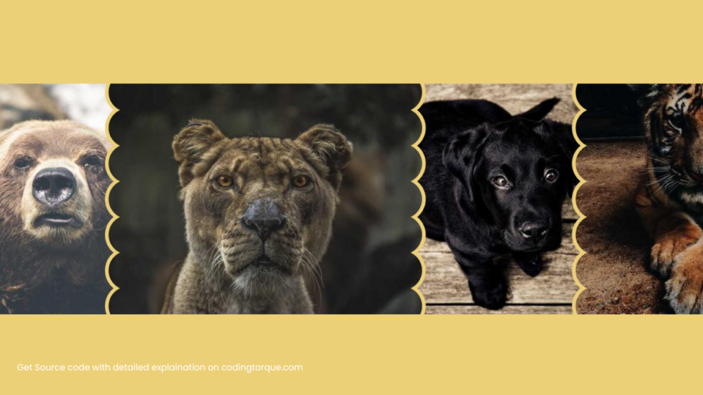
<div class="gallery">
    <img src="https://picsum.photos/id/433/600/400" alt="A Bear">
    <img src="https://picsum.photos/id/1074/600/400" alt="A lioness">
    <img src="https://picsum.photos/id/237/600/400" alt="A Dog">
    <img src="https://picsum.photos/id/593/600/400" alt="A Tiger">
</div>
CSS Code
Create a file style.css and paste the code below.
.gallery {
  --s: 30px; /* control the zig-zag size */
  --g: 5px; /* control the gap */

  display: grid;
  height: 350px;
  grid-auto-flow: column;
  place-items: center;
}
.gallery > img {
  width: 0;
  min-width: calc(100% + var(--s));
  height: 0;
  min-height: 100%;
  object-fit: cover;
  --mask:
  linear-gradient(-90deg,#0000 calc(2*var(--s)),#000 0) var(--s),
  radial-gradient(var(--s),#000 98%,#0000) 50%/calc(2*var(--s)) calc(1.8*var(--s)) space repeat;
-webkit-mask: var(--mask);
        mask: var(--mask);
  cursor: pointer;
  transition: .5s;
}
.gallery > img:nth-child(odd) {
  --mask:
  radial-gradient(calc(var(--s) + var(--g)) at calc(var(--s) + var(--g)) 50%,#0000 98% ,#000 ) calc(-1*(var(--s) + var(--g)))/ 100% calc(1.8*var(--s));
}
.gallery > img:hover {
  width: 15vw;
}
.gallery > img:first-child {
  min-width: calc(100% + var(--s)/2);
  place-self: start;
  --mask:
  radial-gradient(calc(var(--s) + var(--g)) at right,#0000 98%,#000) 50%/ 100% calc(1.8*var(--s));
}
.gallery > img:last-child {
  min-width: calc(100% + var(--s)/2);
  place-self: end;
}
.gallery > img:last-child:nth-child(odd) {
  --mask:
  radial-gradient(calc(var(--s) + var(--g)) at left,#0000 98%,#000) 50%/ 100% calc(1.8*var(--s));
}
.gallery > img:last-child:nth-child(even) {
  --mask:
  linear-gradient(to right,#0000 var(--s),#000 0),
  radial-gradient(var(--s),#000 98%,#0000) left/calc(2*var(--s)) calc(1.8*var(--s)) repeat-y;
}

body {
  margin: 0;
  min-height: 100vh;
  display: grid;
  align-content: center;
  background: #ECD078;
}
Final Output
Written by: Piyush Patil
Code Credits: t_afif
If you found any mistakes or have any doubts please feel free to Contact Us
Hope you find this post helpful💖


