
Before we start, here are some cards you might like to create:
- Filter Cards using JavaScript
- Animated Product Card using JavaScript
- Profile Cards Hover Effect using HTML & CSS
I would recommend you don’t just copy and paste the code, just look at the code and type by understanding it.
HTML Code
Starter Template
<!doctype html>
<html lang="en">

<head>
    <!-- Required meta tags -->
    <meta charset="utf-8">
    <meta name="viewport" content="width=device-width, initial-scale=1">

    <!-- Font Awesome CDN  -->
    <link rel="stylesheet" href="https://cdnjs.cloudflare.com/ajax/libs/font-awesome/5.14.0/css/all.min.css"
        integrity="sha512-1PKOgIY59xJ8Co8+NE6FZ+LOAZKjy+KY8iq0G4B3CyeY6wYHN3yt9PW0XpSriVlkMXe40PTKnXrLnZ9+fkDaog=="
        crossorigin="anonymous" />

    <!-- CSS -->
    <link rel="stylesheet" href="style.css">

    <title>Signup/Login Form with Toggle button using HTML and CSS - Coding Torque</title>
</head>

<body>
   <!-- Further code here -->
</body>

</html>
Paste the below code in your <body> tag.
<div class="main">
<input type="checkbox" id="chk" aria-hidden="true">
<div class="signup">
<form>
<label for="chk" aria-hidden="true">Sign up</label>
<input type="text" name="txt" placeholder="User name" required="">
<input type="email" name="email" placeholder="Email" required="">
<input type="password" name="pswd" placeholder="Password" required="">
<button>Sign up</button>
</form>
</div>
<div class="login">
<form>
<label for="chk" aria-hidden="true">Login</label>
<input type="email" name="email" placeholder="Email" required="">
<input type="password" name="pswd" placeholder="Password" required="">
<button>Login</button>
</form>
</div>
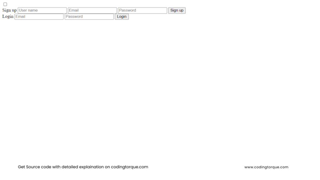
</div>Output Till Now
CSS Code
Create a file style.css and paste the code below.
body {
  margin: 0;
  padding: 0;
  display: flex;
  justify-content: center;
  align-items: center;
  min-height: 100vh;
  font-family: "Jost", sans-serif;
  background: linear-gradient(to bottom, #0f0c29, #302b63, #24243e);
}
.main {
  width: 350px;
  height: 500px;
  background: red;
  overflow: hidden;
  background: url("https://doc-08-2c-docs.googleusercontent.com/docs/securesc/68c90smiglihng9534mvqmq1946dmis5/fo0picsp1nhiucmc0l25s29respgpr4j/1631524275000/03522360960922298374/03522360960922298374/1Sx0jhdpEpnNIydS4rnN4kHSJtU1EyWka?e=view&authuser=0&nonce=gcrocepgbb17m&user=03522360960922298374&hash=tfhgbs86ka6divo3llbvp93mg4csvb38")
    no-repeat center/ cover;
  border-radius: 10px;
  box-shadow: 5px 20px 50px #000;
}
#chk {
  display: none;
}
.signup {
  position: relative;
  width: 100%;
  height: 100%;
}
label {
  color: #fff;
  font-size: 2.3em;
  justify-content: center;
  display: flex;
  margin: 60px;
  font-weight: bold;
  cursor: pointer;
  transition: 0.5s ease-in-out;
}
input {
  width: 60%;
  height: 20px;
  background: #e0dede;
  justify-content: center;
  display: flex;
  margin: 20px auto;
  padding: 10px;
  border: none;
  outline: none;
  border-radius: 5px;
}
button {
  width: 60%;
  height: 40px;
  margin: 10px auto;
  justify-content: center;
  display: block;
  color: #fff;
  background: #573b8a;
  font-size: 1em;
  font-weight: bold;
  margin-top: 20px;
  outline: none;
  border: none;
  border-radius: 5px;
  transition: 0.2s ease-in;
  cursor: pointer;
}
button:hover {
  background: #6d44b8;
}
.login {
  height: 460px;
  background: #eee;
  border-radius: 60% / 10%;
  transform: translateY(-180px);
  transition: 0.8s ease-in-out;
}
.login label {
  color: #573b8a;
  transform: scale(0.6);
}

#chk:checked ~ .login {
  transform: translateY(-500px);
}
#chk:checked ~ .login label {
  transform: scale(1);
}
#chk:checked ~ .signup label {
  transform: scale(0.6);
}
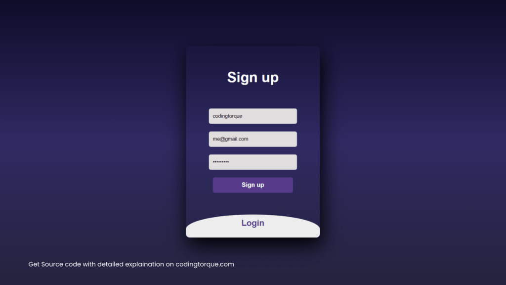
Output Till Now
Written by: Piyush Patil
Credits: @mamislimen
If you have any doubts or any project ideas feel free to Contact Us
Hope you find this post helpful💖


