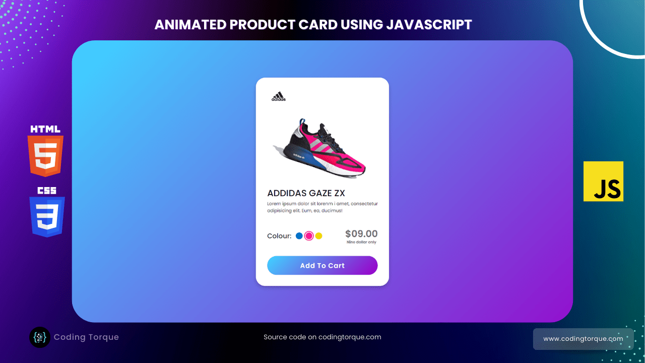
Welcome to Coding Torque, fellow coders! Are you looking to add some flair to your website design? In this tutorial, we will be creating an Animated Product Card using HTML, CSS, and JavaScript (with a little help from JQuery). Not only will this project enhance your front-end development skills, but it will also give your website a professional and visually appealing touch. So, let’s get started and bring your product cards to life!
Before we start, here are some JavaScript Games you might like to create:
1. Snake Game using JavaScript
2. 2D Bouncing Ball Game using JavaScript
3. Rock Paper Scissor Game using JavaScript
4. Tic Tac Toe Game using JavaScript
5. Whack a Mole Game using JavaScript
I would recommend you don’t just copy and paste the code, just look at the code and type by understanding it.
HTML Code
Starter Template
<!doctype html>
<html lang="en">

<head>
    <!-- Required meta tags -->
    <meta charset="utf-8">
    <meta name="viewport" content="width=device-width, initial-scale=1">

    <!-- CSS -->
    <link rel="stylesheet" href="style.css">

    <title>Animated Product Card using JavaScript - @code.scientist x @codingtorque</title>
</head>

<body>
    <!-- further code here ->

    <!-- JQuery -->
    <script src="https://code.jquery.com/jquery-3.6.3.js"
        integrity="sha256-nQLuAZGRRcILA+6dMBOvcRh5Pe310sBpanc6+QBmyVM=" crossorigin="anonymous"></script>

    <script src="script.js"></script>
</body>

</html>
Paste the below code in your <body> tag
<div class="product-card">
    <div class="logo-cart">
        <img src="https://fadzrinmadu.github.io/hosted-assets/animated-product-card-using-html-css-and-javascript/logo.jpg"
            alt="logo">
        <i class='bx bx-shopping-bag'></i>
    </div>
    <div class="main-images">
        <img id="blue" class="blue active"
            src="https://fadzrinmadu.github.io/hosted-assets/animated-product-card-using-html-css-and-javascript/blue.png"
            alt="blue">
        <img id="pink" class="pink"
            src="https://fadzrinmadu.github.io/hosted-assets/animated-product-card-using-html-css-and-javascript/pink.png"
            alt="blue">
        <img id="yellow" class="yellow"
            src="https://fadzrinmadu.github.io/hosted-assets/animated-product-card-using-html-css-and-javascript/yellow.png"
            alt="blue">
    </div>
    <div class="shoe-details">
        <span class="shoe_name">ADDIDAS GAZE ZX</span>
        <p>Lorem ipsum dolor sit lorenm i amet, consectetur adipisicing elit. Eum, ea, ducimus!</p>
        <div class="stars">
            <i class='bx bxs-star'></i>
            <i class='bx bxs-star'></i>
            <i class='bx bxs-star'></i>
            <i class='bx bxs-star'></i>
            <i class='bx bx-star'></i>
        </div>
    </div>
    <div class="color-price">
        <div class="color-option">
            <span class="color">Colour:</span>
            <div class="circles">
                <span class="circle blue active" id="blue"></span>
                <span class="circle pink " id="pink"></span>
                <span class="circle yellow " id="yellow"></span>
            </div>
        </div>
        <div class="price">
            <span class="price_num">$09.00</span>
            <span class="price_letter">Nine dollar only</span>
        </div>
    </div>
    <div class="button">
        <div class="button-layer"></div>
        <button>Add To Cart</button>
    </div>
</div>
Output Till Now
CSS Code
Create a file style.css and paste the code below.
@import url("https://fonts.googleapis.com/css2?family=Poppins:wght@400;500;600&display=swap");
* {
  margin: 0;
  padding: 0;
  box-sizing: border-box;
  font-family: "Poppins", sans-serif;
}

body {
  height: 100vh;
  display: flex;
  align-items: center;
  justify-content: center;
  background-image: linear-gradient(135deg, #43cbff 10%, #9708cc 100%);
}
.product-card {
  position: relative;
  max-width: 355px;
  width: 100%;
  border-radius: 25px;
  padding: 20px 30px 30px 30px;
  background: #fff;
  box-shadow: 0 5px 10px rgba(0, 0, 0, 0.2);
  z-index: 3;
  overflow: hidden;
}
.product-card .logo-cart {
  display: flex;
  align-items: center;
  justify-content: space-between;
}
.product-card .logo-cart img {
  height: 60px;
  width: 60px;
  object-fit: cover;
}
.product-card .logo-cart i {
  font-size: 27px;
  color: #707070;
  cursor: pointer;
  transition: color 0.3s ease;
}
.product-card .logo-cart i:hover {
  color: #333;
}
.product-card .main-images {
  position: relative;
  height: 210px;
}
.product-card .main-images img {
  position: absolute;
  height: 300px;
  width: 300px;
  object-fit: cover;
  transform: rotate(18deg);
  left: 12px;
  top: -40px;
  z-index: -1;
  opacity: 0;
  transition: opacity 0.5s ease;
}
.product-card .main-images img.active {
  opacity: 1;
}
.product-card .shoe-details .shoe_name {
  font-size: 24px;
  font-weight: 500;
  color: #161616;
}
.product-card .shoe-details p {
  font-size: 12px;
  font-weight: 400;
  color: #333;
  text-align: justify;
}
.product-card .shoe-details .stars i {
  margin: 0 -1px;
  color: #333;
}
.product-card .color-price .color-option {
  display: flex;
  align-items: center;
}
.color-price {
  display: flex;
  justify-content: space-between;
  align-items: center;
  margin-top: 10px;
}
.color-price .color-option .color {
  font-size: 18px;
  font-weight: 500;
  color: #333;
  margin-right: 8px;
}
.color-option .circles {
  display: flex;
}
.color-option .circles .circle {
  height: 18px;
  width: 18px;
  background: #0071c7;
  border-radius: 50%;
  margin: 0 4px;
  cursor: pointer;
  transition: all 0.4s ease;
}
.color-option .circles .circle.blue.active {
  box-shadow: 0 0 0 2px #fff, 0 0 0 4px #0071c7;
}
.color-option .circles .circle.pink {
  background: #fa1795;
}
.color-option .circles .circle.pink.active {
  box-shadow: 0 0 0 2px #fff, 0 0 0 4px #fa1795;
}
.color-option .circles .circle.yellow {
  background: #f5da00;
}
.color-option .circles .circle.yellow.active {
  box-shadow: 0 0 0 2px #fff, 0 0 0 4px #f5da00;
}
.color-price .price {
  display: flex;
  flex-direction: column;
  justify-content: center;
  align-items: center;
}
.color-price .price .price_num {
  font-size: 25px;
  font-weight: 600;
  color: #707070;
}
.color-price .price .price_letter {
  font-size: 10px;
  font-weight: 600;
  margin-top: -4px;
  color: #707070;
}
.product-card .button {
  position: relative;
  height: 50px;
  width: 100%;
  border-radius: 25px;
  margin-top: 30px;
  overflow: hidden;
}
.product-card .button .button-layer {
  position: absolute;
  height: 100%;
  width: 300%;
  left: -100%;
  background-image: linear-gradient(135deg, #9708cc, #43cbff, #9708cc, #43cbff);
  transition: all 0.4s ease;
  border-radius: 25px;
}
.product-card .button:hover .button-layer {
  left: 0;
}
.product-card .button button {
  position: relative;
  height: 100%;
  width: 100%;
  background: none;
  outline: none;
  border: none;
  font-size: 18px;
  font-weight: 600;
  letter-spacing: 1px;
  color: #fff;
}
Output Till Now

JavaScript Code
script.js and paste the code below.let circle = document.querySelector(".color-option");
circle.addEventListener("click", (e) => {
let target = e.target;
if (target.classList.contains("circle")) {
circle.querySelector(".active").classList.remove("active");
target.classList.add("active");
document.querySelector(".main-images .active").classList.remove("active");
document.querySelector(`.main-images .${target.id}`).classList.add("active");
}
});


