Before we start, here are some CSS Projects you might like to create:
1. Snake Game using JavaScript
2. 2D Bouncing Ball Game using JavaScript
3. Rock Paper Scissor Game using JavaScript
4. Tic Tac Toe Game using JavaScript
5. Whack a Mole Game using JavaScript
I would recommend you don’t just copy and paste the code, just look at the code and type by understanding it.
HTML Code
Starter Template
<!doctype html>
<html lang="en">

<head>
    <!-- Required meta tags -->
    <meta charset="utf-8">
    <meta name="viewport" content="width=device-width, initial-scale=1">

    <!-- Font Awesome CDN  -->
    <link rel="stylesheet" href="https://cdnjs.cloudflare.com/ajax/libs/font-awesome/5.14.0/css/all.min.css"
        integrity="sha512-1PKOgIY59xJ8Co8+NE6FZ+LOAZKjy+KY8iq0G4B3CyeY6wYHN3yt9PW0XpSriVlkMXe40PTKnXrLnZ9+fkDaog=="
        crossorigin="anonymous" />

    <!-- CSS -->
    <link rel="stylesheet" href="style.css">

    <title>Profile Cards Hover Effect - Coding Torque</title>
</head>

<body>
    <!-- Further code here -->
</body>

</html>
Paste the below code in your <body> tag
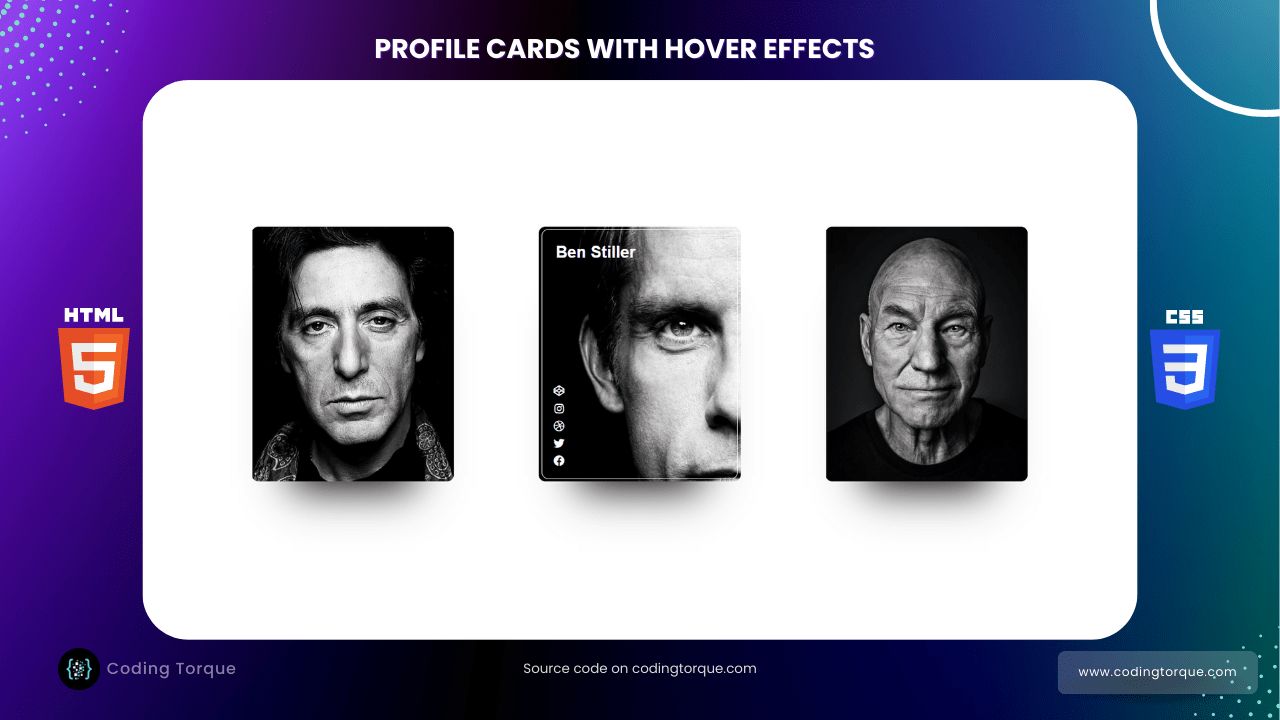
<div class="container">
<div class="card card0">
<div class="border">
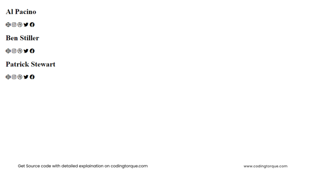
<h2>Al Pacino</h2>
<div class="icons">
<i class="fab fa-codepen" aria-hidden="true"></i>
<i class="fab fa-instagram" aria-hidden="true"></i>
<i class="fab fa-dribbble" aria-hidden="true"></i>
<i class="fab fa-twitter" aria-hidden="true"></i>
<i class="fab fa-facebook" aria-hidden="true"></i>
</div>
</div>
</div>
<div class="card card1">
<div class="border">
<h2>Ben Stiller</h2>
<div class="icons">
<i class="fab fa-codepen" aria-hidden="true"></i>
<i class="fab fa-instagram" aria-hidden="true"></i>
<i class="fab fa-dribbble" aria-hidden="true"></i>
<i class="fab fa-twitter" aria-hidden="true"></i>
<i class="fab fa-facebook" aria-hidden="true"></i>
</div>
</div>
</div>
<div class="card card2">
<div class="border">
<h2>Patrick Stewart</h2>
<div class="icons">
<i class="fab fa-codepen" aria-hidden="true"></i>
<i class="fab fa-instagram" aria-hidden="true"></i>
<i class="fab fa-dribbble" aria-hidden="true"></i>
<i class="fab fa-twitter" aria-hidden="true"></i>
<i class="fab fa-facebook" aria-hidden="true"></i>
</div>
</div>
</div>
</div>Output Till Now
CSS Code
Create a file style.css and paste the code below.
@import url("https://fonts.googleapis.com/css2?family=Poppins&display=swap");

.container {
  height: 100vh;
  width: 100vw;
  max-height: 800px;
  max-width: 1280px;
  min-height: 600px;
  min-width: 1000px;
  display: flex;
  justify-content: space-around;
  align-items: center;
  margin: 0 auto;
}

.border {
  height: 369px;
  width: 290px;
  background: transparent;
  border-radius: 10px;
  transition: border 1s;
  position: relative;
}

.border:hover {
  border: 1px solid #fff;
}

.card {
  height: 379px;
  width: 300px;
  background: #808080;
  border-radius: 10px;
  transition: background 0.8s;
  overflow: hidden;
  background: #000;
  box-shadow: 0 70px 63px -60px #000;
  display: flex;
  justify-content: center;
  align-items: center;
  position: relative;
}

.card0 {
  background: url("https://i.pinimg.com/736x/8f/a0/51/8fa051251f5ac2d0b756027089fbffde--terry-o-neill-al-pacino.jpg")
    center center no-repeat;
  background-size: 300px;
}

.card0:hover {
  background: url("https://i.pinimg.com/736x/8f/a0/51/8fa051251f5ac2d0b756027089fbffde--terry-o-neill-al-pacino.jpg")
    left center no-repeat;
  background-size: 600px;
}

.card0:hover h2 {
  opacity: 1;
}

.card0:hover .fab {
  opacity: 1;
}

.card1 {
  background: url("https://i.pinimg.com/originals/28/d2/e6/28d2e684e7859a0dd17fbd0cea00f8a9.jpg")
    center center no-repeat;
  background-size: 300px;
}

.card1:hover {
  background: url("https://i.pinimg.com/originals/28/d2/e6/28d2e684e7859a0dd17fbd0cea00f8a9.jpg")
    left center no-repeat;
  background-size: 600px;
}

.card1:hover h2 {
  opacity: 1;
}

.card1:hover .fab {
  opacity: 1;
}

.card2 {
  background: url("https://i.pinimg.com/originals/ee/85/08/ee850842e68cfcf6e3943c048f45c6d1.jpg")
    center center no-repeat;
  background-size: 300px;
}

.card2:hover {
  background: url("https://i.pinimg.com/originals/ee/85/08/ee850842e68cfcf6e3943c048f45c6d1.jpg")
    left center no-repeat;
  background-size: 600px;
}

.card2:hover h2 {
  opacity: 1;
}

.card2:hover .fab {
  opacity: 1;
}

h2 {
  font-family: "Helvetica Neue", Helvetica, Arial, sans-serif;
  color: #fff;
  margin: 20px;
  opacity: 0;
  transition: opacity 1s;
}

.fab {
  opacity: 0;
  transition: opacity 1s;
}

.icons {
  position: absolute;
  fill: #fff;
  color: #fff;
  height: 130px;
  top: 226px;
  width: 50px;
  display: flex;
  flex-direction: column;
  align-items: center;
  justify-content: space-around;
}
Output Till Now
Written by: Piyush Patil
Code Credits: @petegarvin1
If you have any doubts or any project ideas feel free to Contact Us
Hope you find this post helpful💖


