Before we start, here are some more login forms you might like to create:
I would recommend you don’t just copy and paste the code, just look at the code and type by understanding it.
HTML Code
Starter Template
<!doctype html>
<html lang="en">
<head>
<!-- Required meta tags -->
<meta charset="utf-8">
<meta name="viewport" content="width=device-width, initial-scale=1">
<!-- Font Awesome CDN -->
<link rel="stylesheet" href="https://cdnjs.cloudflare.com/ajax/libs/font-awesome/5.14.0/css/all.min.css"
integrity="sha512-1PKOgIY59xJ8Co8+NE6FZ+LOAZKjy+KY8iq0G4B3CyeY6wYHN3yt9PW0XpSriVlkMXe40PTKnXrLnZ9+fkDaog=="
crossorigin="anonymous" />
<!-- CSS -->
<link rel="stylesheet" href="style.css">
<title>Awesome Login Form using HTML and CSS - Coding Torque</title>
</head>
<body>
<!-- Futher code here -->
</body>
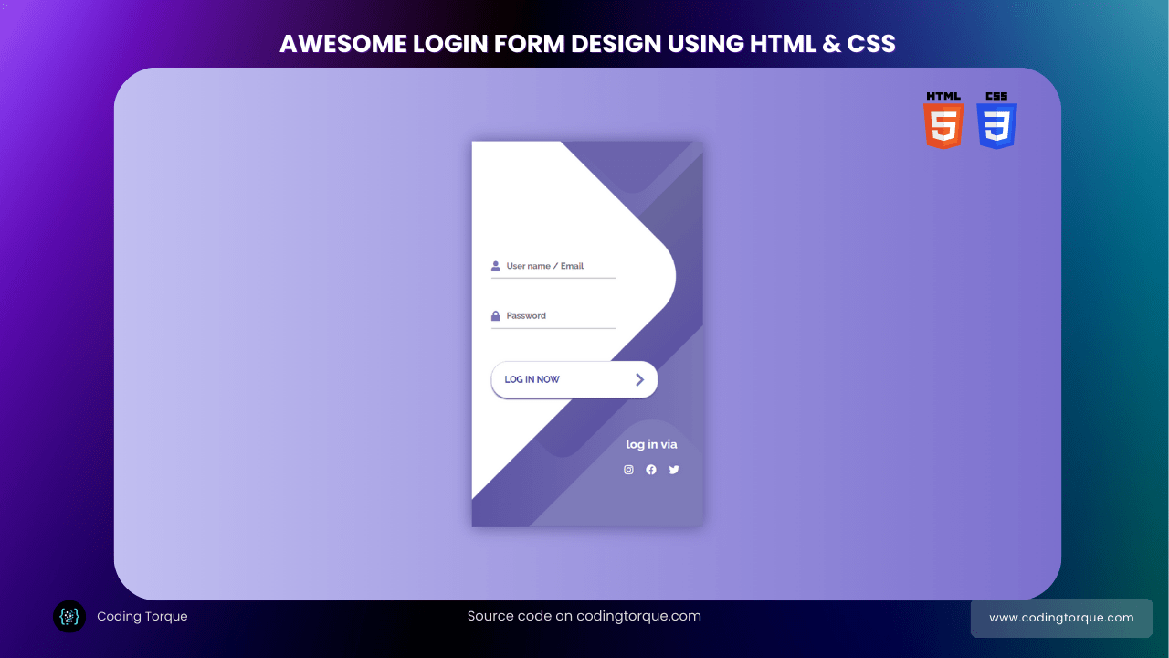
</html>Paste the below code in your <body> tag.
<div class="container">
    <div class="screen">
        <div class="screen__content">
            <form class="login">
                <div class="login__field">
                    <i class="login__icon fas fa-user"></i>
                    <input type="text" class="login__input" placeholder="User name / Email">
                </div>
                <div class="login__field">
                    <i class="login__icon fas fa-lock"></i>
                    <input type="password" class="login__input" placeholder="Password">
                </div>
                <button class="button login__submit">
                    <span class="button__text">Log In Now</span>
                    <i class="button__icon fas fa-chevron-right"></i>
                </button>
            </form>
            <div class="social-login">
                <h3>log in via</h3>
                <div class="social-icons">
                    <a href="#" class="social-login__icon fab fa-instagram"></a>
                    <a href="#" class="social-login__icon fab fa-facebook"></a>
                    <a href="#" class="social-login__icon fab fa-twitter"></a>
                </div>
            </div>
        </div>
        <div class="screen__background">
            <span class="screen__background__shape screen__background__shape4"></span>
            <span class="screen__background__shape screen__background__shape3"></span>
            <span class="screen__background__shape screen__background__shape2"></span>
            <span class="screen__background__shape screen__background__shape1"></span>
        </div>
    </div>
</div>
Output Till Now

CSS Code
Create a file style.css and paste the code below.
@import url("https://fonts.googleapis.com/css?family=Raleway:400,700");

* {
  box-sizing: border-box;
  margin: 0;
  padding: 0;
  font-family: Raleway, sans-serif;
}

body {
  background: linear-gradient(90deg, #c7c5f4, #776bcc);
}

.container {
  display: flex;
  align-items: center;
  justify-content: center;
  min-height: 100vh;
}

.screen {
  background: linear-gradient(90deg, #5d54a4, #7c78b8);
  position: relative;
  height: 600px;
  width: 360px;
  box-shadow: 0px 0px 24px #5c5696;
}

.screen__content {
  z-index: 1;
  position: relative;
  height: 100%;
}

.screen__background {
  position: absolute;
  top: 0;
  left: 0;
  right: 0;
  bottom: 0;
  z-index: 0;
  -webkit-clip-path: inset(0 0 0 0);
  clip-path: inset(0 0 0 0);
}

.screen__background__shape {
  transform: rotate(45deg);
  position: absolute;
}

.screen__background__shape1 {
  height: 520px;
  width: 520px;
  background: #fff;
  top: -50px;
  right: 120px;
  border-radius: 0 72px 0 0;
}

.screen__background__shape2 {
  height: 220px;
  width: 220px;
  background: #6c63ac;
  top: -172px;
  right: 0;
  border-radius: 32px;
}

.screen__background__shape3 {
  height: 540px;
  width: 190px;
  background: linear-gradient(270deg, #5d54a4, #6a679e);
  top: -24px;
  right: 0;
  border-radius: 32px;
}

.screen__background__shape4 {
  height: 400px;
  width: 200px;
  background: #7e7bb9;
  top: 420px;
  right: 50px;
  border-radius: 60px;
}

.login {
  width: 320px;
  padding: 30px;
  padding-top: 156px;
}

.login__field {
  padding: 20px 0px;
  position: relative;
}

.login__icon {
  position: absolute;
  top: 30px;
  color: #7875b5;
}

.login__input {
  border: none;
  border-bottom: 2px solid #d1d1d4;
  background: none;
  padding: 10px;
  padding-left: 24px;
  font-weight: 700;
  width: 75%;
  transition: 0.2s;
}

.login__input:active,
.login__input:focus,
.login__input:hover {
  outline: none;
  border-bottom-color: #6a679e;
}

.login__submit {
  background: #fff;
  font-size: 14px;
  margin-top: 30px;
  padding: 16px 20px;
  border-radius: 26px;
  border: 1px solid #d4d3e8;
  text-transform: uppercase;
  font-weight: 700;
  display: flex;
  align-items: center;
  width: 100%;
  color: #4c489d;
  box-shadow: 0px 2px 2px #5c5696;
  cursor: pointer;
  transition: 0.2s;
}

.login__submit:active,
.login__submit:focus,
.login__submit:hover {
  border-color: #6a679e;
  outline: none;
}

.button__icon {
  font-size: 24px;
  margin-left: auto;
  color: #7875b5;
}

.social-login {
  position: absolute;
  height: 140px;
  width: 160px;
  text-align: center;
  bottom: 0px;
  right: 0px;
  color: #fff;
}

.social-icons {
  display: flex;
  align-items: center;
  justify-content: center;
}

.social-login__icon {
  padding: 20px 10px;
  color: #fff;
  text-decoration: none;
  text-shadow: 0px 0px 8px #7875b5;
}

.social-login__icon:hover {
  transform: scale(1.5);
}
Output Till Now

Written by: Piyush Patil
Code Credits: @Mohuth
If you have any doubts or any project ideas feel free to Contact Us
Hope you find this post helpful💖


