
Before we start, here are some cards you might like to create:
Animated Product Card using JavaScript
Profile Cards Hover Effect using HTML & CSS
I would recommend you don’t just copy and paste the code, just look at the code and type by understanding it.
HTML Code
Starter Template
<!doctype html>
<html lang="en">

<head>
    <!-- Required meta tags -->
    <meta charset="utf-8">
    <meta name="viewport" content="width=device-width, initial-scale=1">

    <!-- Font Awesome CDN  -->
    <link rel="stylesheet" href="https://cdnjs.cloudflare.com/ajax/libs/font-awesome/5.14.0/css/all.min.css"
        integrity="sha512-1PKOgIY59xJ8Co8+NE6FZ+LOAZKjy+KY8iq0G4B3CyeY6wYHN3yt9PW0XpSriVlkMXe40PTKnXrLnZ9+fkDaog=="
        crossorigin="anonymous" />

    <!-- CSS -->
    <link rel="stylesheet" href="style.css">

    <title>Star wars product card - Coding Torque</title>
</head>

<body>
   <!-- Further code here -->
</body>

</html>
Paste the below code in your <body> tag.
<div class="card">
<div class="left">
<div class="slider"><i class="fas fa-arrow-left"></i></div><img class="wordmark"
src="http://res.cloudinary.com/prvnbist/image/upload/v1508603572/starwars.png" alt="star wars" />
</div>
<div class="right"><img class="helmet"
src="http://res.cloudinary.com/prvnbist/image/upload/v1508603573/helmet.png" alt="helmet" />
<div class="productInfo">
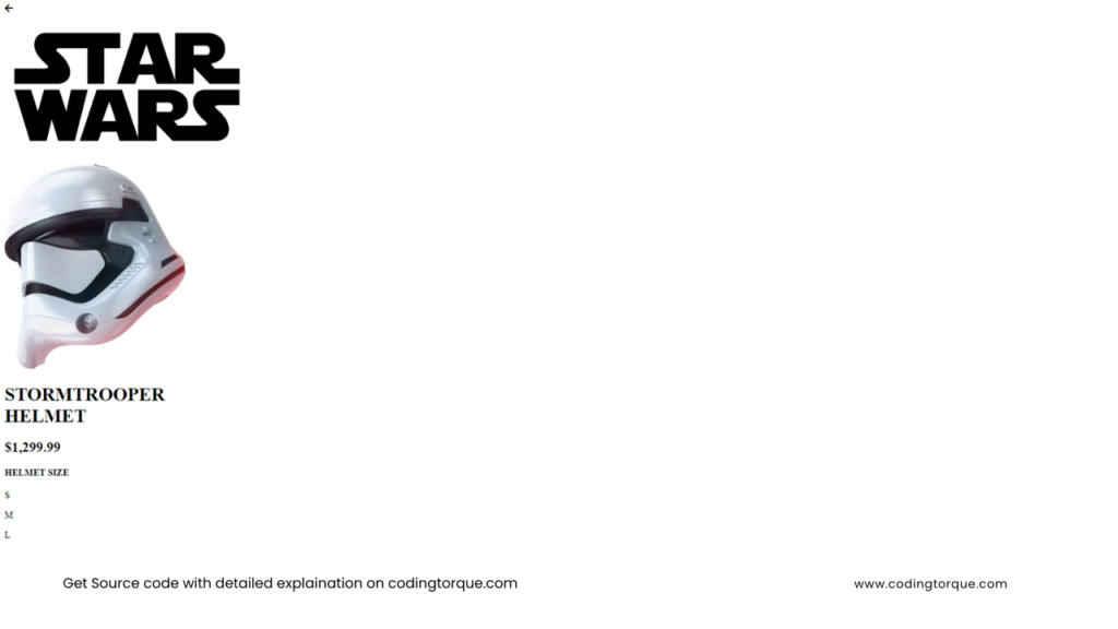
<h1>STORMTROOPER <br> HELMET</h1>
<h2>$1,299.99</h2>
<div class="details">
<div class="size">
<h4>HELMET SIZE</h4>
<p>S</p>
<p>M</p>
<p>L</p>
<p>XL</p>
</div>
<div class="durability">
<h3>75%</h3>
<h4>DURABILITY <br> RATE</h4>
</div>
</div>
<button>ADD TO CART</button><i class="fas fa-star"></i>
<a href="#">ADD TO WISHLIST</a>
<div class="slider"><i class="fas fa-arrow-right"></i></div>
</div>
</div>
</div>Output Till Now
CSS Code
Create a file style.css and paste the code below.
@import url("https://fonts.googleapis.com/css?family=Open+Sans");
@import url("https://fonts.googleapis.com/css?family=Open+Sans:800");
* {
  box-sizing: border-box;
  margin: 0;
  padding: 0;
}
::-webkit-scrollbar {
  display: none;
}
button {
  border: none;
  cursor: pointer;
}
button:focus {
  outline: 0;
}
.card {
  width: 892px;
  height: auto;
  position: absolute;
  top: 50%;
  left: 50%;
  transform: translate(-50%, -50%);
  display: flex;
  align-items: center;
}
.card .left {
  width: 480px;
  height: 553px;
  background: #cc3843;
  border-radius: 23px;
  display: flex;
  align-items: center;
}
.card .left .wordmark {
  opacity: 0.2;
  transform: rotate(-90deg) scale(1.2);
  margin-left: -90px;
}
.card .right {
  width: 654px;
  height: 479px;
  background: #0c1f2c;
  position: absolute;
  left: -10%;
  transform: translateX(50%);
  border-radius: 23px;
}
.card .right .helmet {
  position: absolute;
  top: 50%;
  transform: translate(-50%, -50%);
}
.card .right .productInfo {
  width: 300px;
  height: 300px;
  margin: 50px 0 0 235px;
  color: #fff;
  font-family: "Open Sans", sans-serif;
}
.card .right .productInfo h1 {
  font-weight: 800;
  line-height: 46px;
  font-size: 40px;
  margin-bottom: 15px;
}
.card .right .productInfo h2 {
  font-weight: 300;
  font-size: 32px;
  letter-spacing: 1.6px;
  margin-bottom: 30px;
}
.card .right .productInfo .details {
  height: 145px;
}
.card .right .productInfo .details .size,
.card .right .productInfo .details .durability {
  width: 50%;
  float: left;
}
.card .right .productInfo .details .size {
  border-right: 1px solid #cb1f40;
  padding: 30px 0;
}
.card .right .productInfo .details .durability {
  text-align: center;
}
.card .right .productInfo .details .durability h4 {
  margin-top: 20px;
  margin-bottom: 30px;
}
.card .right .productInfo button {
  height: 48px;
  background: #cb2140;
  border-radius: 90px;
  font-weight: 300;
  line-height: 35px;
  font-size: 14px;
  padding: 0 24px;
  color: #fff;
}
.card .right .productInfo i.fav {
  font-size: 12px;
  margin: 0 12px 0 24px;
  color: #cb2140;
}
.card .right .productInfo a {
  font-size: 12px;
  color: #fff;
  opacity: 0.3;
  text-decoration: none;
}
.card .right .productInfo h3 {
  width: 80px;
  height: 80px;
  font-weight: 300;
  line-height: 80px;
  font-size: 16px;
  margin-left: 30px;
  positon: relative;
}
.card .right .productInfo h3:after {
  content: "";
  position: absolute;
  width: 80px;
  height: 80px;
  border-radius: 50%;
  border: 2px solid #cb1f40;
  border-top-color: transparent;
  transform: rotate(-45deg) translate(-50%, -50%);
}
.card .right .productInfo h4 {
  font-weight: bold;
  line-height: normal;
  font-size: 12px;
  letter-spacing: 3px;
  margin-bottom: 15px;
}
.card .right .productInfo p {
  width: 30px;
  height: 30px;
  display: inline-block;
  line-height: normal;
  text-align: center;
  font-weight: 300px;
  line-height: 28px;
  font-size: 14px;
  border-radius: 50%;
  transition: 0.3s linear;
  border: 1px solid transparent;
  cursor: pointer;
}
.card .right .productInfo p:hover {
  border: 1px solid #cb1f40;
}
.card .right .productInfo p:nth-of-type(1) {
  border: 1px solid #cb1f40;
}
.slider {
  width: 60px;
  height: 60px;
  background: #fff;
  border-radius: 50%;
  line-height: 70px;
  text-align: center;
  margin-left: -30px;
  box-shadow: 0 0 60px rgba(0, 0, 0, 0.2);
  color: #cb1f40;
  cursor: pointer;
}
.slider:nth-of-type(2) {
  position: absolute;
  top: 50%;
  right: -60px;
  transform: translate(-50%, -50%);
}
@media screen and (max-width: 576px) {
  .card {
    transform: rotate(90deg) scale(0.7) translate(calc(50% - 25vh), 50%);
    position: static;
  }
}
Written by: Piyush Patil
Credits: @prvnbist
If you have any doubts or any project ideas feel free to Contact Us
Hope you find this post helpful💖


