Hello Guys! Welcome to Coding Torque. In this blog, I’m going to explain to you how to make the Slide-in Overlay Effect on hover using JavaScript. This will be a step-by-step guide. Let’s get started 🚀.
Before we start, here are some JavaScript Games you might like to create:
1. Snake Game using JavaScript
2. 2D Bouncing Ball Game using JavaScript
3. Rock Paper Scissor Game using JavaScript
4. Tic Tac Toe Game using JavaScript
5. Whack a Mole Game using JavaScript
I would recommend you don’t just copy and paste the code, just look at the code and type by understanding it.
HTML Code
Starter Template
<!doctype html>
<html lang="en">

<head>
    <!-- Required meta tags -->
    <meta charset="utf-8">
    <meta name="viewport" content="width=device-width, initial-scale=1">

    <!-- Font Awesome Icons  -->
    <link rel="stylesheet" href="https://cdnjs.cloudflare.com/ajax/libs/font-awesome/5.15.1/css/all.min.css"
        integrity="sha512-+4zCK9k+qNFUR5X+cKL9EIR+ZOhtIloNl9GIKS57V1MyNsYpYcUrUeQc9vNfzsWfV28IaLL3i96P9sdNyeRssA=="
        crossorigin="anonymous" />
    <title>Slide-in Overlay Hover Effect using CSS - @code.scientist</title>
</head>

<body>

    <!-- Further code here -->

</body>

</html>
Paste the below code in your <body> tag
<div class="card">
<div class="main-content">
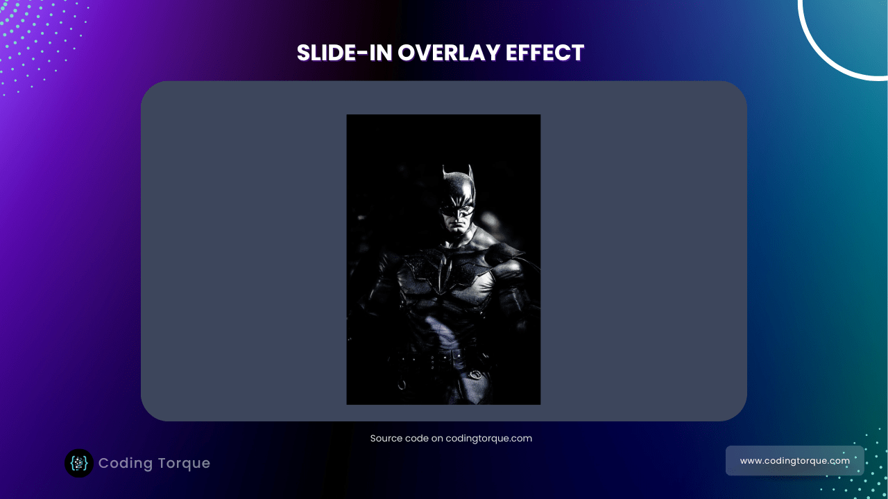
<img src="https://images.unsplash.com/photo-1531259683007-016a7b628fc3?w=500&q=80&fit=max" alt="Batman">
</div>
<div class="overlay-content">
<p>
"Sometimes the truth isn't good enough, sometimes people deserve more. Sometimes people deserve to have
their faith rewarded..."
<span>- The Dark Knight -</span>
</p>
</div>
</div>
Output Till Now

CSS Code
Create a file style.css and paste the code below.
@import url('https://fonts.googleapis.com/css?family=Acme&display=swap');

* {
    margin: 0;
    padding: 0;
    box-sizing: border-box;
}

body {
    font-family: 'Acme', sans-serif;
    width: 100vw;
    height: 100vh;
    display: flex;
    justify-content: center;
    align-items: center;
    background-color: #3d465c;
    color: #fff;
}

.card {
    width: 350px;
    height: 525px;
    overflow: hidden;
    position: relative;
}

.card .main-content {
    width: 100%;
    height: 100%;
}

.card .main-content img {
    width: 100%;
    height: 100%;
}

.card .overlay-content {
    width: 100%;
    height: 100%;
    background-color: #ffeac9;
    color: #080808;
    display: flex;
    justify-content: center;
    align-items: center;
    overflow: hidden;
    position: absolute;
    z-index: 1;
    transition: 0.6s;
    top: 0%;
    left: 100%;
    opacity: 0.8;
}

.card:hover .overlay-content {
    /* left: 0; */
    transform: translateX(-100%);
}

.card .overlay-content p {
    text-align: center;
    font-size: 1.4rem;
    margin: 2rem;
    letter-spacing: 1px;
    line-height: 1.75rem;
}

.card .overlay-content p span {
    display: block;
    letter-spacing: normal;
    font-size: 1rem;
    font-style: italic;
    margin-top: 1.25rem;
}

@media (max-width: 576px) {
    .card {
        width: 300px;
        height: 450px;
    }
}
Output Till Now

Written by: Piyush Patil
Code Credits: @Coding_Journey
If you have any doubts or any project ideas feel free to Contact Us
Hope you find this post helpful💖


