I would recommend you don’t just copy and paste the code, just look at the code and type by understanding it.
HTML Code
Starter Template
<!doctype html>
<html lang="en">

<head>
    <!-- Required meta tags -->
    <meta charset="utf-8">
    <meta name="viewport" content="width=device-width, initial-scale=1">

    <!-- CSS -->
    <link rel="stylesheet" href="style.css">

    <title>Step By Step Form using JavaScript - Coding Torque</title>
</head>

<body>
    <!-- Further code here -->

    <script src="https://code.jquery.com/jquery-3.6.3.js"
        integrity="sha256-nQLuAZGRRcILA+6dMBOvcRh5Pe310sBpanc6+QBmyVM=" crossorigin="anonymous"></script>

    <script src="script.js"></script>
</body>

</html>
Paste the below code in your <body> tag.
<div class="modal-wrap">
<div class="modal-header"><span class="is-active"></span><span></span><span></span></div>
<div class="modal-bodies">
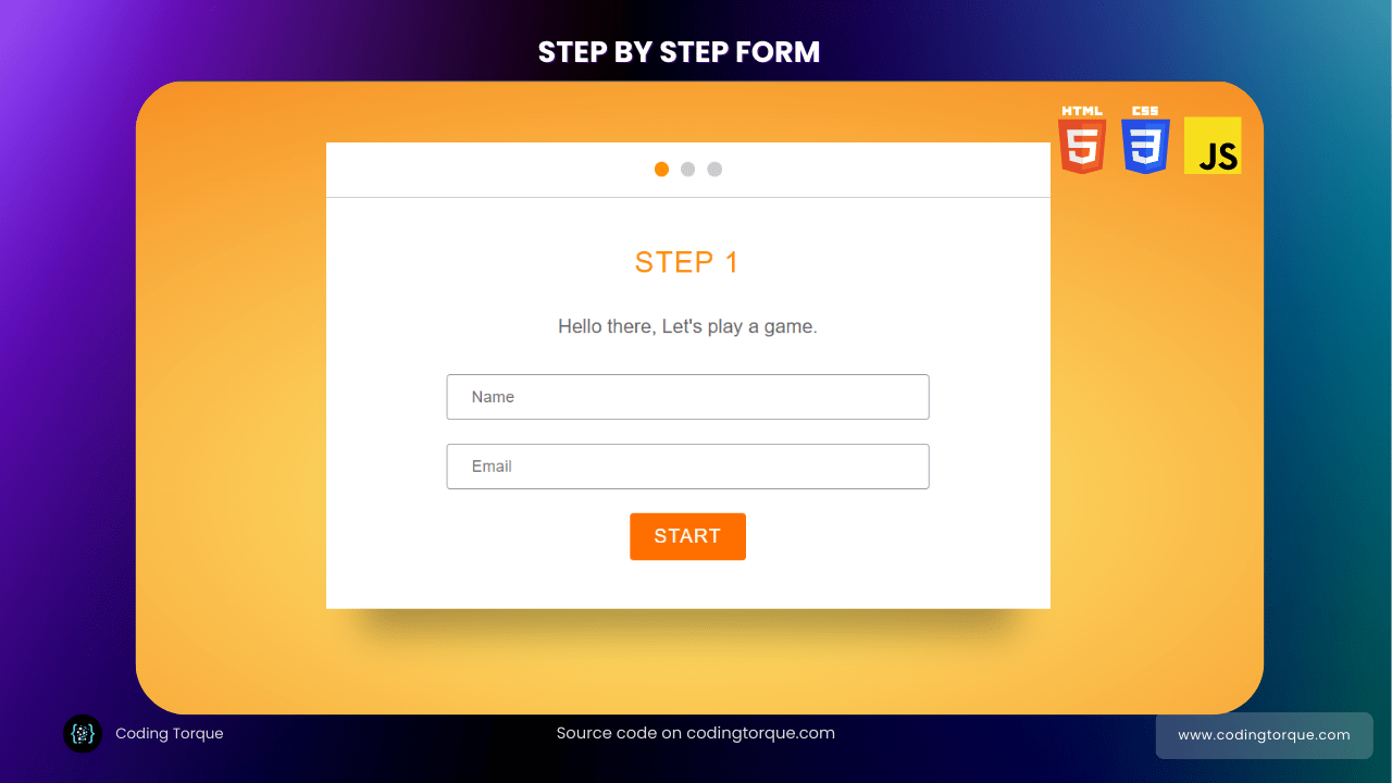
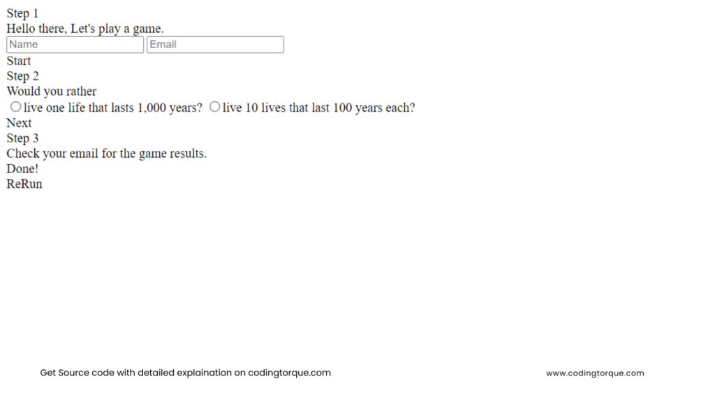
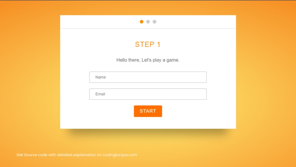
<div class="modal-body modal-body-step-1 is-showing">
<div class="title">Step 1</div>
<div class="description">Hello there, Let's play a game.</div>
<form>
<input type="text" placeholder="Name" />
<input type="email" placeholder="Email" />
<div class="text-center">
<div class="button">Start</div>
</div>
</form>
</div>
<div class="modal-body modal-body-step-2">
<div class="title">Step 2</div>
<div class="description">Would you rather</div>
<form>
<label>
<input type="radio" name="radio" />live one life that lasts 1,000 years?
</label>
<label>
<input type="radio" name="radio" id="radio2" />live 10 lives that last 100 years each?
</label>
<div class="text-center fade-in">
<div class="button">Next</div>
</div>
</form>
</div>
<div class="modal-body modal-body-step-3">
<div class="title">Step 3</div>
<div class="description">Check your email for the game results.</div>
<div class="text-center">
<div class="button">Done!</div>
</div>
</div>
</div>
</div>
<div class="text-center">
<div class="rerun-button">ReRun</div>
</div>Output Till Now
CSS Code
Create a file style.css and paste the code below.
html {
  background: radial-gradient(#fff176, #f57f17);
  min-height: 100%;
  font-family: "Roboto", sans-serif;
}

.title {
  text-transform: uppercase;
  text-align: center;
  margin-bottom: 30px;
  color: #ff8f00;
  font-weight: 300;
  font-size: 24px;
  letter-spacing: 1px;
}

.description {
  text-align: center;
  color: #666;
  margin-bottom: 30px;
}

input[type="text"],
input[type="email"] {
  padding: 10px 20px;
  border: 1px solid #999;
  border-radius: 3px;
  display: block;
  width: 100%;
  margin-bottom: 20px;
  box-sizing: border-box;
  outline: none;
}
input[type="text"]:focus,
input[type="email"]:focus {
  border-color: #ff6f00;
}

input[type="radio"] {
  margin-right: 10px;
}

label {
  margin-bottom: 20px;
  display: block;
  font-size: 18px;
  color: #666;
  border-top: 1px solid #ddd;
  border-bottom: 1px solid #ddd;
  padding: 20px 0;
  cursor: pointer;
}
label:first-child {
  margin-bottom: 0;
  border-bottom: none;
}

.button,
.rerun-button {
  padding: 10px 20px;
  border-radius: 3px;
  background: #ff6f00;
  color: white;
  text-transform: uppercase;
  letter-spacing: 1px;
  display: inline-block;
  cursor: pointer;
}
.button:hover,
.rerun-button:hover {
  background: #e66400;
}
.button.rerun-button,
.rerun-button.rerun-button {
  border: 1px solid rgba(255, 255, 255, 0.6);
  margin-bottom: 50px;
  box-shadow: 0px 10px 15px -6px rgba(0, 0, 0, 0.2);
  display: none;
}

.text-center {
  text-align: center;
}

.modal-wrap {
  max-width: 600px;
  margin: 50px auto;
  transition: transform 300ms ease-in-out;
}

.modal-header {
  height: 45px;
  background: white;
  border-bottom: 1px solid #ccc;
  display: flex;
  justify-content: center;
  align-items: center;
}
.modal-header span {
  display: block;
  height: 12px;
  width: 12px;
  margin: 5px;
  border-radius: 50%;
  background: rgba(0, 0, 0, 0.2);
}
.modal-header span.is-active {
  background: rgba(0, 0, 0, 0.4);
  background: #ff8f00;
}

.modal-bodies {
  position: relative;
  perspective: 1000px;
}

.modal-body {
  background: white;
  padding: 40px 100px;
  box-shadow: 0px 50px 30px -30px rgba(0, 0, 0, 0.3);
  margin-bottom: 50px;
  position: absolute;
  top: 0;
  display: none;
  box-sizing: border-box;
  width: 100%;
  transform-origin: top left;
}
.modal-body.is-showing {
  display: block;
}

.animate-out {
  animation: out 600ms ease-in-out forwards;
}

.animate-in {
  animation: in 500ms ease-in-out forwards;
  display: block;
}

.animate-up {
  transform: translateY(-500px) rotate(30deg);
}

@keyframes out {
  0% {
    transform: translateY(0px) rotate(0deg);
  }
  60% {
    transform: rotate(60deg);
  }
  100% {
    transform: translateY(800px) rotate(10deg);
  }
}

@keyframes in {
  0% {
    opacity: 0;
    transform: rotateX(-90deg);
  }
  100% {
    opacity: 1;
    transform: rotateX(0deg);
  }
}
Output Till Now
JavaScript Code
Create a file script.js and paste the code below.
$('.button').click(function () {
    var $btn = $(this),
        $step = $btn.parents('.modal-body'),
        stepIndex = $step.index(),
        $pag = $('.modal-header span').eq(stepIndex);

    if (stepIndex === 0 || stepIndex === 1) { step1($step, $pag); }
    else { step3($step, $pag); }

});


function step1($step, $pag) {
    console.log('step1');
    // animate the step out
    $step.addClass('animate-out');

    // animate the step in
    setTimeout(function () {
        $step.removeClass('animate-out is-showing')
            .next().addClass('animate-in');
        $pag.removeClass('is-active')
            .next().addClass('is-active');
    }, 600);

    // after the animation, adjust the classes
    setTimeout(function () {
        $step.next().removeClass('animate-in')
            .addClass('is-showing');

    }, 1200);
}


function step3($step, $pag) {
    console.log('3');

    // animate the step out
    $step.parents('.modal-wrap').addClass('animate-up');

    setTimeout(function () {
        $('.rerun-button').css('display', 'inline-block');
    }, 300);
}

$('.rerun-button').click(function () {
    $('.modal-wrap').removeClass('animate-up')
        .find('.modal-body')
        .first().addClass('is-showing')
        .siblings().removeClass('is-showing');

    $('.modal-header span').first().addClass('is-active')
        .siblings().removeClass('is-active');
    $(this).hide();
});
Written by: Piyush Patil
Code Credits: @devtips
If you have any doubts or any project ideas feel free to Contact Us.
Hope you find this post helpful💖


