
Before we start, here are some cards you might like to create:
- Profile Cards Hover Effect using HTML & CSS
- Animated Product Card using HTML, CSS and JavaScript
- GitHub Profile Searcher using HTML, CSS and JavaScript
I would recommend you don’t just copy and paste the code, just look at the code and type by understanding it.
HTML Code
Starter Template
<!doctype html>
<html lang="en">

<head>
    <!-- Required meta tags -->
    <meta charset="utf-8">
    <meta name="viewport" content="width=device-width, initial-scale=1">

    <!-- Font Awesome CDN  -->
    <link rel="stylesheet" href="https://cdnjs.cloudflare.com/ajax/libs/font-awesome/5.14.0/css/all.min.css"
        integrity="sha512-1PKOgIY59xJ8Co8+NE6FZ+LOAZKjy+KY8iq0G4B3CyeY6wYHN3yt9PW0XpSriVlkMXe40PTKnXrLnZ9+fkDaog=="
        crossorigin="anonymous" />

    <!-- CSS -->
    <link rel="stylesheet" href="style.css">

    <title>Creative Gradient Cards with hover effect - Coding Torque</title>
</head>

<body>
    <!-- Furthur code here -->
</body>

</html>
Paste the below code in your <body> tag.
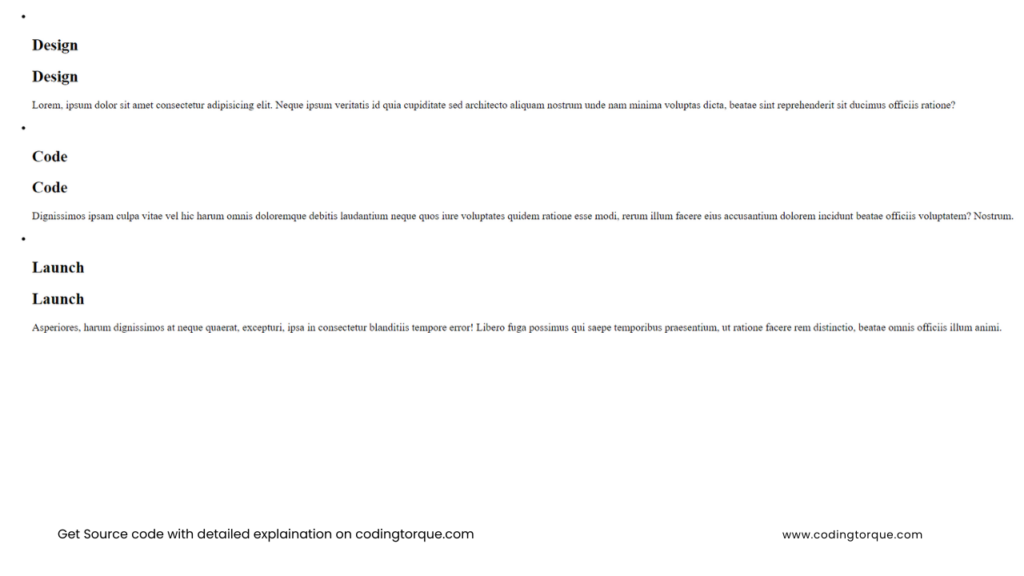
<div class="container">
    <ul class="cards">
        <li class="card cards__item">
            <div class="card__frame">
                <div class="card__picture">
                    <img src="https://image.flaticon.com/icons/svg/1496/1496034.svg" alt="" width="120">
                </div>
                <h2 class="card__title">Design</h2>
            </div>
            <div class="card__overlay"></div>
            <div class="card__content">
                <h2>Design</h2>
                <p>Lorem, ipsum dolor sit amet consectetur adipisicing elit. Neque ipsum veritatis id quia
                    cupiditate sed architecto aliquam nostrum unde nam minima voluptas dicta, beatae sint
                    reprehenderit sit ducimus officiis ratione?</p>
            </div>
        </li>
        <li class="card cards__item">
            <div class="card__frame">
                <div class="card__picture">
                    <img src="https://image.flaticon.com/icons/svg/1336/1336494.svg" alt="" width="120">
                </div>
                <h2 class="card__title">Code</h2>
            </div>
            <div class="card__overlay"></div>
            <div class="card__content">
                <h2>Code</h2>
                <p>Dignissimos ipsam culpa vitae vel hic harum omnis doloremque debitis laudantium neque quos iure
                    voluptates quidem ratione esse modi, rerum illum facere eius accusantium dolorem incidunt beatae
                    officiis voluptatem? Nostrum.</p>
            </div>
        </li>
        <li class="card cards__item">
            <div class="card__frame">
                <div class="card__picture">
                    <img src="https://image.flaticon.com/icons/svg/478/478543.svg" alt="" width="120">
                </div>
                <h2 class="card__title">Launch</h2>
            </div>
            <div class="card__overlay"></div>
            <div class="card__content">
                <h2>Launch</h2>
                <p>Asperiores, harum dignissimos at neque quaerat, excepturi, ipsa in consectetur blanditiis tempore
                    error! Libero fuga possimus qui saepe temporibus praesentium, ut ratione facere rem distinctio,
                    beatae omnis officiis illum animi.</p>
            </div>
        </li>
    </ul>
</div>
Output Till Now
CSS Code
Create a file style.css and paste the code below.
body {
  display: flex;
  align-items: center;
  justify-content: center;
  min-height: 100vh;
  font-family: 'Poppins', sans-serif;
  color: #fff;
  background-color: #333;
}
.container {
  flex-grow: 1;
  max-width: 960px;
  margin-left: auto;
  margin-right: auto;
  padding-left: 20px;
  padding-right: 20px;
}
.cards {
  display: grid;
  grid-template-columns: repeat(3, 1fr);
  grid-gap: 32px;
  margin: 0;
  padding: 0;
  list-style: none;
}
.cards__item {
  height: 400px;
}
.card {
  position: relative;
  display: flex;
  align-items: center;
  justify-content: center;
  background-color: #000;
}
.card::before {
  content: "";
  position: absolute;
  top: 0;
  left: 0;
  z-index: 20;
  width: 50%;
  height: 100%;
  background-color: rgba(255, 255, 255, 0.1);
  pointer-events: none;
}
.card:nth-child(1) {
  background-image: linear-gradient(45deg, #3503ad, #f7308c);
}
.card:nth-child(2) {
  background-image: linear-gradient(45deg, #cf0, #09afff);
}
.card:nth-child(3) {
  background-image: linear-gradient(45deg, #e91e63, #ffeb3b);
}
.card__frame {
  position: absolute;
  top: 0;
  left: 0;
  right: 0;
  bottom: 0;
  display: flex;
  flex-direction: column;
  align-items: center;
  justify-content: center;
  text-align: center;
}
.card__picture {
  margin-bottom: 12px;
  filter: invert(1);
}
.card__picture img {
  display: block;
  max-width: 100%;
  height: auto;
}
.card__title {
  margin: 0;
  font-weight: 700;
  letter-spacing: 0.08em;
  text-transform: uppercase;
}
.card__overlay {
  position: absolute;
  bottom: 20px;
  right: 20px;
  display: flex;
  align-items: center;
  justify-content: center;
  width: 52px;
  height: 52px;
  background-color: #fff;
  border-radius: 50%;
  box-shadow: 0 2px 4px rgba(0, 0, 0, 0.2);
  transition: 0.5s;
  cursor: pointer;
}
.card__overlay::before {
  content: "Read";
  font-size: 12px;
  text-transform: uppercase;
  font-weight: 500;
  letter-spacing: 0.02em;
}
.card__overlay:hover, .card__overlay:focus {
  bottom: 0;
  right: 0;
  width: 100%;
  height: 100%;
  box-shadow: none;
  border-radius: 0;
  opacity: 0.9;
}
.card__overlay:hover::before, .card__overlay:focus::before {
  content: none;
}
.card:nth-child(1) .card__overlay {
  background-image: linear-gradient(45deg, #3503ad, #f7308c);
}
.card:nth-child(2) .card__overlay {
  background-image: linear-gradient(45deg, #cf0, #09afff);
}
.card:nth-child(3) .card__overlay {
  background-image: linear-gradient(45deg, #e91e63, #ffeb3b);
}
.card__content {
  z-index: 1;
  padding: 20px;
  line-height: 1.4;
  opacity: 0;
  visibility: hidden;
  box-sizing: border-box;
  pointer-events: none;
  transition: 0s;
}
.card__overlay:hover ~ .card__content {
  opacity: 1;
  visibility: visible;
  transition: 0.2s 0.3s;
}
.card__content h2 {
  margin: 0;
  margin-bottom: 16px;
}
Output Till Now

Written by: Piyush Patil
If you have any doubts or any project ideas feel free to Contact Us
Hope you find this post helpful💖


