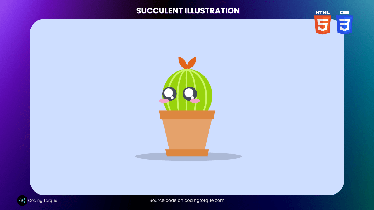
Succulents have become a popular houseplant in recent years, with their unique shapes and colors adding a touch of greenery to any space. In this tutorial, we’ll show you how to create a beautiful succulent illustration using HTML and CSS. By utilizing the power of CSS, we can create intricate designs without the need for images or external assets. We’ll start by creating the HTML structure for the succulent, then use CSS to style each element and create the intricate details that make succulents so appealing. We’ll also show you how to add animation to your design, bringing it to life with movement and depth. By the end of this tutorial, you’ll have a stunning succulent illustration that can be used on its own or incorporated into a larger design project. So, let’s dive into creating a succulent illustration using HTML and CSS!
Before we start here are 50 projects to create using HTML CSS and JavaScript –
I would recommend you don’t just copy and paste the code, just look at the code and type by understanding it.
Demo
HTML Code
Starter Template
<!doctype html>
<html lang="en">

<head>
    <!-- Required meta tags -->
    <meta charset="utf-8">
    <meta name="viewport" content="width=device-width, initial-scale=1">

    <!-- CSS -->
    <link rel="stylesheet" href="style.css">

    <title>Succulent Illustration using HTML and CSS - Coding Torque</title>
</head>

<body>
    <!-- Further code here -->
</body>

</html>
Paste the below code in your <body> tag.
<div class="george">
    <div class="shadow"></div>
    <div class="george_flower"></div>
    <div class="george_head">
        <div class="line"></div>
        <div class="cheek"></div>
        <div class="eye"></div>
        <div class="eye"></div>
    </div>
    <div class="pot_top"></div>
    <div class="pot_body"></div>
    <div class="pot_plate"></div>
</div>
CSS Code
Create a file style.css and paste the code below.
body,
html {
  display: flex;
  align-items: center;
  justify-content: center;
  height: 100%;
  background-color: #cedeff;
}
.george {
  text-align: center;
  display: flex;
  flex-flow: column nowrap;
  align-items: center;
  position: absolute;
  padding-top: 30vh;
}
.george .pot_top {
  width: 30vh;
  height: 0;
  border-top: 5vh solid #dd8740;
  border-left: 0.9090909091vh solid transparent;
  border-right: 0.9090909091vh solid transparent;
}
.george .pot_body {
  width: 20vh;
  height: 0;
  border-top: 17vh solid #e5a26b;
  border-left: 4vh solid transparent;
  border-right: 4vh solid transparent;
}
.george .pot_plate {
  width: 23vh;
  height: 0;
  border-top: 4vh solid #dd8740;
  border-left: 0.8vh solid transparent;
  border-right: 0.8vh solid transparent;
}
.george .george_flower {
  position: absolute;
  top: 0;
  left: 11vh;
  height: 6.6666666667vh;
  width: 5vh;
  border-radius: 0 100% 0 100%;
  background-color: #e2641b;
}
.george .george_flower:before {
  content: "";
  top: 0;
  left: 5vh;
  transform: rotate(70deg);
  position: absolute;
  height: 6.6666666667vh;
  width: 5vh;
  border-radius: 0 100% 0 100%;
  background-color: #e2641b;
}
.george .george_head {
  position: absolute;
  z-index: -1;
  top: 6.6666666667vh;
  left: 2vh;
  height: 30vh;
  width: 28vh;
  background-color: #98d30c;
  border-radius: 100%;
}
.george .george_head .line {
  height: 30vh;
  width: 1vh;
  background-color: #ccf668;
  position: absolute;
  left: 13vh;
}
.george .george_head:before {
  content: "";
  display: block;
  height: 30vh;
  width: 20.7407407407vh;
  border: solid 1vh #ccf668;
  border-radius: 100%;
  position: absolute;
  left: 2.5vh;
}
.george .george_head:after {
  content: "";
  display: block;
  height: 30vh;
  width: 9.3333333333vh;
  border: solid 1vh #ccf668;
  border-radius: 100%;
  position: absolute;
  left: 8vh;
}
.george .george_head .eye {
  height: 8vh;
  width: 8vh;
  position: absolute;
  background-color: #464d5b;
  border-radius: 100%;
  z-index: 1;
  top: 10vh;
  left: 0;
}
.george .george_head .eye:before {
  content: "";
  display: block;
  position: absolute;
  height: 1.6666666667vh;
  width: 1.6666666667vh;
  background-color: #fff;
  border-radius: 100%;
  bottom: 1vh;
  right: 1.6666666667vh;
  animation: shimmer 0.25s infinite alternate;
}
.george .george_head .eye:after {
  content: "";
  display: block;
  position: absolute;
  height: 5vh;
  width: 5vh;
  background-color: #fff;
  border-radius: 100%;
  bottom: 2vh;
  right: 2vh;
  animation: shimmer 0.25s infinite alternate;
}
.george .george_head .eye:last-of-type {
  left: 11.4285714286vh;
}
.george .george_head .cheek {
  height: 2.5vh;
  width: 5.7142857143vh;
  border-radius: 60%;
  background-color: #f2a4ca;
  position: absolute;
  top: 16.6666666667vh;
  left: -2vh;
  z-index: 5;
}
.george .george_head .cheek:after {
  content: "";
  height: 2.5vh;
  width: 5.7142857143vh;
  border-radius: 60%;
  background-color: #f2a4ca;
  position: absolute;
  left: 17.3913043478vh;
  z-index: 5;
}
.george .shadow {
  height: 5vh;
  width: 60vh;
  position: absolute;
  bottom: -2.5vh;
  right: -15vh;
  background-color: #464d5b;
  opacity: 0.25;
  border-radius: 100%;
  z-index: -10;
}
@keyframes shimmer {
  0% {
    transform: translateX(-0.0666666667vh) translateY(0.0666666667vh);
  }
  50% {
    transform: translateX(-0.0666666667vh) translateY(-0.0666666667vh);
  }
  100% {
    transform: translateX(0.0666666667vh) translateY(0.0666666667vh);
  }
}
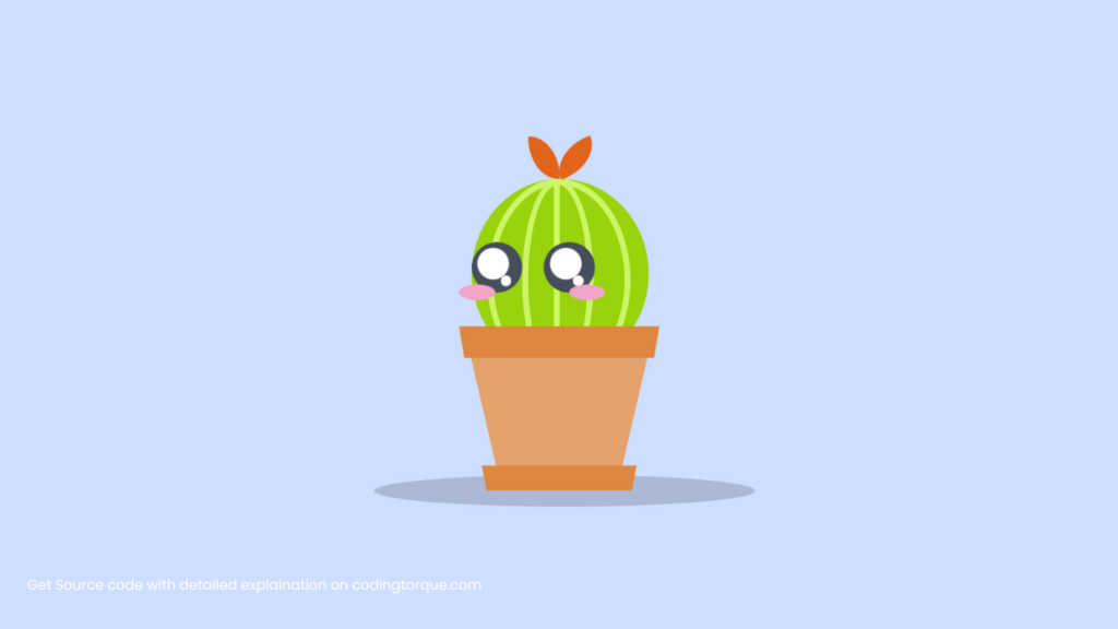
Final Output
Written by: Piyush Patil
Code Credits: @worksbyvan
If you found any mistakes or have any doubts please feel free to Contact Us
Hope you find this post helpful💖


