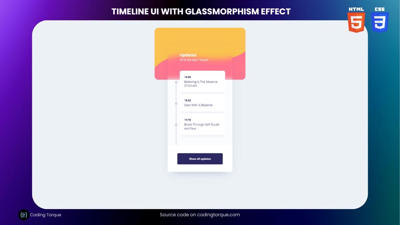
Are you looking for a creative and visually appealing way to display information on your website? Consider building a “Timeline UI Design” using HTML and CSS. This design is perfect for showcasing the history of your company or the milestones of your project. In this tutorial, we’ll walk you through the step-by-step process of creating a “Timeline UI Design” using HTML and CSS. You’ll learn how to create the timeline structure, add the timeline events, and style the design using CSS. Plus, you’ll gain valuable experience in using CSS to create dynamic and responsive designs. By the end of this tutorial, you’ll have a functional and eye-catching “Timeline UI Design” that you can use to engage your website visitors and showcase your accomplishments. So, let’s get started on creating a beautiful and informative timeline using HTML and CSS!
Before we start here are some more projects you might like to create –
- Duck Hunt Game using HTML and CSS
- 3D CSS Cards with Hover Effect
- IPhone X Design using HTML CSS and JavaScript
- CSS Glassmorphism Cards with Hover Effects
I would recommend you don’t just copy and paste the code, just look at the code and type by understanding it.
Demo
HTML Code
Starter Template
<!doctype html>
<html lang="en">

<head>
    <!-- Required meta tags -->
    <meta charset="utf-8">
    <meta name="viewport" content="width=device-width, initial-scale=1">

    <!-- CSS -->
    <link rel="stylesheet" href="style.css">

    <title>Timeline UI Design using HTML and CSS - Coding Torque</title>
</head>

<body>
    <!-- Further code here -->
</body>

</html>
Paste the below code in your <body> tag.
<div class="main">

        <div class="cardTop">
            <svg width="497" height="219" viewBox="0 0 497 219" fill="none" xmlns="http://www.w3.org/2000/svg">
                <path fill-rule="evenodd" clip-rule="evenodd"
                    d="M-38.5 196C-38.5 196 34 91 133.5 91C233 91 427 159 532.5 30C638 -99 518 236 518 236L-49 246.5L-38.5 196Z"
                    fill="#FF768E" />
            </svg>
        </div>

        <div class="timeline">
            <h3>Updates</h3>
            <label>23 in the last 7 hours</label>
            <div class="box">
                <div class="container">
                    <div class="lines">
                        <div class="dot"></div>
                        <div class="line"></div>
                        <div class="dot"></div>
                        <div class="line"></div>
                        <div class="dot"></div>
                        <div class="line"></div>
                    </div>
                    <div class="cards">
                        <div class="card">
                            <h4>16:30</h4>
                            <p>Believing Is The Absence<br> Of Doubt</p>
                        </div>
                        <div class="card mid">
                            <h4>15:22</h4>
                            <p>Start With A Baseline</p>
                        </div>
                        <div class="card">
                            <h4>14:15</h4>
                            <p>Break Through Self Doubt<br> And Fear</p>
                        </div>
                    </div>
                </div>
                <div class="bottom">
                    <div class="btn">Show all updates</div>
                </div>
            </div>
        </div>
    </div>
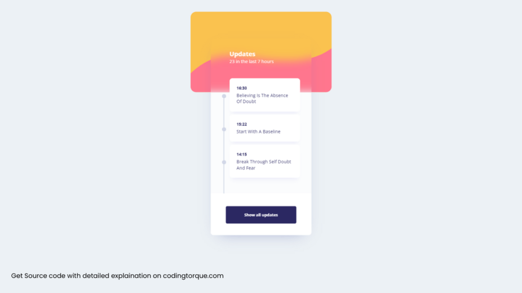
Output Till Now
CSS Code
Create a file style.css and paste the code below.
@import url("https://fonts.googleapis.com/css?family=Open+Sans:400,400i,700");
* {
  margin: 0;
  padding: 0;
  outline: none;
  text-decoration: none;
  list-style: none;
  font-family: "Mulish", sans-serif;
}
body {
  display: flex;
  padding-top: 50px;
  justify-content: center;
  background: #ecf1f5;
  transform: scale(0.8) translateY(-50px);
}
.cardTop {
  width: 497px;
  height: 284px;
  background: #fac24f;
  border-radius: 20px;
  display: flex;
  overflow: hidden;
  align-items: flex-end;
}
.timeline {
  width: 355px;
  height: 696px;
  background: #ecf1f5 24;
  mix-blend-mode: normal;
  backdrop-filter: blur(15px);
  overflow: hidden;
  position: absolute;
  top: 144px;
  margin-left: 71px;
  box-shadow: 0px 20px 53px -30px rgba(95, 102, 173, 0.566816);
  border-radius: 10px;
}
.timeline h3 {
  font-family: Open Sans;
  font-style: normal;
  font-weight: bold;
  font-size: 22px;
  line-height: 30px;
  color: #fff;
  margin-left: 66px;
  margin-top: 40px;
}
.timeline label {
  font-family: Open Sans;
  font-style: normal;
  font-weight: normal;
  font-size: 16px;
  line-height: 22px;
  /* identical to box height */
  margin-left: 66px;
  margin-top: 10px;
  color: #fff;
}
.timeline .box {
  width: 100%;
  height: 509px;
  background: #fbfcfd;
  margin-top: 99.5px;
}
.timeline .box .container {
  width: 100%;
  height: 357px;
  display: flex;
}
.timeline .box .container .lines {
  margin-left: 40px;
  margin-top: 6px;
}
.timeline .box .container .lines .dot {
  width: 14px;
  height: 14px;
  background: #d1d6e6;
  border-radius: 7px;
}
.timeline .box .container .lines .line {
  height: 103px;
  width: 2px;
  background: #d1d6e6;
  margin-left: 5.3px;
}
.timeline .box .container .cards {
  margin-left: 12px;
  transform: translateY(-50px);
}
.timeline .box .container .cards .card {
  width: 249px;
  height: 93px;
  padding-top: 25px;
  background: #fff;
  box-shadow: 0 2px 2px 0 #eee 40;
  border-radius: 10px;
  box-shadow: 0px 16px 15px -10px rgba(105, 96, 215, 0.0944602);
  margin-bottom: 10px;
}
.timeline .box .container .cards .card.mid {
  height: 71px;
}
.timeline .box .container .cards .card h4 {
  font-family: Open Sans;
  font-style: normal;
  font-weight: bold;
  font-size: 14px;
  line-height: 19px;
  margin-left: 25px;
  margin-bottom: 5px;
  color: #2b2862;
}
.timeline .box .container .cards .card p {
  font-family: Open Sans;
  font-style: normal;
  font-weight: normal;
  font-size: 16px;
  line-height: 22px;
  color: #2b2862;
  margin-left: 25px;
}
.timeline .box .bottom {
  width: 100%;
  height: 107px;
  background: #fff;
  box-shadow: 0 0 2px #eee 50;
  padding-top: 45px;
}
.timeline .box .bottom .btn {
  width: 249px;
  height: 62px;
  background: #fff 40;
  mix-blend-mode: normal;
  cursor: pointer;
  border: 1px solid #8260d7 80;
  border-radius: 5px;
  display: flex;
  align-items: center;
  justify-content: center;
  font-family: Open Sans;
  font-style: normal;
  font-weight: bold;
  font-size: 14px;
  line-height: 19px;
  color: #2b2862;
  margin-left: 53px;
  transition: 0.3s;
  background: #2b2862;
  color: #fff;
  border-color: #2b2862;
}
.timeline .box .bottom .btn:hover {
  transform: scale(1.03);
}
Final Output
Written by: Piyush Patil
Code Credits: @bbera
If you found any mistakes or have any doubts please feel free to Contact Us
Hope you find this post helpful💖


