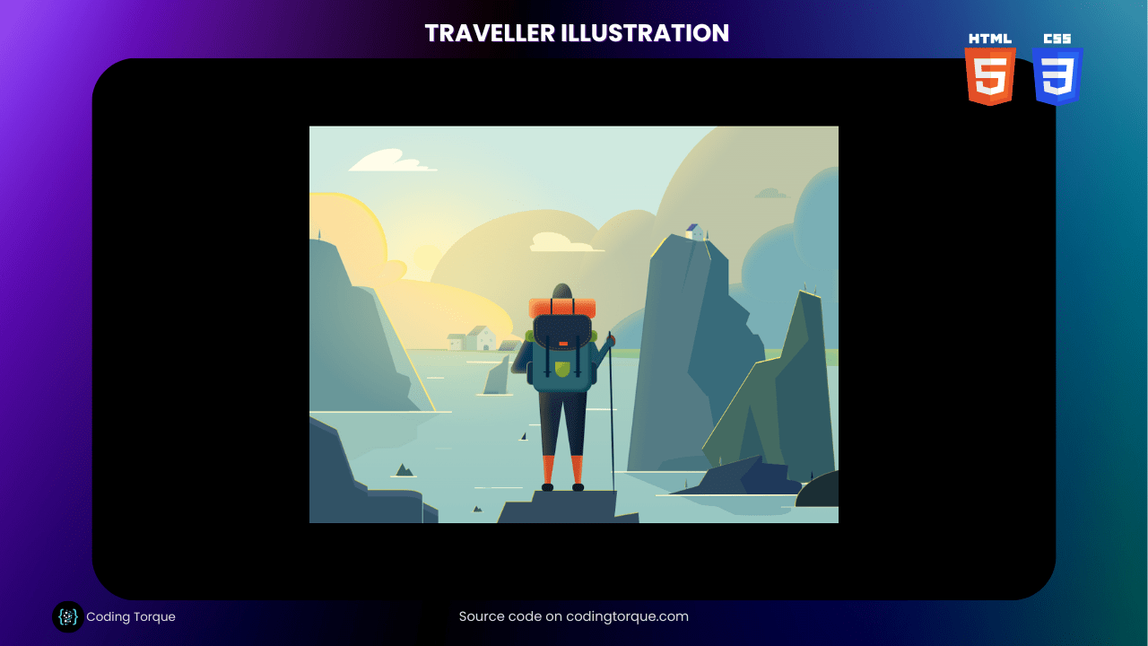
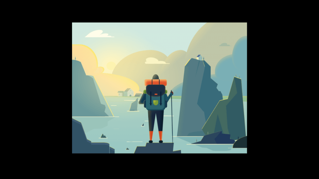
Do you want to showcase your artistic and creative skills using HTML and CSS? Consider creating a “Traveller Illustration” using these two languages. In this tutorial, we’ll show you step-by-step how to create a “Traveller Illustration” from scratch using HTML and CSS. You’ll learn how to use HTML to create the structure of the illustration and style it with CSS to give it a realistic and artistic appearance. Plus, you’ll gain valuable experience in using CSS to create dynamic and responsive designs. By the end of this tutorial, you’ll have a functional and visually stunning “Traveller Illustration” that you can use to showcase your skills and engage your website visitors. So, let’s get started on creating a beautiful and detailed “Traveller Illustration” using HTML and CSS!
Before we start here are 50 projects to create using HTML CSS and JavaScript –
I would recommend you don’t just copy and paste the code, just look at the code and type by understanding it.
Demo
HTML Code
Starter Template
<!doctype html>
<html lang="en">

<head>
    <!-- Required meta tags -->
    <meta charset="utf-8">
    <meta name="viewport" content="width=device-width, initial-scale=1">

    <!-- CSS -->
    <link rel="stylesheet" href="style.css">

   <!-- fontawesome  -->
    <link rel="stylesheet" href="https://use.fontawesome.com/releases/v5.3.1/css/all.css">

    <title>Traveller Illustration using HTML and CSS - Coding Torque</title>
</head>

<body>
    <!-- Further code here -->

     <script src="script.js"></script>
</body>

</html>
Paste the below code in your <body> tag.
<div class="wrap">
    <div class="sun"></div>
    <div class="cloud1"></div>
    <div class="cloud2"></div>
    <div class="cloud3"></div>
    <div class="cloud4"></div>
    <div class="cloud5"></div>
    <div class="cloud6"></div>
    <div class="land"></div>
    <div class="mountain1">
        <div class="rock"></div>
        <div class="ripples"></div>
        <div class="shadow"></div>
        <div class="tree"></div>
    </div>
    <div class="mountain2">
        <div class="shadow1"></div>
        <div class="shadow2"></div>
        <div class="shadow3"></div>
        <div class="shadow4"></div>
        <div class="shadow5"></div>
        <div class="home1">
            <div class='front'>
                <span class="roof"></span>
                <span class="triangle"></span>
                <span class="sidewall"></span>
                <div class="wall">
                    <span class="top-window"></span>
                    <span class="middle-window"></span>
                    <span class="door"></span>
                </div>
            </div>
        </div>
        <div class="tree"></div>
        <div class="ripples"></div>
        <div class="shadow6"></div>
        <div class="shadow7"></div>
    </div>
    <div class="mountain3">
        <div class="rock"></div>
        <div class="shadow1"></div>
        <div class="shadow2"></div>
        <div class="shadow3"></div>
        <div class="tree tree--1"></div>
        <div class="tree tree--2"></div>
        <div class="ripples"></div>
    </div>
    <div class="mountain4">
        <div class="shadow1"></div>
        <div class="shadow2"></div>
        <div class="shadow3"></div>
        <div class="shadow4"></div>
        <div class="ripples"></div>
        <div class="tree tree--1"></div>
        <div class="tree tree--2"></div>
    </div>
    <div class="mountain5">
        <div class="ripples"></div>
        <div class="tree"></div>
    </div>
    <div class="mountain6">
        <div class="shadow1"></div>
    </div>
    <div class="mountain7"></div>
    <div class="mountain8">
        <div class="ripples"></div>
        <div class="shadow"></div>
    </div>
    <div class="mountain9">
        <div class="ripples"></div>
    </div>
    <div class="mountain10">
        <div class="ripples"></div>
    </div>
    <div class="mountain11">
        <div class="ripples"></div>
    </div>
    <div class="home1">
        <div class='front'>
            <span class="roof"></span>
            <span class="triangle"></span>
            <span class="sidewall"></span>
            <div class="wall">
                <span class="top-window"></span>
                <span class="middle-window"></span>
                <span class="door"></span>
            </div>
        </div>
    </div>
    <div class="home2">
        <div class='window'></div>
    </div>
    <div class="home3"></div>
    <div class="home4"></div>
    <div class="traveler">
        <div class="leg-left">
            <div class="boot"></div>
            <div class="sock"></div>
        </div>
        <div class="leg-right">
            <div class="boot"></div>
            <div class="sock"></div>
        </div>
        <div class="backpack">
            <div class="cap"></div>
            <div class="seam"></div>
            <div class="mat3"></div>
        </div>
        <div class="mat1"></div>
        <div class="mat2"></div>
        <div class="head"></div>
        <div class="arm-left"></div>
        <div class="arm-right"></div>
        <div class="stick"></div>
    </div>
    <div class="ripples ripples--1"></div>
    <div class="ripples ripples--2"></div>
</div>
CSS Code
Create a file style.css and paste the code below.
body {
  margin: 150px;
  background: black;
}
.wrap {
  width: 1080px;
  height: 810px;
  margin: 0 auto;
  background: linear-gradient(
    to bottom,
    #d0e9df 0%,
    #d0e9df 55%,
    #acd0c2 56%,
    #98c7c3 100%
  );
  position: relative;
  overflow: hidden;
}
.wrap::before {
  content: "";
  width: 55%;
  height: 65%;
  background: radial-gradient(
    ellipse at center,
    #fef3b0 0%,
    #fef3b0 7%,
    #fff6c7 7%,
    rgba(255, 246, 199, 0.3) 40%,
    rgba(249, 240, 213, 0) 70%
  );
  position: absolute;
  left: -55px;
  top: 5px;
}
.sun {
  width: 85%;
  height: 85%;
  background: radial-gradient(
    ellipse at center,
    rgba(254, 243, 176, 0.5) 0%,
    rgba(255, 244, 177, 0) 55%
  );
  position: absolute;
  left: -140px;
  z-index: 5;
}
.cloud1 {
  background: linear-gradient(
    30deg,
    #d5daba 0%,
    #d5daba 5%,
    #fddd9e 60%,
    #fae56e 85%,
    #fae56e 100%
  );
  border-radius: 0 70% 30% 0;
  width: 415px;
  height: 145px;
  box-shadow: 80px 45px 0 -45px #fddd9e, inset -7px 5px 5px -5px #fde76b;
  position: absolute;
  top: 310px;
  z-index: 3;
}
.cloud1::after {
  content: "";
  width: 45px;
  height: 75px;
  background: linear-gradient(
    30deg,
    rgba(253, 221, 158, 0.5) 0%,
    #fddd9e 60%,
    #fde59b 85%,
    #fae56e 85%,
    #fae56e 100%
  );
  box-shadow: inset 0 8px 5px 0 #fde76b;
  border-radius: 50% 50% 0 0;
  transform: rotate(70deg);
  position: absolute;
  top: -50px;
  left: 140px;
  z-index: 1;
}
.cloud1::before {
  content: "";
  width: 160px;
  height: 180px;
  background: linear-gradient(
    50deg,
    #d5daba 0%,
    #fddd9e 40%,
    #fde59b 85%,
    #fae56e 85%,
    #fae56e 100%
  );
  box-shadow: inset -7px 5px 5px 0 #fde76b;
  border-radius: 0 95% 40% 0;
  position: absolute;
  top: -175px;
}
.cloud2 {
  background: linear-gradient(-30deg, #bfc6a8 0%, #bfc6a8 30%, #f9e49f 100%);
  border-radius: 100% 50% 0 0;
  width: 370px;
  height: 285px;
  position: absolute;
  top: 170px;
  left: 240px;
  z-index: 1;
}
.cloud2::before {
  content: "";
  width: 200px;
  height: 285px;
  background: linear-gradient(-40deg, #bfc6a8 0%, #bfc6a8 65%, #f9e49f 100%);
  border-radius: 85% 50% 0 0;
  position: absolute;
  top: 0px;
  left: 305px;
  z-index: 0;
}
.cloud2::after {
  content: "";
  background: linear-gradient(-50deg, #bfc6a8 0%, #bfc6a8 70%, #f9e49f 100%);
  border-radius: 70% 10% 0 0;
  width: 400px;
  height: 500px;
  position: absolute;
  top: -215px;
  left: 450px;
  z-index: 1;
}
.cloud3 {
  background: #7aafb5;
  border-radius: 200% 0 0 0;
  width: 500px;
  height: 150px;
  box-shadow: inset 0px 14px 20px -2px #a7bba3;
  position: absolute;
  top: 305px;
  left: 600px;
  z-index: 2;
}
.cloud3::before {
  content: "";
  background: #7aafb5;
  border-radius: 65% 30% 0 30%;
  width: 200px;
  height: 165px;
  box-shadow: inset 0px 14px 20px -2px #a7bba3;
  position: absolute;
  top: -110px;
  left: 282px;
}
.cloud3::after {
  content: "";
  background: #7aafb5;
  border-radius: 90% 0 0 50%;
  width: 140px;
  height: 210px;
  box-shadow: inset 0px 14px 20px -2px #a7bba3;
  position: absolute;
  top: -222px;
  left: 387px;
}
.cloud4 {
  width: 76px;
  height: 45px;
  background: #fffdea;
  border-radius: 50% 50% 0 0;
  box-shadow: 64px 11px 0 -11px #fffdea, 100px 18px 0 -18px #fffdea,
    127px 21px 0 -21px #fffdea;
  transform: skew(-50deg, 0);
  position: absolute;
  top: 45px;
  left: 105px;
}
.cloud5 {
  width: 76px;
  height: 40px;
  background: #faf4c4;
  border-radius: 50% 50% 0 0;
  box-shadow: 50px 11px 0 -11px #faf4c4, 80px 18px 0 -18px #faf4c4,
    -25px 12px 0 -12px #faf4c4;
  transform: skew(25deg, 0);
  position: absolute;
  top: 216px;
  left: 457px;
  z-index: 5;
}
.cloud6 {
  width: 76px;
  height: 40px;
  background: #a7bba3;
  border-radius: 50% 50% 0 0;
  box-shadow: 50px 11px 0 -11px #a7bba3, 80px 18px 0 -18px #a7bba3,
    -25px 12px 0 -12px #a7bba3;
  transform: skew(-25deg, 0) scale(0.5);
  position: absolute;
  top: 116px;
  left: 900px;
  z-index: 5;
}
.land {
  width: 0;
  height: 0;
  border-style: solid;
  border-width: 0 900px 35px 0;
  border-color: transparent #8cc199 transparent transparent;
  position: absolute;
  right: 0;
  top: 455px;
  z-index: 3;
}
.land::before {
  content: "";
  width: 900px;
  height: 35px;
  box-shadow: inset 0 5px 20px -5px #d1d074;
  position: absolute;
}
.home1 {
  display: flex;
  flex-direction: row-reverse;
  align-items: flex-end;
  position: absolute;
  top: 407px;
  left: 320px;
  z-index: 4;
}
.home1 .front {
  height: 50px;
  width: 60px;
  display: grid;
  grid-template-columns: 2fr 3fr;
  grid-template-rows: 2fr 3fr;
}
.home1 .front .roof {
  background: linear-gradient(#b8b481, #859297);
  transform: skewX(-45deg) translateX(50%);
}
.home1 .front .triangle {
  border-bottom: 20px solid #cad3ca;
  border-left: 20px solid transparent;
  border-right: 20px solid transparent;
}
.home1 .front .wall {
  display: flex;
  flex-direction: column;
  align-items: center;
}
.home1 .wall {
  background: #cad3ca;
}
.home1 .sidewall {
  background: #94baae;
}
.home1 .top-window {
  width: 8px;
  height: 8px;
  display: inline-block;
  background: #a9c1c1;
  border-radius: 100%;
  transform: translateY(-120%);
}
.home1 .middle-window {
  display: flex;
  justify-content: space-around;
  width: 100%;
}
.home1 .middle-window::after,
.home1 .middle-window::before {
  content: "";
  display: inline-block;
  height: 5px;
  width: 5px;
  background: #a9c1c1;
}
.home1 .door {
  display: inline-block;
  height: 11px;
  width: 10px;
  background: #6d949b;
  border-top-left-radius: 25px;
  border-top-right-radius: 25px;
  transform: translateY(55%);
}
.home2 {
  width: 40px;
  height: 25px;
  background: linear-gradient(
    to right,
    #fae69b 0%,
    #cbd7bf 20%,
    #cbd7bf 60%,
    #92b49d 80%,
    #92b49d 100%
  );
  position: absolute;
  top: 432px;
  left: 282px;
  z-index: 3;
}
.home2::before {
  content: "";
  width: 2em;
  border-style: solid;
  border-color: #92b49d transparent;
  border-width: 0 4px 10px;
  position: absolute;
  top: -8px;
}
.home2::after {
  content: "";
  width: 34px;
  height: 8px;
  background: linear-gradient(to right, #a2b393 0%, #87a389 100%);
  transform: skewX(-26deg);
  position: absolute;
  top: -6px;
}
.home2 .window {
  width: 4px;
  height: 5px;
  background: #8aa590;
  transform: rotate(45deg);
  box-shadow: 7px -10px 0 -1px #8aa590;
  position: absolute;
  top: 10px;
  left: 7px;
}
.home3 {
  width: 35px;
  height: 21px;
  background: linear-gradient(to bottom, #b6ba89 0%, #516f85 100%);
  transform: skewX(-26deg);
  position: absolute;
  top: 437px;
  left: 390px;
  z-index: 3;
}
.home3::before {
  content: "";
  width: 0;
  height: 0;
  border-style: solid;
  border-width: 0 15px 21px 15px;
  border-color: transparent transparent #8db2ae transparent;
  transform: skewX(26deg);
  position: absolute;
  top: 0;
  left: 25px;
}
.tree {
  width: 0;
  height: 0;
  border-style: solid;
  border-width: 0 2.5px 20px 3.5px;
  border-color: transparent transparent #547b8e transparent;
  position: absolute;
  top: -62px;
  left: 114px;
  z-index: 4;
}
.tree::before {
  content: "";
  width: 1.5px;
  height: 10px;
  background: #547b8e;
  position: absolute;
  top: 20px;
  left: -1px;
}
.ripples {
  width: 315px;
  height: 3px;
  background: #fef7ce;
  border-radius: 0 85% 0;
  position: absolute;
  top: 64px;
  left: -55px;
  z-index: 4;
}
.mountain1 {
  width: 3em;
  border-style: solid;
  border-color: #699799 transparent;
  border-width: 0 9em 22em 0;
  border-radius: 0 100% 0 0;
  position: absolute;
  top: 230px;
  left: 0;
  z-index: 4;
}
.mountain1::before {
  content: "";
  width: 3em;
  border-style: solid;
  border-color: #699799 transparent;
  border-width: 0 5em 16em 0;
  border-radius: 0 95% 0 0;
  position: absolute;
  top: 96px;
  left: 75px;
  z-index: 4;
}
.mountain1::after {
  content: "";
  width: 3em;
  border-style: solid;
  border-color: #94bdb8 transparent;
  border-width: 0 8em 16em 0;
  border-radius: 0 90% 0 0;
  filter: drop-shadow(4px 1px 1px #ffe972);
  position: absolute;
  top: 96px;
  left: 80px;
  z-index: 3;
}
.mountain1 .rock::after {
  content: "";
  width: 1em;
  border-style: solid;
  border-color: #699799 transparent;
  border-width: 0 3em 2em 1.5em;
  border-radius: 0 0 0;
  transform: rotate(72deg);
  position: absolute;
  top: 290px;
  left: 150px;
  z-index: 4;
}
.mountain1 .rock::before {
  content: "";
  width: 0;
  border-style: solid;
  border-color: #699799 transparent;
  border-width: 0 2em 2em 0.5em;
  border-radius: 0 0 0;
  position: absolute;
  top: 320px;
  left: 190px;
  z-index: 4;
}
.mountain1 .ripples {
  width: 290px;
  height: 3px;
  background: #fef7ce;
  border-radius: 0 0 85% 0;
  position: absolute;
  top: 352px;
  left: 0;
  z-index: 4;
}
.mountain1 .shadow {
  width: 7em;
  border-style: solid;
  border-color: #9ac4ba transparent;
  border-width: 0 12em 6em 1em;
  border-radius: 0 0 0;
  transform: rotate(180deg) rotateY(160deg);
  position: absolute;
  top: 356px;
  left: -40px;
  z-index: 4;
}
.mountain1 .shadow::before {
  content: "";
  width: 3em;
  border-style: solid;
  border-color: #9ac4ba transparent;
  border-width: 0 5em 2em 1em;
  border-radius: 0 0 0;
  transform: rotate(25deg) rotateY(160deg);
  position: absolute;
  top: 20px;
  left: 125px;
  z-index: 4;
}
.mountain1 .tree {
  border-color: transparent transparent #6a97a8 transparent;
  top: -21px;
  left: 18px;
}
.mountain2 {
  width: 10em;
  border-style: solid;
  border-color: #547b84 transparent;
  border-width: 0 0em 27em 3em;
  border-radius: 0 0 0;
  position: absolute;
  top: 17em;
  left: 40.5em;
  z-index: 4;
}
.mountain2::before {
  content: "";
  width: 5.1em;
  border-style: solid;
  border-color: #547b84 transparent;
  border-width: 0 0.8em 2.4em 1.8em;
  filter: drop-shadow(1px -5px 0 #ffe966);
  position: absolute;
  top: -2.4em;
  left: 0px;
}
.mountain2::after {
  content: "";
  width: 0;
  border-style: solid;
  border-color: #547b84 transparent;
  border-width: 0 3.5em 1em 1em;
  position: absolute;
  top: -53px;
  left: 28px;
  z-index: 6;
}
.mountain2 .shadow1::before {
  content: "";
  width: 34px;
  border-style: solid;
  border-color: #386b7a transparent;
  border-width: 0 0 14.5em 50px;
  position: absolute;
  top: 0;
  left: 76px;
  z-index: 4;
}
.mountain2 .shadow1::after {
  content: "";
  width: 10px;
  border-style: solid;
  border-color: #386b7a transparent;
  border-width: 0 1.6em 2.4em 0;
  transform: skewX(19deg);
  position: absolute;
  top: -38px;
  left: 118px;
  z-index: 4;
}
.mountain2 .shadow2::before {
  content: "";
  width: 14px;
  border-style: solid;
  border-color: #386b7a transparent;
  border-width: 0 0 9.7em 28px;
  transform: rotate(180deg) rotateY(180deg);
  position: absolute;
  top: 275px;
  left: 117px;
  z-index: 4;
}
.mountain2 .shadow2::after {
  content: "";
  width: 43px;
  border-style: solid;
  border-color: #386b7a transparent;
  border-width: 0 2.5em 3em 0;
  transform: rotate(180deg);
  position: absolute;
  top: 231px;
  left: 76px;
  z-index: 4;
}
.mountain2 .shadow3::before {
  content: "";
  width: 0;
  border-style: solid;
  border-color: #386b7a transparent;
  border-width: 93px 61px 0 0;
  transform: skew(22deg, -66deg) rotate(168deg);
  position: absolute;
  top: 112px;
  left: 119px;
  z-index: 4;
}
.mountain2 .shadow3::after {
  content: "";
  width: 0;
  border-style: solid;
  border-color: #386b7a transparent;
  border-width: 60px 35px 0 0;
  transform: skew(22deg, -66deg) rotate(173deg);
  position: absolute;
  top: 141px;
  left: 159px;
  z-index: 4;
}
.mountain2 .shadow4 {
  width: 105px;
  height: 259px;
  background: #386b7a;
  position: absolute;
  transform: skewX(7deg);
  top: 173px;
  left: 142px;
  z-index: 4;
}
.mountain2 .shadow4::before {
  content: "";
  width: 35px;
  height: 20px;
  background: #386b7a;
  position: absolute;
  transform: skewX(22deg);
  top: -20px;
  left: 66px;
  z-index: 4;
}
.mountain2 .shadow5 {
  width: 191px;
  height: 432px;
  background: linear-gradient(to right, #648a81 0%, rgba(255, 255, 255, 0) 16%);
  transform: rotate(6deg);
  opacity: 0.6;
  position: absolute;
  left: -22px;
  top: 8px;
  z-index: 5;
}
.mountain2 .shadow5::before {
  content: "";
  width: 0;
  border-style: solid;
  border-color: #386b7a transparent;
  border-width: 0 0.5em 7em 0;
  transform: rotate(190deg);
  position: absolute;
  top: -48px;
  left: 72px;
  z-index: 4;
}
.mountain2 .shadow5::after {
  content: "";
  width: 115px;
  border-style: solid;
  border-color: #356d78 transparent;
  border-width: 0 2.5em 2em 21px;
  border-radius: 75% 0 0 0;
  transform: rotate(-6deg);
  opacity: 0.7;
  position: absolute;
  top: 388px;
  left: 55px;
  z-index: 4;
}
.mountain2 .home1 {
  top: -80px;
  left: 60px;
  z-index: 4;
  transform: scale(0.7) rotateY(30deg);
}
.mountain2 .home1 .door,
.mountain2 .home1 .top-window {
  visibility: hidden;
}
.mountain2 .home1 .roof {
  background: linear-gradient(to right, #6d6aa3, #376491);
}
.mountain2 .home1 .triangle {
  border-bottom: 20px solid #9ab9b7;
}
.mountain2 .home1 .wall {
  background: #9ab9b7;
}
.mountain2 .home1 .sidewall {
  background: linear-gradient(to right, #f8ec94, #eff5df);
}
.mountain2 .home1 .middle-window::before,
.mountain2 .home1 .middle-window::after {
  background: #356d78;
  opacity: 0.5;
}
.mountain2 .tree {
  width: 0;
  height: 0;
  border-style: solid;
  border-width: 0 2.5px 20px 3.5px;
  border-color: transparent transparent #547b8e transparent;
  position: absolute;
  top: -62px;
  left: 114px;
  z-index: 4;
}
.mountain2 .tree::before {
  content: "";
  width: 1.5px;
  height: 10px;
  background: #547b8e;
  position: absolute;
  top: 20px;
  left: -1px;
}
.mountain2 .ripples {
  width: 290px;
  height: 3px;
  background: #fef7ce;
  border-radius: 0 85% 0;
  position: absolute;
  top: 432px;
  left: -80px;
  z-index: 4;
}
.mountain2 .shadow6 {
  width: 14em;
  border-style: solid;
  border-color: #7fb3b3 transparent;
  border-width: 0 11em 4.5em 1em;
  border-radius: 15% 70% 0 0;
  transform: rotate(180deg);
  position: absolute;
  top: 435px;
  left: -57px;
  z-index: 4;
}
.mountain2 .shadow7 {
  width: 7em;
  border-style: solid;
  border-color: #7fb3b3 transparent;
  border-width: 0 10em 4.5em 0em;
  border-radius: 15% 70% 0 0;
  transform: rotate(180deg);
  position: absolute;
  top: 450px;
  left: 15px;
  z-index: 4;
}
.mountain3 {
  width: 3em;
  border-style: solid;
  border-color: #446a61 transparent;
  border-width: 0 2em 23.5em 6.8em;
  border-radius: 0 0 0;
  filter: drop-shadow(0px -1.5px 0px #ffe966);
  position: absolute;
  top: 22em;
  left: 55.5em;
  z-index: 5;
}
.mountain3::before {
  content: "";
  width: 0;
  border-style: solid;
  border-color: #446a61 transparent;
  border-width: 0 2.8em 1em 0.3em;
  border-radius: 0 0 0;
  position: absolute;
  top: -1em;
  left: 0em;
  z-index: 6;
}
.mountain3::after {
  content: "";
  width: 3em;
  border-style: solid;
  border-color: #446a61 transparent;
  border-width: 0 2em 15em 6em;
  border-radius: 0 0 0;
  position: absolute;
  top: 8.5em;
  left: -10em;
  z-index: 5;
}
.mountain3 .rock {
  width: 13em;
  border-style: solid;
  border-color: #446a61 transparent;
  border-width: 0 4em 4em 2em;
  transform: rotate(-58deg);
  border-radius: 0 0 0;
  position: absolute;
  top: 12em;
  left: -16em;
  z-index: 0;
}
.mountain3 .shadow1 {
  width: 0;
  border-style: solid;
  border-color: #315b63 transparent;
  border-width: 0 3em 10em 2em;
  border-radius: 0 0 0;
  position: absolute;
  top: 13.5em;
  left: -8em;
  z-index: 6;
}
.mountain3 .shadow1::before {
  content: "";
  width: 1.5em;
  border-style: solid;
  border-color: #315b63 transparent;
  border-width: 10em 0em 13em 1em;
  transform: skew(5deg, 17deg);
  border-radius: 0 0 0;
  position: absolute;
  top: -14em;
  left: 7.4em;
  z-index: 6;
}
.mountain3 .shadow1::after {
  content: "";
  width: 9em;
  border-style: solid;
  border-color: #315b63 transparent;
  border-width: 0 6em 6em 4em;
  transform: rotate(-94deg);
  border-radius: 0 0 0;
  position: absolute;
  top: -3em;
  left: -3em;
  z-index: 6;
}
.mountain3 .shadow2 {
  width: 4.8em;
  border-style: solid;
  border-color: #315b63 transparent;
  border-width: 0 1em 4em 0;
  position: absolute;
  transform: skewX(17deg);
  top: 19.3em;
  left: -1.5em;
  z-index: 6;
}
.mountain3 .ripples {
  width: 290px;
  height: 3px;
  background: #fef7ce;
  border-radius: 0 85% 0;
  position: absolute;
  top: 376px;
  left: -165px;
  z-index: 4;
}
.mountain3 .tree--1 {
  top: -35px;
  left: 13px;
  transform: rotate(-10deg) scale(0.8);
}
.mountain3 .tree--2 {
  top: -28px;
  left: 35px;
  transform: rotate(8deg) scale(0.8);
}
.mountain4 {
  width: 9em;
  border-style: solid;
  border-color: #2b465d transparent;
  border-width: 0em 2.5em 4em 0;
  border-radius: 25% 65% 0 0;
  transform: rotateY(180deg);
  filter: drop-shadow(2px 0px 0 #c3bd65);
  position: absolute;
  top: 43em;
  left: 49em;
  z-index: 5;
}
.mountain4 .shadow1 {
  width: 7em;
  border-style: solid;
  border-color: #20395b transparent;
  border-width: 0em 1em 2em 0;
  border-radius: 0 0 0 40%;
  transform: rotate(180deg) rotateY(180deg);
  position: absolute;
  top: 32px;
  left: -39px;
  z-index: 5;
}
.mountain4 .shadow2 {
  width: 4em;
  border-style: solid;
  border-color: #20395b transparent;
  border-width: 0em 2em 2.3em 0;
  border-radius: 0;
  transform: rotate(-5deg);
  position: absolute;
  top: 0;
  left: -8px;
  z-index: 5;
}
.mountain4 .shadow3 {
  width: 0;
  border-style: solid;
  border-color: #2b465d transparent;
  border-width: 0em 7em 2em 0;
  border-radius: 15% 0 0 0;
  position: absolute;
  top: -18px;
  left: 2.7em;
  z-index: 5;
}
.mountain4 .shadow3::before {
  content: "";
  width: 0;
  border-style: solid;
  border-color: #20395b transparent;
  border-width: 0em 1.7em 2em 0;
  border-radius: 20% 0 0 0;
  position: absolute;
  top: 0;
  left: 0;
  z-index: 5;
}
.mountain4 .shadow4 {
  width: 0;
  border-style: solid;
  border-color: #2b465d transparent;
  border-width: 0em 7em 2em 0;
  border-radius: 15% 0 0 0;
  position: absolute;
  top: 32px;
  left: 7.7em;
  z-index: 5;
}
.mountain4 .ripples {
  width: 315px;
  height: 3px;
  background: #fef7ce;
  border-radius: 0 85% 0;
  position: absolute;
  top: 64px;
  left: -55px;
  z-index: 4;
}
.mountain4 .tree--1 {
  top: 30px;
  left: 195px;
}
.mountain4 .tree--2 {
  top: -17px;
  left: 125px;
  transform: scale(0.8);
}
.mountain5 {
  width: 9em;
  height: 5em;
  background-color: #1b2f34;
  border-radius: 100% 0 0 0;
  box-shadow: -2px 0px 0 0 #c3bd65;
  position: absolute;
  top: 43.5em;
  left: 62em;
  z-index: 5;
}
.mountain5 .ripples {
  height: 2px;
  top: 80px;
  left: -30px;
}
.mountain5 .tree {
  border-color: transparent transparent #011a2d transparent;
  position: absolute;
  transform: scale(0.8);
  top: 5px;
  left: 32px;
}
.mountain5 .tree::before {
  background: #011a2d;
}
.mountain6 {
  width: 11em;
  border-style: solid;
  border-color: #315265 transparent;
  border-width: 0em 2em 4em 0;
  border-radius: 0 40% 0 0;
  transform: rotate(90deg) rotateY(180deg);
  filter: drop-shadow(14px 0 0 #426078) drop-shadow(2px 0 0 #e9df50);
  position: absolute;
  top: 42.3em;
  left: -73px;
  z-index: 5;
}
.mountain6::before {
  content: "";
  width: 0;
  border-style: solid;
  border-color: #315265 transparent;
  border-width: 0em 7em 2.5em 0;
  border-radius: 0 40% 0 0;
  position: absolute;
  top: -2.2em;
  left: 4em;
  z-index: 5;
}
.mountain6 .shadow1 {
  width: 3.5em;
  height: 12em;
  background-color: #315265;
  border-top-right-radius: 20%;
  position: absolute;
  top: -10.5em;
  left: 0em;
  z-index: 6;
}
.mountain6 .shadow1::before,
.mountain6 .shadow1::after {
  content: "";
  width: 4em;
  border-style: solid;
  border-color: #315265 transparent;
  border-width: 0em 2em 4em 0;
  border-radius: 0 40% 0 0;
  position: absolute;
  top: 7em;
  left: 0em;
  z-index: 5;
}
.mountain6 .shadow1::after {
  width: 1em;
  border-width: 0em 1em 2em 0;
  border-radius: 0;
  top: -2em;
  left: 0em;
}
.mountain7 {
  width: 10.5em;
  border-style: solid;
  border-color: #334c5f transparent;
  border-width: 0 0 5em 1em;
  border-radius: 0;
  filter: drop-shadow(-1px -1px 0 #e9df50);
  transform: skewX(-6deg);
  position: absolute;
  top: 46.5em;
  left: 27.5em;
  z-index: 4;
}
.mountain7::before,
.mountain7::after {
  content: "";
  width: 10.5em;
  border-style: solid;
  border-color: #334c5f transparent;
  border-width: 0 0 3em 1em;
  border-radius: 0;
  transform: skewX(0deg);
  position: absolute;
  top: 23px;
  left: -72px;
  z-index: 5;
}
.mountain7::after {
  width: 5em;
  border-width: 0 0 2em 1em;
  transform: skewX(0deg) rotate(-10deg);
  top: 53px;
  left: 123px;
}
.mountain8 {
  width: 3em;
  border-style: solid;
  border-color: #6d989a transparent;
  border-width: 0 25px 2em 0;
  border-radius: 0;
  filter: drop-shadow(1px -1px 2px #f2e36e);
  transform: rotate(-90deg) skewY(15deg);
  position: absolute;
  top: 31em;
  left: 21.5em;
  z-index: 4;
}
.mountain8::before {
  content: "";
  width: 4.5em;
  border-style: solid;
  border-color: #6d989a transparent;
  border-width: 0 10px 1em 0;
  border-radius: 0 60% 0 0;
  transform: rotate(0) skewY(-10deg);
  position: absolute;
  top: 23px;
  left: 0px;
  z-index: 4;
}
.mountain8 .ripples {
  width: 75px;
  height: 2px;
  transform: rotate(90deg);
  background: #faffd5;
  top: 22px;
  left: -38px;
}
.mountain8 .shadow {
  width: 46px;
  height: 1px;
  transform: rotate(90deg);
  position: absolute;
  background: #356f87;
  box-shadow: 2px -2px 5px 1px #356f87;
  top: 22px;
  left: -22px;
}
.mountain9,
.mountain10 {
  width: 0;
  border-style: solid;
  border-color: #3b6468 transparent;
  border-width: 0 14px 1.6em 14px;
  border-radius: 0;
  filter: drop-shadow(-0.5px 0 0 #f2e36e);
  position: absolute;
  top: 43em;
  left: 11em;
  z-index: 4;
}
.mountain9::before,
.mountain10::before {
  content: "";
  width: 0;
  border-style: solid;
  border-color: #3b6468 transparent;
  border-width: 0 10px 1em 25px;
  border-radius: 0;
  position: absolute;
  top: 10px;
  left: -10px;
  z-index: 4;
}
.mountain9 .ripples,
.mountain10 .ripples {
  width: 55px;
  height: 2px;
  top: 26px;
  left: -24px;
}
.mountain10 {
  transform: scale(0.5);
  border-color: #3b4457 transparent;
  top: 48em;
  left: 20.5em;
}
.mountain11 {
  width: 0;
  border-style: solid;
  border-color: #233665 transparent;
  border-width: 0 0 1em 10px;
  border-radius: 0;
  filter: drop-shadow(-0.5px 0 0 #f2e36e);
  position: absolute;
  top: 39em;
  left: 27em;
  z-index: 4;
}
.mountain11 .ripples {
  width: 20px;
  height: 2px;
  top: 16px;
  left: -15px;
}
.ripples--1,
.ripples--2 {
  width: 100px;
  height: 3px;
  background: #fef7ce;
  border-radius: 0 85% 0;
  position: absolute;
  top: 30em;
  left: 20em;
  z-index: 3;
  box-shadow: 13em 6em 0 0 #f1ffdc, 1em 16em 0 -1px #f1ffdc;
}
.ripples--2 {
  width: 35px;
  top: 32em;
  left: 15em;
  box-shadow: 13em 6em 0 0 #f1ffdc, 1em 9em 0 -1px #f1ffdc;
}
.traveler .leg-left,
.traveler .leg-right {
  width: 1.5em;
  border-style: solid;
  border-color: #17253c transparent;
  border-width: 0 1.4em 9em 0.6em;
  transform: rotateX(180deg);
  position: absolute;
  top: 33em;
  left: 29.2em;
  z-index: 4;
}
.traveler .leg-left::before,
.traveler .leg-right::before {
  content: "";
  width: 1.5em;
  height: 9em;
  background: linear-gradient(
    to right,
    rgba(101, 102, 51, 0.53) 0%,
    rgba(5, 19, 31, 0) 100%
  );
  position: absolute;
  left: -4px;
  transform: rotate(4deg);
}
.traveler .leg-left .sock,
.traveler .leg-right .sock {
  width: 0.6em;
  border-style: solid;
  border-color: #d1451e transparent;
  border-width: 0 0.6em 4em 0.3em;
  position: absolute;
  top: -4em;
  left: 0px;
  z-index: 4;
}
.traveler .leg-left .sock::before,
.traveler .leg-right .sock::before {
  content: "";
  width: 0.6em;
  height: 4em;
  background: linear-gradient(
    to right,
    rgba(226, 163, 85, 0.53) 0%,
    rgba(5, 11, 31, 0) 100%
  );
  position: absolute;
  left: -2px;
  transform: rotate(4deg);
}
.traveler .leg-left .boot,
.traveler .leg-right .boot {
  width: 1.5em;
  height: 1em;
  background-color: #091e23;
  border-radius: 7px;
  position: absolute;
  top: -4.6em;
  left: -2px;
  z-index: 6;
}
.traveler .leg-right {
  left: 32em;
  transform: rotate(180deg);
}
.traveler .leg-right::before {
  background: linear-gradient(
    to right,
    rgba(5, 25, 40, 0.9) 0%,
    rgba(5, 11, 31, 0) 100%
  );
}
.traveler .backpack {
  width: 7.5em;
  height: 10em;
  background-color: #2b636e;
  border-radius: 20px;
  box-shadow: inset -6px -6px 4px 0 #124854;
  position: absolute;
  top: 24em;
  left: 28.5em;
  z-index: 7;
}
.traveler .backpack::before {
  content: "";
  width: 8px;
  height: 86px;
  background: #042039;
  box-shadow: 62px 0 0 0 #042039;
  position: absolute;
  top: 43px;
  left: 26px;
  z-index: 7;
}
.traveler .backpack::after {
  content: "";
  width: 15px;
  height: 3px;
  background: #042039;
  box-shadow: 62px 0 0 0 #042039;
  position: absolute;
  top: 116px;
  left: 22px;
  z-index: 7;
}
.traveler .backpack .cap {
  width: 7.5em;
  height: 4.7em;
  background-color: #1b2e43;
  border-radius: 20px 20px 45% 45%;
  box-shadow: inset 1px 0 3px 0 #c0cc5a;
  position: absolute;
  top: 0;
  left: 0;
  z-index: 6;
}
.traveler .backpack .cap::before {
  content: "";
  width: 1em;
  height: 0.5em;
  background-color: #e55433;
  position: absolute;
  top: 3.5em;
  left: 3.4em;
  z-index: 5;
}
.traveler .backpack .cap::after {
  content: "";
  width: 30px;
  height: 32px;
  border-radius: 0 0 50% 50%;
  background: linear-gradient(135deg, #ccc834 0%, #789c34 47%, #789c34 100%);
  position: absolute;
  top: 97px;
  left: 46px;
  z-index: 5;
}
.traveler .backpack .seam {
  width: 6.7em;
  height: 4.4em;
  background-color: transparent;
  border: 1px dashed #dd6247;
  border-radius: 20px 20px 45% 45%;
  opacity: 0.6;
  position: absolute;
  top: -2px;
  left: 7px;
  z-index: 6;
}
.traveler .mat1 {
  width: 8.5em;
  height: 2.5em;
  background-color: #de502a;
  border-radius: 10px;
  box-shadow: inset 8px 8px 15px 0 #ffc170;
  position: absolute;
  top: 22em;
  left: 28em;
  z-index: 6;
}
.traveler .mat1::before {
  content: "";
  width: 4px;
  height: 35px;
  background-color: #00233e;
  box-shadow: 45px 0 0 0 #00233e;
  position: absolute;
  top: 0;
  left: 44px;
  z-index: 6;
}
.traveler .mat2 {
  width: 9em;
  height: 3em;
  background-color: #123547;
  border-radius: 10px;
  box-shadow: inset 1px 0px 2px 0 #ffdc9c;
  position: absolute;
  top: 30em;
  left: 27.7em;
  z-index: 6;
}
.traveler .mat3 {
  width: 9.2em;
  height: 1.5em;
  background-color: #2b601a;
  border-radius: 10px;
  box-shadow: inset 2px 2px 15px 0 #c0cc5a;
  position: absolute;
  top: 2em;
  left: -0.95em;
  z-index: 4;
}
.traveler .head {
  width: 2.5em;
  height: 4em;
  border-radius: 90%;
  background: linear-gradient(135deg, #8b7a5a 0%, #061d31 45%, #061d31 100%);
  position: absolute;
  top: 20em;
  left: 31em;
  z-index: 4;
}
.traveler .arm-left {
  width: 71px;
  height: 102px;
  background: #093453;
  border-radius: 25% 40% 73% 164%;
  transform: rotate(206deg) matrix(1, -0.5, 0, 1, 0, 0);
  box-shadow: inset -1px 0 15px 0 #c6b559;
  position: absolute;
  top: 25.5em;
  left: 27em;
  z-index: 5;
}
.traveler .arm-right {
  width: 71px;
  height: 70px;
  background: #1d4f64;
  border-radius: 32%;
  transform: rotate(66deg);
  position: absolute;
  top: 27em;
  left: 32.5em;
  z-index: 5;
}
.traveler .arm-right::before {
  content: "";
  width: 14px;
  height: 70px;
  background: #1d4f64;
  border-radius: 50% 30% 0 0;
  transform: translate(43px, -40px) rotate(-35deg);
  box-shadow: inset -1px 0 3px 0 #001c34;
  position: absolute;
  top: 0;
  left: 0;
  z-index: 5;
}
.traveler .arm-right::after {
  content: "";
  width: 18px;
  height: 24px;
  background: #1d4f64;
  transform: rotate(-66deg) translate(50px, 5px);
  border-radius: 85% 90% 70% 50%;
  box-shadow: inset -2px 5px 3px 0 #821e08;
  position: absolute;
  top: 0;
  left: 0;
  z-index: 6;
}
.traveler .stick {
  width: 4px;
  height: 18.8em;
  background: #0b263b;
  transform: rotate(-1.5deg);
  border-radius: 0 0 40% 40%;
  position: absolute;
  top: 28.1em;
  left: 38.5em;
  z-index: 5;
}
.traveler .stick::before {
  content: "";
  width: 4px;
  height: 16px;
  background: #0b263b;
  transform: rotate(-1deg);
  border-radius: 35%;
  position: absolute;
  top: -32px;
  left: 0;
  z-index: 5;
}
Final Output
Written by: Piyush Patil
Code Credits: @petrek
If you found any mistakes or have any doubts please feel free to Contact Us
Hope you find this post helpful💖


