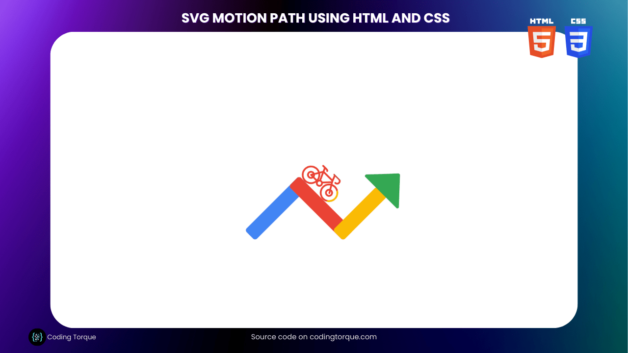
SVGs are a powerful tool for creating vector graphics that can be scaled and animated without losing quality. In this tutorial, we’ll show you how to create an SVG motion path using HTML and CSS. A motion path is an animation technique that allows you to move an object along a specific path, giving the illusion of motion. We’ll start by creating a basic SVG shape, then define a motion path using the <path> element. Next, we’ll use CSS to style the SVG and add animation properties to make the object move along the path. We’ll also show you how to adjust the speed and direction of the animation, as well as adding easing effects for a more natural movement. By the end of this tutorial, you’ll have a good understanding of how to create SVG motion paths and how they can be used to add dynamic and engaging animation to your web projects. So, let’s get started on creating an SVG motion path using HTML and CSS!
Before we start here are 50 projects to create using HTML CSS and JavaScript –
I would recommend you don’t just copy and paste the code, just look at the code and type by understanding it.
Demo
HTML Code
Starter Template
<!doctype html>
<html lang="en">

<head>
    <!-- Required meta tags -->
    <meta charset="utf-8">
    <meta name="viewport" content="width=device-width, initial-scale=1">

    <!-- CSS -->
    <link rel="stylesheet" href="style.css">

    <title>SVG Motion Path using HTML and CSS - Coding Torque</title>
</head>

<body>
    <!-- Further code here -->
</body>

</html>
Paste the below code in your <body> tag.
<!-- be warned: messy syntax -->
<svg viewBox="0 0 700 500" width="700" height="500">
    <defs>
        <!-- group element describing the bicycle
    the icon was actually designed for a different project :P
    -->
        <g id="bicycle">
            <svg viewBox="0 0 100 60" x="-75" y="-45" width="150" height="90">
                <g fill="none" stroke-width="4" stroke-linecap="round" stroke-linejoin="round">
                    <circle cx="21" cy="39" r="19" />
                    <circle cx="21" cy="39" r="7" />

                    <circle cx="48" cy="39" r="6" />

                    <path d="M 40 39 h -19 l 15 -25 h 29 l 15 25 m -13.2 -22 l -14 15" />
                    <path d="M 44 32 l -12 -27 h -6 h 10 q 5 0 5 2" />
                    <path d="M 65 13 l -5 -12 h -2 h 15 a 6 6 0 0 1 0 12" />

                    <circle cx="79" cy="39" r="19" />
                    <circle cx="79" cy="39" r="7" />
                </g>
            </svg>
        </g>

        <!-- rectangles clipping the visible area for the bike icon -->
        <clipPath id="clip--blue" clipUnits="userSpaceOnUse">
            <rect transform="rotate(-45)" x="-75" width="300" y="-50" height="100" />
        </clipPath>
        <clipPath id="clip--red">
            <rect transform="rotate(45)" x="-50" width="220" y="-362.5" height="140" />
        </clipPath>
        <clipPath id="clip--yellow">
            <rect transform="rotate(-45)" x="217.5" width="217.5" y="167.5" height="100" />
        </clipPath>
    </defs>
    <g transform="translate(75 400)">
        <!-- path element describing the path picked up by CSS -->
        <!-- <path id="motion-path" fill="none" stroke="currentColor" stroke-width="2" stroke-dasharray="5" d="M 0 0 l 200 -200 a 50 50 0 0 1 50 0 l 100 100 a 50 50 0 0 0 50 0 l 125 -125" /> -->

        <!-- include four variants of the bike group, with a different color and a clip hiding the variant past a defined threshold  -->
        <use href="#bicycle" stroke="#34a853" />
        <use clip-path="url(#clip--yellow)" href="#bicycle" stroke="#fabb05" />
        <use clip-path="url(#clip--red)" href="#bicycle" stroke="#ea4335" />
        <use clip-path="url(#clip--blue)" href="#bicycle" stroke="#4285f4" />

        <!-- colored rectangles included below the bicycle, and very loosely matching the clipPath elements -->
        <g transform="translate(37.5 22.5) rotate(-45)">
            <rect fill="#4285f4" rx="10" width="262.5" height="50" />
            <g transform="translate(262.5 0)">
                <g transform="rotate(90)">
                    <rect fill="#ea4335" rx="10" width="262.5" height="50" />
                    <g transform="translate(212.5 50)">
                        <g transform="rotate(-90)">
                            <rect fill="#fabb05" rx="10" width="212.5" height="50" />
                            <g transform="translate(212.5 50)">
                                <path fill="#34a853" stroke="#34a853" stroke-width="10" stroke-linejoin="round"
                                    stroke-linecap="round" d="M 0 0 v 50 l 80 -75 -80 -75 z" />
                            </g>
                        </g>
                    </g>
                </g>
            </g>
        </g>
    </g>
</svg>
CSS Code
Create a file style.css and paste the code below.
* {
  box-sizing: border-box;
  padding: 0;
  margin: 0;
}
/* center in the viewport */
body {
  min-height: 100vh;
  display: flex;
  flex-direction: column;
  justify-content: center;
  align-items: center;
}
body > svg {
  display: block;
  width: 80vw;
  max-width: 500px;
  height: auto;
}

/* animate the group describing the bicycle along a prescribed path */
#bicycle {
  offset-path: path(
    "M 0 0 l 200 -200 a 50 50 0 0 1 50 0 l 100 100 a 50 50 0 0 0 50 0 l 125 -125"
  );
  offset-distance: 0%;
  animation: offsetDistance 4s cubic-bezier(0.645, 0.045, 0.355, 1) infinite
    alternate;
}
@keyframes offsetDistance {
  to {
    offset-distance: 100%;
  }
}
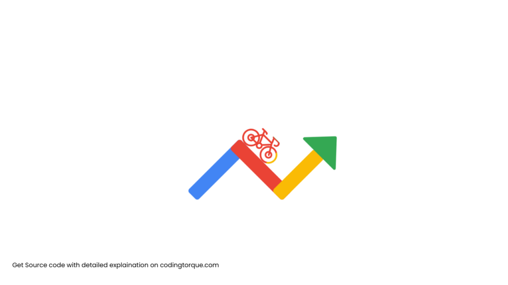
Final Output
Written by: Piyush Patil
Code Credits: @borntofrappe
If you found any mistakes or have any doubts please feel free to Contact Us
Hope you find this post helpful💖


