Before we start, here are some cards you might like to create:
- Filter Cards using JavaScript
- Animated Product Card using JavaScript
- Profile Cards Hover Effect using HTML & CSS
I would recommend you don’t just copy and paste the code, just look at the code and type by understanding it.
HTML Code
Starter Template
<!doctype html>
<html lang="en">

<head>
    <!-- Required meta tags -->
    <meta charset="utf-8">
    <meta name="viewport" content="width=device-width, initial-scale=1">

    <!-- CSS -->
    <link rel="stylesheet" href="style.css">

    <title>Cards with reflection effect - Coding Torque</title>
</head>

<body>
   <!-- Further code here -->
</body>

</html>
Paste the below code in your <body> tag.
<div class="container">
<img src="https://images.unsplash.com/photo-1598550880863-4e8aa3d0edb4?ixlib=rb-4.0.3&ixid=MnwxMjA3fDB8MHxwaG90by1wYWdlfHx8fGVufDB8fHx8&auto=format&fit=crop&w=327&q=80"
alt="">
<img src="https://images.unsplash.com/photo-1500648767791-00dcc994a43e?ixlib=rb-4.0.3&ixid=MnwxMjA3fDB8MHxwaG90by1wYWdlfHx8fGVufDB8fHx8&auto=format&fit=crop&w=387&q=80"
alt="">
<img src="https://images.unsplash.com/photo-1517841905240-472988babdf9?ixlib=rb-4.0.3&ixid=MnwxMjA3fDB8MHxwaG90by1wYWdlfHx8fGVufDB8fHx8&auto=format&fit=crop&w=1887&q=80"
alt="">
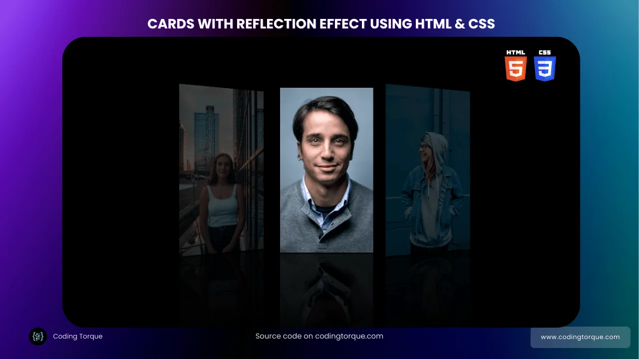
</div>Output Till Now
CSS Code
Create a file style.css and paste the code below.
* {
  margin: 0;
  padding: 0;
  box-sizing: border-box;
}

body {
  width: 100%;
  height: 100vh;
  background-color: #000;
  display: grid;
  place-items: center;
}

img {
  width: 30%;
  height: 20rem;
  object-fit: cover;
  -webkit-box-reflect: below 2px
    linear-gradient(transparent, transparent, #0004);
  transform-origin: center;
  transform: perspective(800px) rotateY(25deg);
  transition: 0.5s;
}

.container {
  max-width: 600px;
  max-height: 350px;

  display: flex;
  justify-content: center;
  align-items: center;
  gap: 20px;
}

.container:hover img {
  opacity: 0.3;
}

.container img:hover {
  transform: perspective(800px) rotateY(0deg);
  opacity: 1;
}
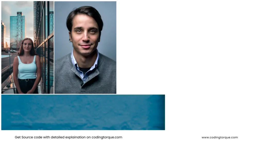
Output Till Now

Written by: Piyush Patil
If you have any doubts or any project ideas feel free to Contact Us
Hope you find this post helpful💖