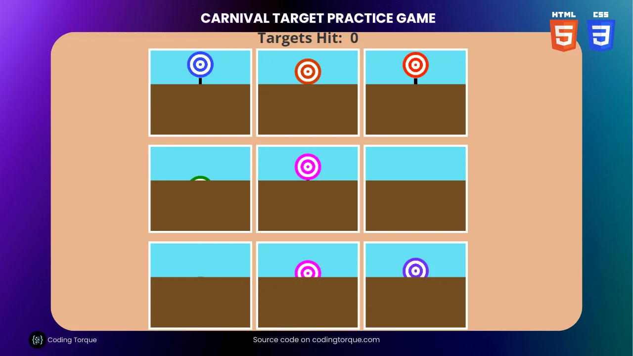
Are you a fan of carnival games? Do you enjoy testing your aim and accuracy with target shooting? If so, you’re in luck! In this blog post, we’ll explore how to create a fun and interactive carnival target practice game using only HTML and CSS.
Target practice games are a classic carnival staple, and with this tutorial, you’ll learn how to create your very own version to play and share with friends. Using HTML and CSS, we’ll design and code the game’s elements, including the targets, background, and user interface.
So, whether you’re looking to improve your web development skills or just want to create a fun game to play, this tutorial is for you. Let’s get started and bring the carnival to your computer screen!
Before we start here are some more games you might like to create using css only –
- Neomorphic Tic Tac Toe Game using HTML and CSS Only
- Whac a mole game using HTML and CSS Only
- Plankman Game using HTML and CSS Only
- Rock Paper Scissor Game using HTML and CSS Only
- Carnival Target Practice Game using HTML and CSS Only
I would recommend you don’t just copy and paste the code, just look at the code and type by understanding it.
Demo
See the Pen Pure CSS (Sass) Carnival Game by Una Kravets (@una) on CodePen.
HTML Code
Starter Template
<!doctype html>
<html lang="en">

<head>
    <!-- Required meta tags -->
    <meta charset="utf-8">
    <meta name="viewport" content="width=device-width, initial-scale=1">

    <link href='https://fonts.googleapis.com/css?family=Open+Sans:400,700' rel='stylesheet'
    type='text/css'>

    <!-- CSS -->
    <link rel="stylesheet" href="style.css">

    <title>Carnival Target Practice Game using HTML and CSS Only - Coding Torque</title>
</head>

<body>
    <!-- Further code here -->
</body>

</html>
Paste the below code in your <body> tag.
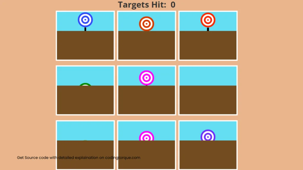
<h1>CSS Only Carnival: Target Practice</h1> <h2>This game uses no JS at all (isn't CSS awesome?). You have 8 seconds to hit as many targets as you can!</h2> <div class="game-over"> <h1>Game Over!</h1> <a class="play-again" target="_parent" href="https://codepen.io/una/full/NxZaNr">Play Again</a> </div> <ul class="game-area"> <li><input type="checkbox"><div class="shield"></div></li> <li><input type="checkbox"><div class="shield"></div></li> <li><input type="checkbox"><div class="shield"></div></li> <li><input type="checkbox"><div class="shield"></div></li> <li><input type="checkbox"><div class="shield"></div></li> <li><input type="checkbox"><div class="shield"></div></li> <li><input type="checkbox"><div class="shield"></div></li> <li><input type="checkbox"><div class="shield"></div></li> <li><input type="checkbox"><div class="shield"></div></li> </ul> <h3 class="total-count">Targets Hit: </h3> <small><a href="https://twitter.com/<una</una>">Made with love by @una ♥</a></small>
CSS Code
Create a file style.css and paste the code below.
* {
  box-sizing: border-box;
}

h1 {
  font-size: 1.4em;
}

body {
  counter-reset: game;
  text-align: center;
  background: #e9b58b;
  font-family: 'Open Sans', 'Helvetica', 'Arial', sans-serif;
  color: #333;
}

input:checked {
  counter-increment: game;
}

.total-count::after {
  content: counter(game);
}

h2 {
  font-size: 1em;
  margin: -.5em auto 3em;
  font-weight: 400;
}

.total-count {
  font-size: 1.75em;
  position: absolute;
  top: 1.75em;
  width: 100%;
  left: 0;
  text-align: center;
  z-index: 300;
}

.game-area {
  display: flex;
  flex-flow: wrap;
  align-items: center;
  justify-content: space-between;
  max-width: 600px;
  min-height: 550px;
  max-height: 700px;
  margin: 0 auto;
  padding-left: 0; //list reset
}

li {
  width: calc(33% - .5em);
  margin-bottom: 1em;
  height: 10em;
  list-style: none;
  position: relative;
  outline: 4px solid white;
  background: #64ddf3;

  @for $i from 1 through 9 {
    $speed: random()*5 + 's';
    $color-hue: random()*360 + 'deg';
    $brightness: random() + 1;

    &:nth-child(#{$i}) {
      input {
        filter: hue-rotate(#{$color-hue}) brightness(#{$brightness});
        animation-duration: #{$speed};
      }
    }
  }
}

input[type="checkbox"] {
  width: 50px;
  height: 50px;
  position: absolute;
  cursor: crosshair;
  background: radial-gradient(red 10%, white 10%, white 30%, red 30%, red 50%, white 50%, white 80%, red 80%, red 100%);
  border-radius: 50%;
  display: block;
  left: 0;
  right: 0;
  text-align: center;
  margin: 0 auto;
  appearance: none;
  border: 6px solid red;
  animation: hide-target infinite alternate ease-in-out;
  z-index: 1;

  &:before {
    content: '';
    display: block;
    background-color: black;
    height: 50%;
    width: 6px;
    position: absolute;
    left: 0; right: 0;
    top: calc(100% + 6px);
    margin: 0 auto;
    z-index: -1;
  }

  &:focus {
    outline: none;
    appearance: none;
  }


  &:checked {
    pointer-events: none;
    filter: grayscale(1) opacity(.75);
    animation: none;

    &:after {
      content: '+1!';
      padding: .5em;
      margin: 1em 0 0 1.5em;
      font-size: 2.5em;
      font-weight: 600;
    }
  }
}

.shield {
  background: #724c20;
  width: 100%;
  height: 60%;
  margin: 0 auto;
  bottom: 0;
  left: 0; right: 0;
  position: absolute;
  pointer-events: all;
  z-index: 100;
}

@keyframes hide-target {
  0% {
    top: 0
  }
  25% {
    top: 50%
  }
  100% {
    top: 0
  }
}

.game-over {
  height: 100%;
  width: 100%;
  display: block;
  background: white;
  pointer-events: all;
  position: absolute;
  top: -100%;
  left: 0;
  z-index: 200;
  animation: appear .25s forwards;
  animation-delay: 8s;
  background: repeating-linear-gradient(-45deg, #c9ff00 0, #c9ff00 5em, #20c0ff 5em, #20c0ff 10em);

  h1 {
    padding: 1em 0 3.5em;
    background: white;
  }
}

@keyframes appear {
  from {
    top: -100vh;
    opacity: 0;
  }
  to {
    top: 0;
    opacity: 1;
  }
}

.play-again {
  background: white;
  color: #20c0ff;
  padding: .5em 1em;
  font-size: 2.5em;
  font-weight: 700;
}

small a {
  margin-bottom: 2em;
  display: block;
  color: #222;
}
Output Till Now
Written by: Piyush Patil
Code Credits: @una
If you found any mistakes or have any doubts please feel free to Contact Us
Hope you find this post helpful💖