
Looking to add some style and flair to your website’s tabs? Consider creating a “Dark Tabs” design using Pure CSS. This sleek and modern design is perfect for websites with a dark color scheme, and can be achieved using only CSS – no JavaScript required! In this tutorial, we’ll walk you through the step-by-step process of creating “Dark Tabs” using Pure CSS. You’ll learn how to create the tab structure, add the dark color scheme, and create hover effects to make your tabs stand out. Plus, you’ll gain valuable experience in using CSS to create dynamic and responsive designs. So, if you’re ready to take your website’s tabs to the next level, let’s get started on creating “Dark Tabs” using Pure CSS!
Before we start here are some more projects you might like to create –
- Duck Hunt Game using HTML and CSS
- 3D CSS Cards with Hover Effect
- IPhone X Design using HTML CSS and JavaScript
- CSS Glassmorphism Cards with Hover Effects
I would recommend you don’t just copy and paste the code, just look at the code and type by understanding it.
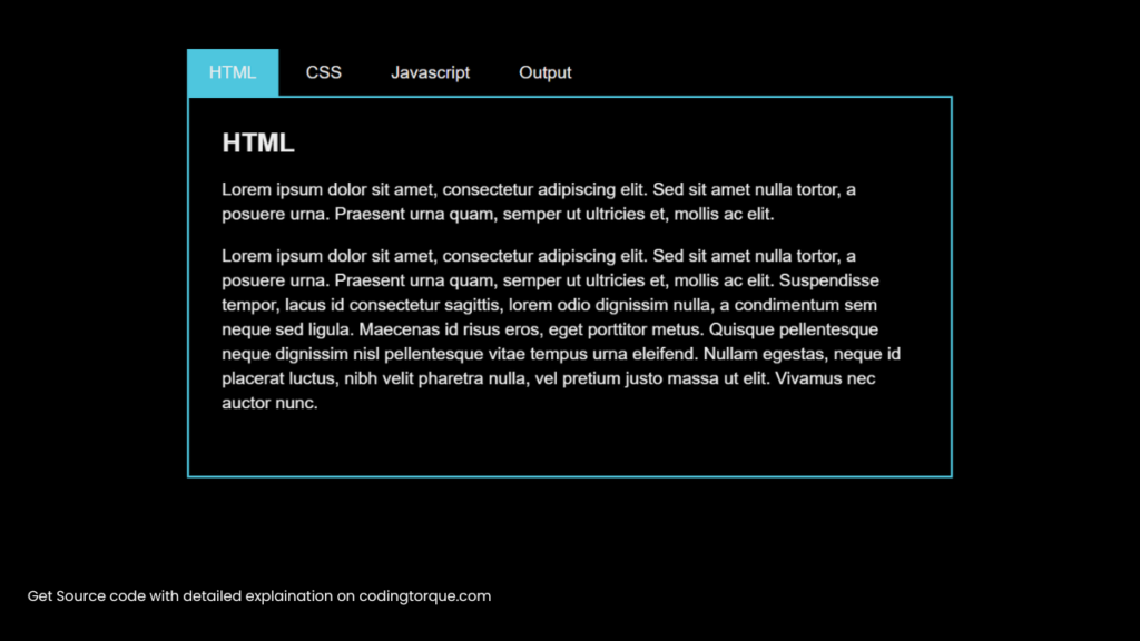
Demo
HTML Code
Starter Template
<!doctype html>
<html lang="en">

<head>
    <!-- Required meta tags -->
    <meta charset="utf-8">
    <meta name="viewport" content="width=device-width, initial-scale=1">

    <!-- CSS -->
    <link rel="stylesheet" href="style.css">

    <title>Dark Tabs using Pure CSS - Coding Torque</title>
</head>

<body>
    <!-- Further code here -->
</body>

</html>
Paste the below code in your <body> tag.
<div class="tabbed">
    <input type="radio" name="tabs" id="tab-nav-1" checked>
    <label for="tab-nav-1">HTML</label>
    <input type="radio" name="tabs" id="tab-nav-2">
    <label for="tab-nav-2">CSS</label>
    <input type="radio" name="tabs" id="tab-nav-3">
    <label for="tab-nav-3">Javascript</label>
    <input type="radio" name="tabs" id="tab-nav-4">
    <label for="tab-nav-4">Output</label>
    <div class="tabs">
        <div>
            <h2>HTML</h2>
            <p>Lorem ipsum dolor sit amet, consectetur adipiscing elit. Sed sit amet nulla tortor, a posuere urna.
                Praesent urna quam, semper ut ultricies et, mollis ac elit. </p>
            <p>Lorem ipsum dolor sit amet, consectetur adipiscing elit. Sed sit amet nulla tortor, a posuere urna.
                Praesent urna quam, semper ut ultricies et, mollis ac elit. Suspendisse tempor, lacus id consectetur
                sagittis, lorem odio dignissim nulla, a condimentum sem neque sed ligula. Maecenas id risus eros,
                eget porttitor metus. Quisque pellentesque neque dignissim nisl pellentesque vitae tempus urna
                eleifend. Nullam egestas, neque id placerat luctus, nibh velit pharetra nulla, vel pretium justo
                massa ut elit. Vivamus nec auctor nunc.</p>
        </div>
        <div>
            <h2>CSS</h2>
            <p>Maecenas dictum, urna ut consequat condimentum, est dui commodo diam, ac pretium dui ante eu quam.
                Curabitur posuere metus nec tellus venenatis placerat. Ut egestas neque in odio vulputate gravida.
                In at justo ac est laoreet eleifend vel quis arcu. Aliquam erat volutpat. Proin vitae vehicula
                neque. Nam tempus erat ac ante tincidunt tincidunt. Pellentesque eu nibh sapien. Nunc augue magna,
                lacinia eget congue eget, mattis id tortor. Fusce id vestibulum neque. Proin tincidunt tellus ut
                risus lobortis cursus. Duis sit amet urna vel sapien ullamcorper varius.</p>
        </div>
        <div>
            <h2>Javascript</h2>
            <p>Duis luctus dolor ac erat luctus hendrerit. Aenean id congue magna. Proin sit amet elit vel lacus
                ornare dignissim imperdiet nec odio. Maecenas condimentum egestas lorem et laoreet. Donec ut leo non
                purus rutrum euismod vel faucibus nunc. Curabitur vel mauris nisi, vitae laoreet erat. Lorem ipsum
                dolor sit amet, consectetur adipiscing elit. Vestibulum ante ipsum primis in faucibus orci luctus et
                ultrices posuere cubilia Curae; Maecenas ipsum odio, iaculis id vulputate vitae, vestibulum at nunc.
                Integer non nisl lorem. Quisque lobortis congue semper. Nunc neque nisi, consequat id egestas vitae,
                porta vel sem.</p>
        </div>
        <div>
            <h2>Output</h2>
            <p>Fusce vel eros eu lectus ultricies fermentum vestibulum adipiscing odio. Suspendisse ultricies, metus
                nec dapibus pharetra, quam arcu vulputate nisl, a pretium nisi velit id ante. Nunc auctor augue sit
                amet orci vestibulum id placerat nulla pellentesque. Duis vel quam velit. Ut auctor ipsum quis lacus
                semper non pretium mi dignissim. Morbi ultrices augue eget nisi hendrerit placerat. Mauris rhoncus
                urna quis metus congue quis condimentum risus interdum. Nam lobortis lectus et enim laoreet mattis.
                Integer faucibus ullamcorper erat, at rhoncus leo bibendum sed. Mauris libero urna, placerat non
                pretium ac, elementum et arcu. Aliquam non tellus diam, vel scelerisque odio. Etiam a quam et enim
                vehicula feugiat posuere at dui. Phasellus at nisl quam. Integer nisi mi, varius vitae placerat
                viverra, dapibus vitae massa. Nullam ut orci vitae nisi ornare aliquam in eget orci.</p>
        </div>
    </div>
</div>
<script src="https://cdnjs.cloudflare.com/ajax/libs/prefixfree/1.0.6/prefixfree.min.js"></script>
Output Till Now

CSS Code
Create a file style.css and paste the code below.
@import "compass/css3";
* {
  box-sizing: border-box;
}
body {
  background: black;
  color: #eee;
  font: 1em "PT Sans", sans-serif;
}
::selection {
  background-color: #4ec6de;
}
.tabbed {
  width: 700px;
  margin: 50px auto;
}
.tabbed > input {
  display: none;
}
.tabbed > label {
  display: block;
  float: left;
  padding: 12px 20px;
  margin-right: 5px;
  cursor: pointer;
  transition: background-color 0.3s;
}
.tabbed > label:hover,
.tabbed > input:checked + label {
  background: #4ec6de;
}
.tabs {
  clear: both;
  perspective: 600px;
}
.tabs > div {
  width: 700px;
  position: absolute;
  border: 2px solid #4ec6de;
  padding: 10px 30px 40px;
  line-height: 1.4em;
  opacity: 0;
  transform: rotateX(-20deg);
  transform-origin: top center;
  transition: opacity 0.3s, transform 1s;
  z-index: 0;
}
#tab-nav-1:checked ~ .tabs > div:nth-of-type(1),
#tab-nav-2:checked ~ .tabs > div:nth-of-type(2),
#tab-nav-3:checked ~ .tabs > div:nth-of-type(3),
#tab-nav-4:checked ~ .tabs > div:nth-of-type(4) {
  transform: rotateX(0);
  opacity: 1;
  z-index: 1;
}
@media screen and (max-width: 700px) {
  .tabbed {
    width: 400px;
  }
  .tabbed > label {
    display: none;
  }
  .tabs > div {
    width: 400px;
    border: none;
    padding: 0;
    opacity: 1;
    position: relative;
    transform: none;
    margin-bottom: 60px;
  }
  .tabs > div h2 {
    border-bottom: 2px solid #4ec6de;
    padding-bottom: 0.5em;
  }
}
Final Output
Written by: Piyush Patil
Code Credits: @YozhEzhi
If you found any mistakes or have any doubts please feel free to Contact Us
Hope you find this post helpful💖


