Before we start, here are some cards you might like to create:
- Filter Cards using JavaScript
- Animated Product Card using JavaScript
- Profile Cards Hover Effect using HTML & CSS
I would recommend you don’t just copy and paste the code, just look at the code and type by understanding it.
HTML Code
Starter Template
<!doctype html>
<html lang="en">

<head>
    <!-- Required meta tags -->
    <meta charset="utf-8">
    <meta name="viewport" content="width=device-width, initial-scale=1">

    <!-- Font Awesome CDN  -->
    <link rel="stylesheet" href="https://cdnjs.cloudflare.com/ajax/libs/font-awesome/5.14.0/css/all.min.css"
        integrity="sha512-1PKOgIY59xJ8Co8+NE6FZ+LOAZKjy+KY8iq0G4B3CyeY6wYHN3yt9PW0XpSriVlkMXe40PTKnXrLnZ9+fkDaog=="
        crossorigin="anonymous" />

    <!-- CSS -->
    <link rel="stylesheet" href="style.css">

    <title>Layered Profile Card Hover Effect - Coding Torque</title>
</head>

<body>
   <!-- Further code here -->
</body>

</html>
Paste the below code in your <body> tag.
<div class="box">
<div class="card">
<div class="imgBx">
<img src="https://images.unsplash.com/photo-1532123675048-773bd75df1b4?ixlib=rb-1.2.1&ixid=eyJhcHBfaWQiOjEyMDd9&auto=format&fit=crop&w=500&q=60"
alt="images">
</div>
<div class="details">
<h2>SomeOne Famous<br><span>Director</span></h2>
</div>
</div>
<div class="card">
<div class="imgBx">
<img src="https://images.unsplash.com/photo-1549417229-aa67d3263c09?ixlib=rb-1.2.1&ixid=eyJhcHBfaWQiOjEyMDd9&auto=format&fit=crop&w=500&q=60"
alt="images">
</div>
<div class="details">
<h2>SomeOne Famous<br><span>Producer</span></h2>
</div>
</div>
<div class="card">
<div class="imgBx">
<img src="https://images.unsplash.com/photo-1548094878-84ced0f6896d?ixlib=rb-1.2.1&ixid=eyJhcHBfaWQiOjEyMDd9&auto=format&fit=crop&w=500&q=60"
alt="images">
</div>
<div class="details">
<h2>SomeOne Famous<br><span>Actor</span></h2>
</div>
</div>
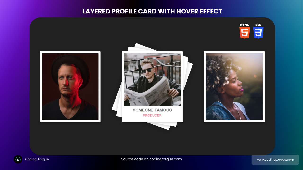
</div>Output Till Now
CSS Code
Create a file style.css and paste the code below.
body {
  margin: 0;
  padding: 0;
  display: flex;
  justify-content: center;
  align-items: center;
  min-height: 100vh;
  background: #212121;
  font-family: sans-serif;
}
.box {
  width: 1200px;
  display: grid;
  grid-template-columns: repeat(auto-fit, minmax(350px, 1fr));
  grid-gap: 15px;
  margin: 0 auto;
}
.card {
  position: relative;
  width: 300px;
  height: 350px;
  background: #fff;
  margin: 0 auto;
  border-radius: 4px;
  box-shadow: 0 2px 10px rgba(0, 0, 0, 0.2);
}
.card:before,
.card:after {
  content: "";
  position: absolute;
  top: 0;
  left: 0;
  width: 100%;
  height: 100%;
  border-radius: 4px;
  background: #fff;
  transition: 0.5s;
  z-index: -1;
}
.card:hover:before {
  transform: rotate(20deg);
  box-shadow: 0 2px 20px rgba(0, 0, 0, 0.2);
}
.card:hover:after {
  transform: rotate(10deg);
  box-shadow: 0 2px 20px rgba(0, 0, 0, 0.2);
}
.card .imgBx {
  position: absolute;
  top: 10px;
  left: 10px;
  bottom: 10px;
  right: 10px;
  background: #222;
  transition: 0.5s;
  z-index: 1;
}

.card:hover .imgBx {
  bottom: 80px;
}

.card .imgBx img {
  position: absolute;
  top: 0;
  left: 0;
  width: 100%;
  height: 100%;
  object-fit: cover;
}

.card .details {
  position: absolute;
  left: 10px;
  right: 10px;
  bottom: 10px;
  height: 60px;
  text-align: center;
}

.card .details h2 {
  margin: 0;
  padding: 0;
  font-weight: 600;
  font-size: 20px;
  color: #777;
  text-transform: uppercase;
}

.card .details h2 span {
  font-weight: 500;
  font-size: 16px;
  color: #f38695;
  display: block;
  margin-top: 5px;
}
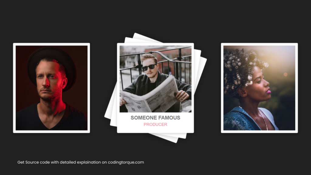
Output Till Now
Written by: Piyush Patil
Credits: @manojsilag
If you have any doubts or any project ideas feel free to Contact Us
Hope you find this post helpful💖


