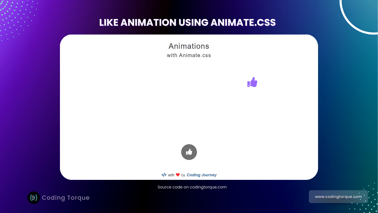
Hello Guys! Welcome to Coding Torque. In this blog, I’m going to explain to you how to make Likes Animation using Animate.css Library. This will be a step-by-step guide. Let’s get started 🚀.
Before we start, here are some JavaScript Games you might like to create:
1. Snake Game using JavaScript
2. 2D Bouncing Ball Game using JavaScript
3. Rock Paper Scissor Game using JavaScript
4. Tic Tac Toe Game using JavaScript
5. Whack a Mole Game using JavaScript
I would recommend you don’t just copy and paste the code, just look at the code and type by understanding it.
HTML Code
Starter Template
<!doctype html>
<html lang="en">

<head>
    <!-- Required meta tags -->
    <meta charset="utf-8">
    <meta name="viewport" content="width=device-width, initial-scale=1">
    <!-- Font Awesome Icons  -->
    <link rel="stylesheet" href="https://cdnjs.cloudflare.com/ajax/libs/font-awesome/5.15.1/css/all.min.css"
        integrity="sha512-+4zCK9k+qNFUR5X+cKL9EIR+ZOhtIloNl9GIKS57V1MyNsYpYcUrUeQc9vNfzsWfV28IaLL3i96P9sdNyeRssA=="
        crossorigin="anonymous" />

    <title>Like animation using animate.css - @code.scientist</title>
</head>

<body>
      <!-- Further code here -->
</body>

</html>
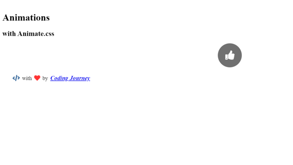
Paste the below code in your <body> tag
<h1 class="animated bounceInDown">Animations</h1>
<h2 class="animated bounceIn">with Animate.css</h2>

<div id="animation-container"></div>
<button id="animation-button" class="animated fadeInUp"><i class="fas fa-thumbs-up"></i></button>

<div id="footer" class="animated zoomIn">
    <i class="fas fa-code animated swing infinite"></i>with<i
        class="fas fa-heart animated pulse infinite"></i>by<a href="#">Coding Journey</a>
</div>
Output Till Now
CSS Code
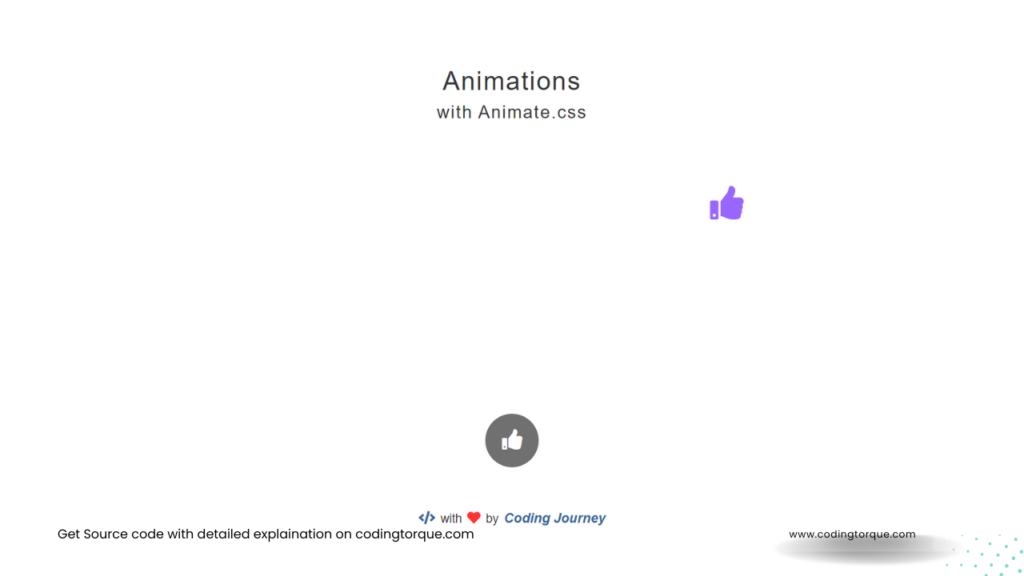
Create a file style.css and paste the code below.
* {
    padding: 0;
    margin: 0;
    box-sizing: border-box;
}

body {
    font-family: "Roboto", sans-serif;
    color: #333;
    text-align: center;
    overflow-x: hidden;
}

a {
    color: #336699;
    text-decoration: none;
}

a:hover,
a:focus {
    color: #23527c;
    text-decoration: underline;
}

h1,
h2 {
    font-weight: 100;
    letter-spacing: 2px;
}

h1 {
    font-size: 38px;
    margin: 40px 0 10px 0;
}

h2 {
    font-size: 26px;
    margin: 10px 0;
}

h2.animated {
    animation-delay: 1s;
    /* animation-iteration-count: infinite;
animation-duration: 0.5s; */
}

#animation-container {
    position: relative;
    height: 50vh;
    width: 50vw;
    margin: 30px auto;
    /* border: 1px solid #333; */
    overflow: hidden;
}

.animated-icon {
    position: absolute;
    color: #333;
    font-size: 50px;
}

#animation-button {
    display: block;
    margin: 0 auto;
    font-size: 30px;
    height: 80px;
    width: 80px;
    color: #fff;
    background-color: rgba(51, 51, 51, 0.7);
    border: 1px solid rgba(0, 0, 0, 0.075);
    border-radius: 50%;
    outline: none;
    cursor: pointer;
    transition: all 0.3s;
    animation-delay: 1.5s;
}

#animation-button:hover {
    background-color: rgba(51, 51, 51, 0.85);
}

#animation-button:active {
    background-color: rgba(51, 51, 51, 1);
}

#footer {
    font-size: 18px;
    position: absolute;
    bottom: 0px;
    width: 100%;
    padding: 25px;
    animation-delay: 1.5s;
}

#footer i,
#footer a {
    font-size: 20px;
    margin: 0 8px;
}

#footer a {
    font-style: italic;
    font-weight: 600;
}

#footer .fa-code {
    color: #336699;
}

#footer .fa-heart {
    color: #ff3333;
}

@media (max-width: 767px) {
    h1 {
        font-size: 30px;
        margin: 25px 0 10px 0;
    }

    h2 {
        font-size: 18px;
    }

    #animation-container {
        height: 50vh;
        width: 70vw;
    }

    #animation-button {
        font-size: 26px;
        width: 70px;
        height: 70px;
    }

    .animated-icon {
        font-size: 40px;
    }

    #footer {
        font-size: 16px;
        padding: 20px;
    }

    #footer i,
    #footer a {
        font-size: 18px;
    }
}

@media (max-height: 639px) {
    #footer {
        position: static;
        padding-bottom: 10px;
    }
}
Output Till Now
JavaScript Code
Create a file
script.js and paste the code below.// Global Variables
const animationContainer = document.getElementById("animation-container");
const animationButton = document.getElementById("animation-button");
const animationEntrancesArray = ["bounceIn", "bounceInDown", "bounceInLeft", "bounceInRight", "bounceInUp", "fadeIn", "fadeInDown", "fadeInLeft", "fadeInRight", "fadeInUp", "flipInX", "flipInY", "lightSpeedIn", "rotateIn", "rotateInDownLeft", "rotateInDownRight", "rotateInUpLeft", "rotateInUpRight", "slideInUp", "slideInLeft", "slideInRight", "slideInDown", "zoomIn", "zoomInDown", "zoomInLeft", "zoomInRight", "zoomInUp"];
const colorsArray = ["#ff6384", "#36a2eb", "#ffce56", "#4bc0c0", "#9966ff", "#ff9f40", "#333333", "#ff99cc", "#004c99", "#999900"];
let colorsArrayIndex = 0;
// Event Listeners
animationButton.addEventListener("click", animationButtonClick);
function animationButtonClick(event) {
const animationContainerWidth = animationContainer.clientWidth;
const animationContainerHeight = animationContainer.clientHeight;
const animatedIconFontSize = window.innerWidth < 767 ? 40 : 50;
const xPosRand = Math.floor(Math.random() * (animationContainerWidth - animatedIconFontSize));
const yPosRand = Math.floor(Math.random() * (animationContainerHeight - animatedIconFontSize));
const animationEntrance = animationEntrancesArray[Math.floor(Math.random() * animationEntrancesArray.length)];
const newElement = document.createElement("i");
newElement.classList.add("fas", "fa-thumbs-up", "animated-icon", "animated", animationEntrance);
newElement.setAttribute("style", `left:${xPosRand}px; top:${yPosRand}px; color: ${colorsArray[colorsArrayIndex]};`);
colorsArrayIndex = (colorsArrayIndex + 1) % colorsArray.length;
animationContainer.appendChild(newElement);
setTimeout(() => {
newElement.classList.remove(animationEntrance);
newElement.classList.add("zoomOut");
setTimeout(() => {
newElement.remove();
}, 1000);
}, 1500);
}
Written by: Piyush Patil
Code Credits: @Coding_Journey
If you have any doubts or any project ideas feel free to Contact Us
Hope you find this post helpful💖


