
Before we start, here are some cards you might like to create:
- Filter Cards using JavaScript
- Animated Product Card using JavaScript
- Profile Cards Hover Effect using HTML & CSS
I would recommend you don’t just copy and paste the code, just look at the code and type by understanding it.
HTML Code
Starter Template
<!doctype html>
<html lang="en">

<head>
    <!-- Required meta tags -->
    <meta charset="utf-8">
    <meta name="viewport" content="width=device-width, initial-scale=1">

    <!-- Font Awesome CDN  -->
    <link rel="stylesheet" href="https://cdnjs.cloudflare.com/ajax/libs/font-awesome/5.14.0/css/all.min.css"
        integrity="sha512-1PKOgIY59xJ8Co8+NE6FZ+LOAZKjy+KY8iq0G4B3CyeY6wYHN3yt9PW0XpSriVlkMXe40PTKnXrLnZ9+fkDaog=="
        crossorigin="anonymous" />

    <!-- CSS -->
    <link rel="stylesheet" href="style.css">

    <title>Subscribe Newsletter Form - Coding Torque</title>
</head>

<body>
    <!-- Further code here -->
</body>

</html>
Paste the below code in your <body> tag.
<div class="container">
<div class="container-close">×</div>
<img src="https://images.unsplash.com/photo-1534670007418-fbb7f6cf32c3?ixlib=rb-1.2.1&ixid=eyJhcHBfaWQiOjEyMDd9&auto=format&fit=crop&w=634&q=80"
alt="image">
<div class="container-text">
<h2>Ideas and UI components in your <br>inbox</h2>
<p>Sign up to receive ideas, free <br> components and free resources plus 15% on all of our <br> pro UI
kits.</p>
<input type="email" placeholder="Email address">
<button type="submit">Subscribe</button>
<span>No spams included</span>
</div>
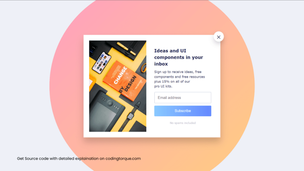
</div>Output Till Now

CSS Code
Create a file style.css and paste the code below.
* {
  margin: 0;
  padding: 0;
  box-sizing: border-box;
}
body {
  font-family: Verdana, Geneva, Tahoma, sans-serif;
  background-color: #eef0f7;
  display: grid;
  place-items: center;
  min-height: 100vh;
  overflow: hidden;
}
.container {
  background-color: #fff;
  width: 600px;
  height: 450px;
  position: relative;
  display: grid;
  grid-template-columns: 1fr 1fr;
  place-items: center;
  line-height: 1.5;
  box-shadow: 0 20px 30px rgba(0, 0, 0, 0.185);
}
.container::after {
  content: "";
  position: absolute;
  background-image: linear-gradient(to bottom right, #ff9ec4, #ffd07e);
  width: 900px;
  height: 900px;
  border-radius: 50%;
  z-index: -1;
}
.container-close {
  position: absolute;
  top: -15px;
  right: -15px;
  background-color: #fff;
  width: 45px;
  height: 45px;
  display: grid;
  place-items: center;
  font-size: 1.7rem;
  color: #2e4052;
  border-radius: 50%;
  box-shadow: 0 10px 20px rgba(0, 0, 0, 0.164);
  cursor: pointer;
}
.container img {
  width: 250px;
  height: 400px;
  object-fit: cover;
  object-position: center;
}
.container-text {
  padding: 10px 40px 10px 10px;
}
.container-text h2 {
  font-size: 1.2rem;
  color: #1a2250;
}
.container-text p {
  font-size: 14px;
  color: #3b4169;
  margin: 10px 0;
}
.container-text input,
.container-text button {
  width: 100%;
  border: none;
  padding: 14px;
  border-radius: 3px;
}
.container-text input {
  border: 2px solid #daddec;
  margin: 5px 0 10px;
  font-size: 1rem;
  color: #656880;
}
.container-text button {
  background-image: linear-gradient(to right, #89caff, #6589ff);
  display: block;
  color: #fff;
  font-size: 1rem;
  cursor: pointer;
  box-shadow: 0 5px 20px #89caff 94;
  transition: box-shadow 0.3s ease-in-out;
}
.container-text button:hover {
  box-shadow: none;
}
.container-text span {
  display: block;
  text-align: center;
  margin: 20px 0 0;
  color: #babdcb;
  font-size: 12px;
}
Output Till Now
Written by: Piyush Patil
Credits: @dickyal6
If you have any doubts or any project ideas feel free to Contact Us
Hope you find this post helpful💖


