
Before we start, here are some cards you might like to create:
- Filter Cards using JavaScript
- Animated Product Card using JavaScript
- Profile Cards Hover Effect using HTML & CSS
I would recommend you don’t just copy and paste the code, just look at the code and type by understanding it.
HTML Code
Starter Template
<!doctype html>
<html lang="en">

<head>
    <!-- Required meta tags -->
    <meta charset="utf-8">
    <meta name="viewport" content="width=device-width, initial-scale=1">

    <!-- Font Awesome CDN  -->
    <link rel="stylesheet" href="https://cdnjs.cloudflare.com/ajax/libs/font-awesome/5.14.0/css/all.min.css"
        integrity="sha512-1PKOgIY59xJ8Co8+NE6FZ+LOAZKjy+KY8iq0G4B3CyeY6wYHN3yt9PW0XpSriVlkMXe40PTKnXrLnZ9+fkDaog=="
        crossorigin="anonymous" />

    <!-- CSS -->
    <link rel="stylesheet" href="style.css">

    <title>Smartwatch product card - Coding Torque</title>
</head>

<body>
   <!-- Further code here -->
</body>

</html>
Paste the below code in your <body> tag.
<div class="wrapper">
<div class="overviewInfo">
<div class="actions">
<div class="backbutton ">
<svg width="24" height="24" viewBox="0 0 24 24" fill="none" xmlns="http://www.w3.org/2000/svg">
<path
d="M1.02698 11.9929L5.26242 16.2426L6.67902 14.8308L4.85766 13.0033L22.9731 13.0012L22.9728 11.0012L4.85309 11.0033L6.6886 9.17398L5.27677 7.75739L1.02698 11.9929Z"
fill="currentColor" />
</svg>
</div>
<div class="cartbutton neurobutton">
<svg width="24" height="24" viewBox="0 0 24 24" fill="none" xmlns="http://www.w3.org/2000/svg">
<path fill-rule="evenodd" clip-rule="evenodd"
d="M5.79166 2H1V4H4.2184L6.9872 16.6776H7V17H20V16.7519L22.1932 7.09095L22.5308 6H6.6552L6.08485 3.38852L5.79166 2ZM19.9869 8H7.092L8.62081 15H18.3978L19.9869 8Z"
fill="currentColor" />
<path
d="M10 22C11.1046 22 12 21.1046 12 20C12 18.8954 11.1046 18 10 18C8.89543 18 8 18.8954 8 20C8 21.1046 8.89543 22 10 22Z"
fill="currentColor" />
<path
d="M19 20C19 21.1046 18.1046 22 17 22C15.8954 22 15 21.1046 15 20C15 18.8954 15.8954 18 17 18C18.1046 18 19 18.8954 19 20Z"
fill="currentColor" />
</svg>
</div>
</div>
<div class="productinfo">
<div class="grouptext">
<h3>BRAND</h3>
<p>Apple</p>
</div>
<div class="grouptext">
<h3>CASE SIZE</h3>
<p>40mm, 44mm</p>
</div>
<div class="grouptext">
<h3>PRICE</h3>
<p>Rs 59,900</p>
</div>
<div class="productImage">
<img src="https://user-images.githubusercontent.com/66505013/216373703-0f41a892-4778-4dff-b2f6-adc7b718a3cc.png"
alt="product: ps5 controller image">
</div>
</div>
</div>
<!-- overview info -->
<div class="productSpecifications">
<h1> Apple Series </h1>
<p> GPS + Cellular mode lets you call, text and get directions without your phone. <br> Measure your blood
oxygen with an all new sensor and app. <br> Check Your heart rhythm with ECG app. </p>
<div class="productFeatures">
<div class="feature">
<div class="featureIcon">
</div>
<div class="featureText">
<p> <strong>Futuristic</strong></p>
<p>Design</p>
</div>
</div>
<div class="feature">
<div class="featureIcon">
</div>
<div class="featureText">
<p> <strong>Built-in</strong></p>
<p>Microphone</p>
</div>
</div>
<div class="feature">
<div class="featureIcon">
</div>
<div class="featureText">
<p> <strong>Haptic</strong></p>
<p>Feedback</p>
</div>
</div>
<div class="feature">
<div class="featureIcon">
</div>
<div class="featureText">
<p> <strong>Fast charge</strong></p>
<p>USB-C port</p>
</div>
</div>
</div>
<div class="checkoutButton">
<div class="priceTag">
<span><i class="fa fa-rupee-sign"></i></span>59,900
</div>
<button class="preorder">
<p>Add to cart</p>
<div class="buttonaction">
<svg width="24" height="24" viewBox="0 0 24 24" fill="none" xmlns="http://www.w3.org/2000/svg">
<path
d="M23.0677 11.9929L18.818 7.75739L17.4061 9.17398L19.2415 11.0032L0.932469 11.0012L0.932251 13.0012L19.2369 13.0032L17.4155 14.8308L18.8321 16.2426L23.0677 11.9929Z"
fill="currentColor" />
</svg>
</div>
</button>
</div>
</div>
<!-- product specificaiton -->
</div>
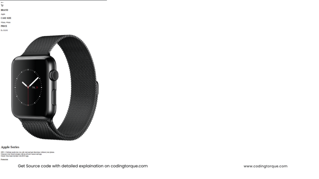
<!-- wrapper-->Output Till Now
CSS Code
Create a file style.css and paste the code below.
@import url("https://fonts.googleapis.com/css2?family=Roboto:wght@300;400;500&display=swap");

*,
button,
input {
  margin: 0px;
  padding: 0px;
  box-sizing: border-box;
  font-family: "Roboto", sans-serif;
}

:root {
  --bg-shape-color: linear-gradient(120deg, #343a4f, #0f1620);
  --lightblue: #3d9dea;
  --darkblue: #4a4eee;
  --text-color: #d5e1ef;
}
html,
body {
  width: 100%;
  min-height: 100vh;
  background-image: linear-gradient(90deg, #414850, #131720);
  color: var(--text-color);
}
body {
  display: flex;
  justify-content: center;
  align-items: center;
  padding: 40px 0px;
}
.wrapper {
  width: 350px;
  border-radius: 40px;
  background-image: var(--bg-shape-color);
  overflow: hidden;
}
.overviewInfo,
.productSpecifications {
  padding: 24px;
}
.overviewInfo {
  background-image: linear-gradient(176deg, var(--lightblue), var(--darkblue));
}
.actions {
  display: flex;
  justify-content: space-between;
  margin-bottom: 32px;
}
.actions .cartbutton {
  position: relative;
}
.actions .cartbutton::after {
  content: "";
  display: block;
  width: 8px;
  height: 8px;
  background-image: linear-gradient(90deg, #489be2, #0f629c);
  border-radius: 50%;
  position: absolute;
  top: 11px;
  right: 8px;
}
.actions .cartbutton svg {
  color: #ababab 73;
}
.actions .backbutton,
.actions .cartbutton {
  width: 40px;
  height: 40px;
  border-radius: 50%;
}
.neurobutton {
  background-image: var(--bg-shape-color);
  display: flex;
  justify-content: center;
  align-items: center;
  box-shadow: inset 3px 4px 5px 0px rgba(197, 197, 197, 0.1),
    inset 3px 6px 6px 5px rgba(78, 77, 77, 0.1),
    -2px -2px 8px 2px rgba(255, 255, 255, 0.1),
    2px 2px 6px 3px rgba(0, 0, 0, 0.4);
}
.productinfo {
  display: flex;
  flex-direction: column;
  justify-content: space-between;
  position: relative;
  min-height: 200px;
  margin-bottom: 50px;
}
.productImage {
  position: absolute;
  width: 300px;
  height: auto;
  transform: translate(75px, 40px);
  transition: ease 2s all;
}
.productImage img {
  width: 90%;
  height: auto;
}
.productImage:hover {
  transition: ease 2s all;
  animation: none;
  transform: translate(75px, 40px) rotate(10deg);
}
h1 {
  font-family: "Michroma", sans-serif;
}
.grouptext h3 {
  letter-spacing: 3.2px;
  font-size: 14px;
  font-weight: 500;
  margin-bottom: 8px;
}
.grouptext p {
  font-size: 12px;
  opacity: 0.8;
}
/* product specifications */
.featureIcon {
  width: 40px;
  height: 40px;
  background-image: var(--bg-shape-color);
  border-radius: 8px;
  margin-right: 16px;
}
.productSpecifications h1 {
  margin-top: 10px;
  margin-bottom: 16px;
  font-size: 32px;
}
.productSpecifications p {
  opacity: 0.8;
  font-size: 15px;
  line-height: 1.5;
}
.productSpecifications .productFeatures {
  display: grid;
  grid-template-columns: 1fr 1fr;
  margin-top: 20px;
  grid-row-gap: 16px;
}
.productSpecifications .productFeatures .feature {
  display: flex;
}
.checkoutButton {
  display: flex;
  width: 100%;
  background-image: var(--bg-shape-color);
  border-radius: 12px;
  overflow: hidden;
  box-shadow: -2px -2px 2px 0px rgba(80, 80, 80, 0.1),
    2px 2px 3px 0px rgba(12, 12, 12, 0.3),
    inset 0px 0px 0px 2px rgba(80, 80, 80, 0.2);
  margin-top: 30px;
  padding: 14px;
  justify-content: space-between;
  align-items: center;
}
.priceTag {
  display: flex;
  align-items: center;
  font-size: 32px;
}
.priceTag span {
  color: #488dc7;
  font-size: 20px;
}
/* checkout button*/
button.preorder {
  outline: 0;
  border: 0;
  border-radius: 6px;
  display: flex;
  align-items: center;
  overflow: hidden;
  background-image: linear-gradient(85deg, #61c7ef, #4833fb);
  color: white;
}
.preorder p {
  padding: 8px 17px;
  border-right: 1px solid rgba(0, 0, 0, 0.4);
}
.buttonaction {
  border-left: 1px solid rgba(255, 255, 255, 0.2);
  padding: 5px 5px;
  display: flex;
  align-items: center;
  justify-content: center;
  color: rgba(255, 255, 255, 0.7);
}
/* animation */
@keyframes updowncontroller {
  0% {
    transform: rotate(-90deg) translate(-56px, 66px);
  }
  80%,
  100% {
    transform: rotate(-70deg) translate(10px, 66px);
  }
}
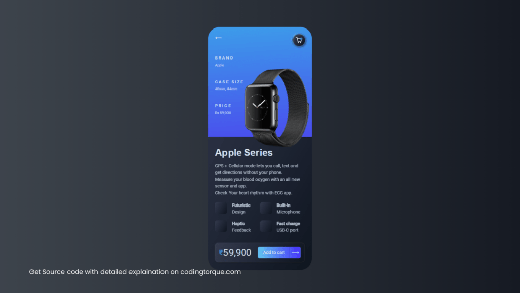
Output Till Now
Written by: Piyush Patil
If you have any doubts or any project ideas feel free to Contact Us
Hope you find this post helpful💖


