Before we start, here are some cards you might like to create:
- Filter Cards using JavaScript
- Animated Product Card using JavaScript
- Profile Cards Hover Effect using HTML & CSS
I would recommend you don’t just copy and paste the code, just look at the code and type by understanding it.
HTML Code
Starter Template
<!doctype html>
<html lang="en">
<head>
<!-- Required meta tags -->
<meta charset="utf-8">
<meta name="viewport" content="width=device-width, initial-scale=1">
<!-- Font Awesome CDN -->
<link rel="stylesheet" href="https://cdnjs.cloudflare.com/ajax/libs/font-awesome/5.14.0/css/all.min.css"
integrity="sha512-1PKOgIY59xJ8Co8+NE6FZ+LOAZKjy+KY8iq0G4B3CyeY6wYHN3yt9PW0XpSriVlkMXe40PTKnXrLnZ9+fkDaog=="
crossorigin="anonymous" />
<!-- CSS -->
<link rel="stylesheet" href="style.css">
<title>Prismatic Forms using HTML CSS and JavaScript - Coding Torque</title>
</head>
<body>
<!-- Further code here -->
<script src="script.js"></script>
</body>
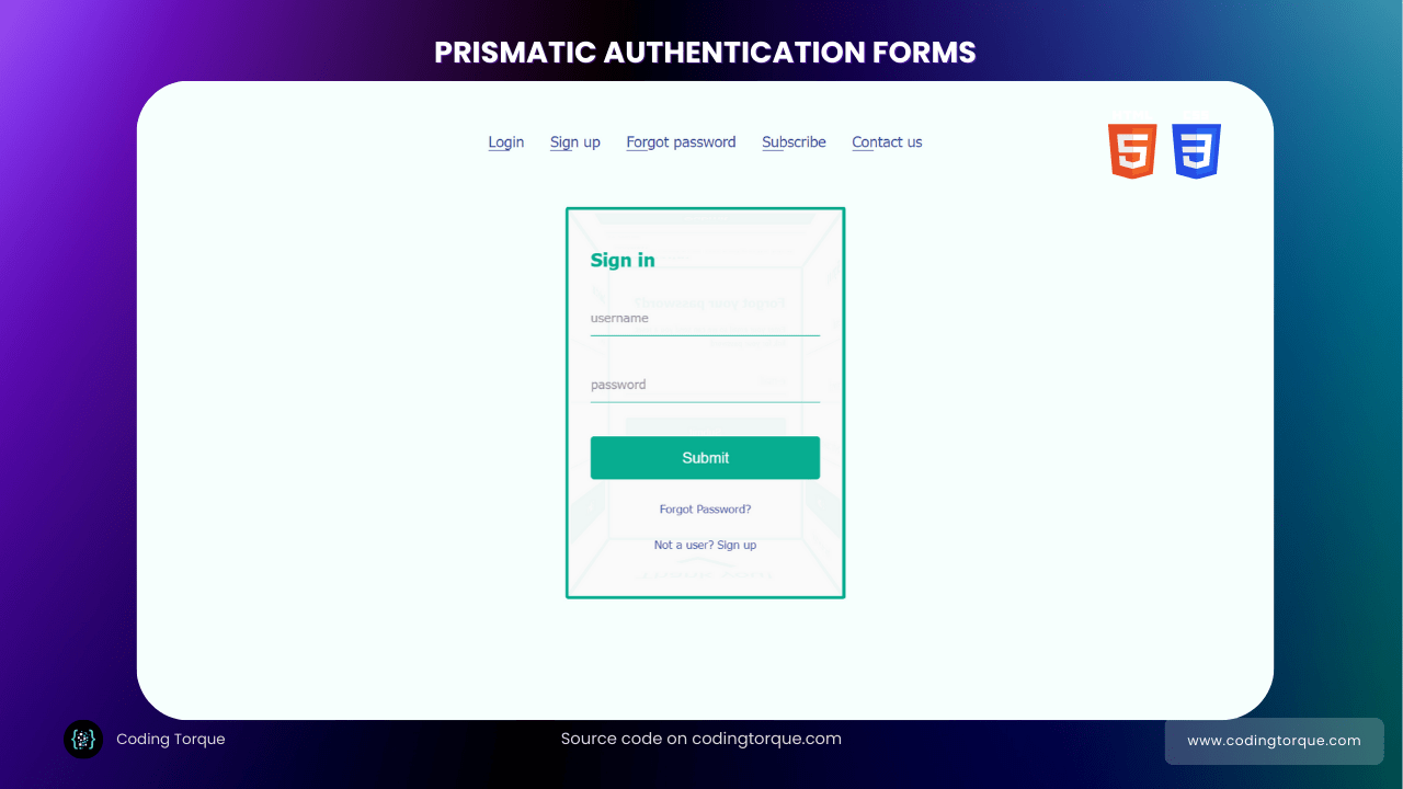
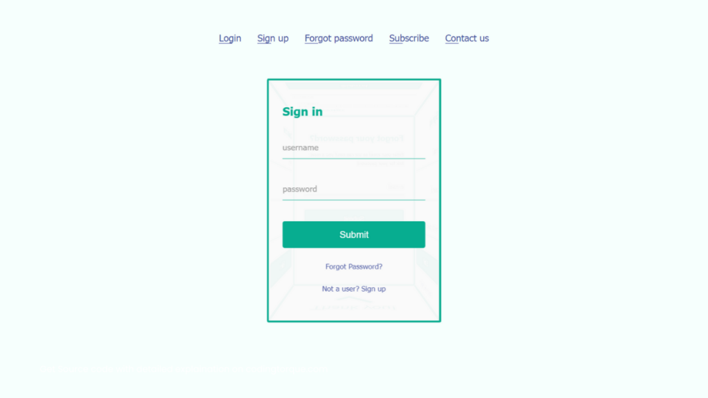
</html>Paste the below code in your <body> tag.
<ul class="nav">
    <li onclick="showLogin()">Login</li>
    <li onclick="showSignup()">Sign up</li>
    <li onclick="showForgotPassword()">Forgot password</li>
    <li onclick="showSubscribe()">Subscribe</li>
    <li onclick="showContactUs()">Contact us</li>
</ul>
<div class="wrapper">
    <div class="rec-prism">
        <div class="face face-top">
            <div class="content">
                <h2>Subscribe</h2>
                <small>Enter your email so we can send you the latest updates!</small>
                <form onsubmit="event.preventDefault()">
                    <div class="field-wrapper">
                        <input type="text" name="email" placeholder="email">
                        <label>e-mail</label>
                    </div>
                    <div class="field-wrapper">
                        <input type="submit" onclick="showThankYou()">
                    </div>
                </form>
            </div>
        </div>
        <div class="face face-front">
            <div class="content">
                <h2>Sign in</h2>
                <form onsubmit="event.preventDefault()">
                    <div class="field-wrapper">
                        <input type="text" name="username" placeholder="username">
                        <label>username</label>
                    </div>
                    <div class="field-wrapper">
                        <input type="password" name="password" placeholder="password" autocomplete="new-password">
                        <label>password</label>
                    </div>
                    <div class="field-wrapper">
                        <input type="submit" onclick="showThankYou()">
                    </div>
                    <span class="psw" onclick="showForgotPassword()">Forgot Password? </span>
                    <span class="signup" onclick="showSignup()">Not a user? Sign up</span>
                </form>
            </div>
        </div>
        <div class="face face-back">
            <div class="content">
                <h2>Forgot your password?</h2>
                <small>Enter your email so we can send you a reset link for your password</small>
                <form onsubmit="event.preventDefault()">
                    <div class="field-wrapper">
                        <input type="text" name="email" placeholder="email">
                        <label>e-mail</label>
                    </div>
                    <div class="field-wrapper">
                        <input type="submit" onclick="showThankYou()">
                    </div>
                </form>
            </div>
        </div>
        <div class="face face-right">
            <div class="content">
                <h2>Sign up</h2>
                <form onsubmit="event.preventDefault()">
                    <div class="field-wrapper">
                        <input type="text" name="email" placeholder="email">
                        <label>e-mail</label>
                    </div>
                    <div class="field-wrapper">
                        <input type="password" name="password" placeholder="password" autocomplete="new-password">
                        <label>password</label>
                    </div>
                    <div class="field-wrapper">
                        <input type="password" name="password2" placeholder="password" autocomplete="new-password">
                        <label>re-enter password</label>
                    </div>
                    <div class="field-wrapper">
                        <input type="submit" onclick="showThankYou()">
                    </div>
                    <span class="singin" onclick="showLogin()">Already a user? Sign in</span>
                </form>
            </div>
        </div>
        <div class="face face-left">
            <div class="content">
                <h2>Contact us</h2>
                <form onsubmit="event.preventDefault()">
                    <div class="field-wrapper">
                        <input type="text" name="name" placeholder="name">
                        <label>Name</label>
                    </div>
                    <div class="field-wrapper">
                        <input type="text" name="email" placeholder="email">
                        <label>e-mail</label>
                    </div>
                    <div class="field-wrapper">
                        <textarea placeholder="your message"></textarea>
                        <label>your message</label>
                    </div>
                    <div class="field-wrapper">
                        <input type="submit" onclick="showThankYou()">
                    </div>
                </form>
            </div>
        </div>
        <div class="face face-bottom">
            <div class="content">
                <div class="thank-you-msg">
                    Thank you!
                </div>
            </div>
        </div>
    </div>
</div>
Output Till Now
CSS Code
Create a file style.css and paste the code below.
* {
  box-sizing: border-box;
}
body {
  font-family: Tahoma, Verdana, Segoe, sans-serif;
  font-size: 14px;
  background: #f6fffd;
  padding: 20px;
  text-align: center;
}
.wrapper {
  width: 250px;
  height: 350px;
  margin: 60px auto;
  perspective: 600px;
  text-align: left;
}
.rec-prism {
  width: 100%;
  height: 100%;
  position: relative;
  transform-style: preserve-3d;
  transform: translateZ(-100px);
  transition: transform 0.5s ease-in;
}
.face {
  position: absolute;
  width: 250px;
  height: 350px;
  padding: 20px;
  background: rgba(250, 250, 250, 0.96);
  border: 3px solid #07ad90;
  border-radius: 3px;
}
.face .content {
  color: #666;
}
.face .content h2 {
  font-size: 1.2em;
  color: #07ad90;
}
.face .content .field-wrapper {
  margin-top: 30px;
  position: relative;
}
.face .content .field-wrapper label {
  position: absolute;
  pointer-events: none;
  font-size: 0.85em;
  top: 40%;
  left: 0;
  transform: translateY(-50%);
  transition: all ease-in 0.25s;
  color: #999;
}
.face .content .field-wrapper input[type="text"],
.face .content .field-wrapper input[type="password"],
.face .content .field-wrapper input[type="submit"],
.face .content .field-wrapper textarea {
  -webkit-appearance: none;
  appearance: none;
}
.face .content .field-wrapper input[type="text"]:focus,
.face .content .field-wrapper input[type="password"]:focus,
.face .content .field-wrapper input[type="submit"]:focus,
.face .content .field-wrapper textarea:focus {
  outline: none;
}
.face .content .field-wrapper input[type="text"],
.face .content .field-wrapper input[type="password"],
.face .content .field-wrapper textarea {
  width: 100%;
  border: none;
  background: transparent;
  line-height: 2em;
  border-bottom: 1px solid #07ad90;
  color: #666;
}
.face .content .field-wrapper input[type="text"]::-webkit-input-placeholder,
.face .content .field-wrapper input[type="password"]::-webkit-input-placeholder,
.face .content .field-wrapper textarea::-webkit-input-placeholder {
  opacity: 0;
}
.face .content .field-wrapper input[type="text"]::-moz-placeholder,
.face .content .field-wrapper input[type="password"]::-moz-placeholder,
.face .content .field-wrapper textarea::-moz-placeholder {
  opacity: 0;
}
.face .content .field-wrapper input[type="text"]:-ms-input-placeholder,
.face .content .field-wrapper input[type="password"]:-ms-input-placeholder,
.face .content .field-wrapper textarea:-ms-input-placeholder {
  opacity: 0;
}
.face .content .field-wrapper input[type="text"]:-moz-placeholder,
.face .content .field-wrapper input[type="password"]:-moz-placeholder,
.face .content .field-wrapper textarea:-moz-placeholder {
  opacity: 0;
}
.face .content .field-wrapper input[type="text"]:focus + label,
.face .content .field-wrapper input[type="password"]:focus + label,
.face .content .field-wrapper textarea:focus + label,
.face
  .content
  .field-wrapper
  input[type="text"]:not(:placeholder-shown)
  + label,
.face
  .content
  .field-wrapper
  input[type="password"]:not(:placeholder-shown)
  + label,
.face .content .field-wrapper textarea:not(:placeholder-shown) + label {
  top: -35%;
  color: #42509e;
}
.face .content .field-wrapper input[type="submit"] {
  -webkit-appearance: none;
  appearance: none;
  cursor: pointer;
  width: 100%;
  background: #07ad90;
  line-height: 2em;
  color: #fff;
  border: 1px solid #07ad90;
  border-radius: 3px;
  padding: 5px;
}
.face .content .field-wrapper input[type="submit"]:hover {
  opacity: 0.9;
}
.face .content .field-wrapper input[type="submit"]:active {
  transform: scale(0.96);
}
.face .content .field-wrapper textarea {
  resize: none;
  line-height: 1em;
}
.face .content .field-wrapper textarea:focus + label,
.face .content .field-wrapper textarea:not(:placeholder-shown) + label {
  top: -25%;
}
.face .thank-you-msg {
  position: absolute;
  width: 200px;
  height: 130px;
  text-align: center;
  font-size: 2em;
  color: #07ad90;
  left: 50%;
  top: 50%;
  -webkit-transform: translate(-50%, -50%);
}
.face .thank-you-msg:after {
  position: absolute;
  content: "";
  width: 50px;
  height: 25px;
  border: 10px solid #07ad90;
  border-right: 0;
  border-top: 0;
  left: 50%;
  top: 50%;
  -webkit-transform: translate(-50%, -50%) rotate(0deg) scale(0);
  transform: translate(-50%, -50%) rotate(0deg) scale(0);
  -webkit-animation: success ease-in 0.15s forwards;
  animation: success ease-in 0.15s forwards;
  animation-delay: 2.5s;
}
.face-front {
  transform: rotateY(0deg) translateZ(125px);
}
.face-top {
  height: 250px;
  transform: rotateX(90deg) translateZ(125px);
}
.face-back {
  transform: rotateY(180deg) translateZ(125px);
}
.face-right {
  transform: rotateY(90deg) translateZ(125px);
}
.face-left {
  transform: rotateY(-90deg) translateZ(125px);
}
.face-bottom {
  height: 250px;
  transform: rotateX(-90deg) translateZ(225px);
}
.nav {
  margin: 20px 0;
  padding: 0;
}
.nav li {
  display: inline-block;
  list-style-type: none;
  font-size: 1em;
  margin: 0 10px;
  color: #42509e;
  position: relative;
  cursor: pointer;
}
.nav li:after {
  content: "";
  position: absolute;
  bottom: 0;
  left: 0;
  width: 20px;
  border-bottom: 1px solid #42509e;
  transition: all ease-in 0.25s;
}
.nav li:hover:after {
  width: 100%;
}
.psw,
.signup,
.singin {
  display: block;
  margin: 20px 0;
  font-size: 0.75em;
  text-align: center;
  color: #42509e;
  cursor: pointer;
}
small {
  font-size: 0.7em;
}
@-webkit-keyframes success {
  from {
    -webkit-transform: translate(-50%, -50%) rotate(0) scale(0);
  }
  to {
    -webkit-transform: translate(-50%, -50%) rotate(-45deg) scale(1);
  }
}
Output Till Now
JavaScript Code
Create a file script.js and paste the code below.
let prism = document.querySelector(".rec-prism");

function showSignup() {
    prism.style.transform = "translateZ(-100px) rotateY( -90deg)";
}
function showLogin() {
    prism.style.transform = "translateZ(-100px)";
}
function showForgotPassword() {
    prism.style.transform = "translateZ(-100px) rotateY( -180deg)";
}

function showSubscribe() {
    prism.style.transform = "translateZ(-100px) rotateX( -90deg)";
}

function showContactUs() {
    prism.style.transform = "translateZ(-100px) rotateY( 90deg)";
}

function showThankYou() {
    prism.style.transform = "translateZ(-100px) rotateX( 90deg)";
}
Written by: Piyush Patil
Credits: @nourabusoud
If you have any doubts or any project ideas feel free to Contact Us
Hope you find this post helpful💖


