Before we start, here are some cards you might like to create:
- Filter Cards using JavaScript
- Animated Product Card using JavaScript
- Profile Cards Hover Effect using HTML & CSS
I would recommend you don’t just copy and paste the code, just look at the code and type by understanding it.
HTML Code
Starter Template
<!doctype html>
<html lang="en">

<head>
    <!-- Required meta tags -->
    <meta charset="utf-8">
    <meta name="viewport" content="width=device-width, initial-scale=1">

    <!-- Font Awesome CDN  -->
    <link rel="stylesheet" href="https://cdnjs.cloudflare.com/ajax/libs/font-awesome/5.14.0/css/all.min.css"
        integrity="sha512-1PKOgIY59xJ8Co8+NE6FZ+LOAZKjy+KY8iq0G4B3CyeY6wYHN3yt9PW0XpSriVlkMXe40PTKnXrLnZ9+fkDaog=="
        crossorigin="anonymous" />

    <!-- CSS -->
    <link rel="stylesheet" href="style.css">

    <title>Product card with floating effect - Coding Torque</title>
</head>

<body>
   <!-- Further code here -->
</body>

</html>
Paste the below code in your <body> tag.
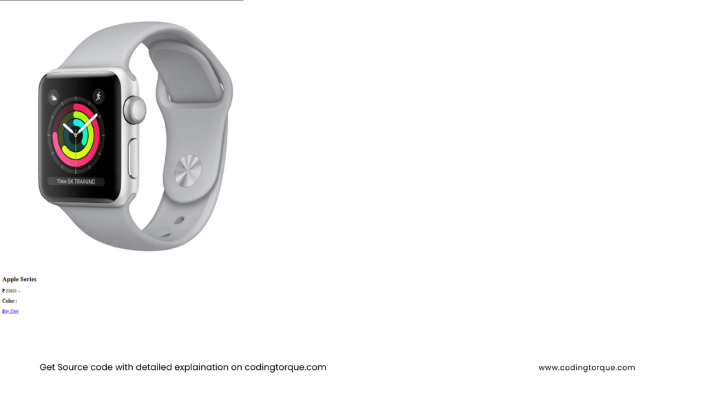
<div class="container">
    <div class="card">
        <div class="imgBx">
            <img
                src="https://user-images.githubusercontent.com/66505013/216517132-9cc09495-b4fe-4ebb-a1d6-46e04e7f2651.png">
        </div>
        <div class="contentBx">
            <h2>Apple Series</h2>
            <p class="price">
                <i class="fa fa-rupee-sign"></i> 53900 /-
            </p>
            <div class="color">
                <h3>Color :</h3>
                <span></span>
                <span></span>
                <span></span>
            </div>
            <a href="#">Buy Now</a>
        </div>
    </div>
</div>
Output Till Now
CSS Code
Create a file style.css and paste the code below.
@import url("https://fonts.googleapis.com/css2?family=Poppins:ital,wght@0,100;0,200;0,300;0,400;0,500;0,600;0,700;0,800;0,900;1,100;1,200;1,300;1,400;1,500;1,600;1,700;1,800;1,900&display=swap");

* {
  font-family: "Poppins", sans-serif;
}

body {
  display: flex;
  justify-content: center;
  align-items: center;
  min-height: 100vh;
  background: #131313;
}

.container {
  position: relative;
}

.container .card {
  position: relative;
  width: 320px;
  height: 450px;
  background: #232323;
  color: white;
  border-radius: 20px;
  overflow: hidden;
}

.container .card:before {
  content: "";
  position: absolute;
  top: 0;
  left: 0;
  width: 100%;
  height: 100%;
  background: #aeafb2;
  clip-path: circle(150px at 80% 20%);
  transition: 0.5s ease-in-out;
}

.container .card:hover:before {
  clip-path: circle(300px at 80% -20%);
}

.container .card:after {
  content: " MAC ";
  position: absolute;
  top: 30%;
  left: -20%;
  font-size: 12em;
  font-weight: 800;
  font-style: italic;
  color: rgba(25, 182, 255, 0.05);
}

.container .card .imgBx {
  position: absolute;
  top: 50%;
  transform: translateY(-50%);
  z-index: 10000;
  width: 100%;
  height: 220px;
  transition: 0.5s;
}

.container .card:hover .imgBx {
  top: 0%;
  transform: translateY(0%);
}

.container .card .imgBx img {
  position: absolute;
  top: 50%;
  left: 50%;
  transform: translate(-40%, -60%);
  width: 270px;
}

.container .card .contentBx {
  position: absolute;
  bottom: 0;
  width: 100%;
  height: 100px;
  text-align: center;
  transition: 1s;
  z-index: 10;
}

.container .card:hover .contentBx {
  height: 210px;
}

.container .card .contentBx h2 {
  position: relative;
  font-weight: 600;
  letter-spacing: 1px;
  color: #fff;
  margin: 0;
}

.container .card .contentBx .size,
.container .card .contentBx .color {
  display: flex;
  justify-content: center;
  align-items: center;
  padding: 8px 20px;
  transition: 0.5s;
  opacity: 0;
  visibility: hidden;
  padding-top: 0;
  padding-bottom: 0;
}

.container .card:hover .contentBx .size {
  opacity: 1;
  visibility: visible;
  transition-delay: 0.5s;
}

.container .card:hover .contentBx .color {
  opacity: 1;
  visibility: visible;
  transition-delay: 0.6s;
}

.container .card .contentBx .color span {
  width: 20px;
  height: 20px;
  background: #ff0;
  border-radius: 50%;
  margin: 0 5px;
  cursor: pointer;
}

.container .card .contentBx .color span:nth-child(2) {
  background: #aeafb2;
}

.container .card .contentBx .color span:nth-child(3) {
  background: pink;
}

.container .card .contentBx .color span:nth-child(4) {
  background: #e91e1e;
}

.container .card .contentBx a {
  display: inline-block;
  padding: 10px 20px;
  background: #fff;
  border-radius: 4px;
  margin-top: 10px;
  text-decoration: none;
  font-weight: 600;
  color: #111;
  opacity: 0;
  transform: translateY(50px);
  transition: 0.5s;
  margin-top: 0;
}

.container .card:hover .contentBx a {
  opacity: 1;
  transform: translateY(0px);
  transition-delay: 0.75s;
}
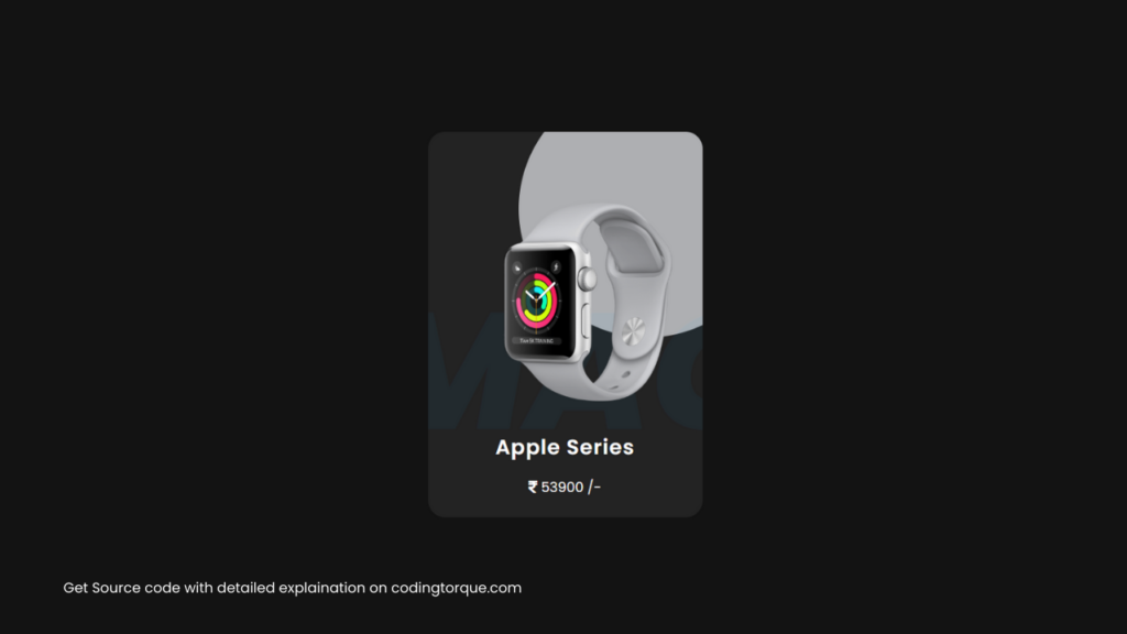
Output Till Now
Written by: Piyush Patil
If you have any doubts or any project ideas feel free to Contact Us
Hope you find this post helpful💖


